

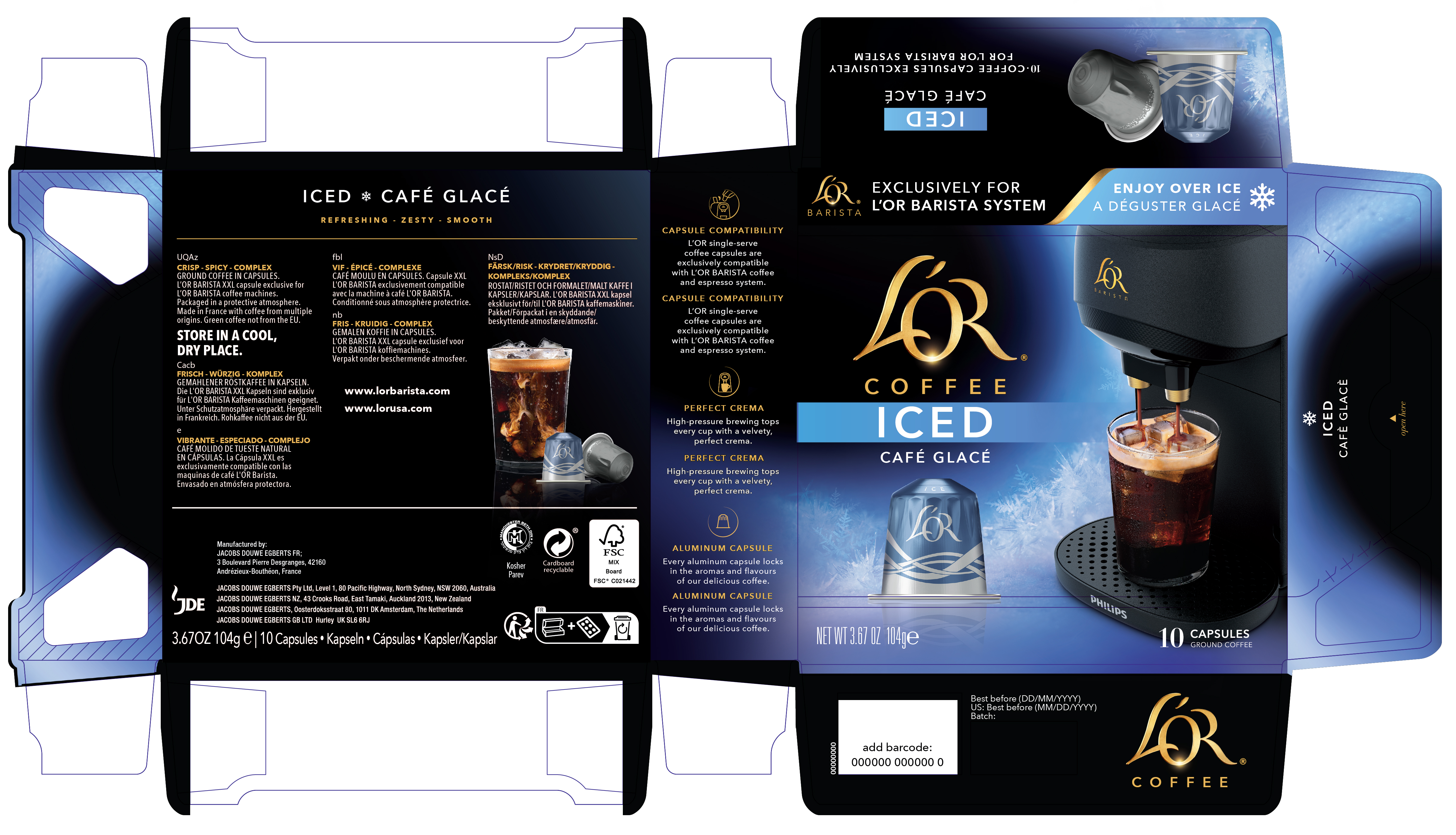
L’OR / Iced Coffee Packaging
SHORT BRIEF.
Develop an adaptation of the existing coffee capsule packaging system that would differentiate the launch of Iced Coffee Packaging and Iced Coffee Capsules. While the initial launch was for Black Iced, we also needed to consider how this might extend to Flavored Iced Coffee. Brand guardrails were defined along with elements that were open to exploration.
Develop an adaptation of the existing coffee capsule packaging system that would differentiate the launch of Iced Coffee Packaging and Iced Coffee Capsules. While the initial launch was for Black Iced, we also needed to consider how this might extend to Flavored Iced Coffee. Brand guardrails were defined along with elements that were open to exploration.
WHAT WE DID.
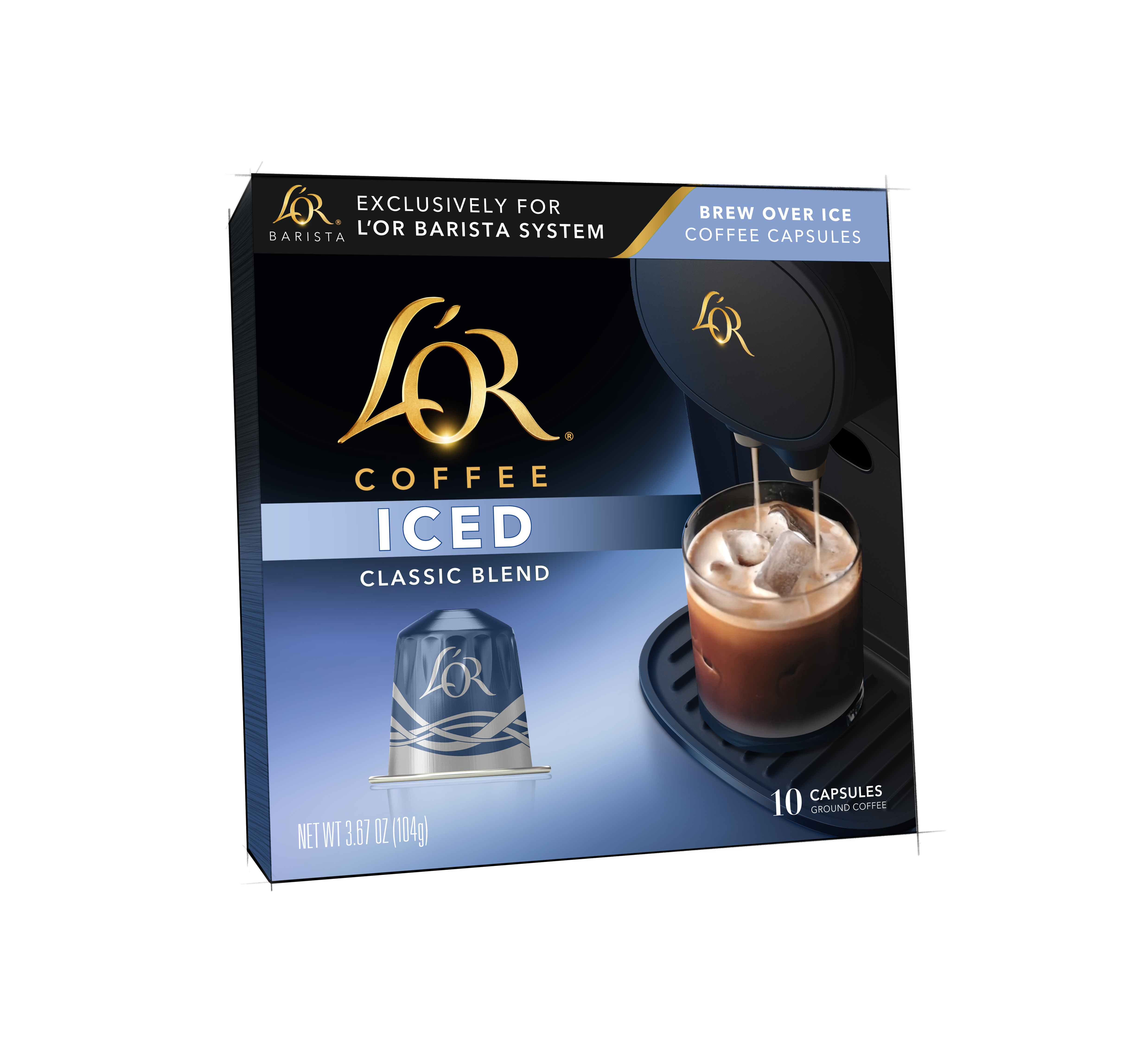
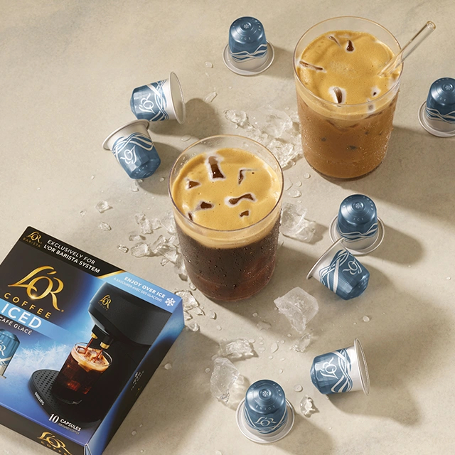
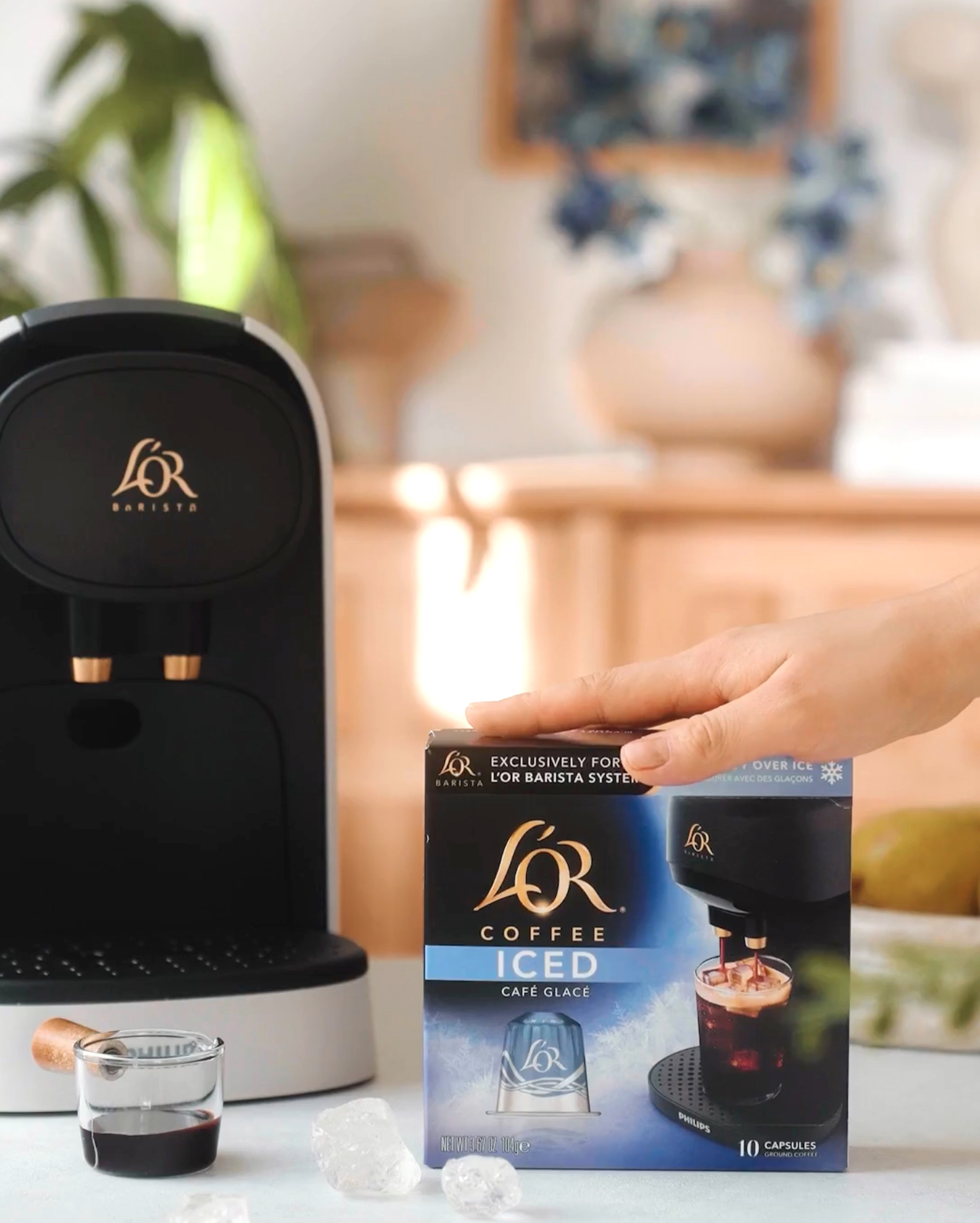
We collaborated closely with L’OR’s marketing and creative team from concept to final artwork, applying our process to adapt their existing design system in a way that accentuates the uniqueness of the Iced series and allows for growth into flavors and seasons. The box is currently available in the UK and France only - sorry to our American friends, you‘ll just have to take that long overdue Paris ︎ trip to try this one out...
Project Deliverables:
Project Deliverables:
- Iced Coffee Package Design
- Iced Coffee Capsule Design
- Package and Capsule renderings
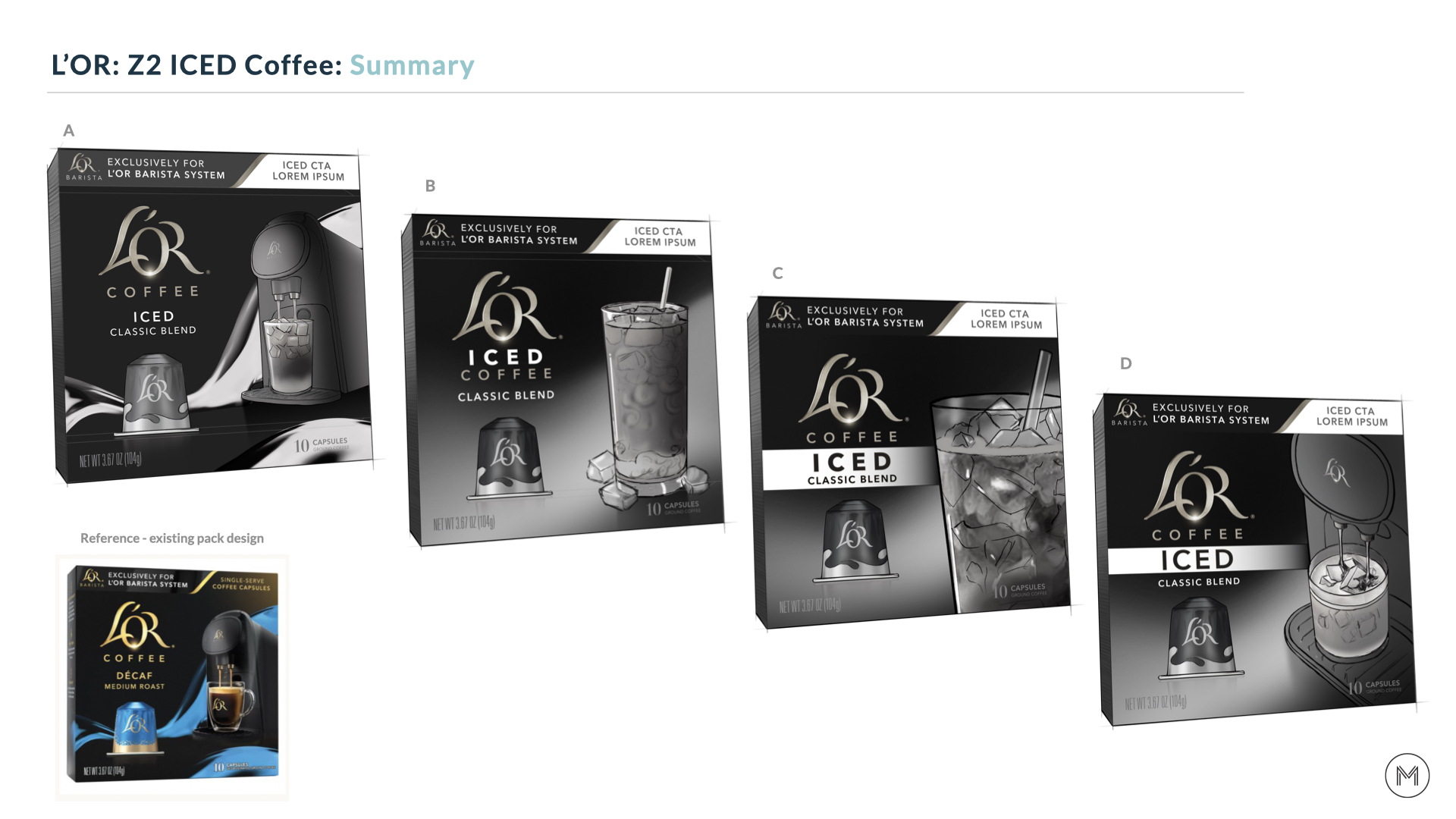
Phase 1: Initial concepting and solving design challenges
To start the process, we worked through a series of rough sketches in order to quickly share potential solutions to get an initial round of feedback from the product development and creative teams.
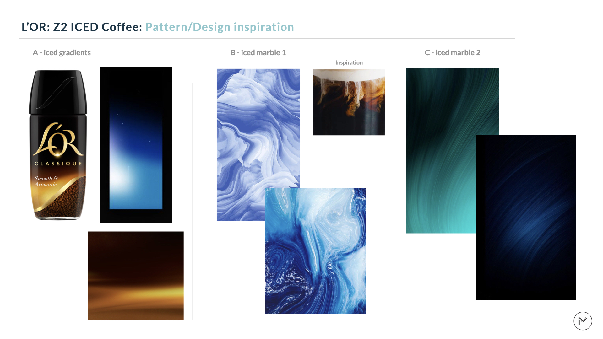
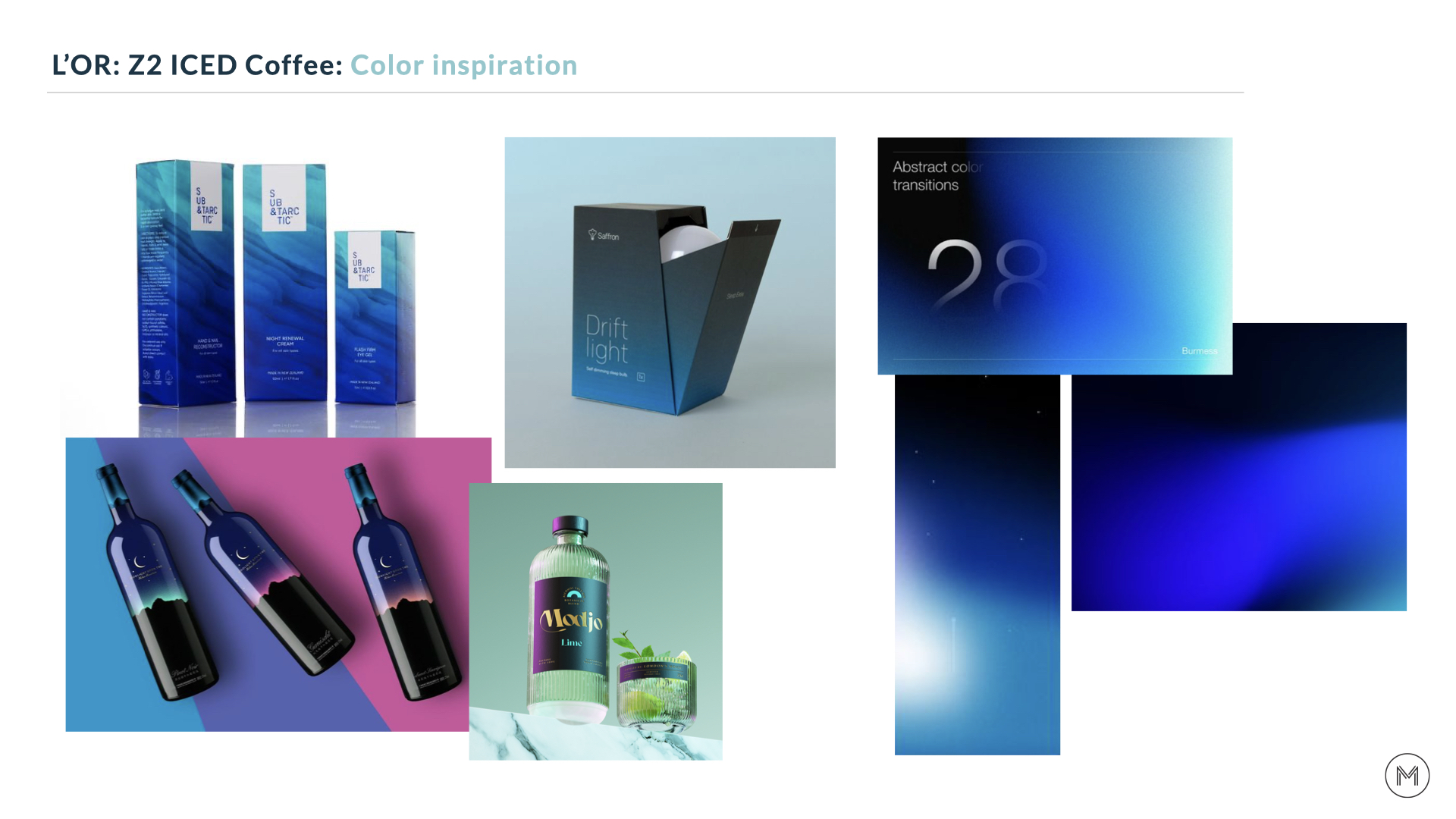
We wanted to keep the focus of the conversation on design hierarchy and how to best incorporate the Barista and iced glas, so color wasn’t added at this stage. We did provide direction through inspirational imagery, allowing the marketing team to provide feedback on color and style.
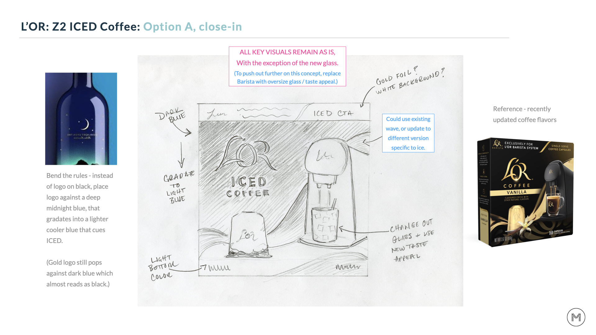
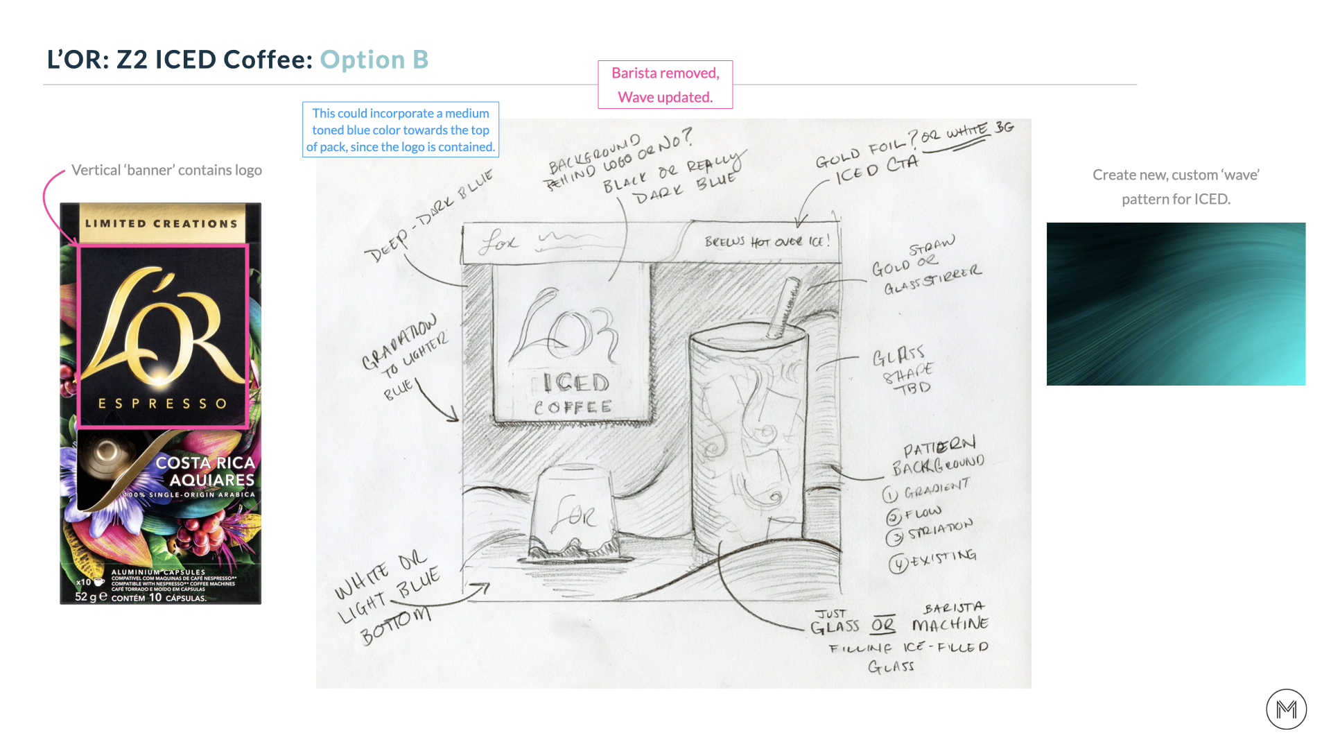
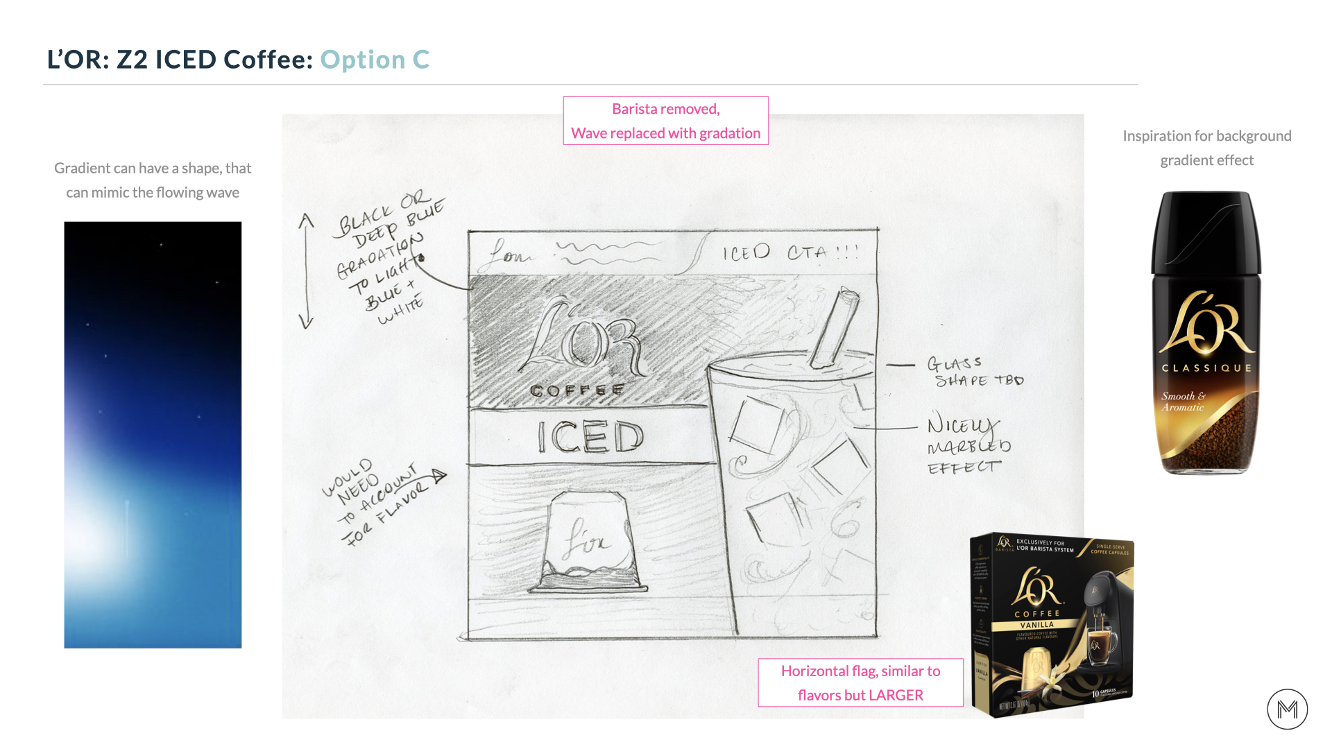
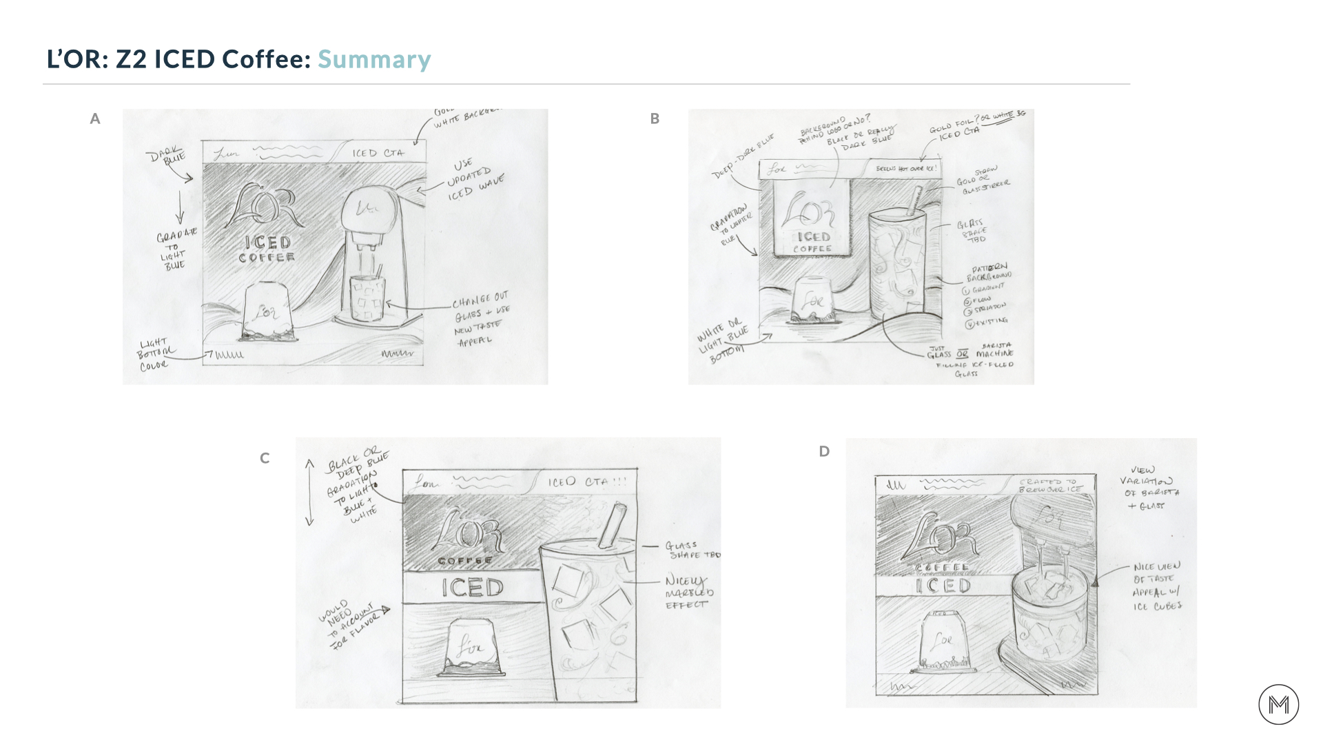
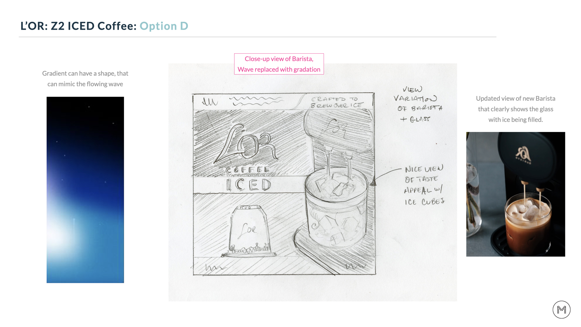
Once we had feedback on the initial concepts, the sketches were refined and shared with L’OR’s leadership team.
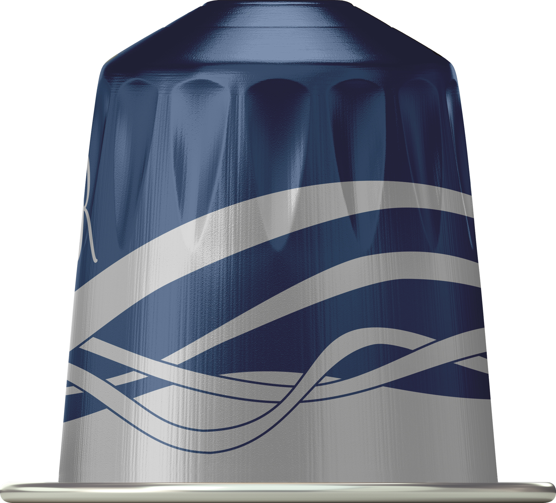
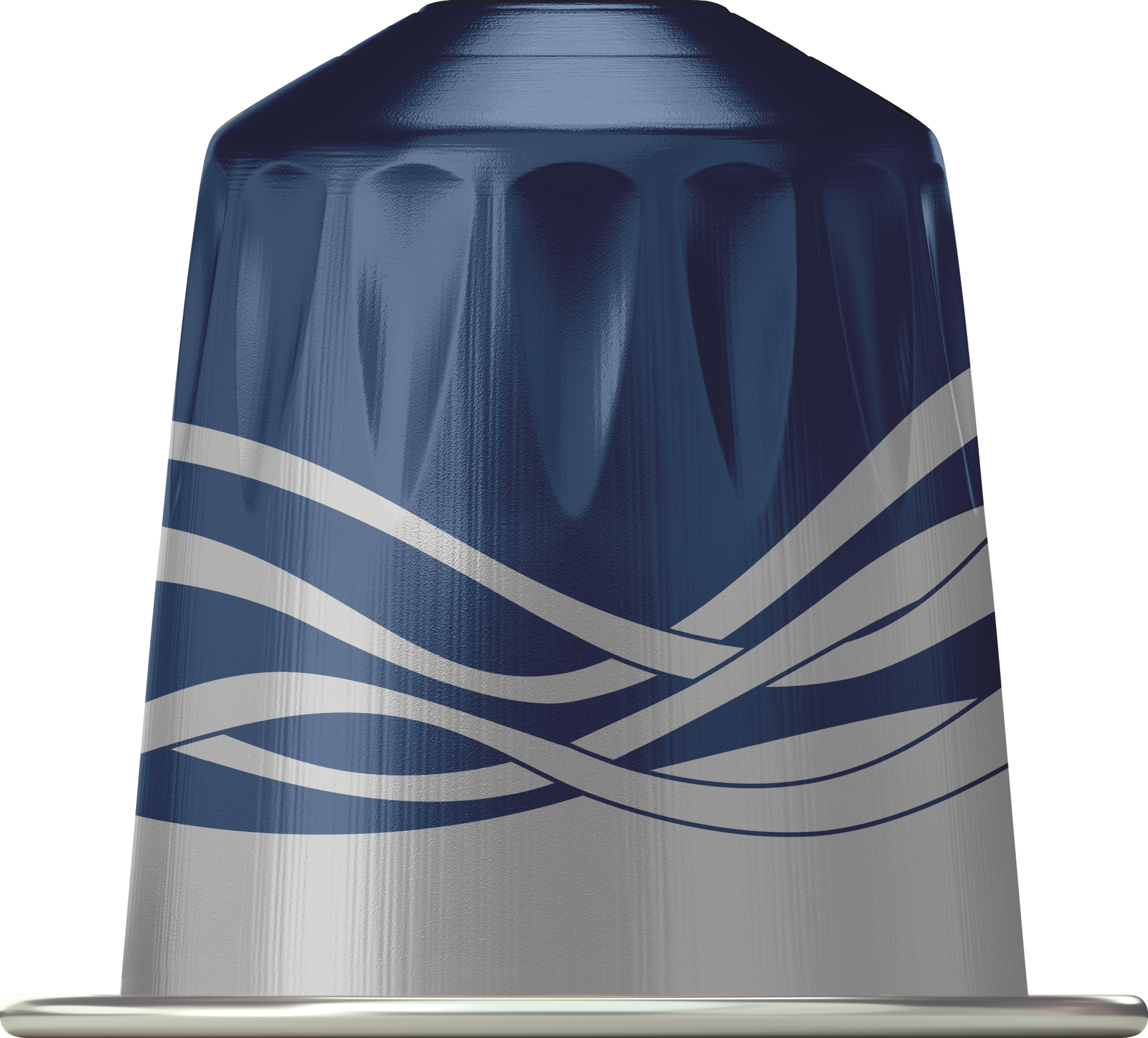
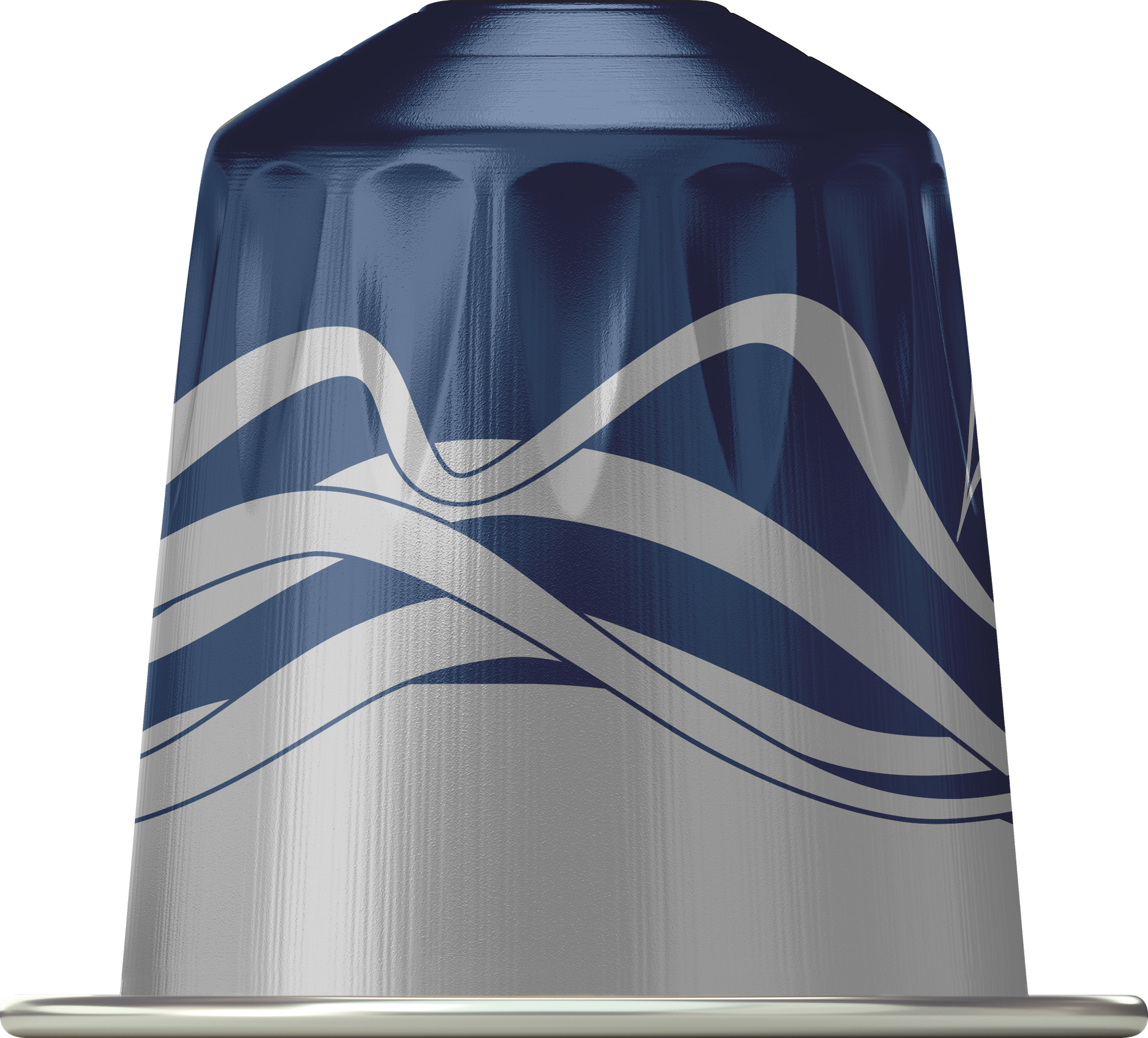
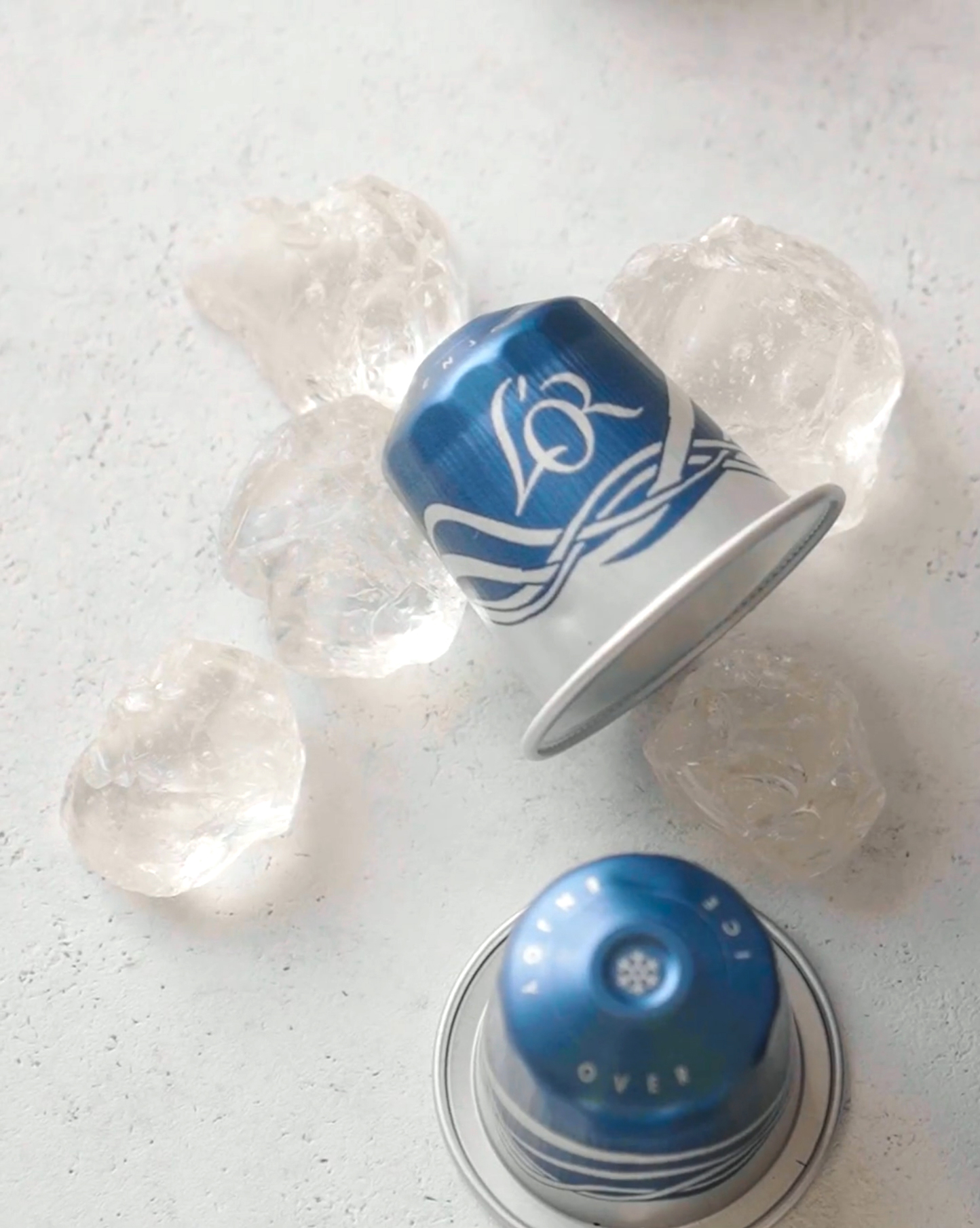
In addition to the packaging, we explored designs for the ICED coffee capsule. Shown here is the selected concept sketch and initial render.
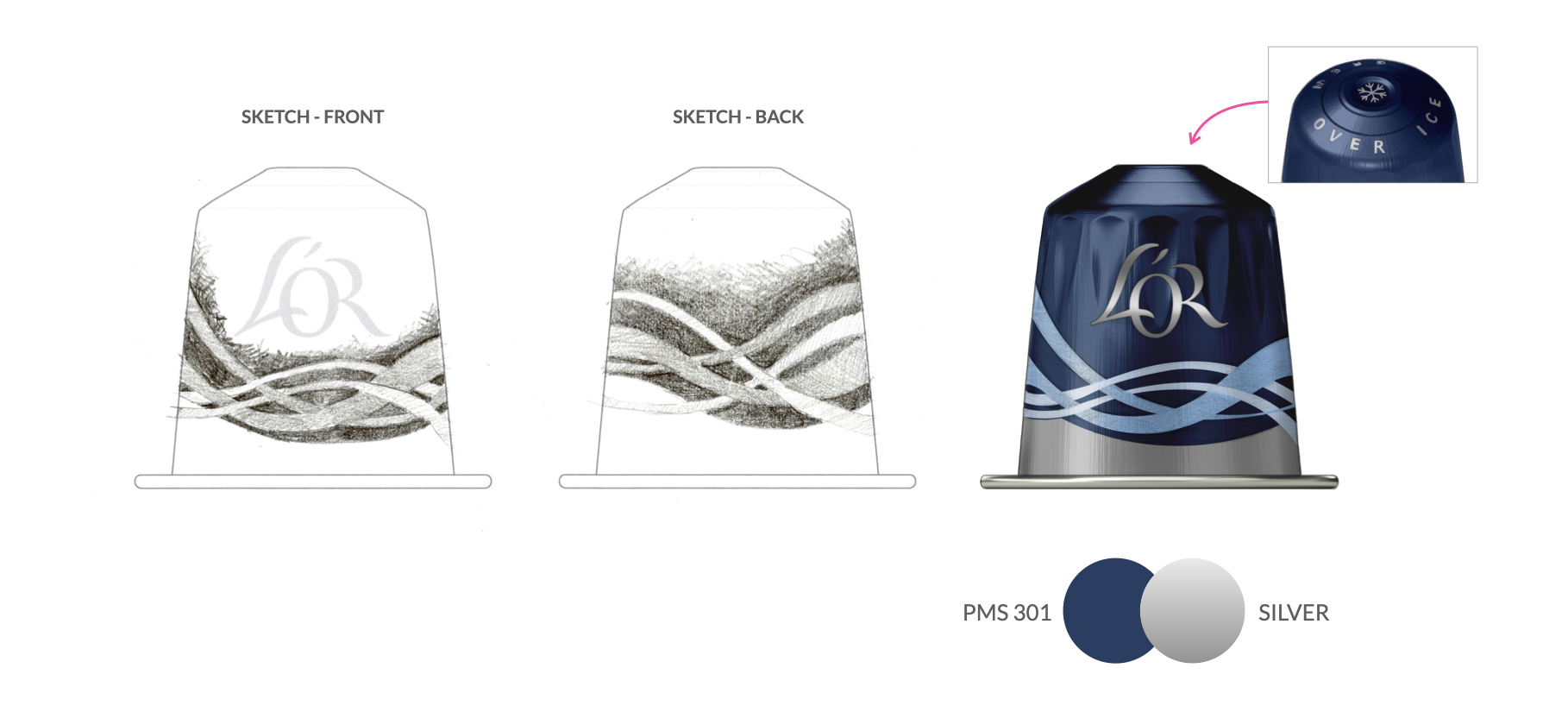
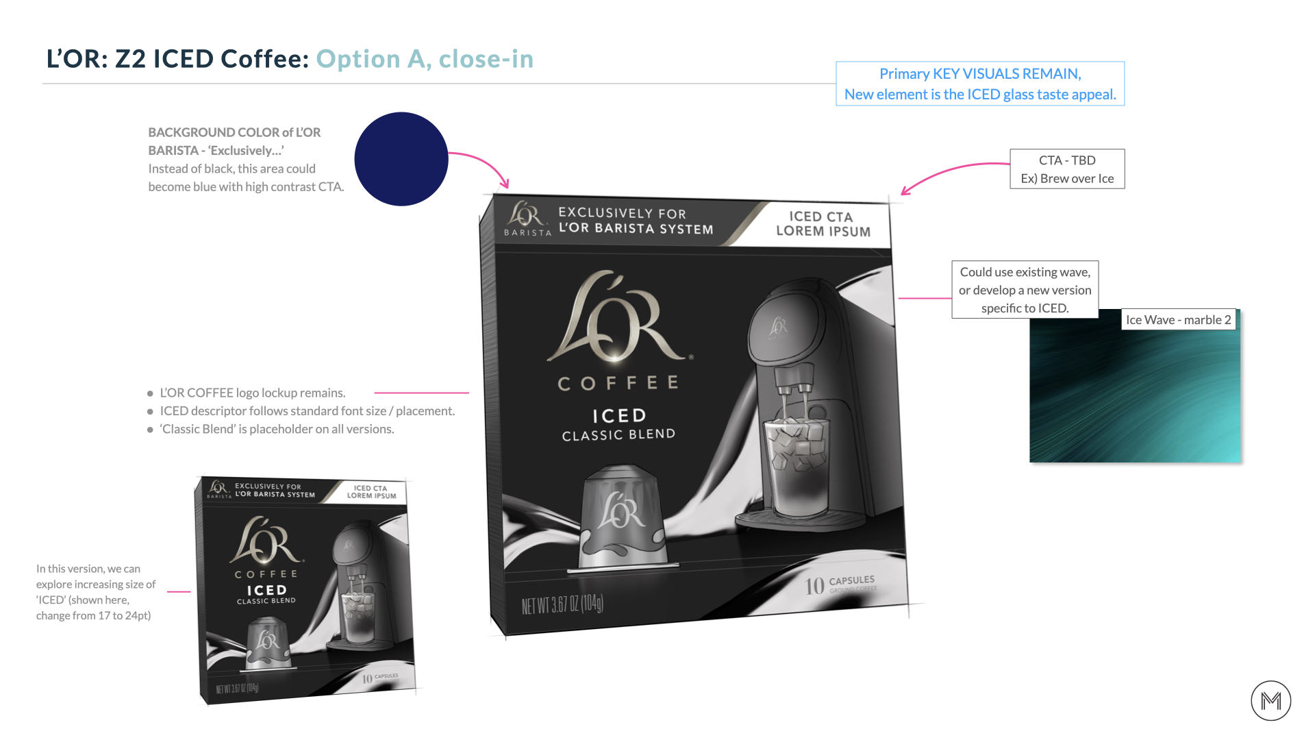
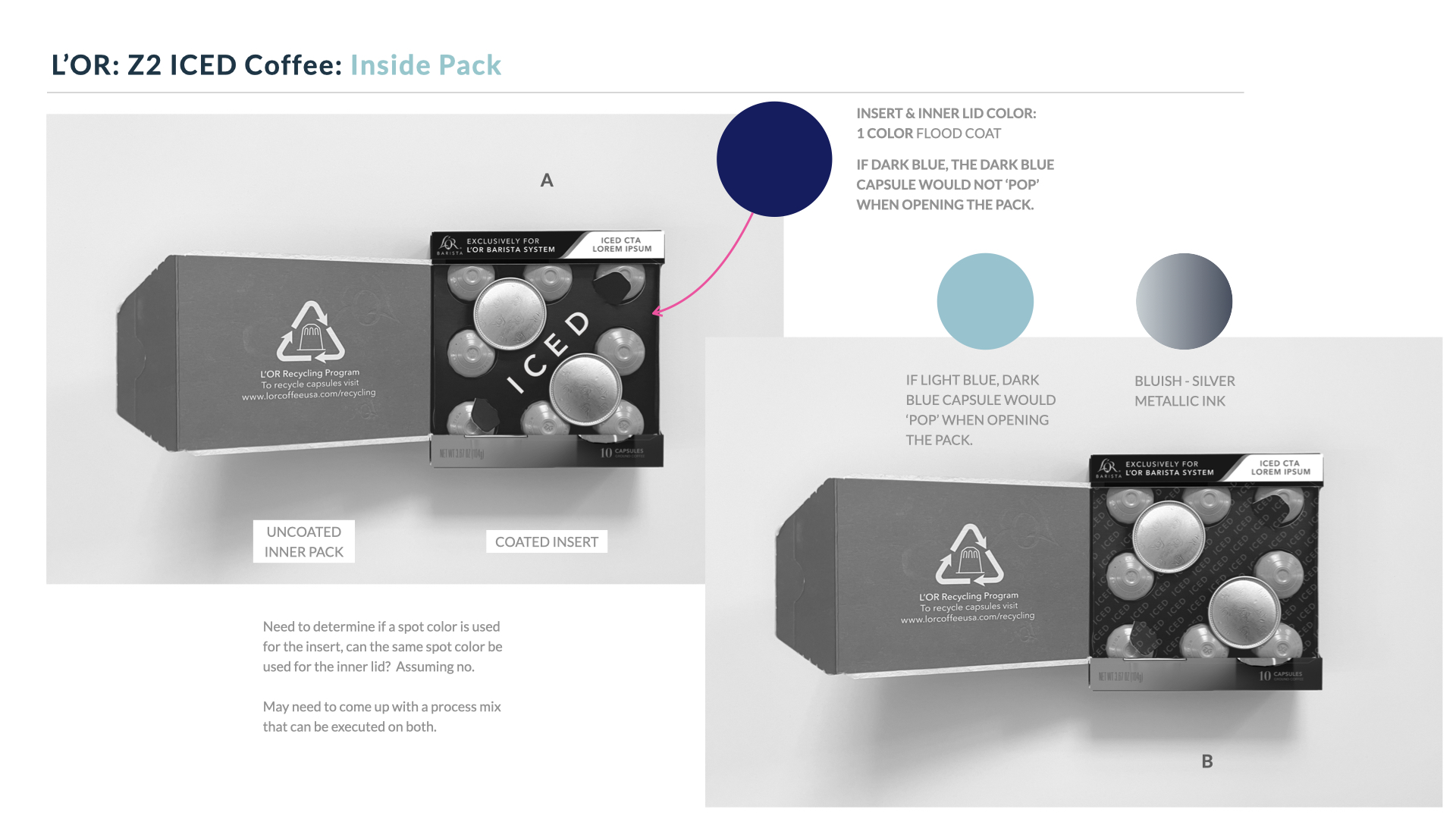
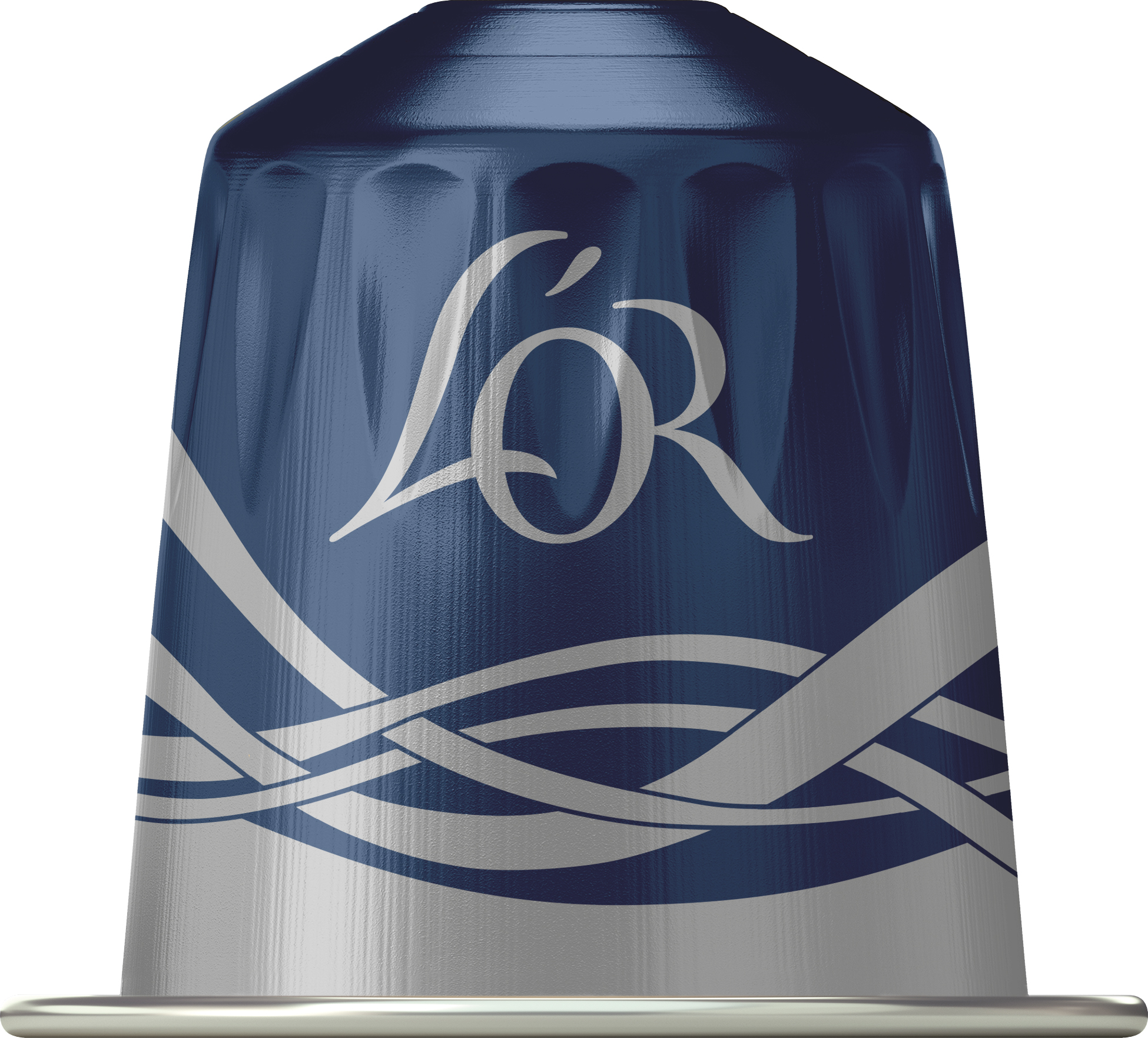
To lock-in the alignment with the team, we added color to the approved concept to help them visualize their selection. The capsule artwork was also approved and the capsule rendering added to the front panel view.
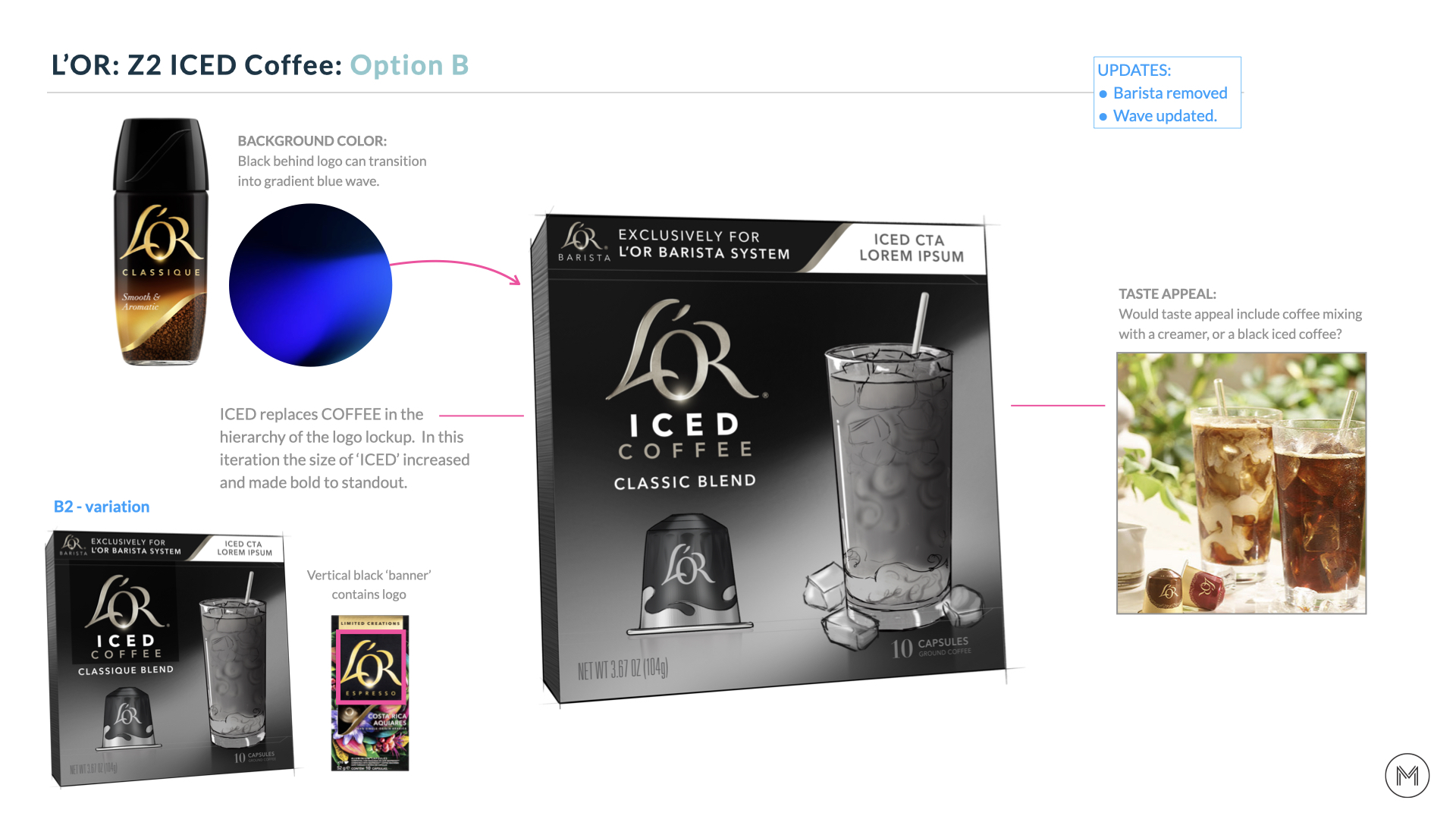
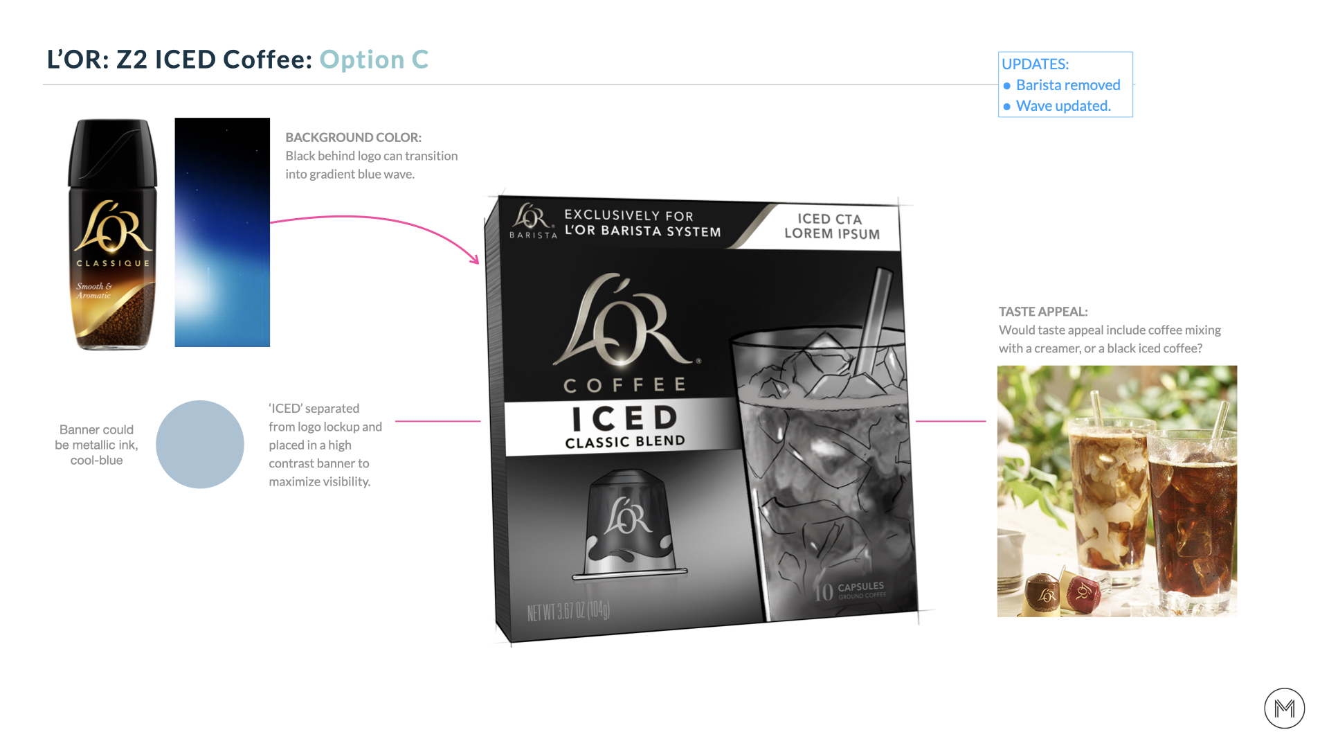
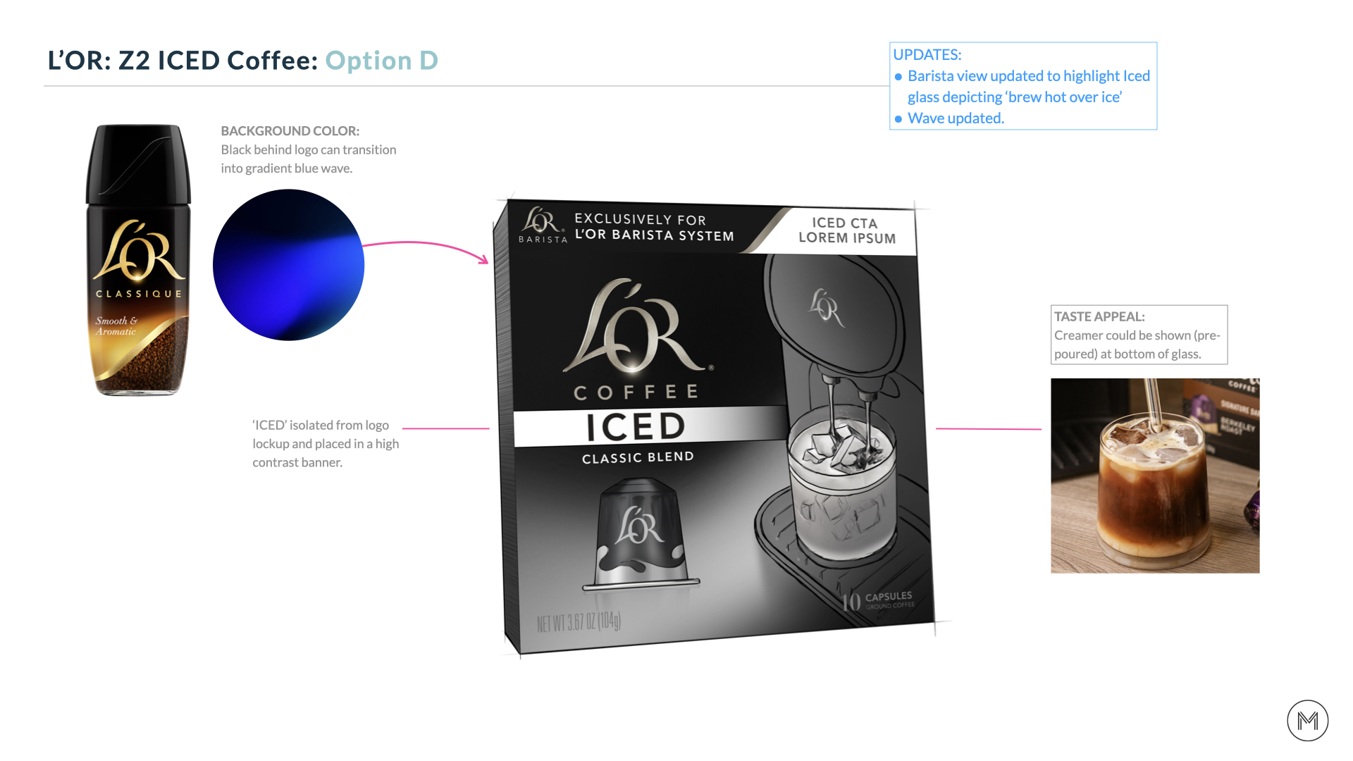
Phase 2: Creating the final art
With initial ideas explored and an approved concept in hand, we start honing in on the final artwork and color. We needed to incorporate a few more key elements to finish off the design.
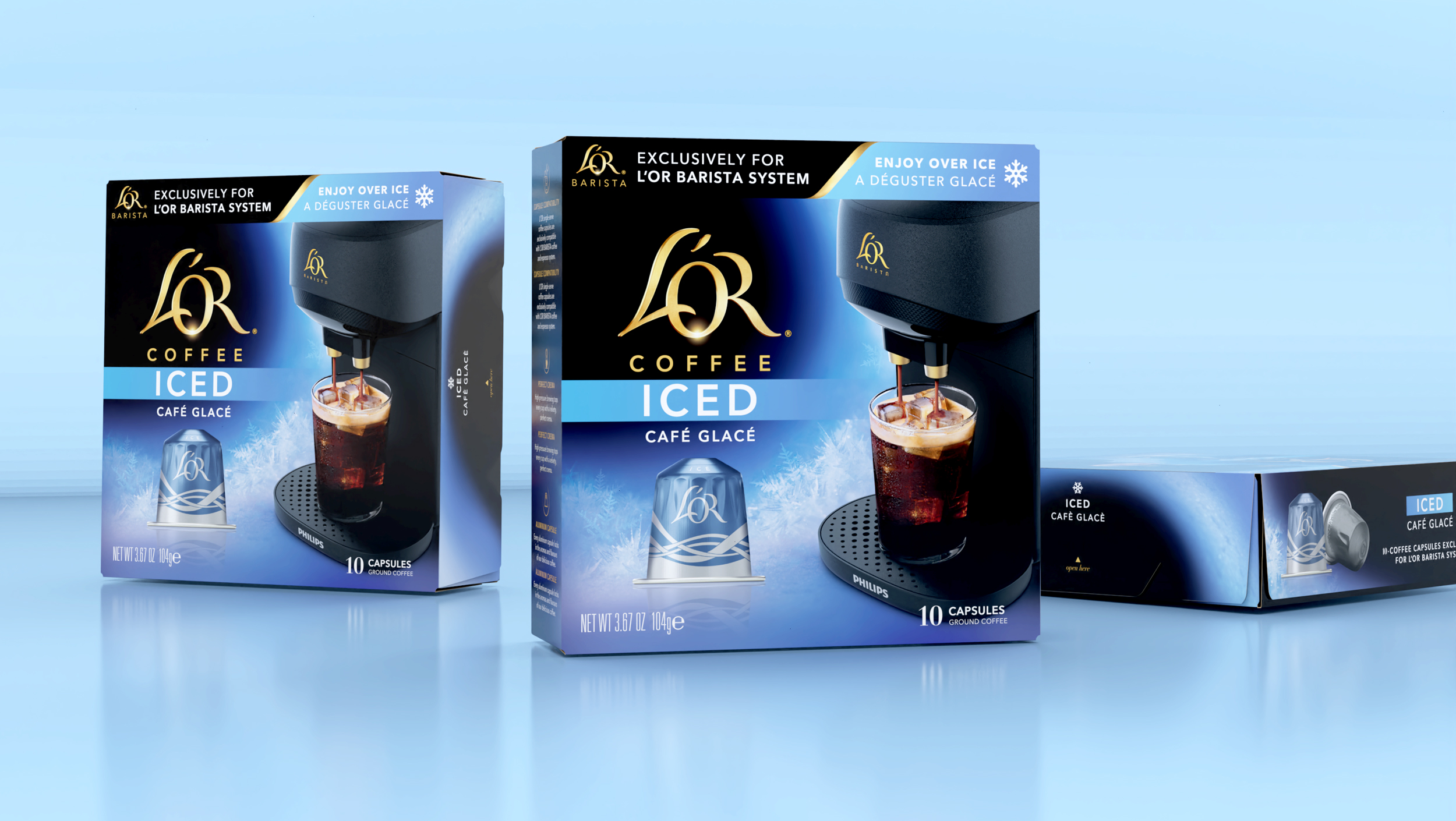
• The newly updated Barista [2.0] machine needed to be integrated with the correct glass, which posed a challenge - we only had a rendering (image) of the machine and a physical glass, so we had the glass photographed at the correct angle and merged the two to create the final visual.
• A more distinctive ice texture was added to the background to enhance the overall ICED appetite appeal and communication.

Phase 3: Finalizing the Artwork
This phase is all about refinement, tightening the details, and making sure everything feels cohesive and shelf-ready. We finalize key elements like marketing copy and NLEA info so everything is accurate. Recommendations on ways to optimize the finish are made, and final 3D renderings are provided.
︎Images below by L’OR
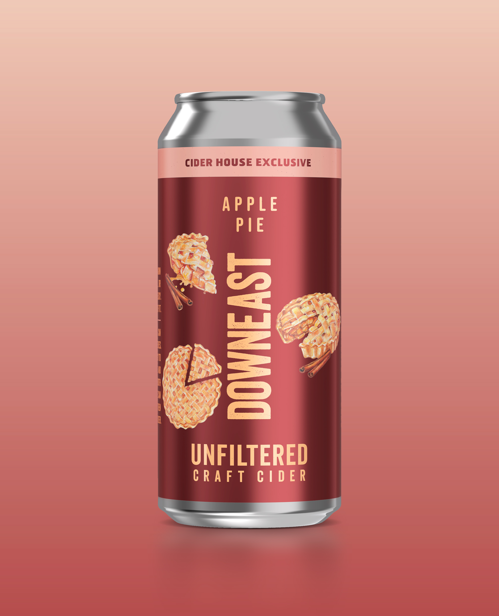
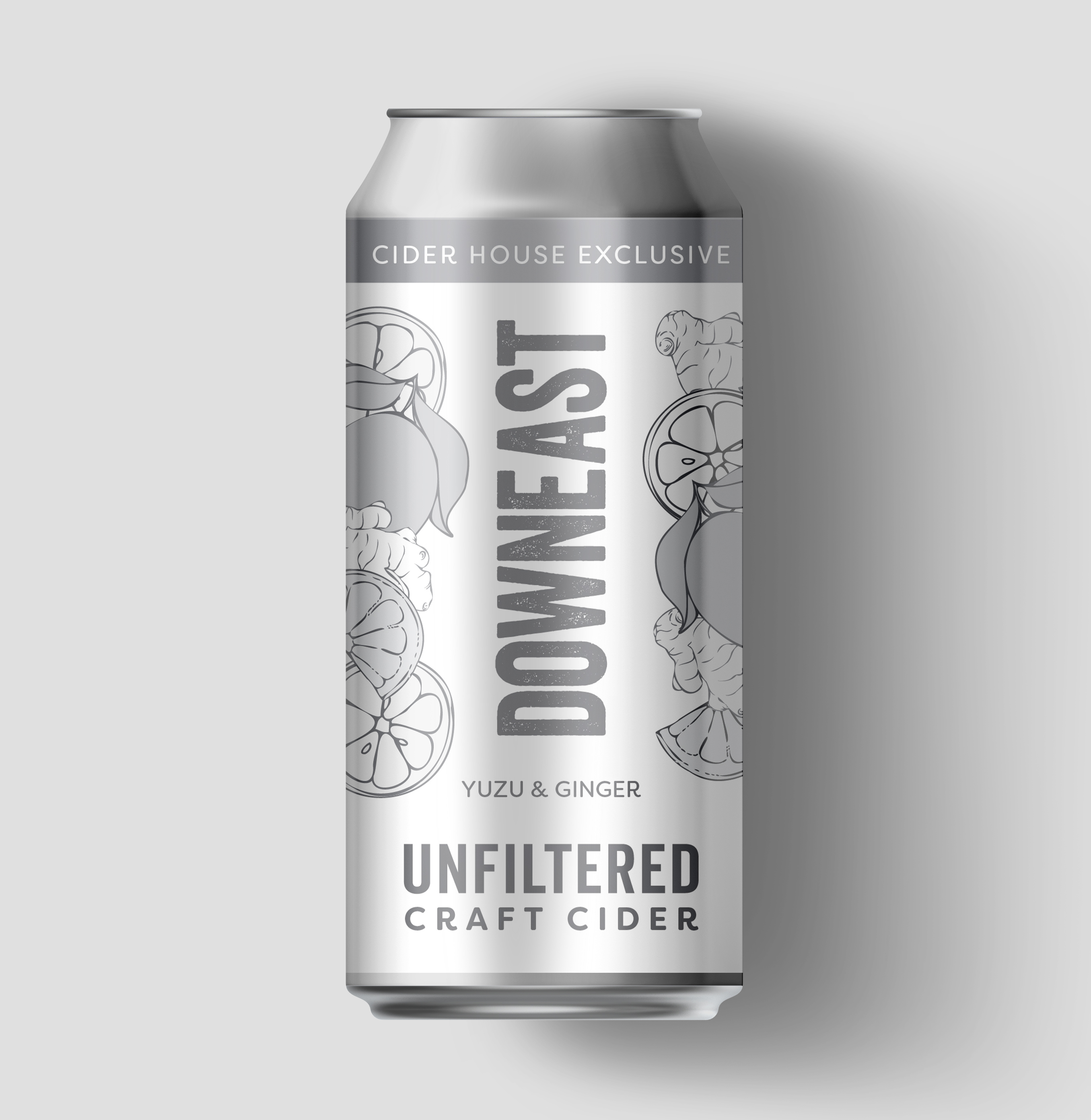
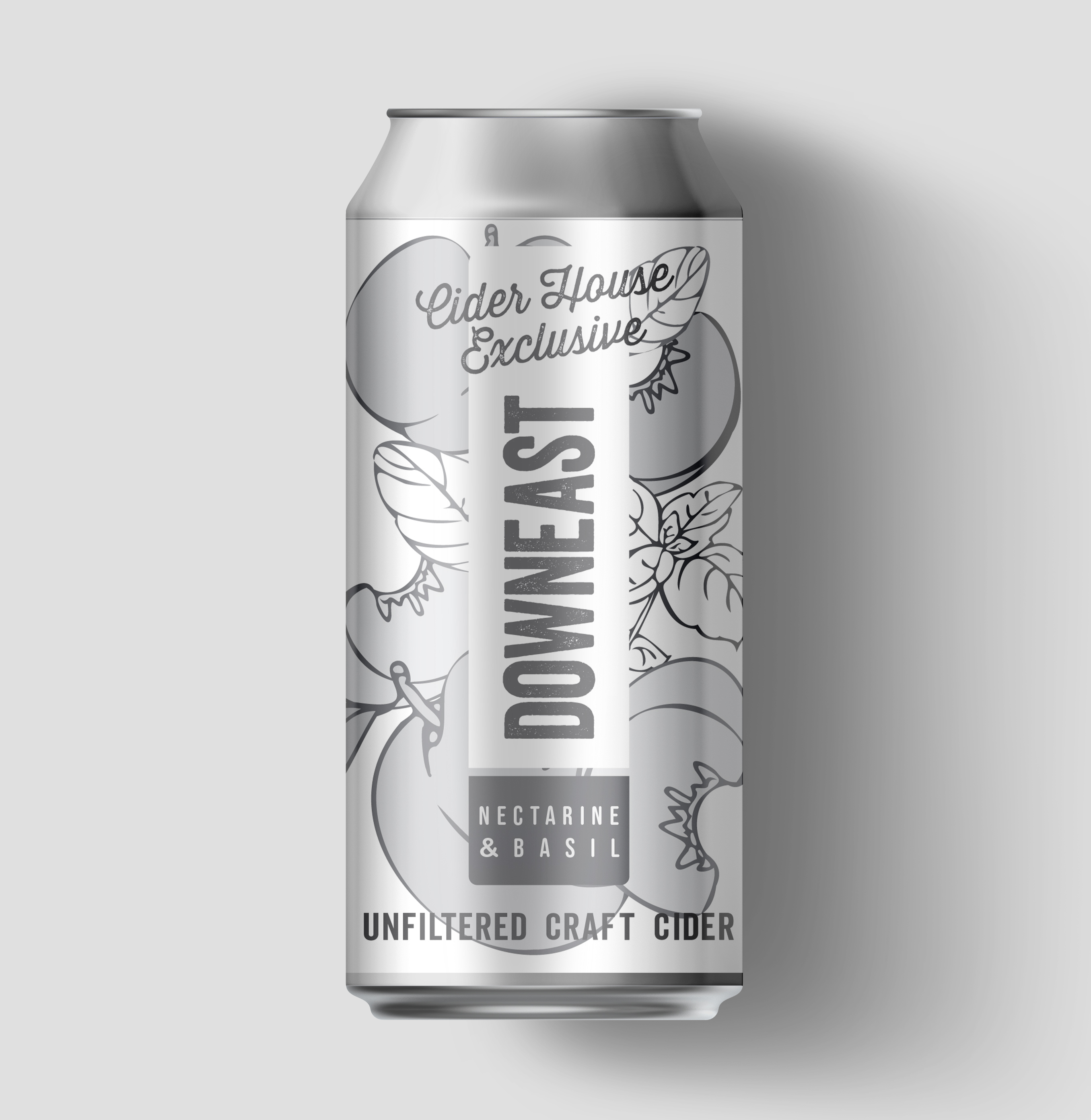
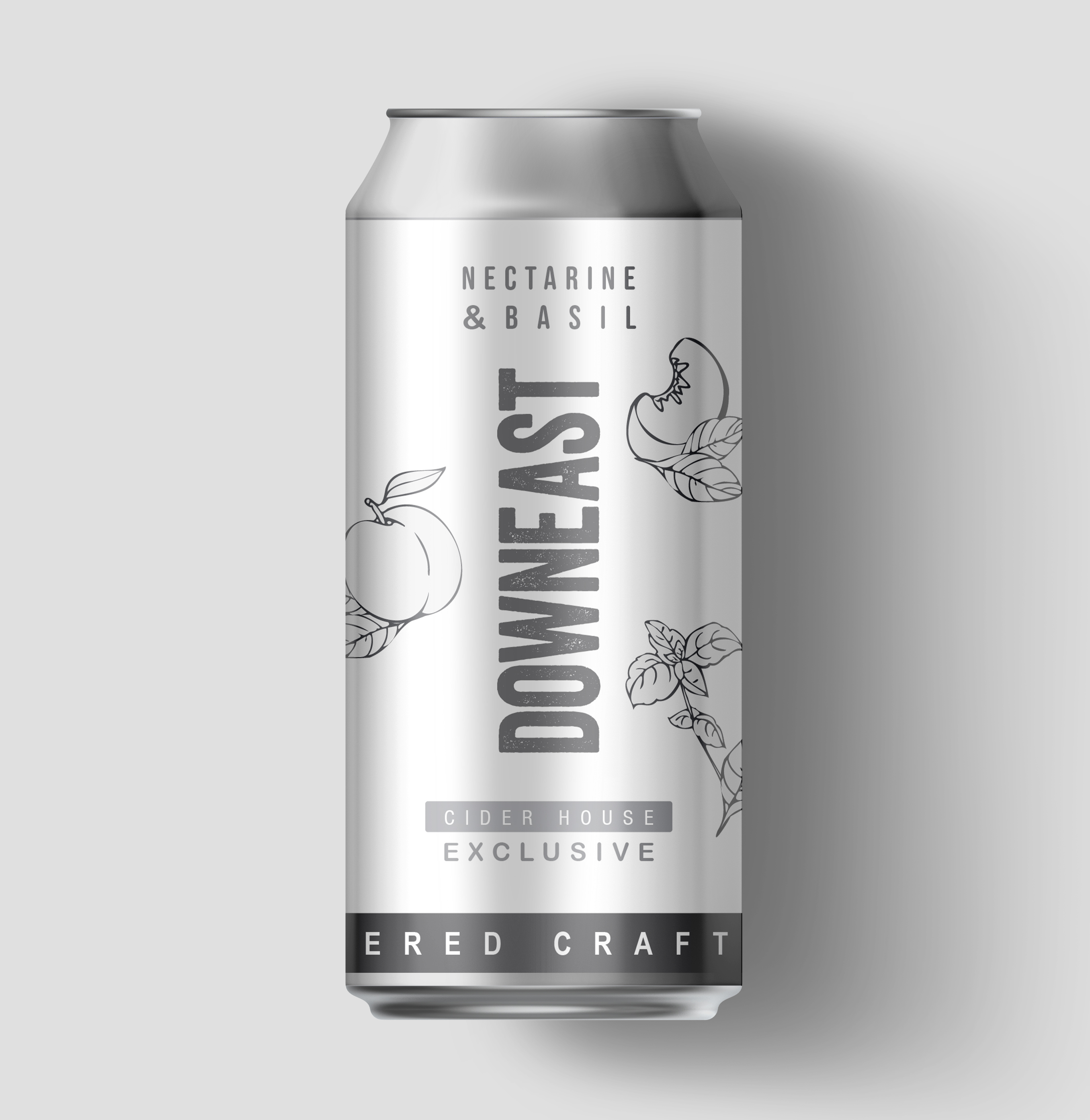
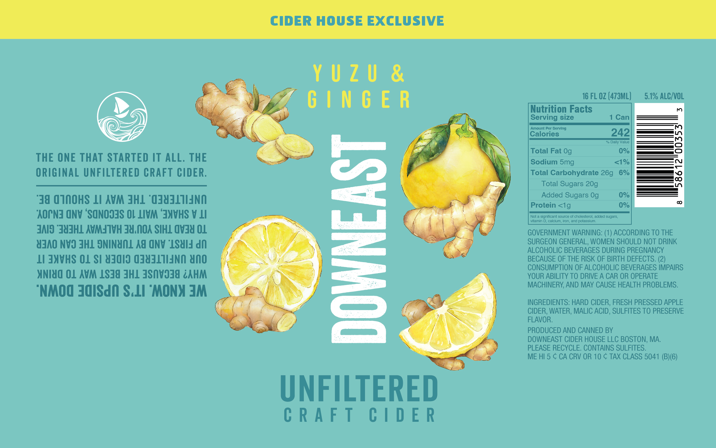
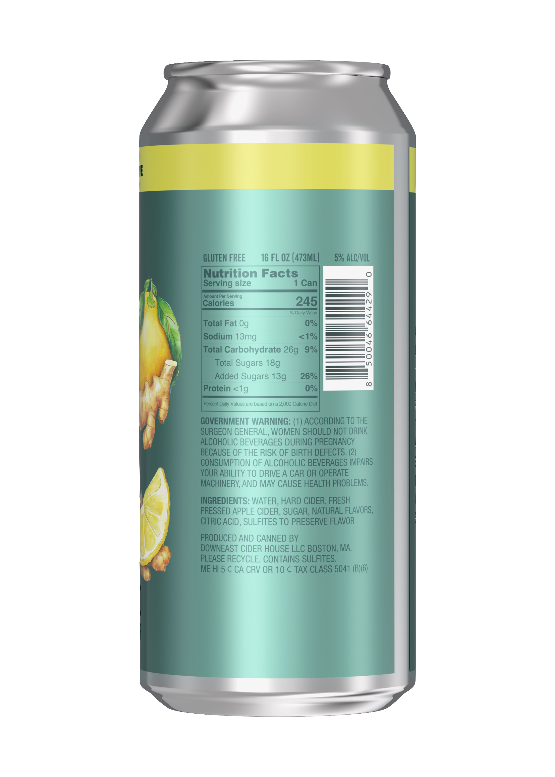
DOWNEAST / Cider House Exclusive Series
SHORT BRIEF.
The Cider House Exclusive Series highlights the premium, experimental side of Downeast Cider. Each limited-release flavor pairs unexpected, seasonal ingredients with a more refined, artisanal aesthetic while still staying true to the brand’s approachable personality. The goal: maintain loyalty among core fans while attracting new consumers with a more elevated palate.
The Cider House Exclusive Series highlights the premium, experimental side of Downeast Cider. Each limited-release flavor pairs unexpected, seasonal ingredients with a more refined, artisanal aesthetic while still staying true to the brand’s approachable personality. The goal: maintain loyalty among core fans while attracting new consumers with a more elevated palate.
WHAT WE DID.
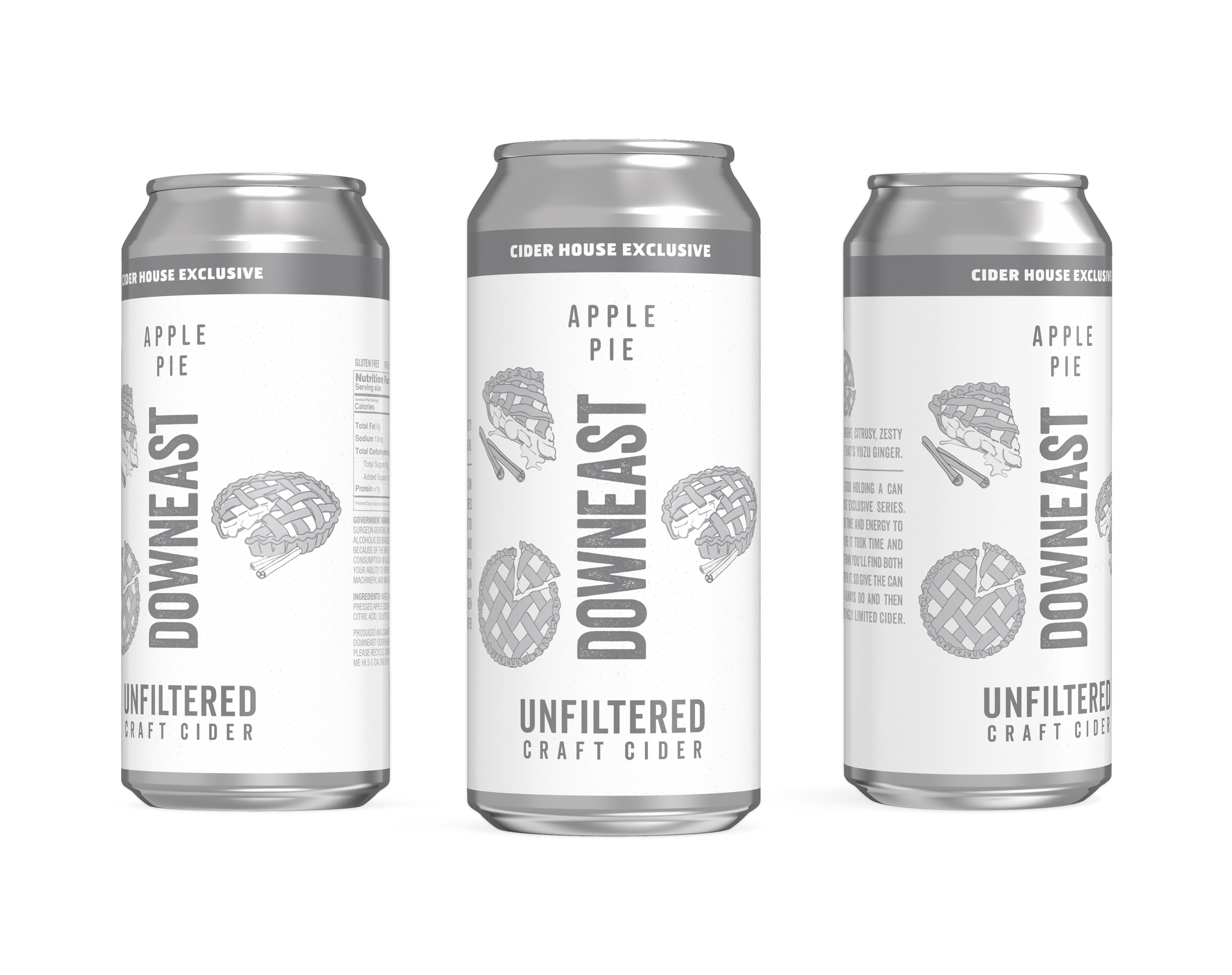
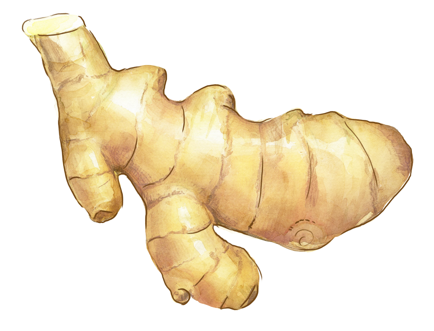
We partnered with the Downeast team from concept to final artwork, applying our process to build a flexible design system that ties the series together. Each can features hand-painted watercolor illustrations (by Mel) of key ingredients, giving the lineup a crafted, small-batch feel. The first flavor to kick off the series was Yuzu & Ginger, a 2025 Spring release - see below for the process that we applied to the creation of this flavor.
It’s been a true collaboration—clear vision, creative trust, and a lot of fun along the way. And the flavors? Genuinely delicious, each perfect for the season. We’ve been thrilled to create artwork that pairs so well with what’s inside the can.
Visit Downeast’s website or their TAP House to try the latest exclusive release ︎︎︎


Phase 1: Concepting & Alignment - Creating the system
We kicked things off by working with the Downeast team to define the design system for the new series. Our goal was to build a system that could flex across future flavors while staying cohesive. We shared a variety of layouts using greyscale ‘sketches’ of the artwork, giving the team space to react to various hierarchies and help shape the direction from the ground up. Other flavors were included in this study, to explore how different flavor names and ingredients might work within the proposed systems.

With feedback from the team, we landed on the design hierarchy below.
Fixed elements are the logo. copy elements, and placement of color.
Flex elements are the ingredient visuals, specifically the number of elements - we agreed that this could shift between 3 and 4, depending on the flavor.
Fixed elements are the logo. copy elements, and placement of color.
Flex elements are the ingredient visuals, specifically the number of elements - we agreed that this could shift between 3 and 4, depending on the flavor.
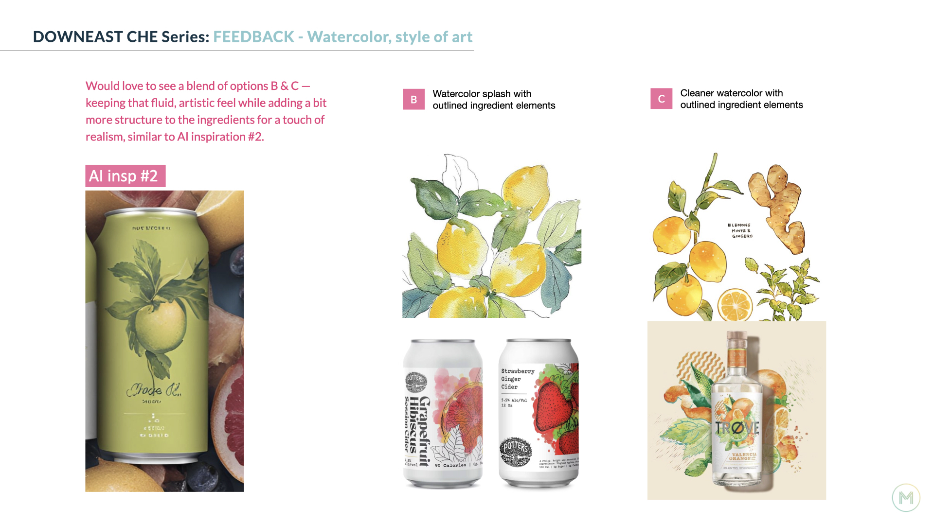
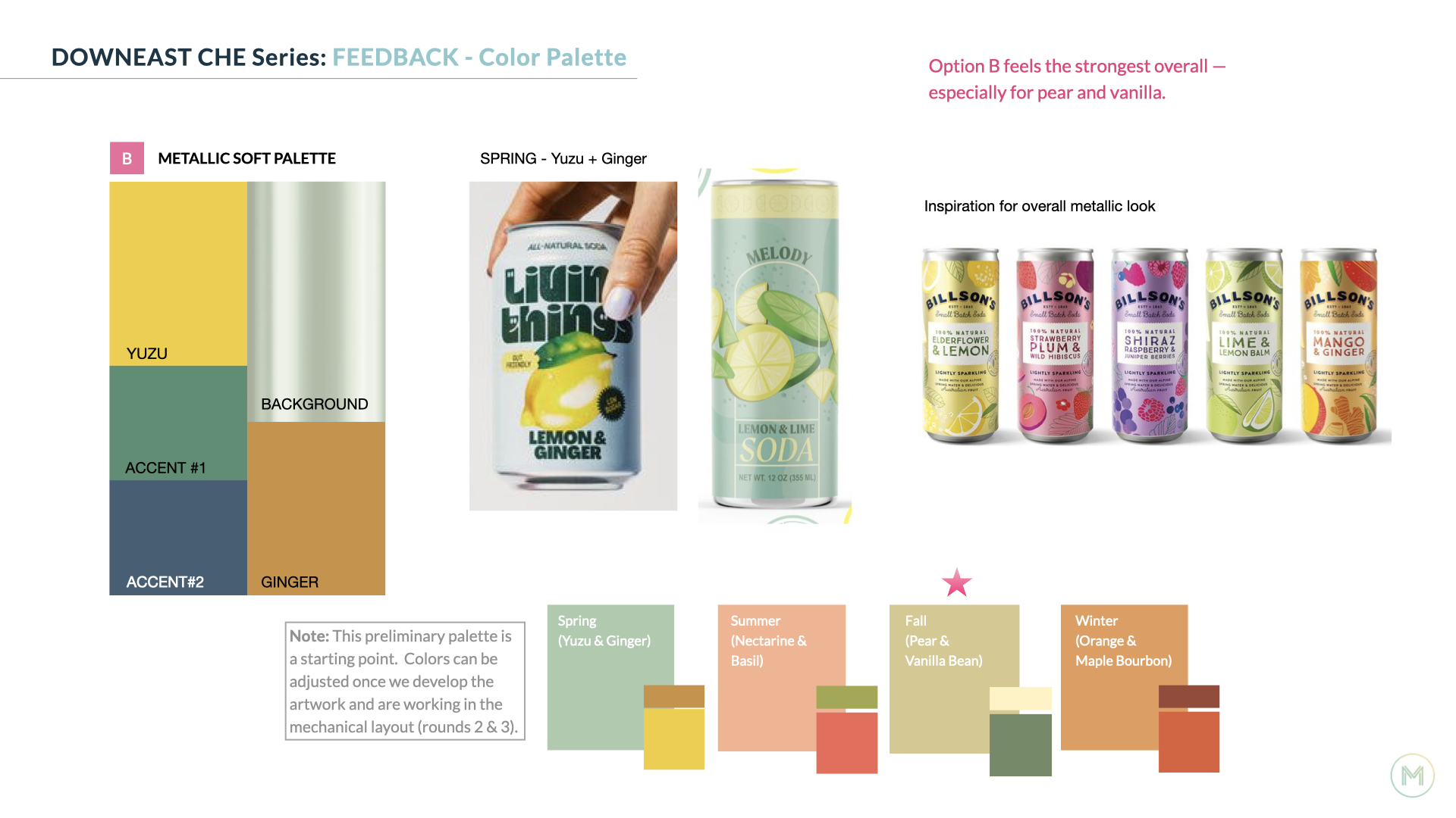
In addition to aligning on a design system, we’re sharing inspiration for potential color combinations, and relevant art styles early on to make sure we’re heading in a direction that feels right for everyone.
Phase 2: Art Development - Creating the art
With the design system in place, we moved into developing the ingredient art and exploring how color could bring each flavor to life in layout. This is one of the most enjoyable parts of the process for us. It's hands-on, creative, and full of discovery.
Mel paints each ingredient element by hand using watercolor. We then bring those scans into Photoshop to refine, clean up, and prep for layout. It’s an iterative process within the studio that thrives on collaboration and keeps the final ingredient art feeling fresh, crafted, and full of character.


Color exploration in layout.
![]()
![]()
![]()
![]()


Phase 3: Finalizing the Artwork for printing
With initial concepts explored and feedback in hand, we start honing in on the final artwork and color. This phase is all about refinement, tightening the details, fine-tuning the palette, and making sure everything feels cohesive and shelf-ready. We make updates to key elements like marketing copy and NLEA info so everything is accurate. Recommendations on ways to optimize the finish for the metallic substrate are made, and 3D can renderings are provided.


︎Image below by Downeast
![]()


LINDT USA / Design Across Franchises & Touchpoints
THE BRIEF.
Lindt’s core brands rely on strong, established systems that must remain consistent as new products, formats, and retail programs are introduced. Each execution needs to align with existing standards while adapting to different packaging structures, sizes, and merchandising environments.
Lindt’s core brands rely on strong, established systems that must remain consistent as new products, formats, and retail programs are introduced. Each execution needs to align with existing standards while adapting to different packaging structures, sizes, and merchandising environments.
WHAT WE DID.
For 10+ years, we’ve supported ongoing packaging and display development across Lindor, Excellence, Classic Recipe, Gold Bunny, and now Dubai Style. The work spans primary packaging, club formats, and retail displays, all designed to integrate seamlessly into Lindt’s broader brand ecosystem.
Lindt LINDOR
Lindt LINDOR expands each year with seasonal and customer-exclusive flavors. We partner with the Lindt Brand, Creative, and Production teams to develop packaging that introduces new flavor experiences while still feeling at home within the LINDOR franchise.
Our work includes creating ingredient visuals and exploring bag and wrapper color combinations across formats ranging from 6oz to 21oz club sizes. Raspberry Cheesecake was one of our favorites and is now a consistent seasonal release at Target.


We redesigned Lindt LINDOR‘s club case system in 2025. We’ll save the full write-up for a separate case study ︎, but here’s a quick look at the updated club case structure / design and the front pallet view for Raspberry Cheesecake.


We developed seasonal packaging updates for LINDOR across Valentine’s Day, Spring, and Holiday, introducing limited-time graphics that feel festive while complementing the core design system. The Valentine’s design features hand-painted watercolor hearts by Mel.
Images below courtesy of Lindt USA.
Images below courtesy of Lindt USA.


Lindt EXCELLENCE
For Excellence, we’ve supported retail and promotional packaging as well as display design. A strong understanding of the brand’s core assets helps ensure new flavors feel consistent across the bar range while still allowing room for variation when appropriate.
Crunchy Mint Cookie builds on the visual approach established for Crispy Wafer, introducing a more expressive background with added texture, touches of gold foil, and ingredient pieces emerging from the signature diamond. The result feels distinctive while still clearly part of the Excellence lineup.


Floor Display w/ Wing showcasing flavor innovation.
![]()
![]()
![]()


Prior Floor Display w/ Header showcasing flavor innovation.
![]()
![]()
![]()


Key Visual and comp print layouts for ‘Love it or We’ll Replace it’ campaign.


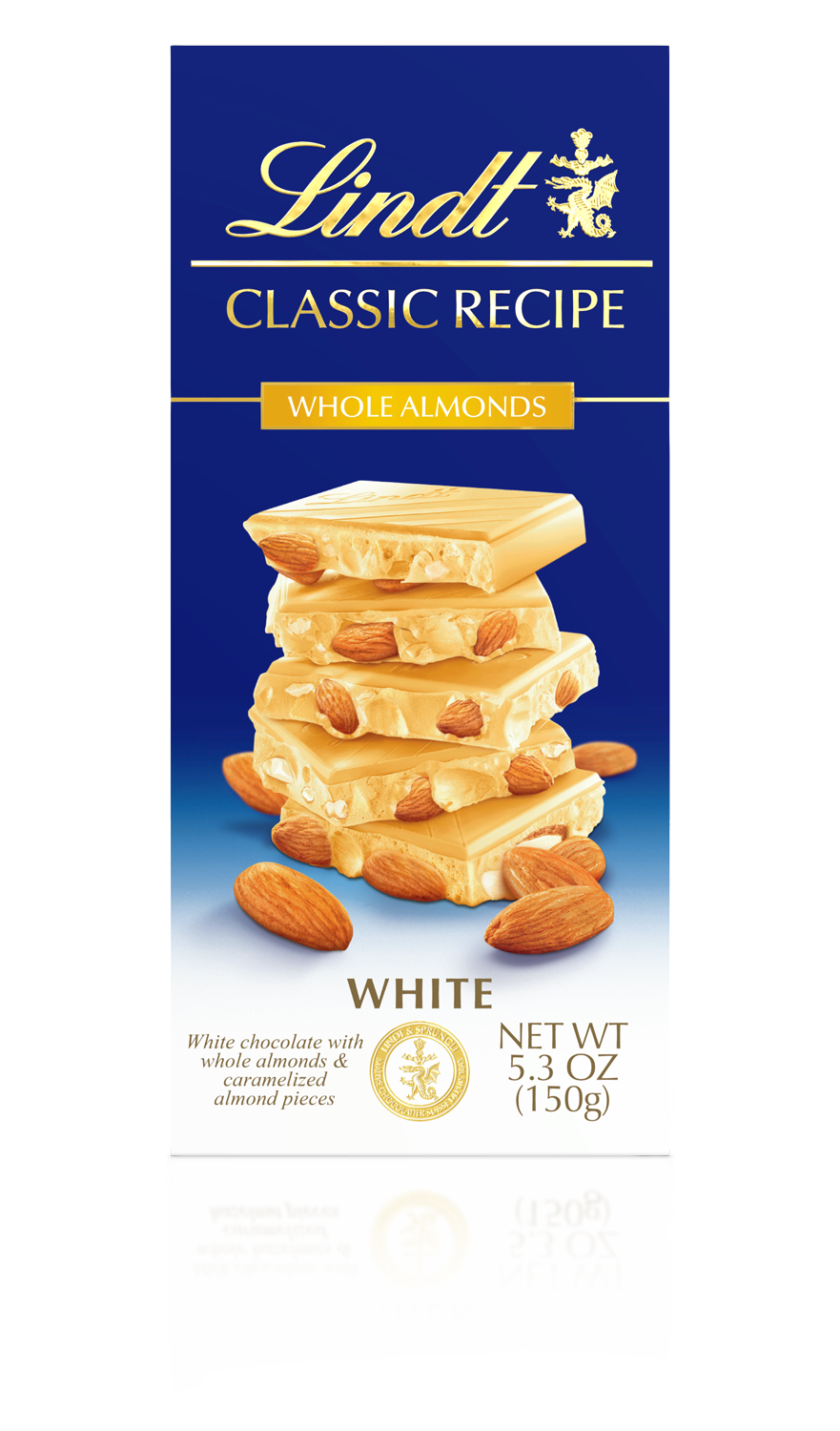
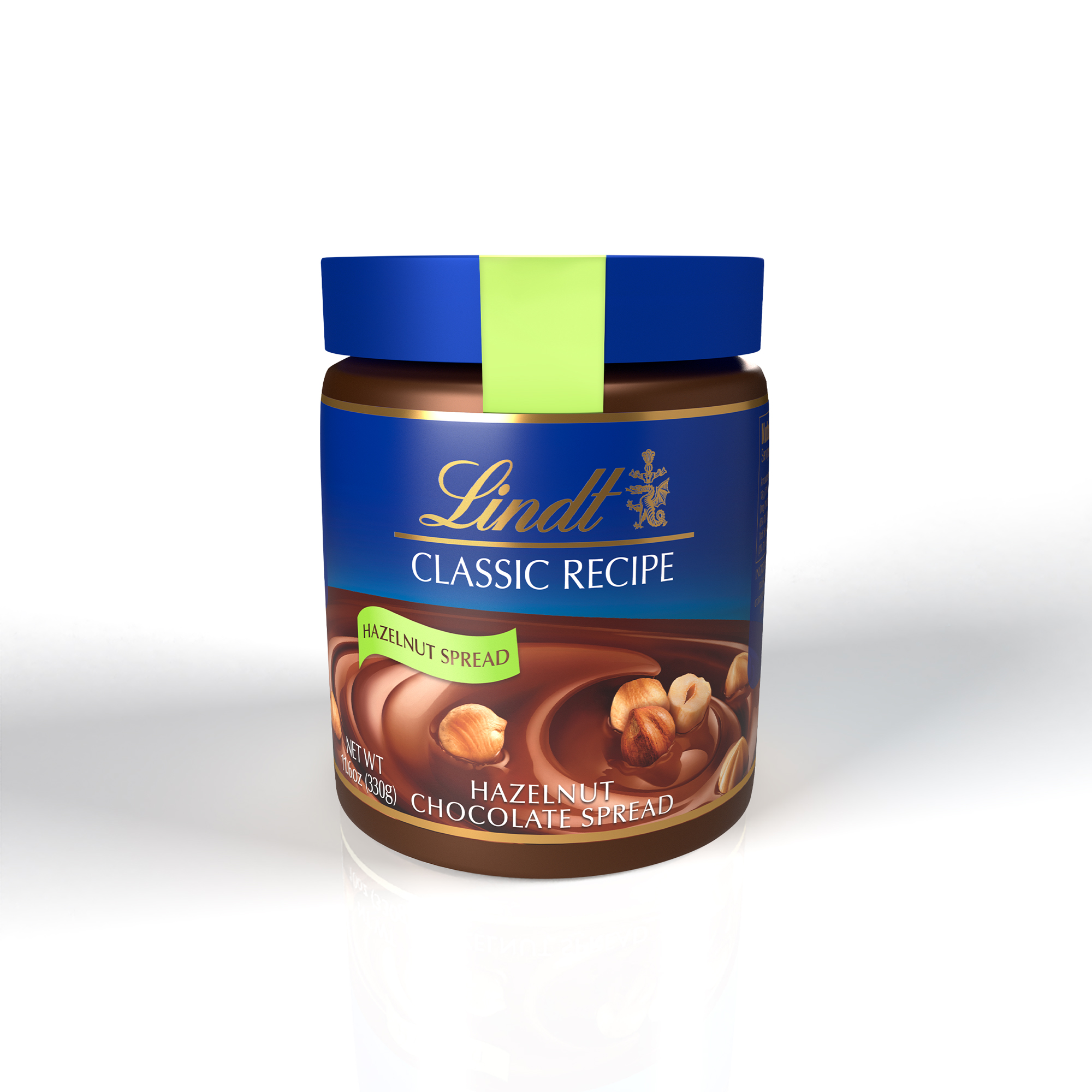
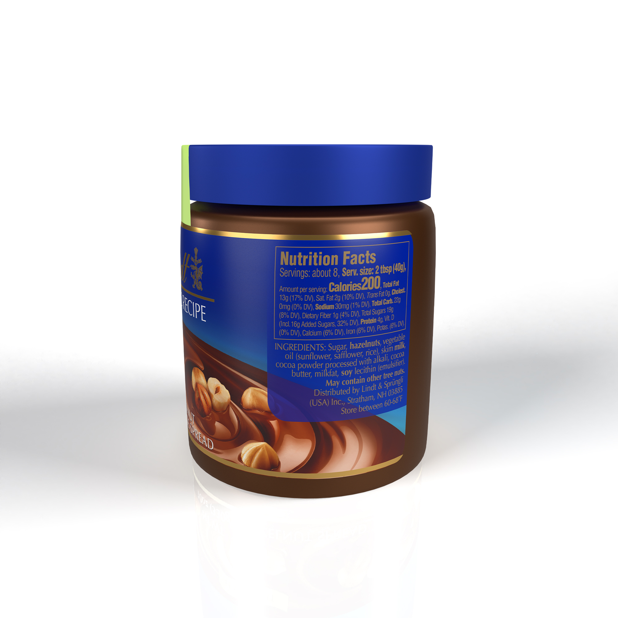
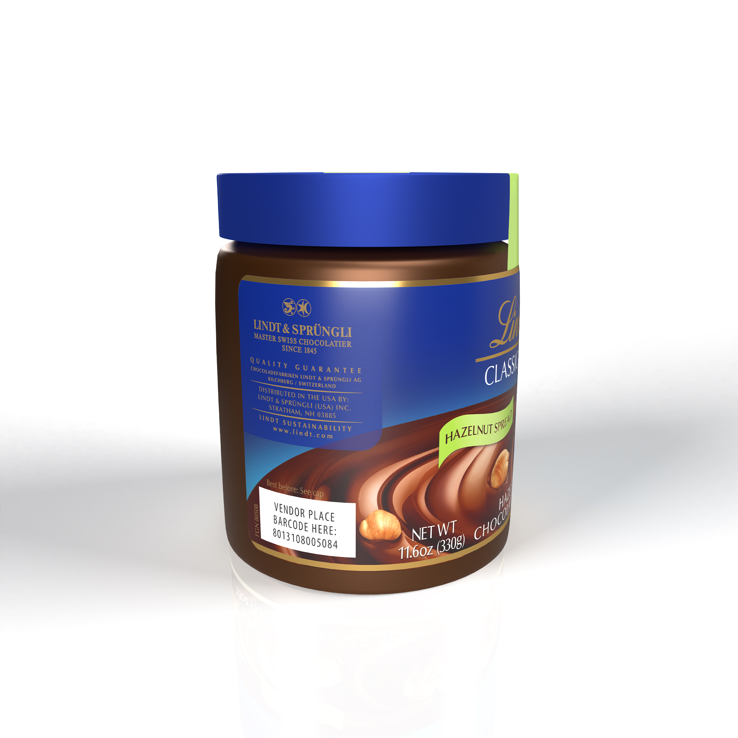
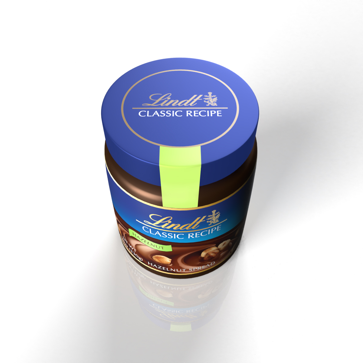
Lindt CLASSIC RECIPE
Lindt is expanding their range of products for Classic Recipe beyond bars and into other formats like spreads, individual wrapped pieces, and the Non-Dairy category. In each case, the objective is to extend the current Classic Recipe design language to these new products while utilizing the equities of the brand to ensure consistency and strengthen recognition on-shelf.
‘Gold’ Bars (Gifting)
![]()

Les Grande Bars
![]()
![]()
![]()

Seasonal designs across formats and sales channels. Bag and wrapper designs for FDM and an XL stand-up pouch and clubcase for the Club channel.


Classic Recipe, Hazelnut Spread

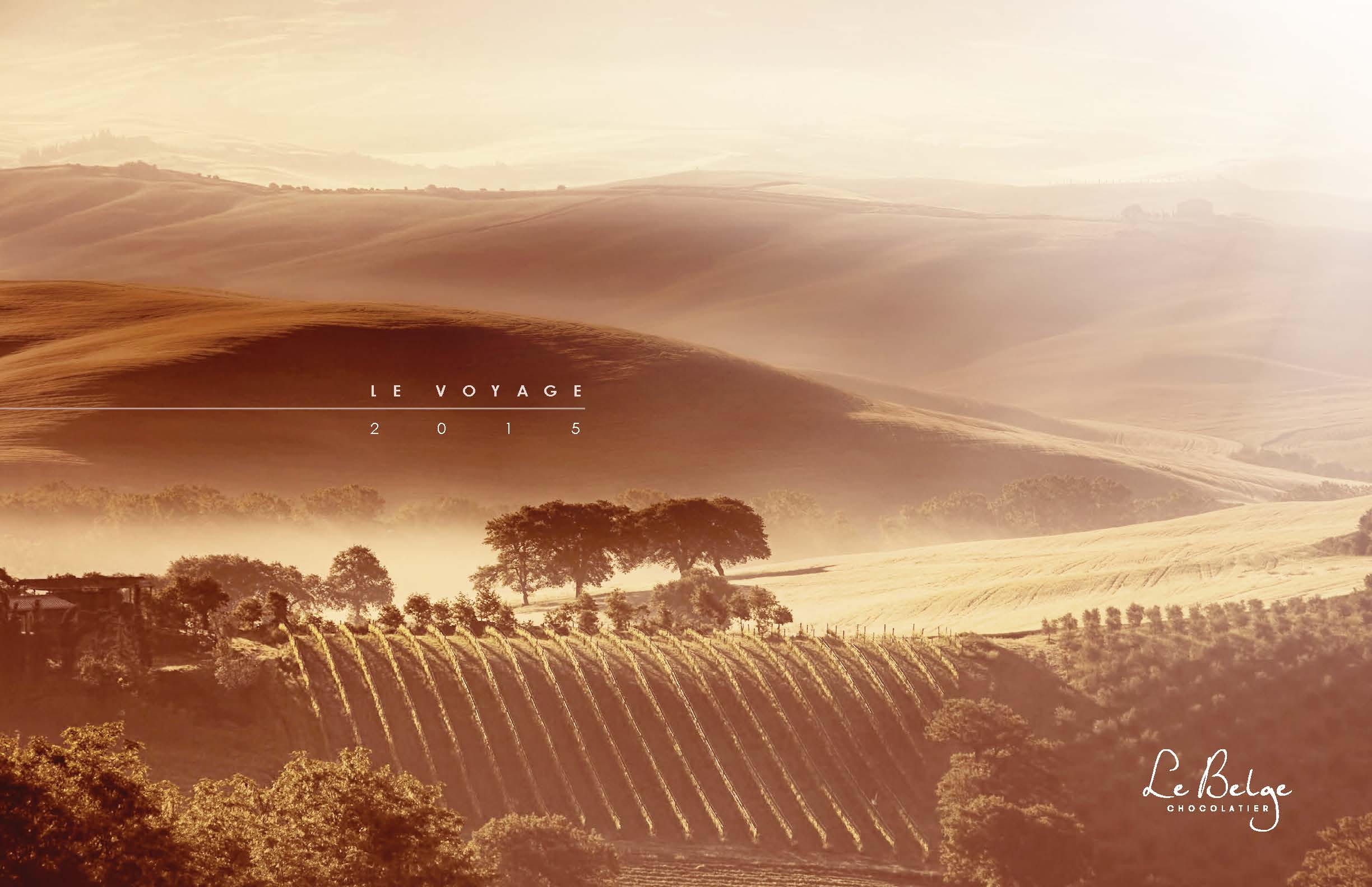
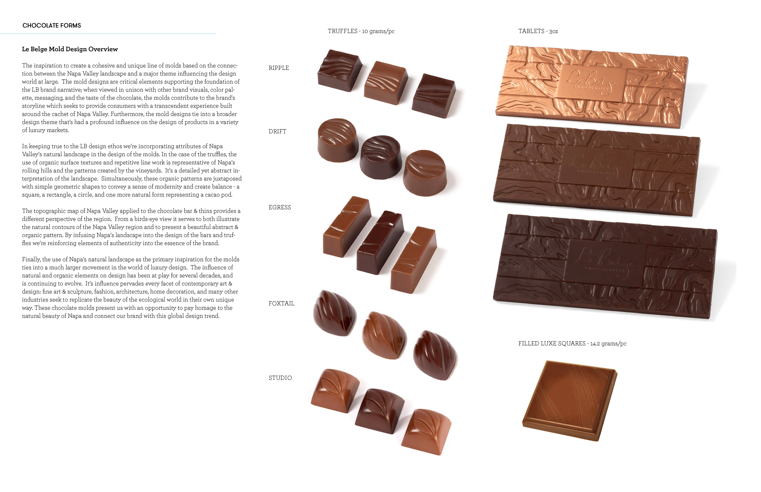
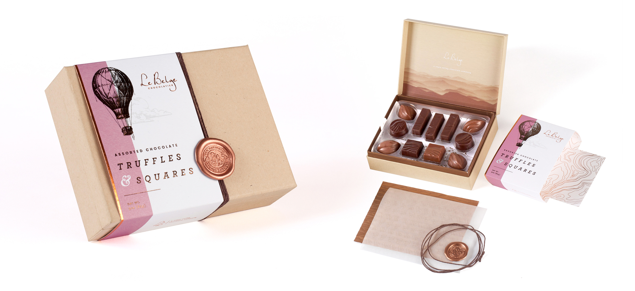
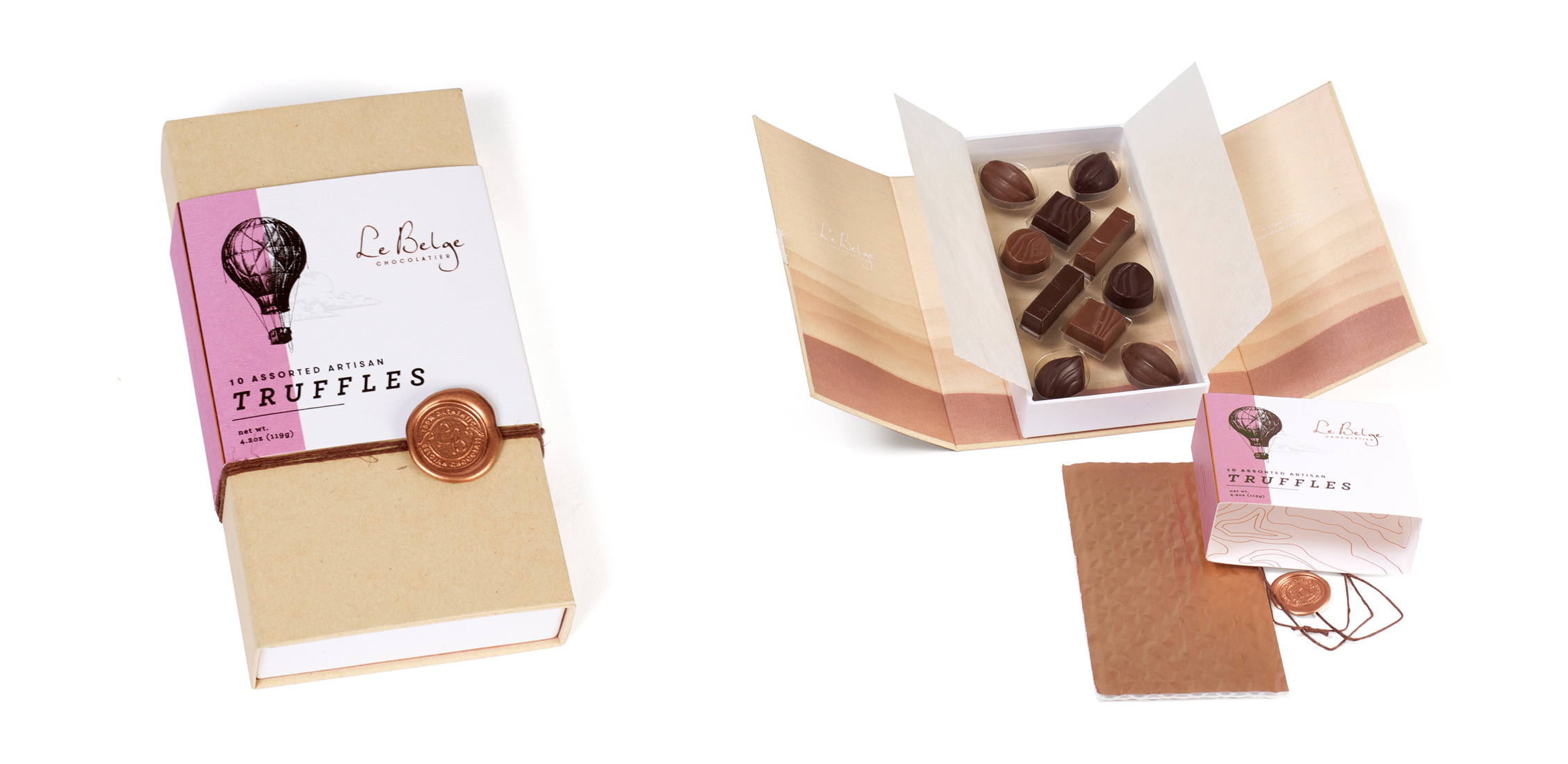
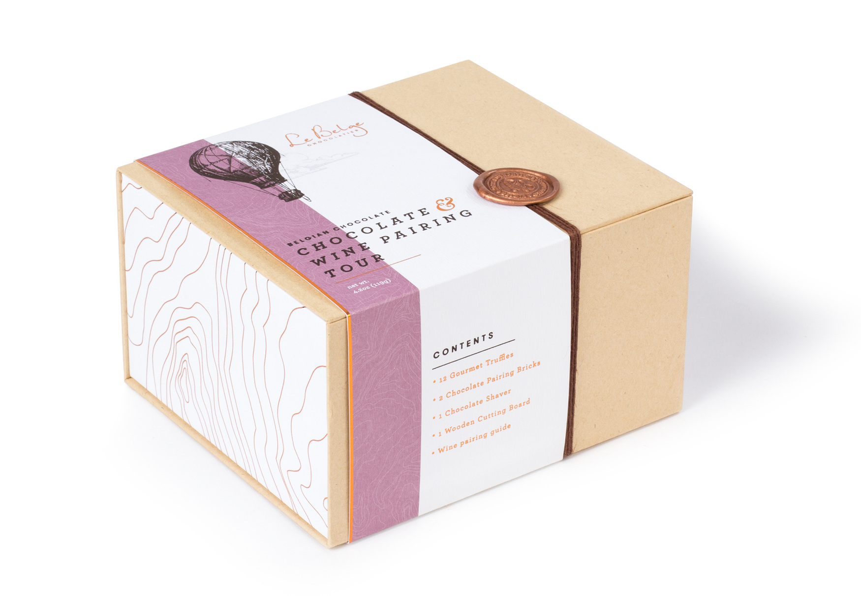
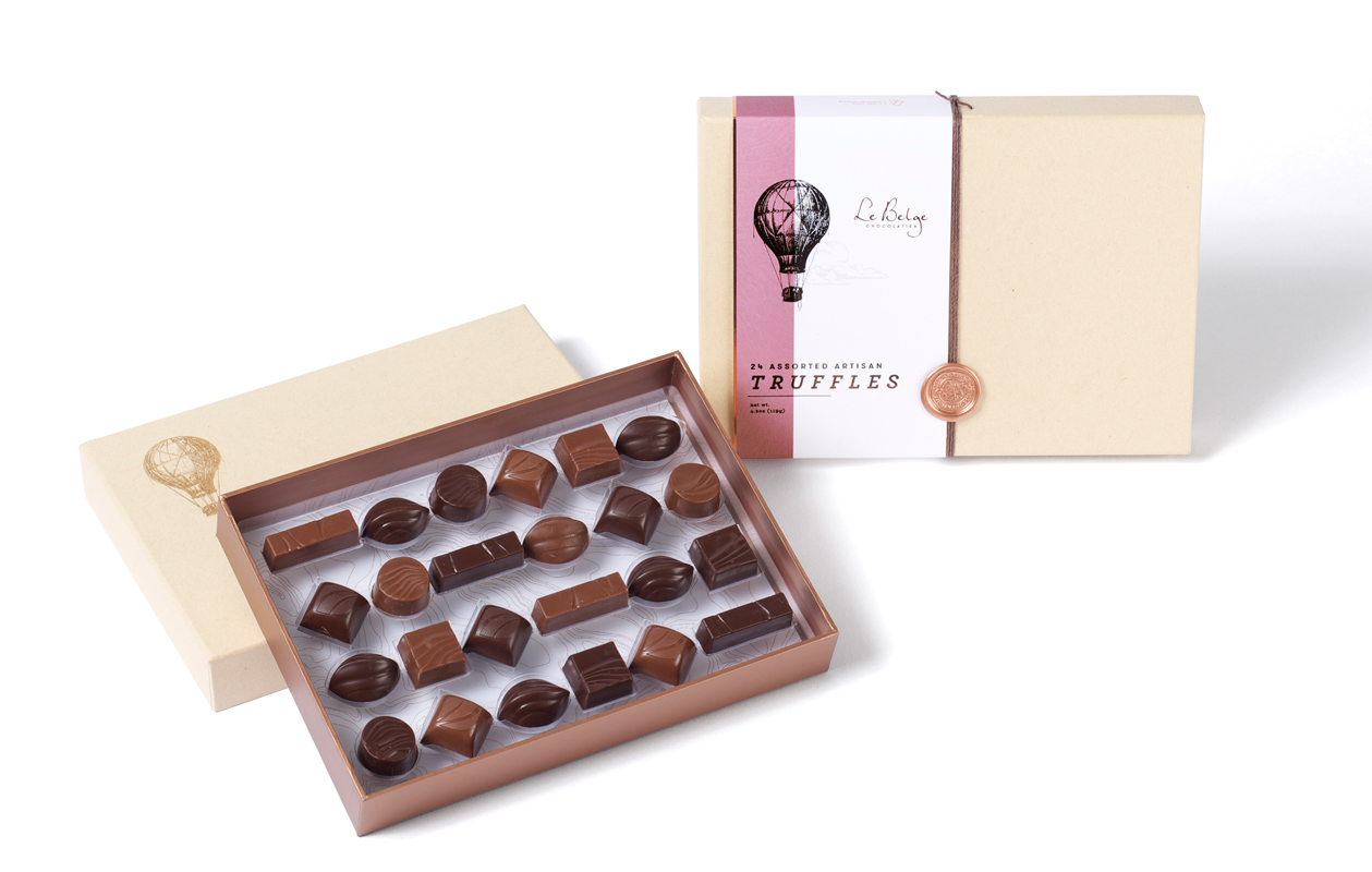
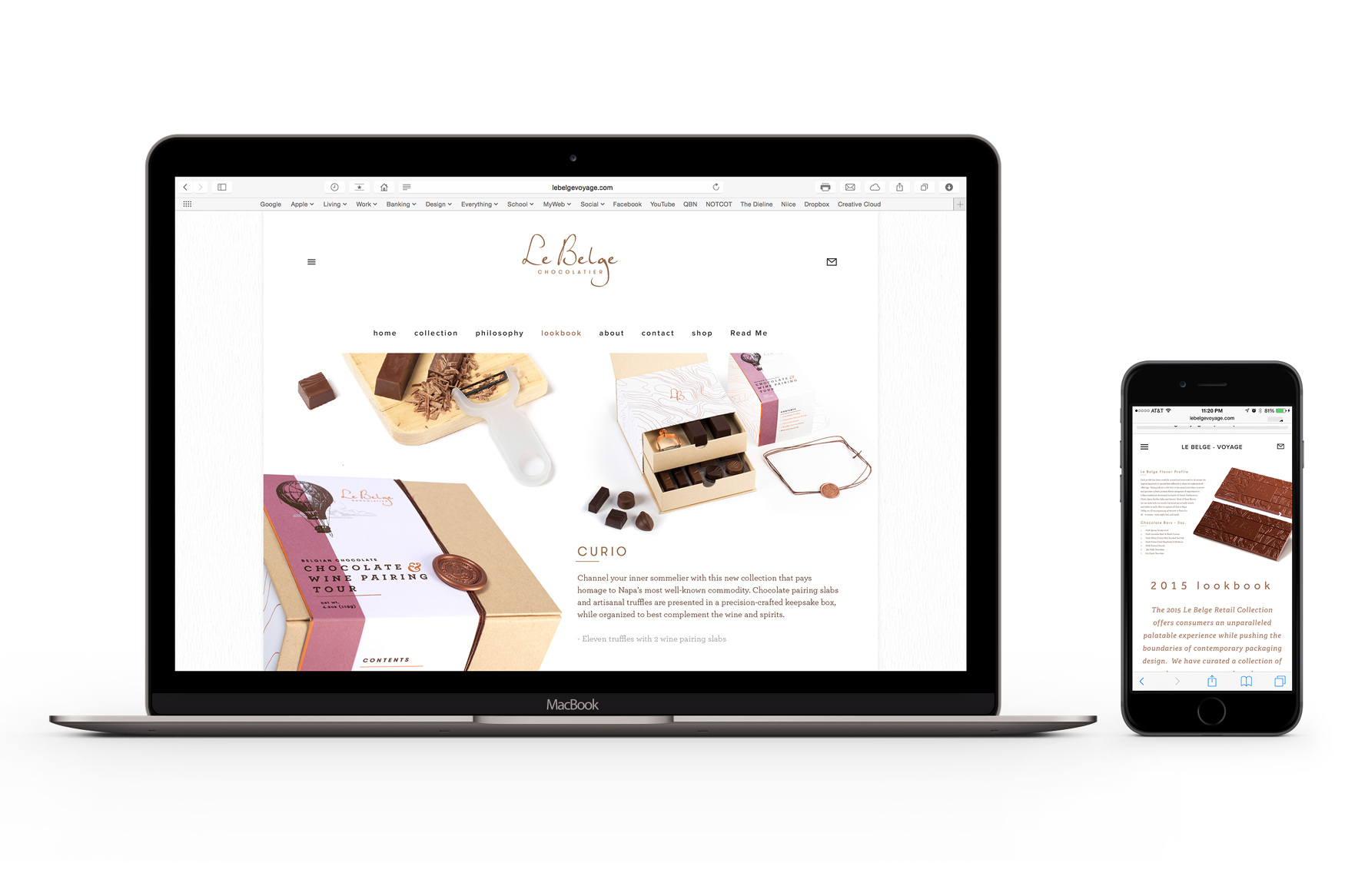
LE BELGE / Le Voyage Collection
SHORT BRIEF.
Create an ultra-premium retail collection targeting premium boutique retail shops, Napa Valley wineries (Napa CA is the home of Le Belge), and high-end hotels.
Create an ultra-premium retail collection targeting premium boutique retail shops, Napa Valley wineries (Napa CA is the home of Le Belge), and high-end hotels.
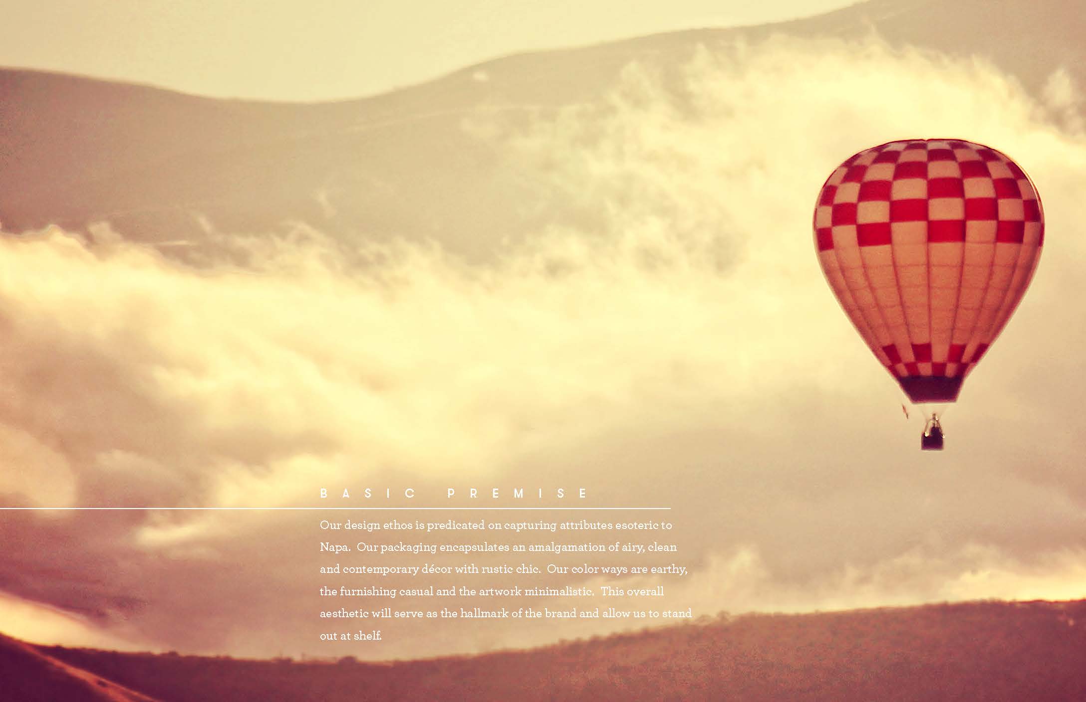
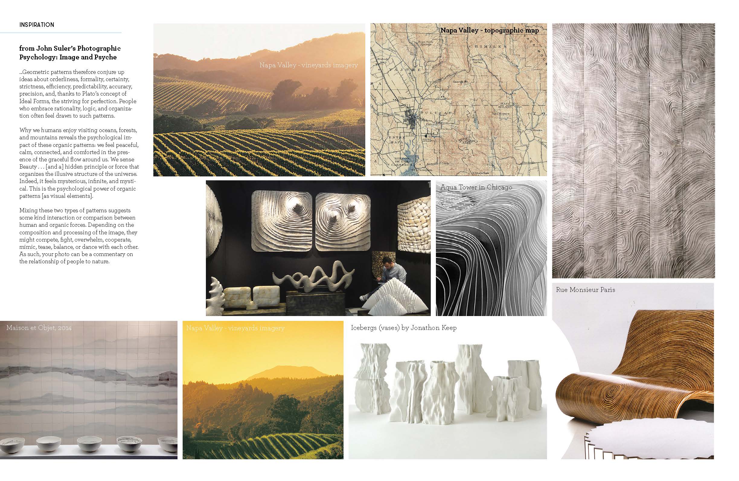
WHAT WE DID.
I led the development of the Le Voyage collection while serving as Product Development Director at Le Belge, overseeing the project from initial concept development through final production. My role included line planning, structural packaging design, pricing strategy, vendor management, and coordinating collaboration between Marketing, R&D, and Finance throughout the process.
Working alongside brand designer Mike Boos, we developed a premium chocolate collection tailored for boutique retail, wineries, and luxury hospitality environments. The final line combined refined packaging structure, layered visual storytelling, and carefully developed flavor assortments into a cohesive collection built for premium retail and hospitality environments.
Working alongside brand designer Mike Boos, we developed a premium chocolate collection tailored for boutique retail, wineries, and luxury hospitality environments. The final line combined refined packaging structure, layered visual storytelling, and carefully developed flavor assortments into a cohesive collection built for premium retail and hospitality environments.


WELLNESS PET / Product & Packaging consumer testing visuals
THE BRIEF.
Wellness Pet needed a set of early-stage product concepts visualized for consumer testing, fast. The concepts spanned multiple formats, from resealable pouches to single-serve and frozen toppers, each with different structural and branding considerations. The challenge wasn’t just sketching ideas. It was making sure each concept was clear, credible, and testable with consumers.
Wellness Pet needed a set of early-stage product concepts visualized for consumer testing, fast. The concepts spanned multiple formats, from resealable pouches to single-serve and frozen toppers, each with different structural and branding considerations. The challenge wasn’t just sketching ideas. It was making sure each concept was clear, credible, and testable with consumers.
WHAT WE DID.
We translated early concepts into clear, test-ready visuals.
Each sketch reflected the intended packaging structure, product format, and real branding, so consumers weren’t reacting to placeholders or guesswork. Across multiple formats, we kept everything consistent and easy to understand, so the team could focus on the ideas, not explaining the visuals.
Each sketch reflected the intended packaging structure, product format, and real branding, so consumers weren’t reacting to placeholders or guesswork. Across multiple formats, we kept everything consistent and easy to understand, so the team could focus on the ideas, not explaining the visuals.


We provided additional visuals to support testing for a Wellness Core Bowl Boosters product concept for cats.
![]()
![]()


