
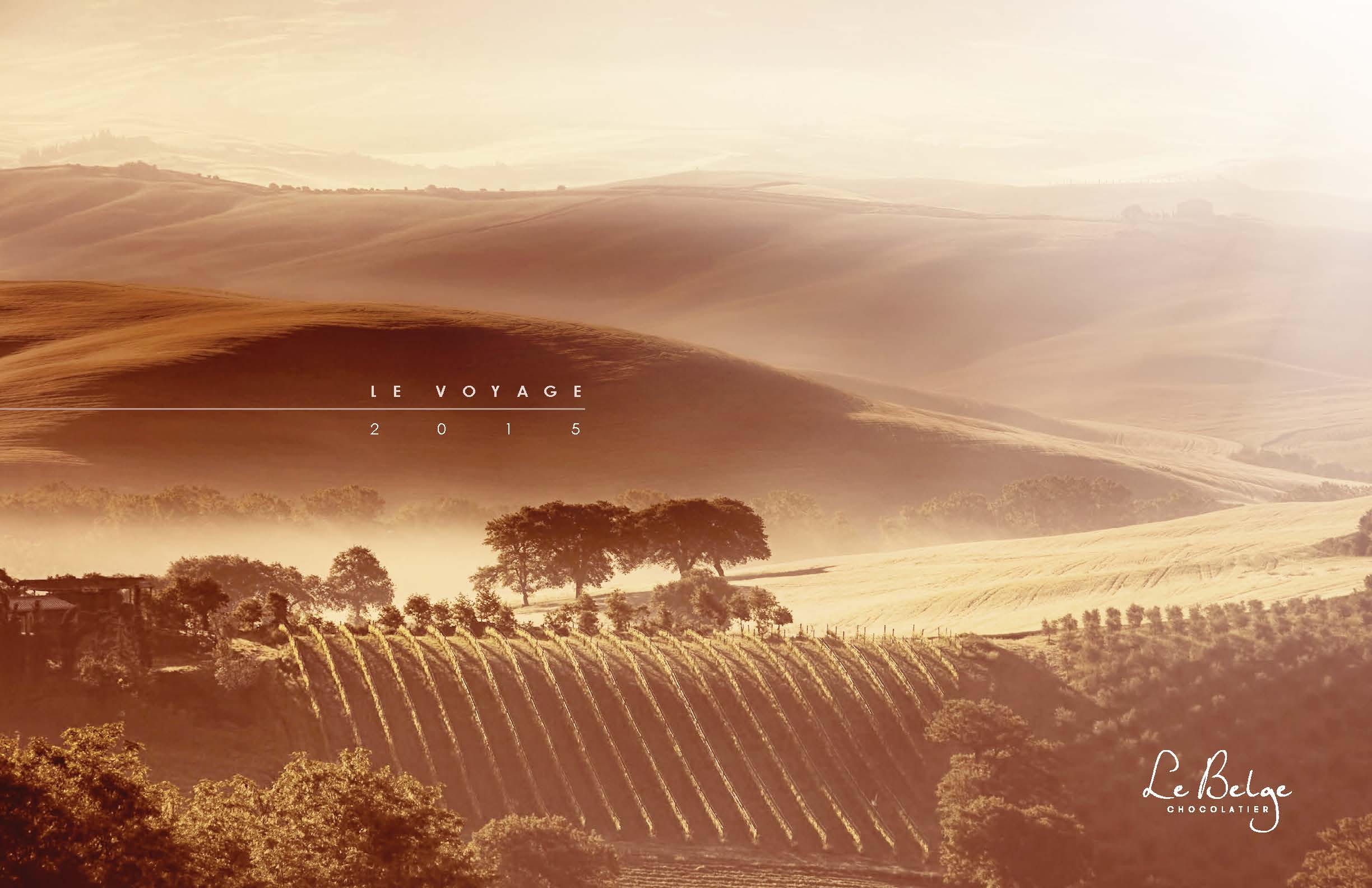
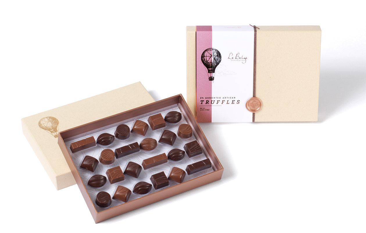
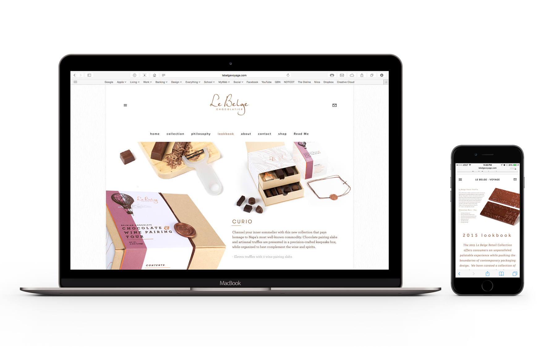
LE BELGE / Le Voyage Collection
SHORT BRIEF.
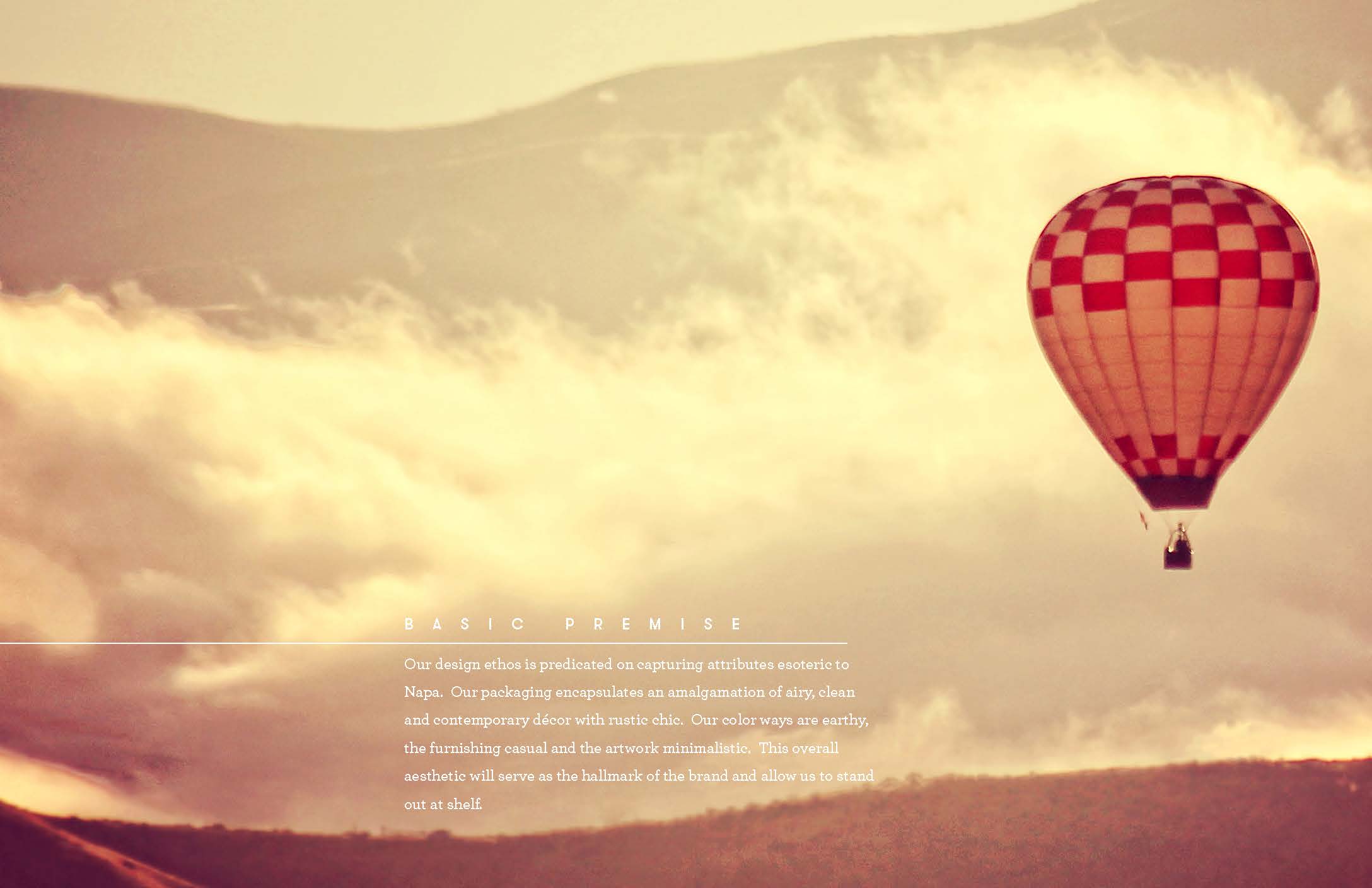
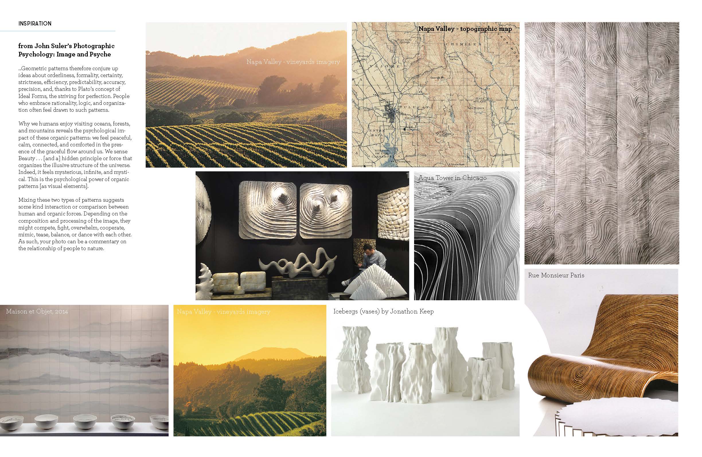
Create an ultra-premium retail collection targeting premium boutique retail shops, Napa Valley wineries (Napa CA is the home of Le Belge), and high-end hotels.
Create an ultra-premium retail collection targeting premium boutique retail shops, Napa Valley wineries (Napa CA is the home of Le Belge), and high-end hotels.
WHAT WE DID.
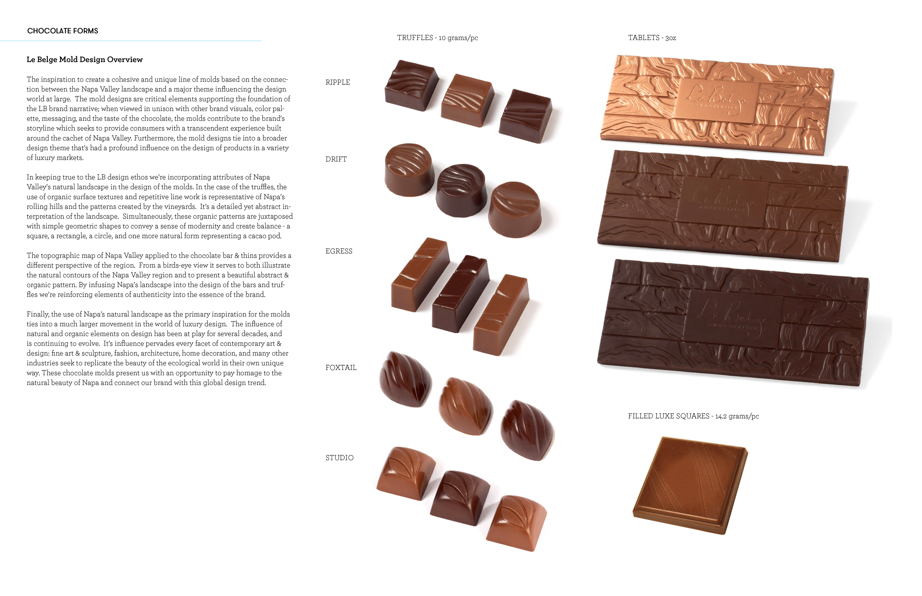
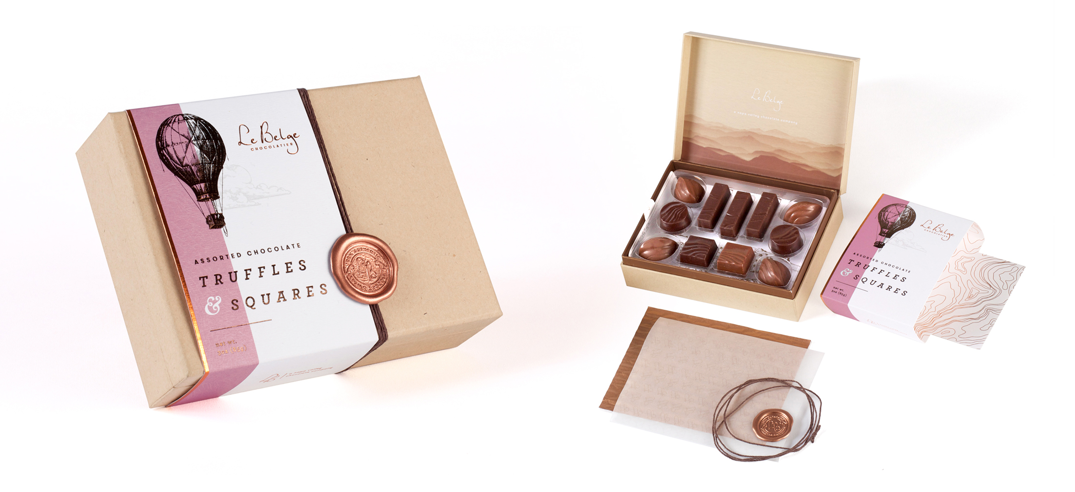
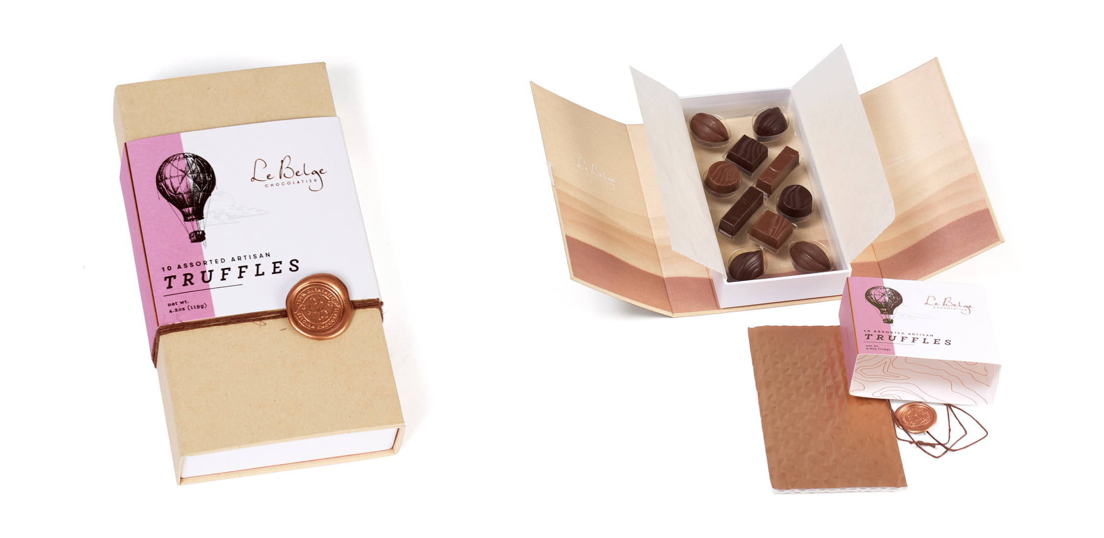
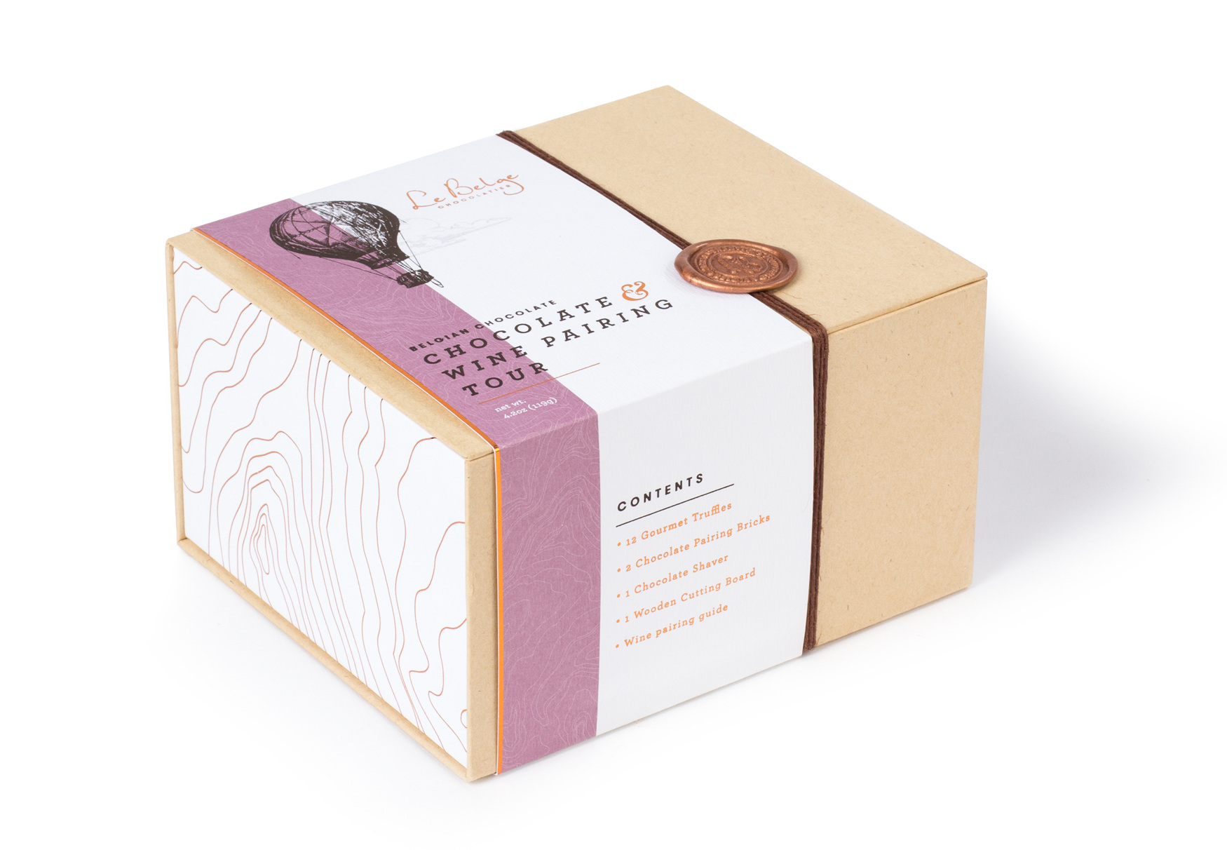
Research and concept development, the creation of flavor profiles with Marketing and R&D. The design of the packaging and visual system, complete with new chocolate truffle and bar molds, was developed in collaboration with designers for Le Belge, namely the wildly talented Mike Boos.


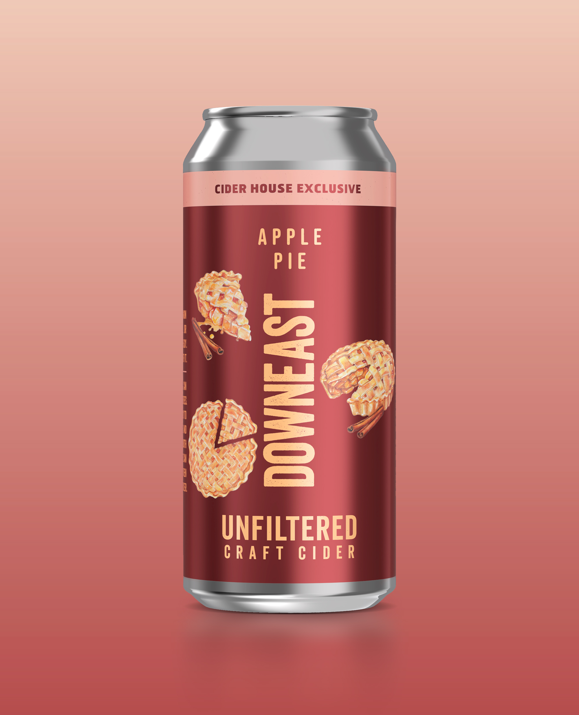
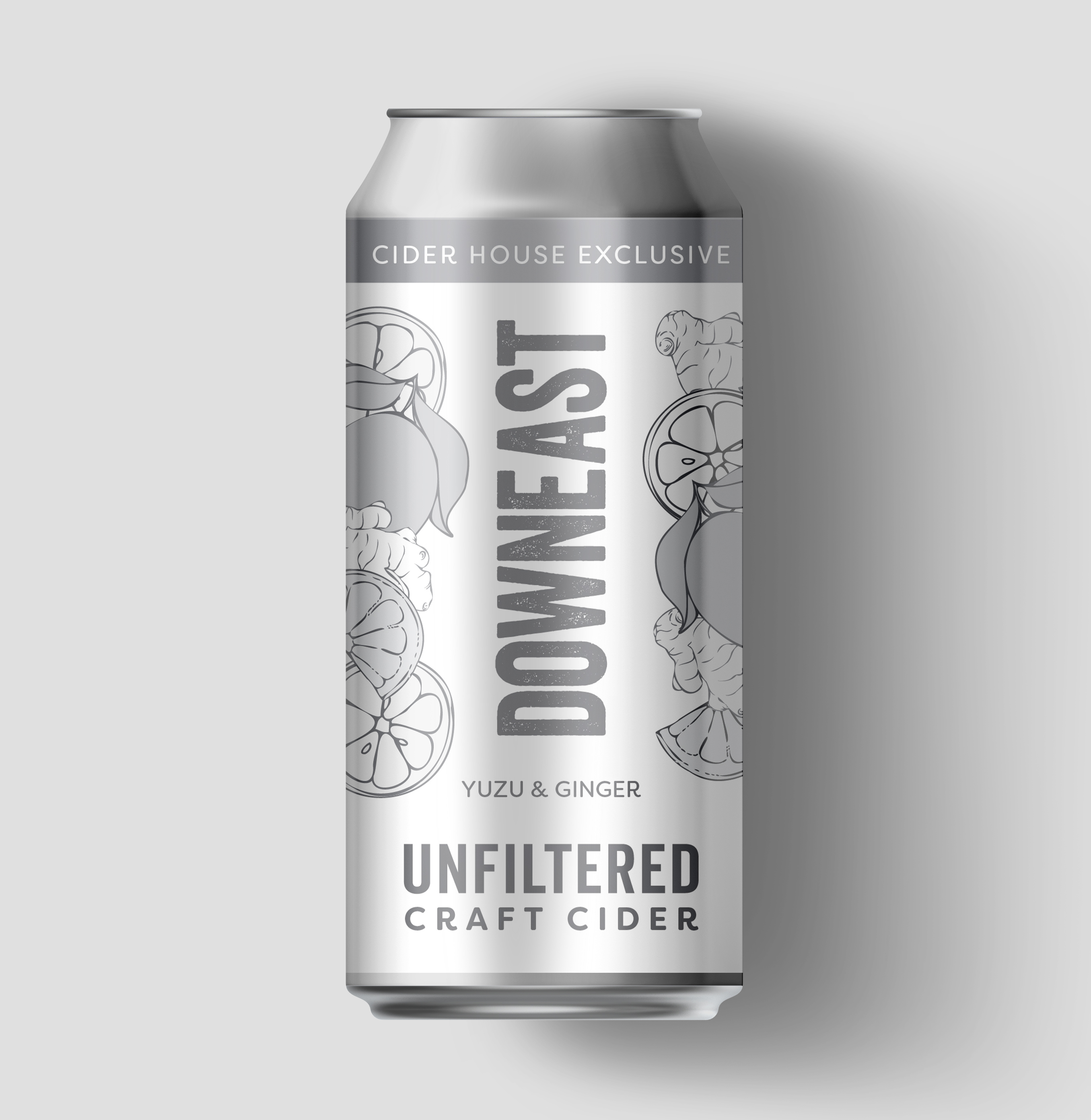
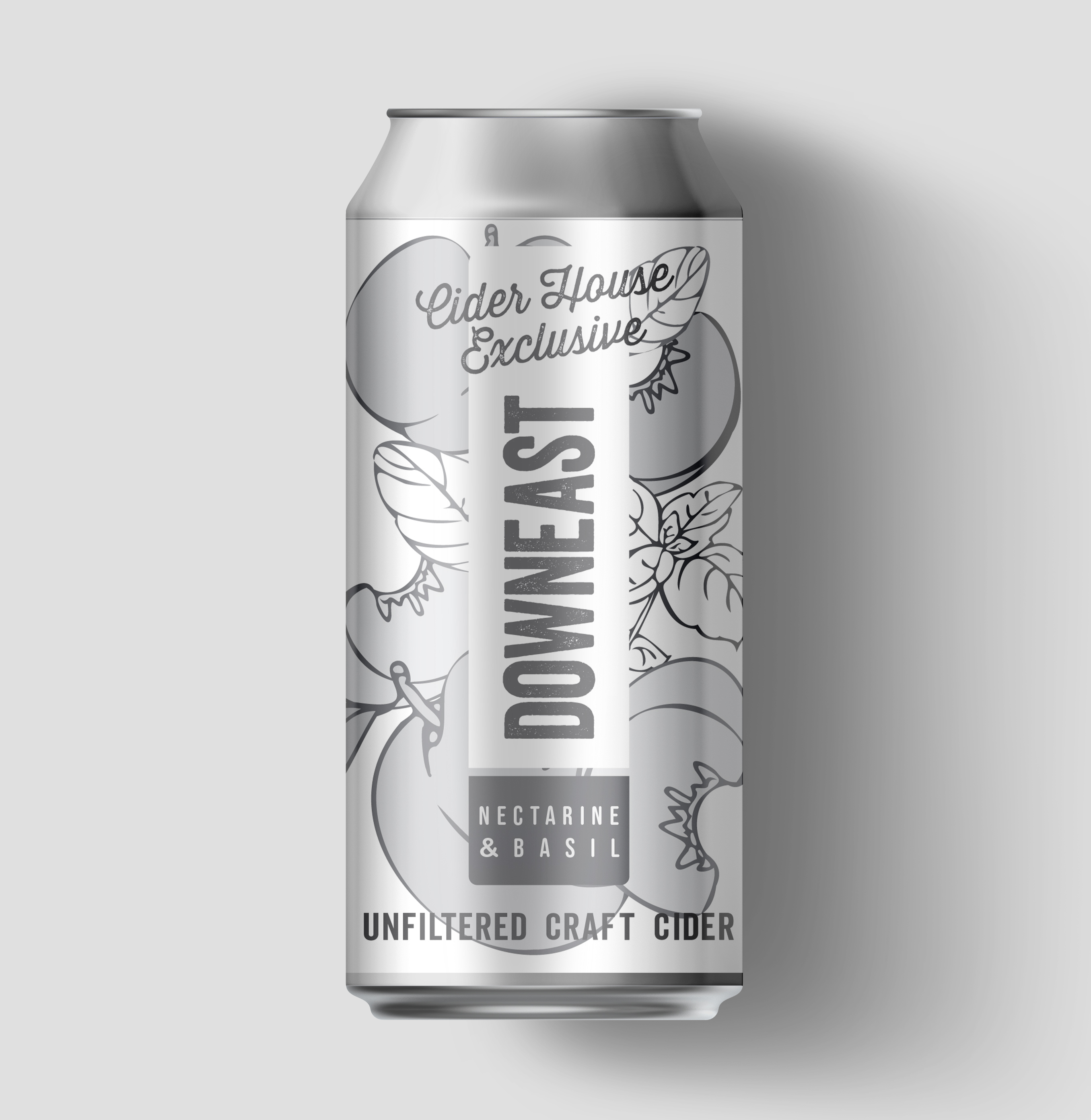
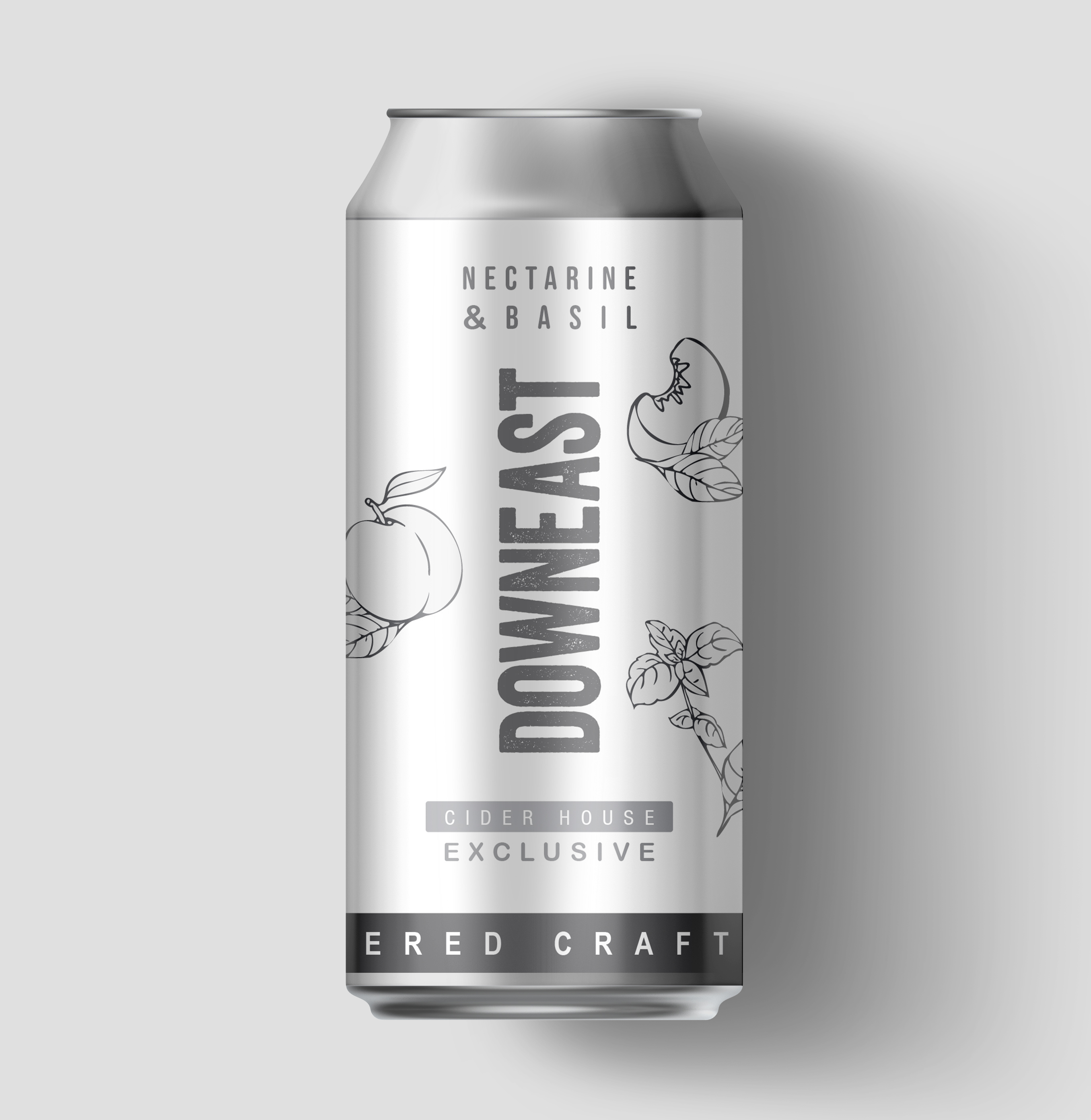
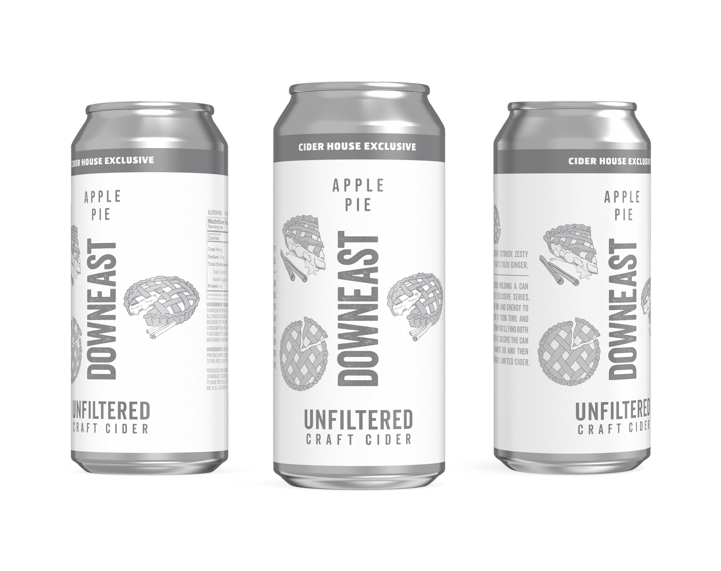
DOWNEAST / Cider House Exclusive Series
SHORT BRIEF.
The Cider House Exclusive Series highlights the premium, experimental side of Downeast Cider. Each limited-release flavor pairs unexpected, seasonal ingredients with a more refined, artisanal aesthetic while still staying true to the brand’s approachable personality. The goal: maintain loyalty among core fans while attracting new consumers with a more elevated palate.
The Cider House Exclusive Series highlights the premium, experimental side of Downeast Cider. Each limited-release flavor pairs unexpected, seasonal ingredients with a more refined, artisanal aesthetic while still staying true to the brand’s approachable personality. The goal: maintain loyalty among core fans while attracting new consumers with a more elevated palate.
WHAT WE DID.
We partnered with the Downeast team from concept to final artwork, applying our process to build a flexible design system that ties the series together. Each can features hand-drawn, watercolor-style illustrations of key ingredients, giving the lineup a crafted, small-batch feel. The first of four flavors was Yuzu & Ginger, a 2025 Spring release - see below for the process that we applied to the creation of this flavor.
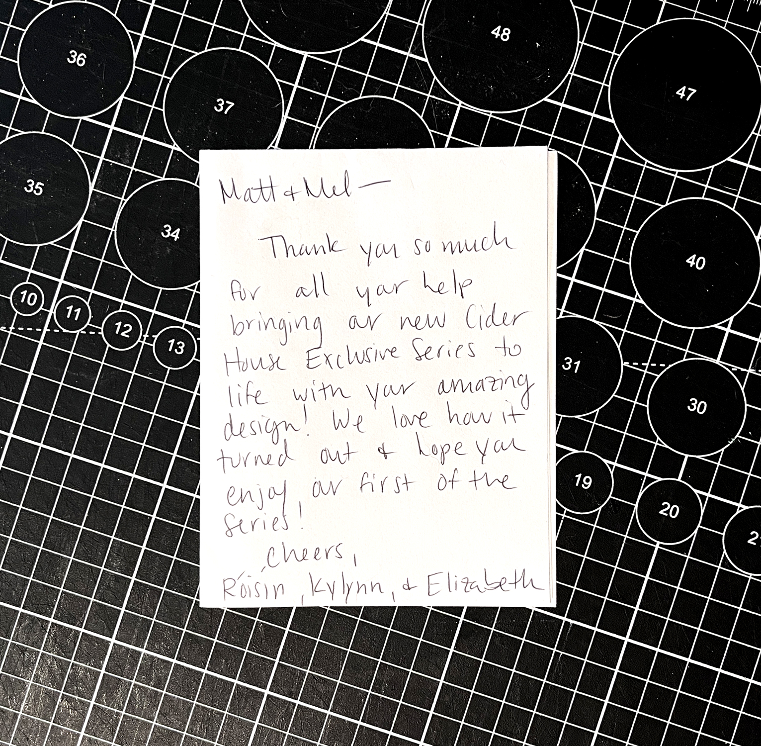
It was a true collaboration—clear vision, creative trust, and a lot of fun along the way. And the flavors? Genuinely delicious, each perfect for the season. We’ve been thrilled to create artwork that pairs so well with what’s inside the can.
Visit Downeast’s website or the TAP House to try the current seasonal variety ︎︎︎


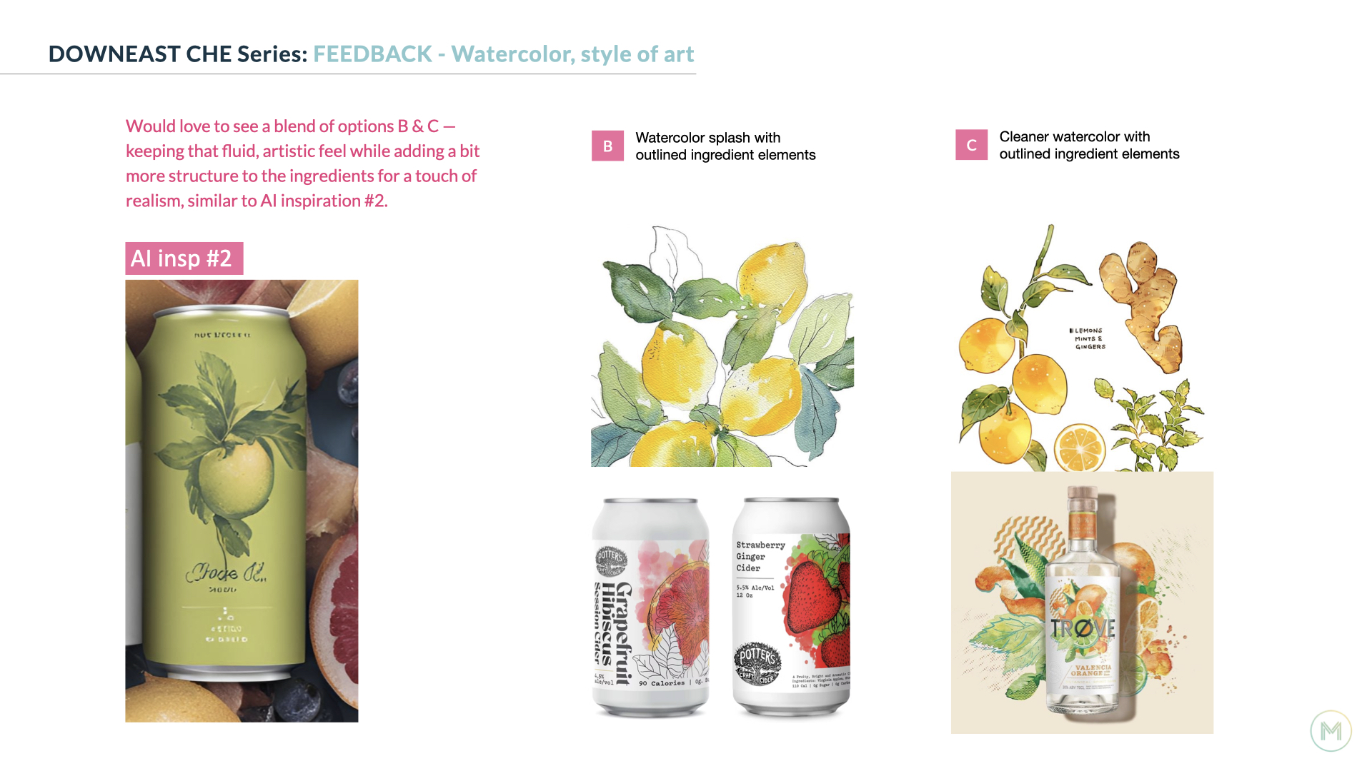
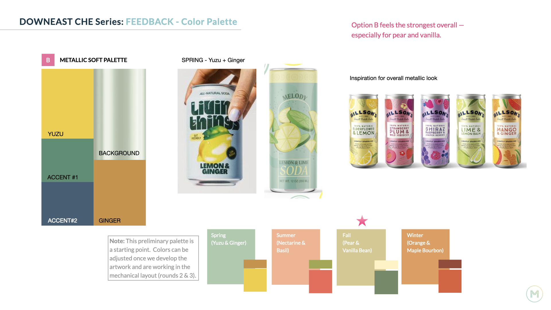
Step 1: Aligning on the System
We kicked things off by working with the Downeast team to define the design hierarchy for the new series. Our goal was to build a system that could flex across future flavors while staying cohesive. We shared a variety of layouts using greyscale ‘sketches’ of the artwork, giving the team space to react and help shape the direction from the ground up. Other flavors were included in this study, to explore how different flavor names and ingredients might work within the proposed systems.

With feedback from the team, we landed on the design hierarchy below.
Fixed elements are the logo. copy elements, and placement of color.
Flex elements are the ingredient visuals, specifically the number of elements - we agreed that this could shift between 3 and 4, depending on the flavor.
Fixed elements are the logo. copy elements, and placement of color.
Flex elements are the ingredient visuals, specifically the number of elements - we agreed that this could shift between 3 and 4, depending on the flavor.
In addition to aligning on a design hierarchy, we’re sharing inspiration for potential color combinations, and relevant art styles early on to make sure we’re heading in a direction that feels right for everyone.
Step 2: Creating the art
With the design system in place, we moved into developing the ingredient art and exploring how color could bring each flavor to life in layout. This is one of the most enjoyable parts of the process for us. It's hands-on, creative, and full of discovery.
Mel paints each ingredient element by hand using watercolor. We then bring those scans into Photoshop to refine, clean up, and prep for layout. It’s an iterative process within the studio that thrives on collaboration and keeps the final ingredient art feeling fresh, crafted, and full of character.


Color exploration in layout.
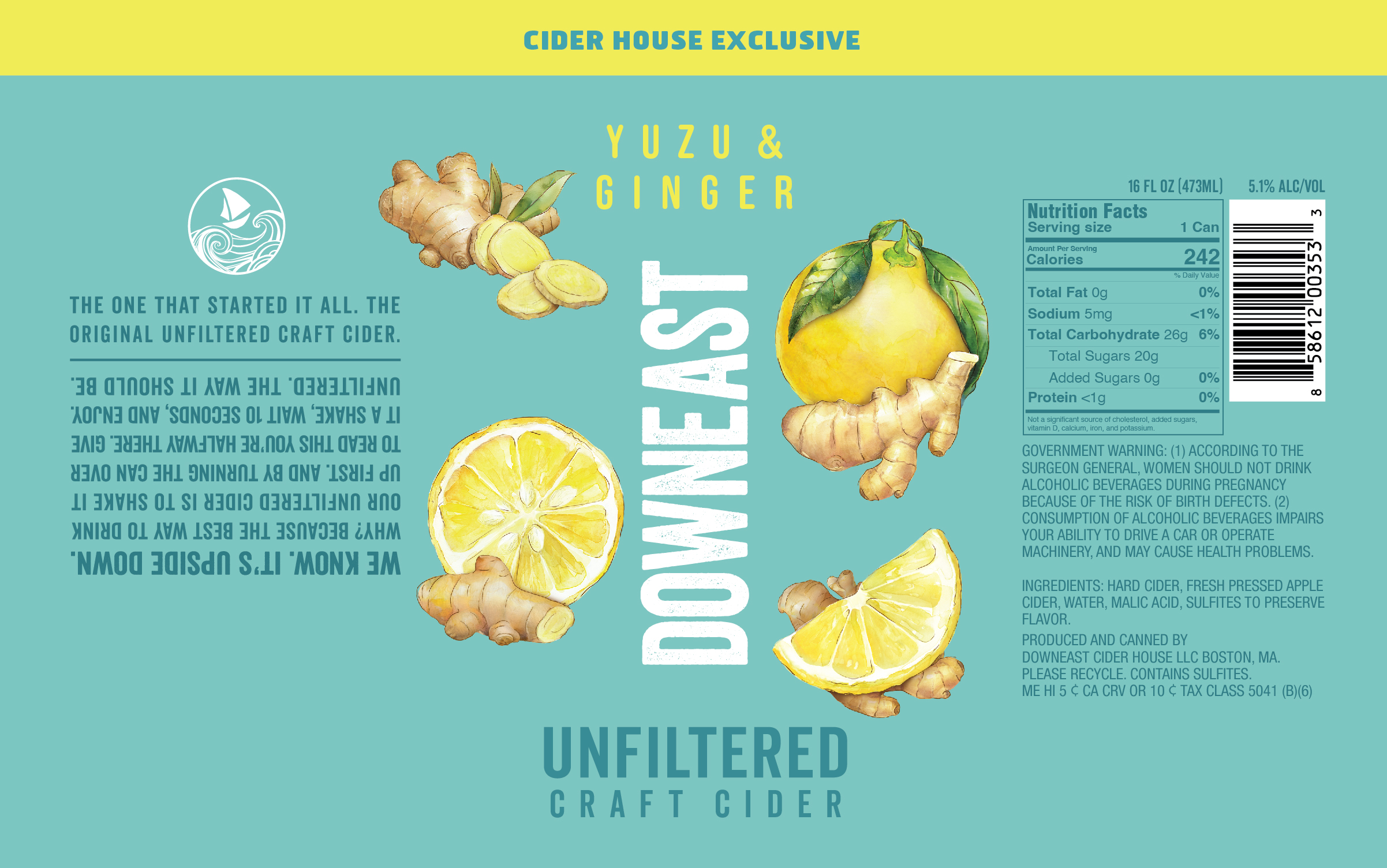


Step 3: Finalizing the Artwork
With initial concepts explored and feedback in hand, we start honing in on the final artwork and color. This phase is all about refinement, tightening the details, fine-tuning the palette, and making sure everything feels cohesive and shelf-ready. We make updates to key elements like marketing copy and NLEA info so everything is accurate. Recommendations on ways to optimize the finish for the metallic substrate are made, and 3D can renderings are provided.


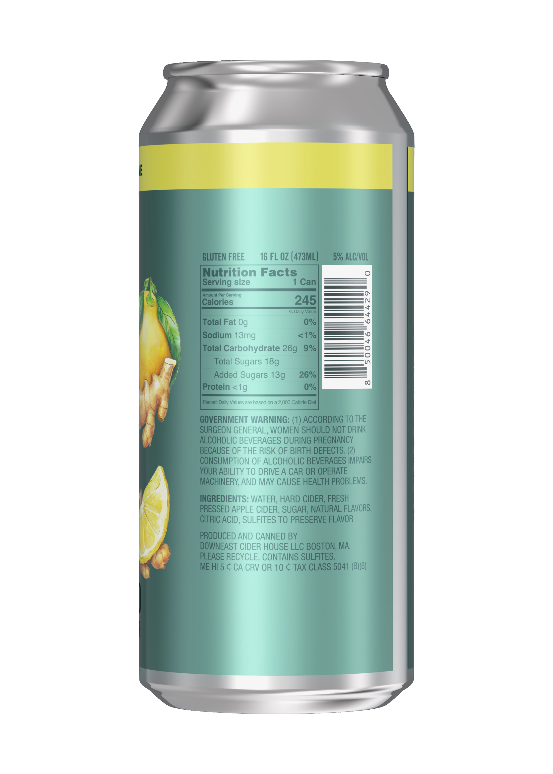
︎Image below by Downeast
![]()


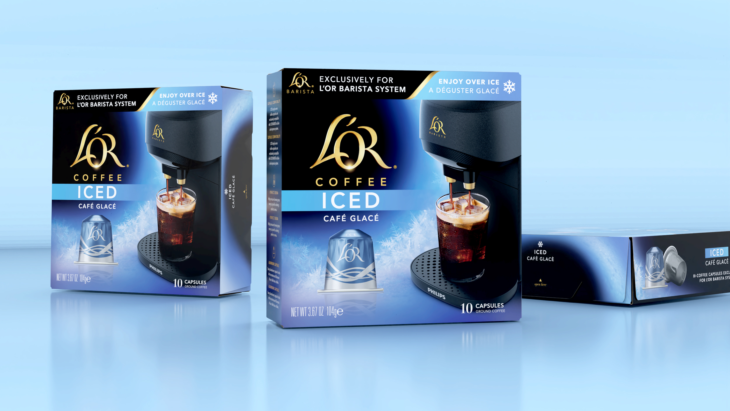
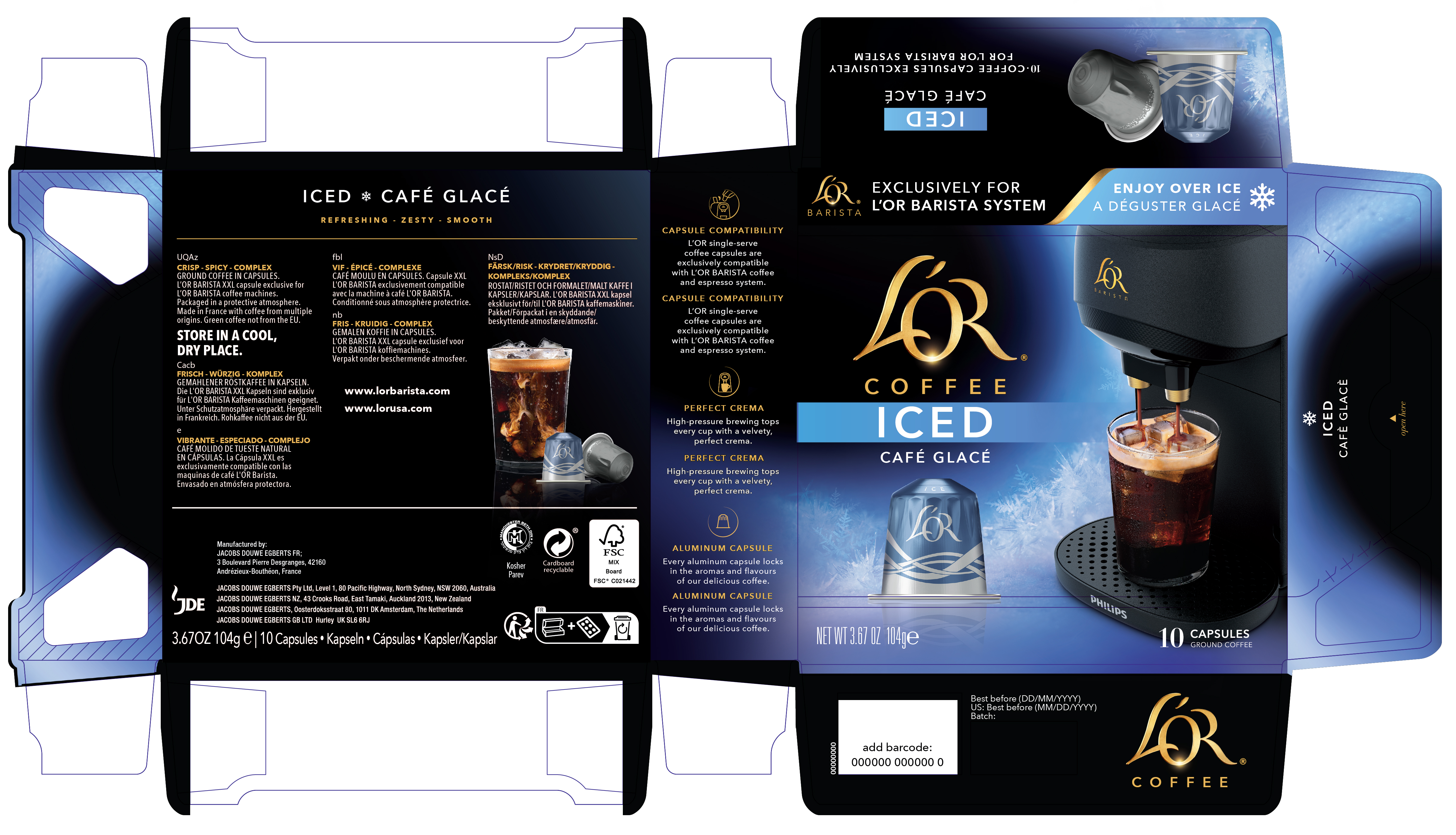
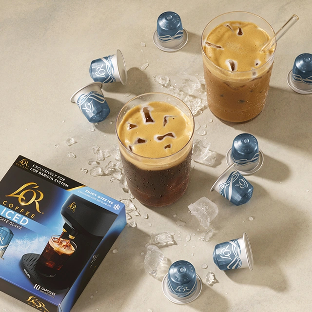
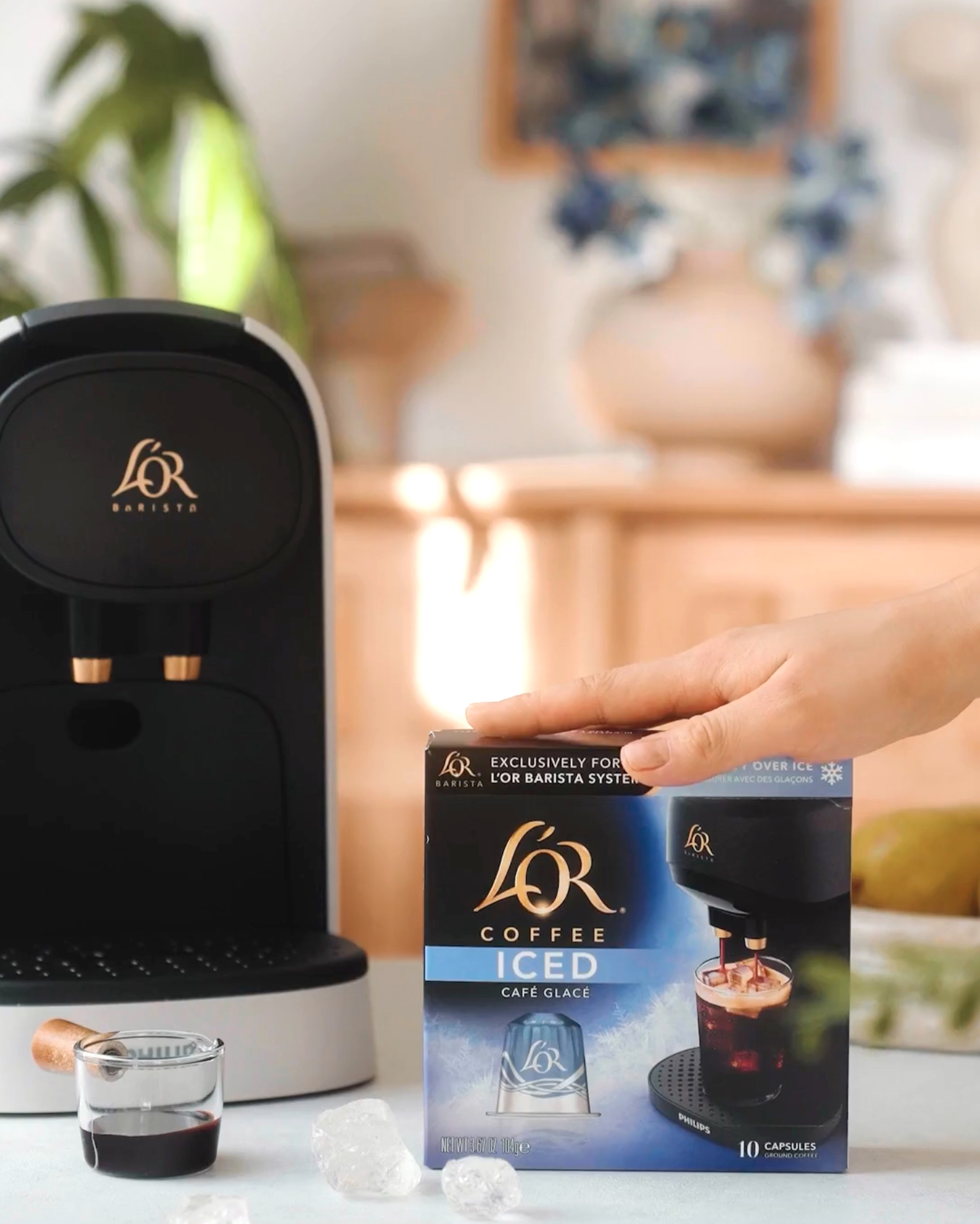
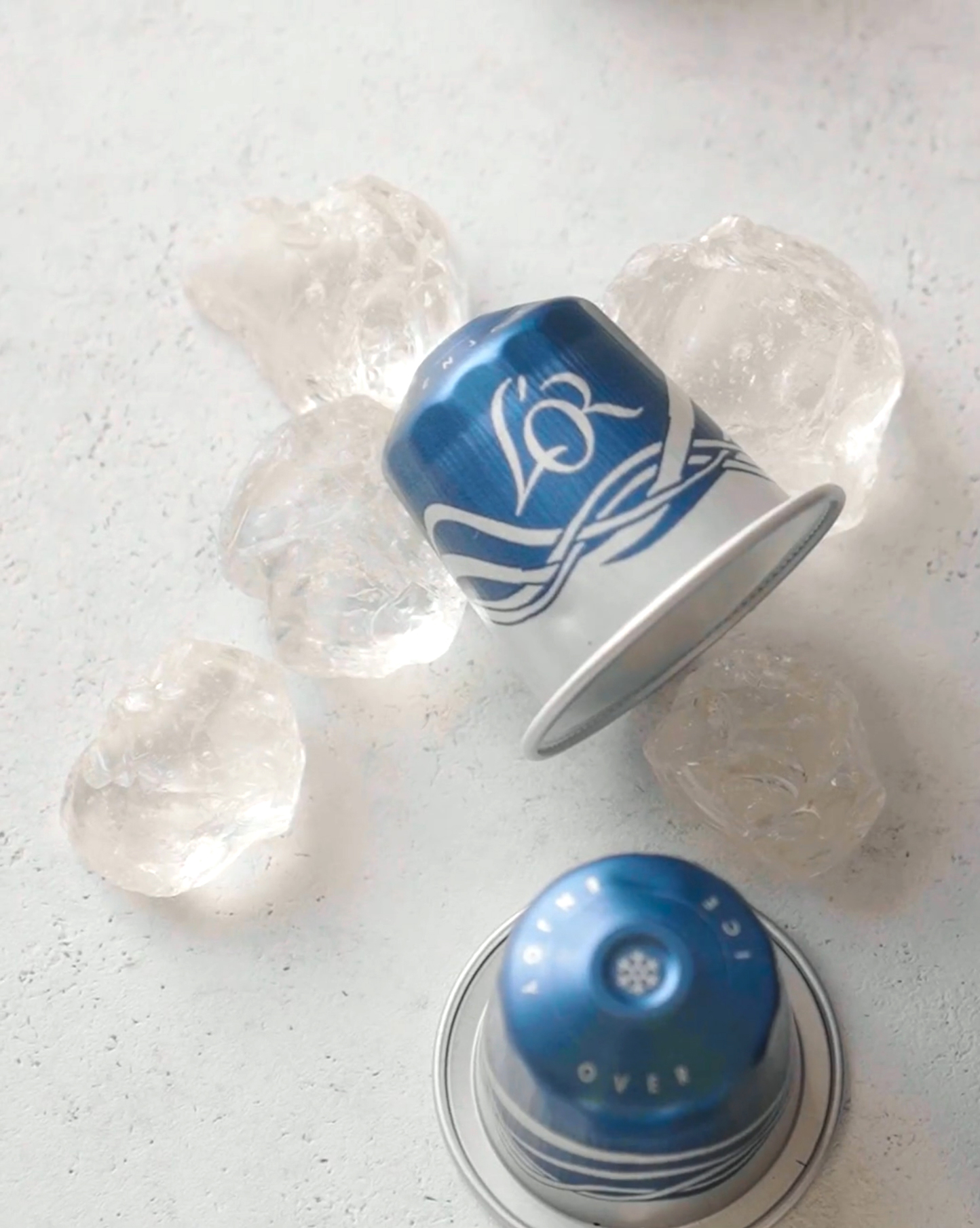
L’OR / Iced Coffee capsules
SHORT BRIEF.
Develop an adaptation of the existing coffee capsule packaging system that would differentiate the launch of Iced Coffee Packaging and Iced Coffee Capsules. While the initial launch was for Black Iced, we also needed to consider how this might roll out to Flavored Iced Coffee. Brand guardrails were provided along with which elements would be open to exploration.
Develop an adaptation of the existing coffee capsule packaging system that would differentiate the launch of Iced Coffee Packaging and Iced Coffee Capsules. While the initial launch was for Black Iced, we also needed to consider how this might roll out to Flavored Iced Coffee. Brand guardrails were provided along with which elements would be open to exploration.
WHAT WE DID.
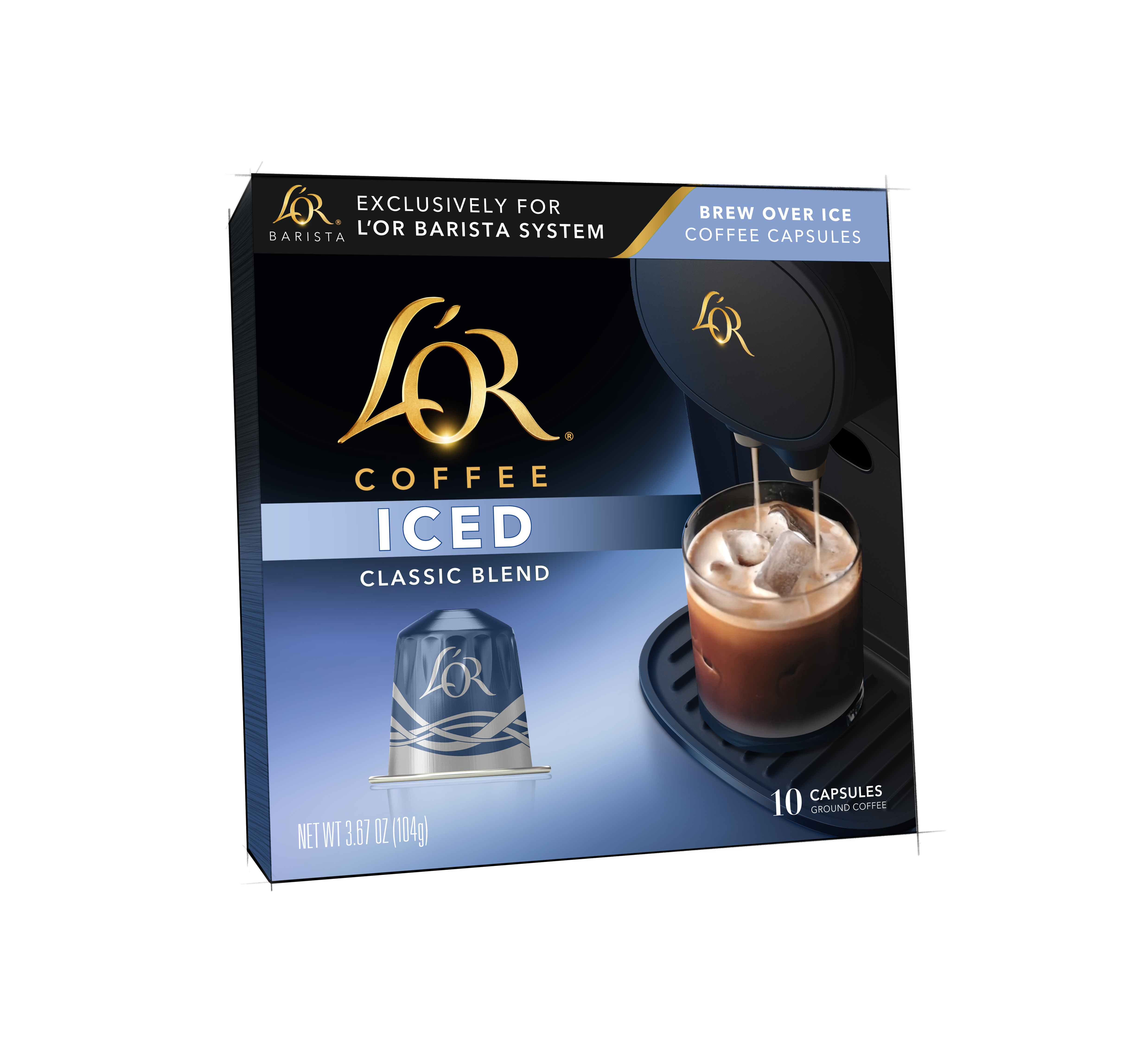
We collaborated closely with L’OR’s marketing and creative team from concept to final artwork, applying our process to adapt their existing design system in a way that accentuates the uniqueness of the Iced series and allows for growth into flavors and seasons. The box is currently available in the UK and France only - sorry to our American friends, you‘ll just have to take that long overdue Paris ︎ trip to try this one out...
Project Deliverables:
Project Deliverables:
- Iced Coffee Package Design
- Iced Coffee Capsule Design
- Package and Capsule renderings
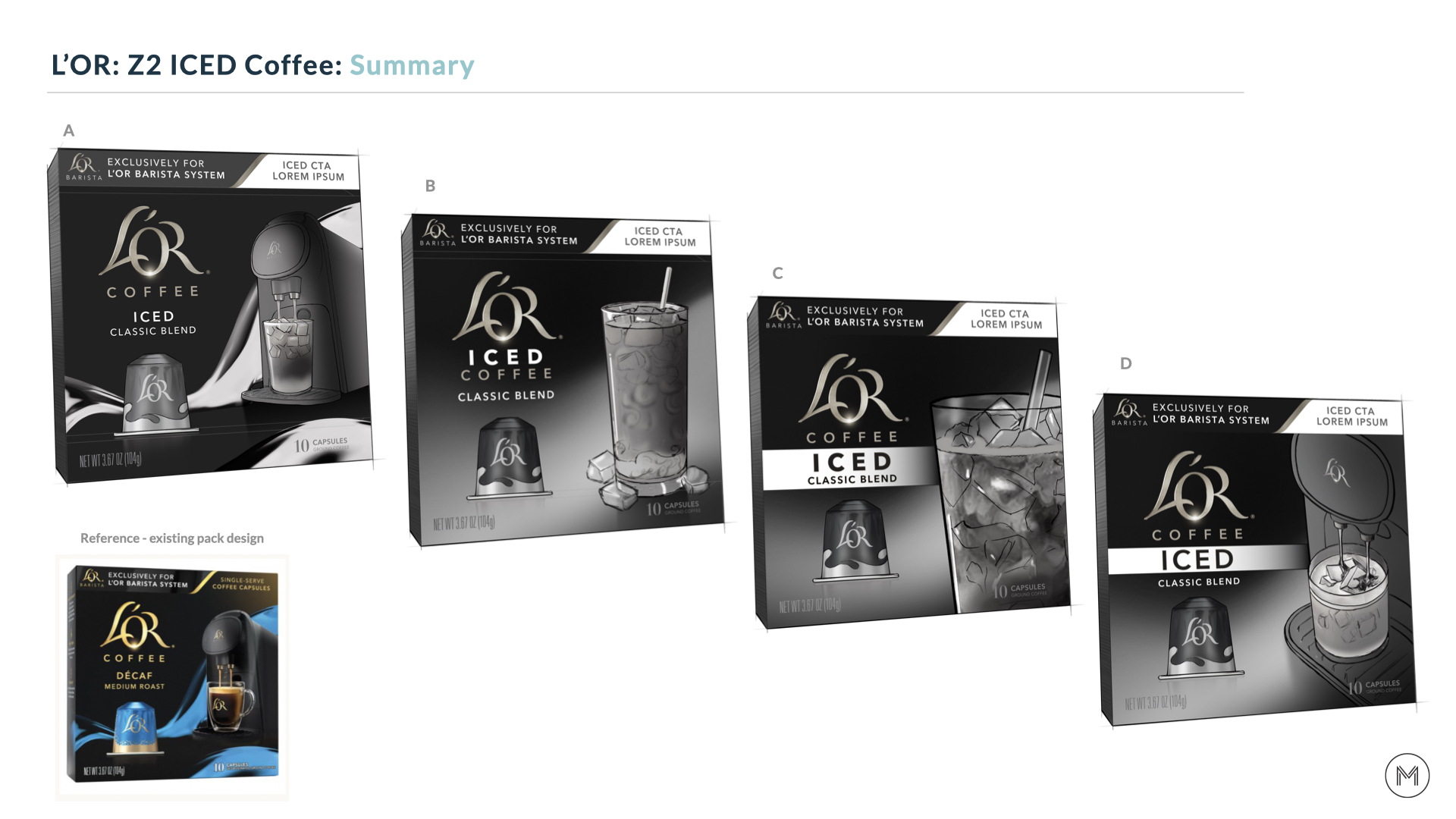
Step 1: Initial concepting and solving design challenges
There were several design challenges that needed to be fleshed out:
1 - How do we communicate ICED in the most clear and effective way ensuring shoppers understand the product benefits at a glance, while maintaining unity with the rest of the Coffee Capsule range?
2 - Should the updated Barista machine be incorporated in a unique way to support differentiation vs the rest of the Espresso and Coffee Capsule range or should it be removed completely?
3 - How can visual cues (i.e. the iced appetite appeal) be utilized to educate shoppers about the new iced capsule offering and functionality?
4 - What category cues should be considered to help shoppers immediately recognize L’OR’s iced capsule packaging?
To start the process, we worked through an initial round of rough sketches in order to quickly share potential solutions and garner feedback from the product development and creative teams.
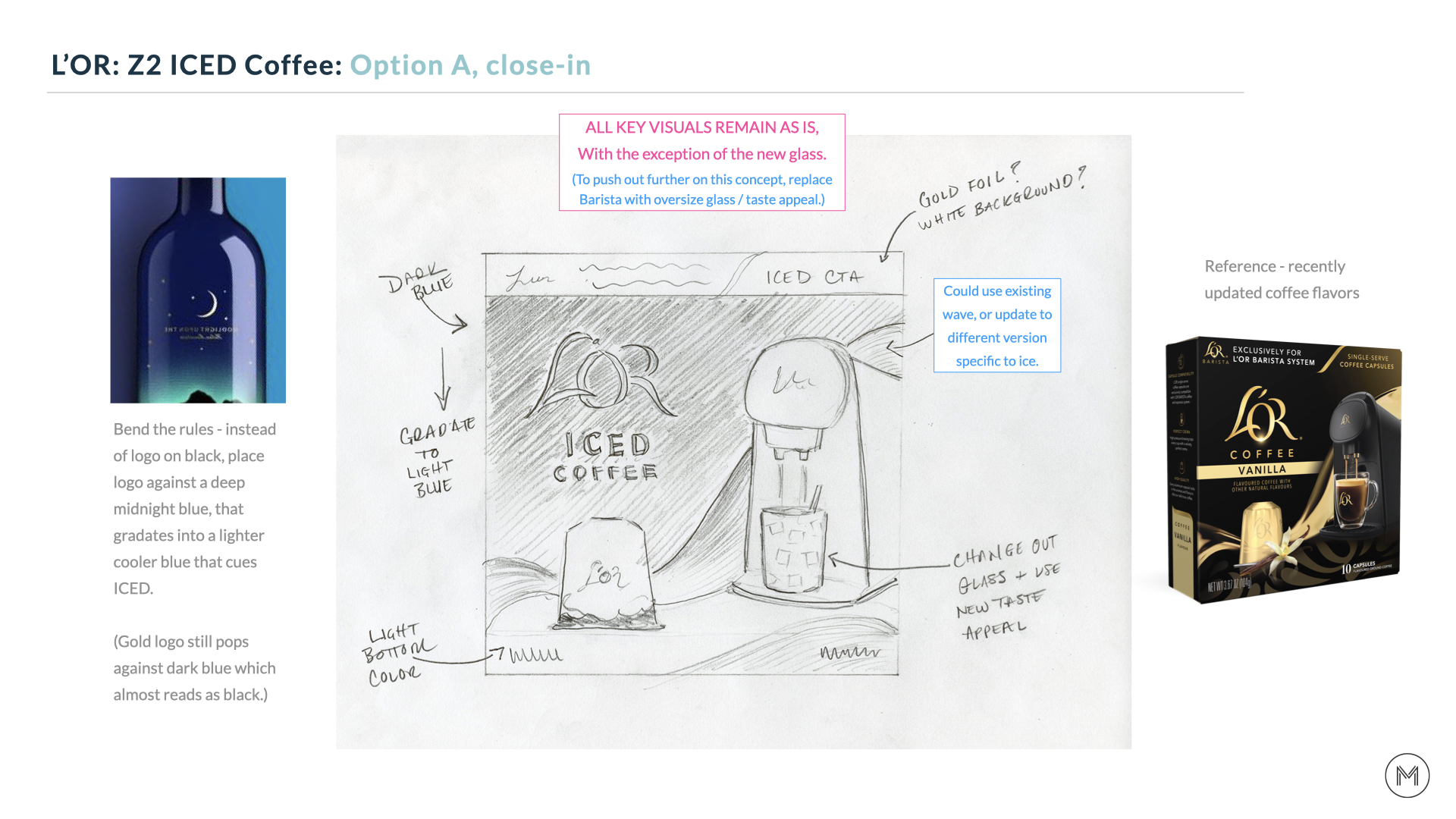
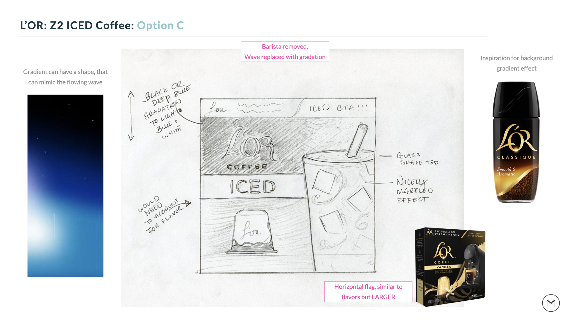
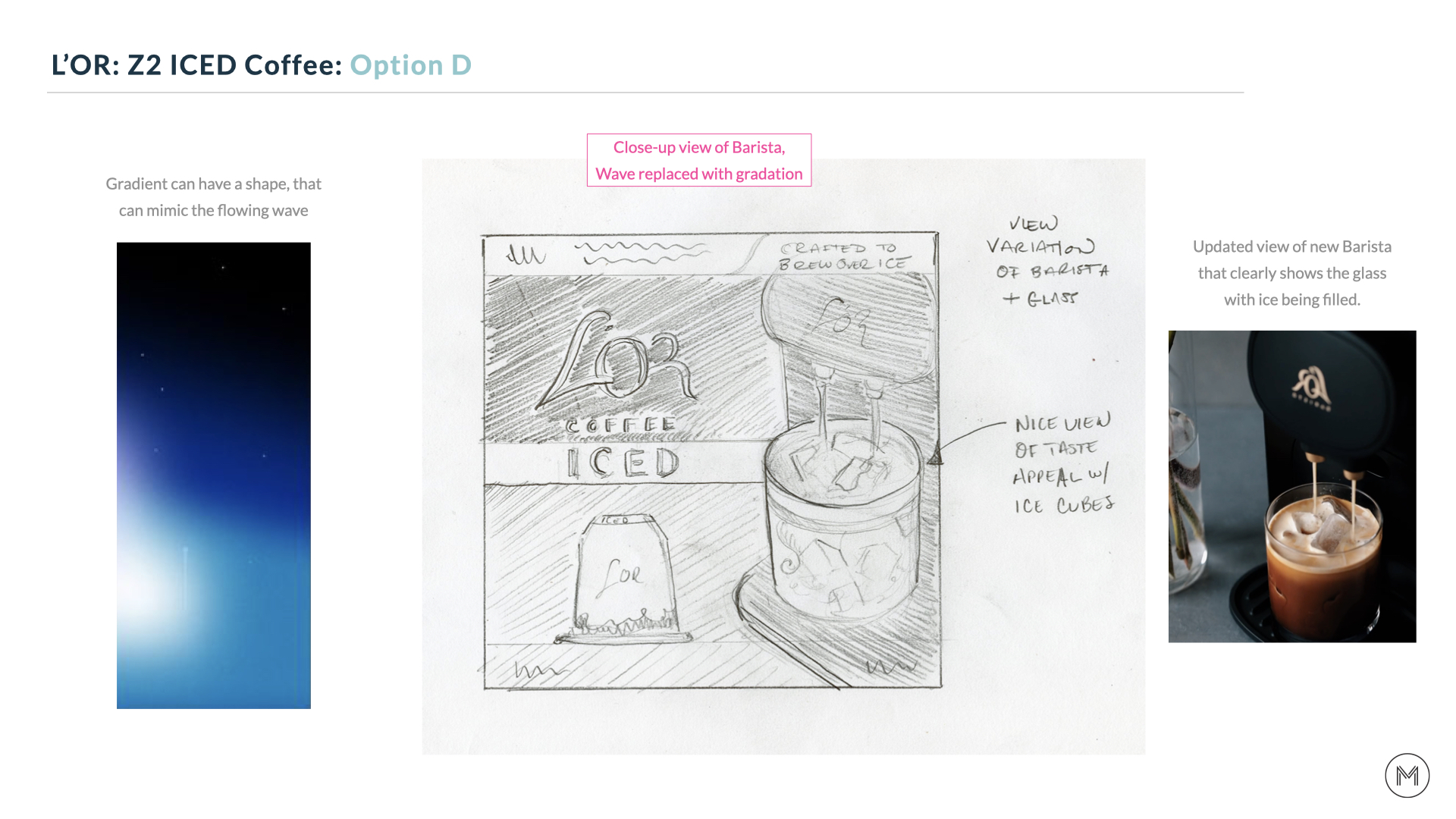
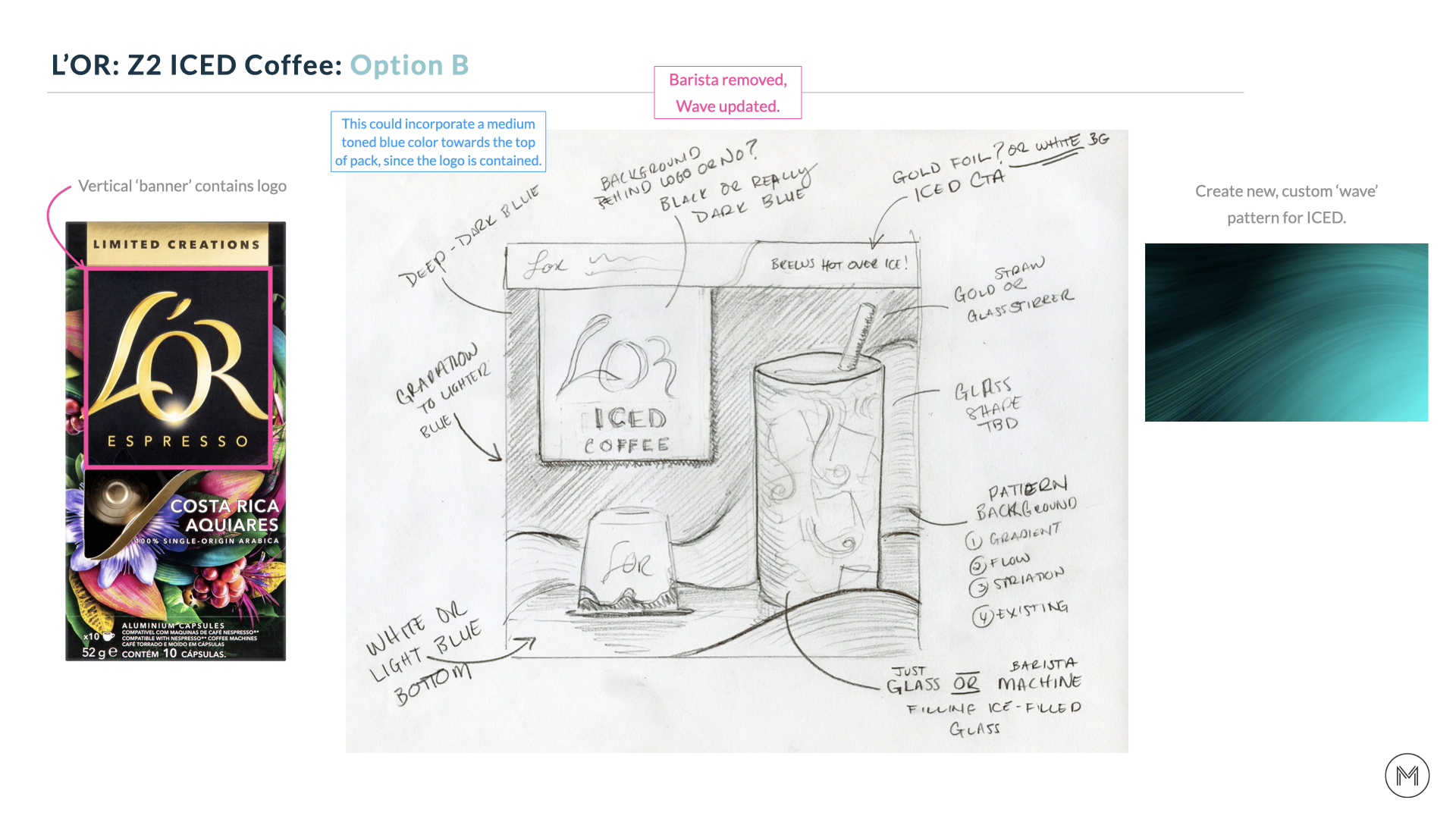
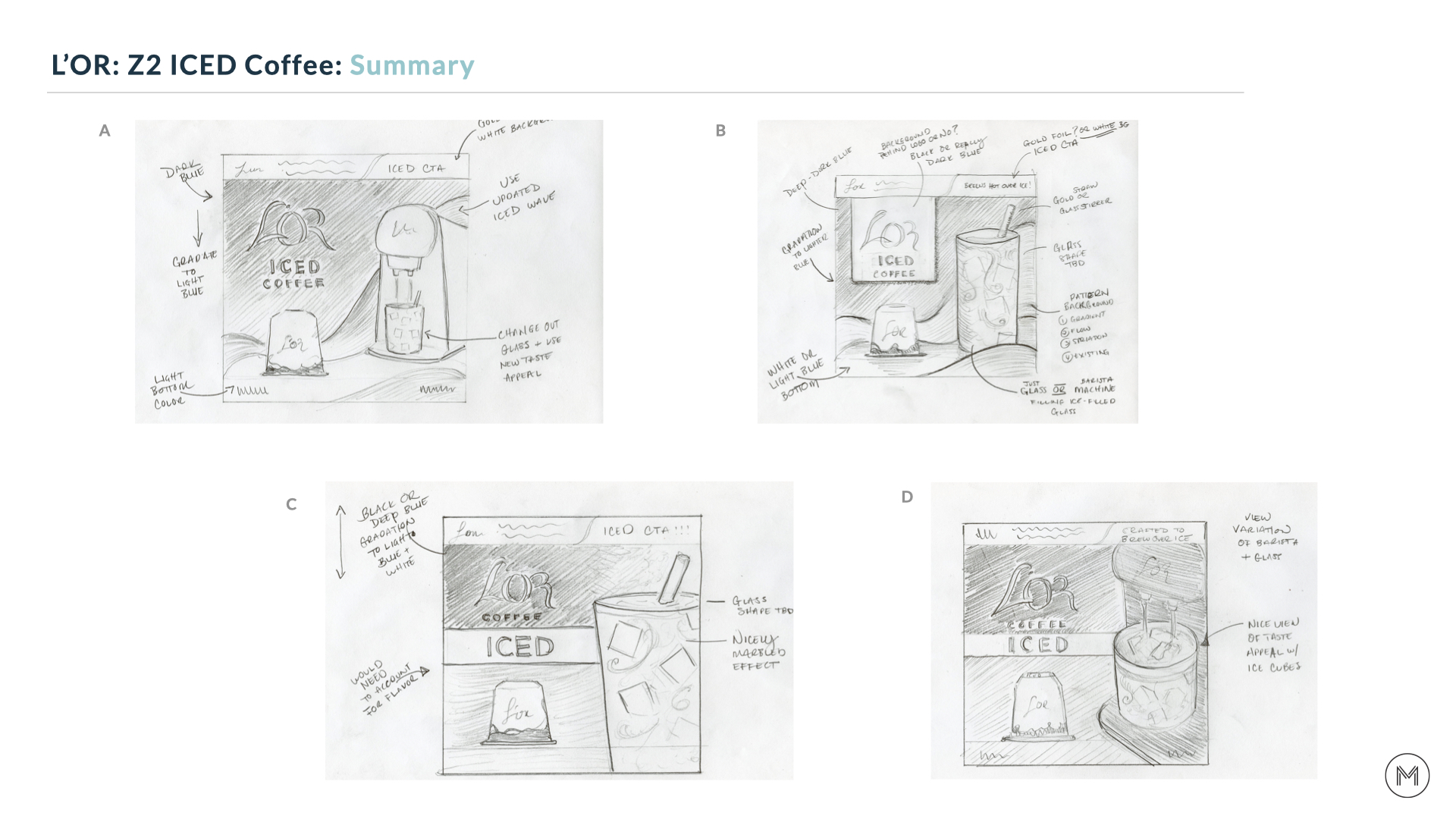
Once we had the green light on the initial concepts, we refined the sketches so they could be shared with the leadership team.
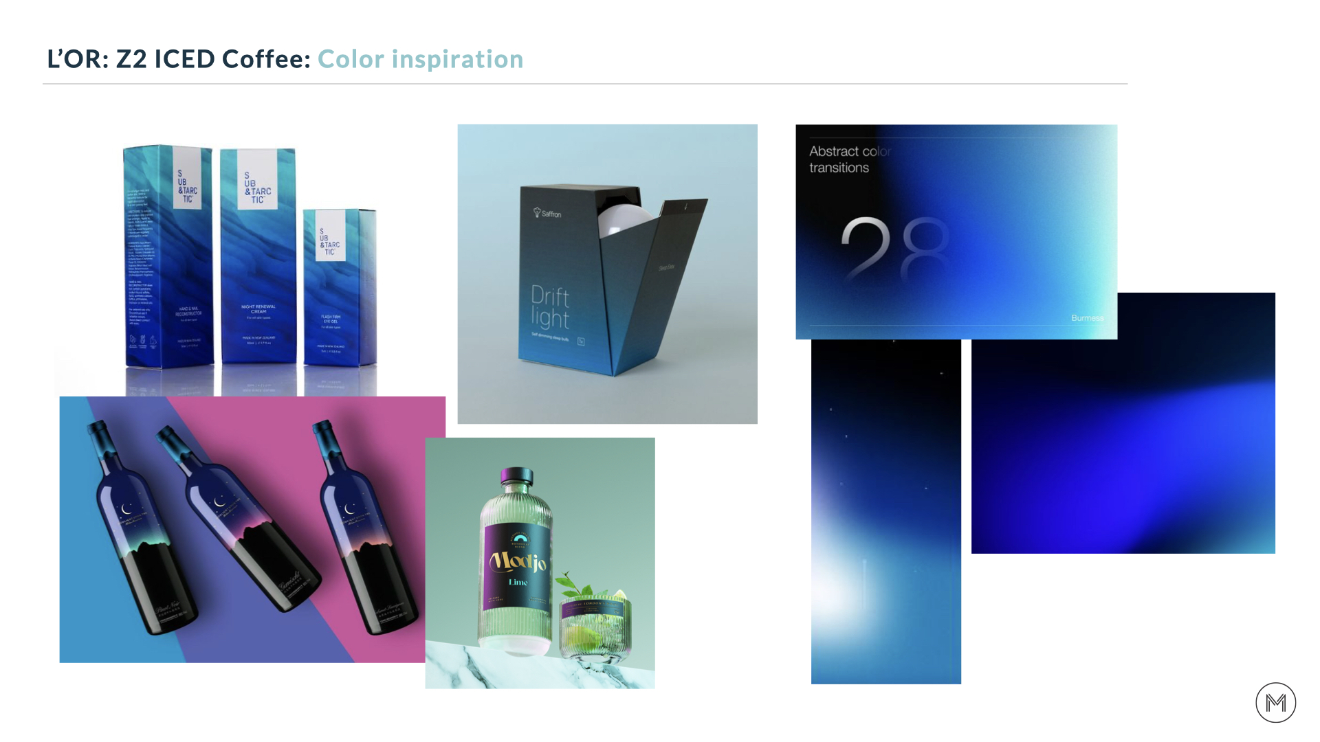
We wanted to keep the focus of the conversation on design hierarchy and how to best incorporate the Barista and iced glas, so color was not added at this stage. We did however provide direction through inspirational imagery, allowing the marketing team to provide feedback on color and style.
We wanted to keep the focus of the conversation on design hierarchy and how to best incorporate the Barista and iced glas, so color was not added at this stage. We did however provide direction through inspirational imagery, allowing the marketing team to provide feedback on color and style.
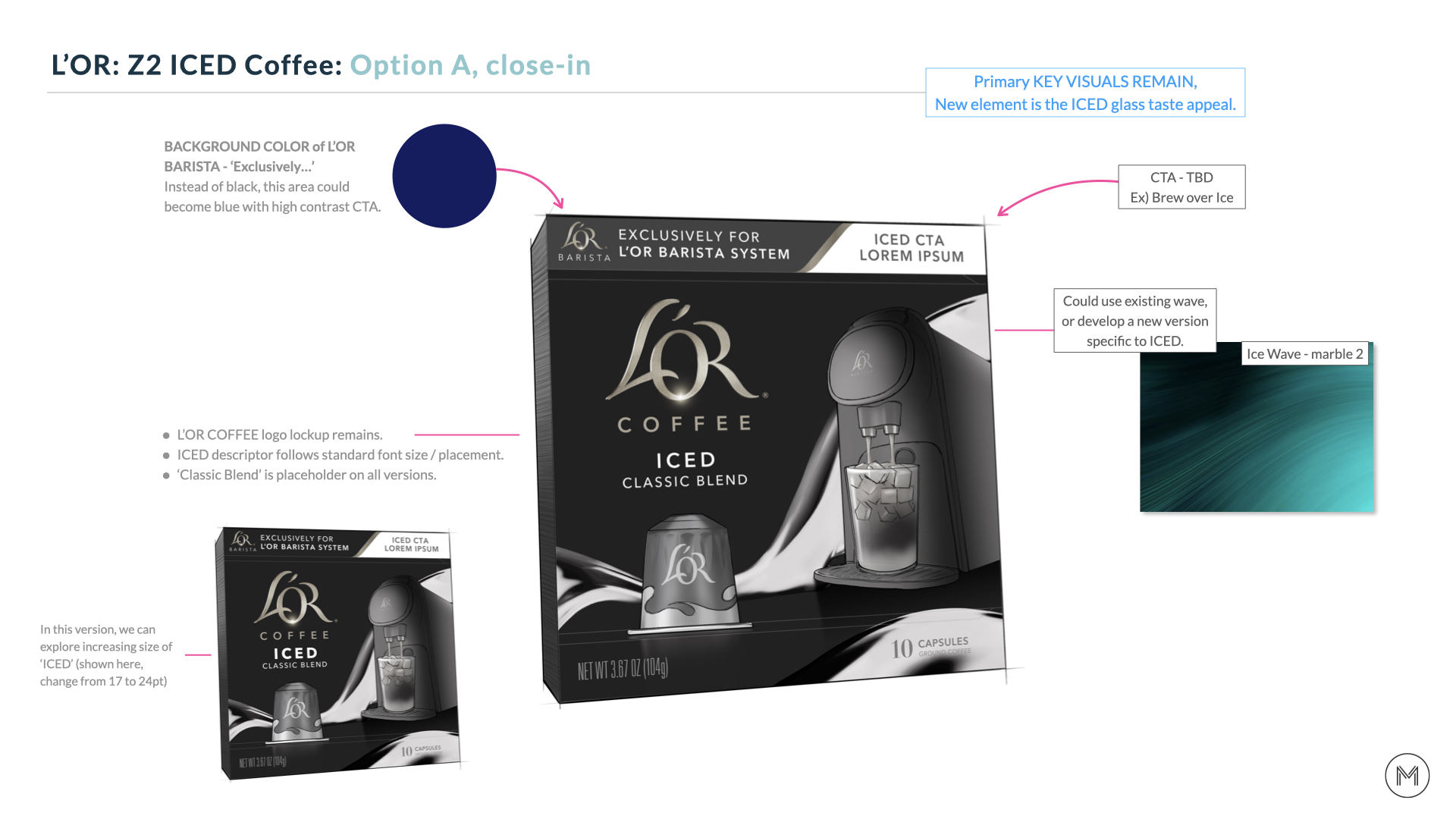
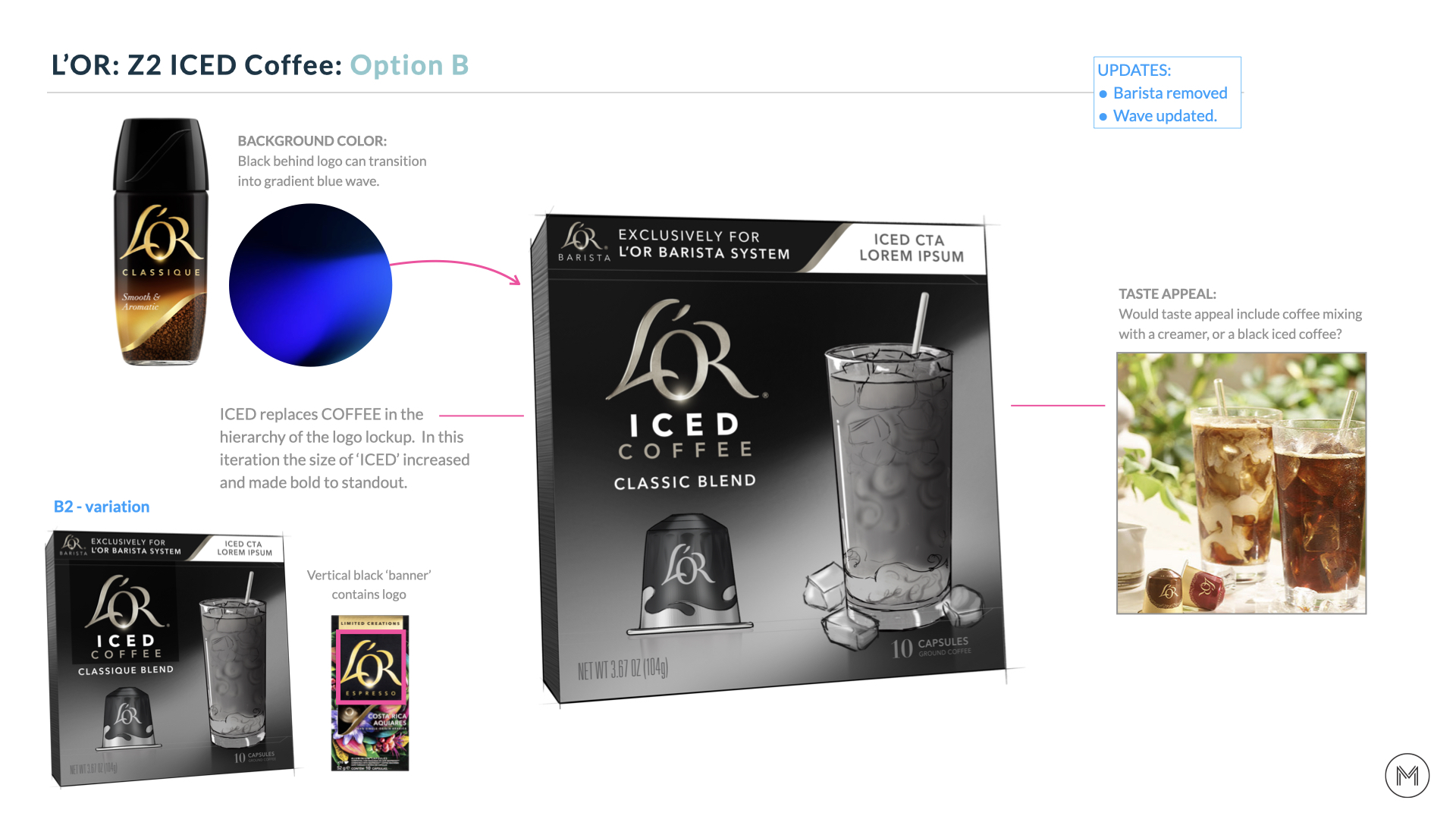
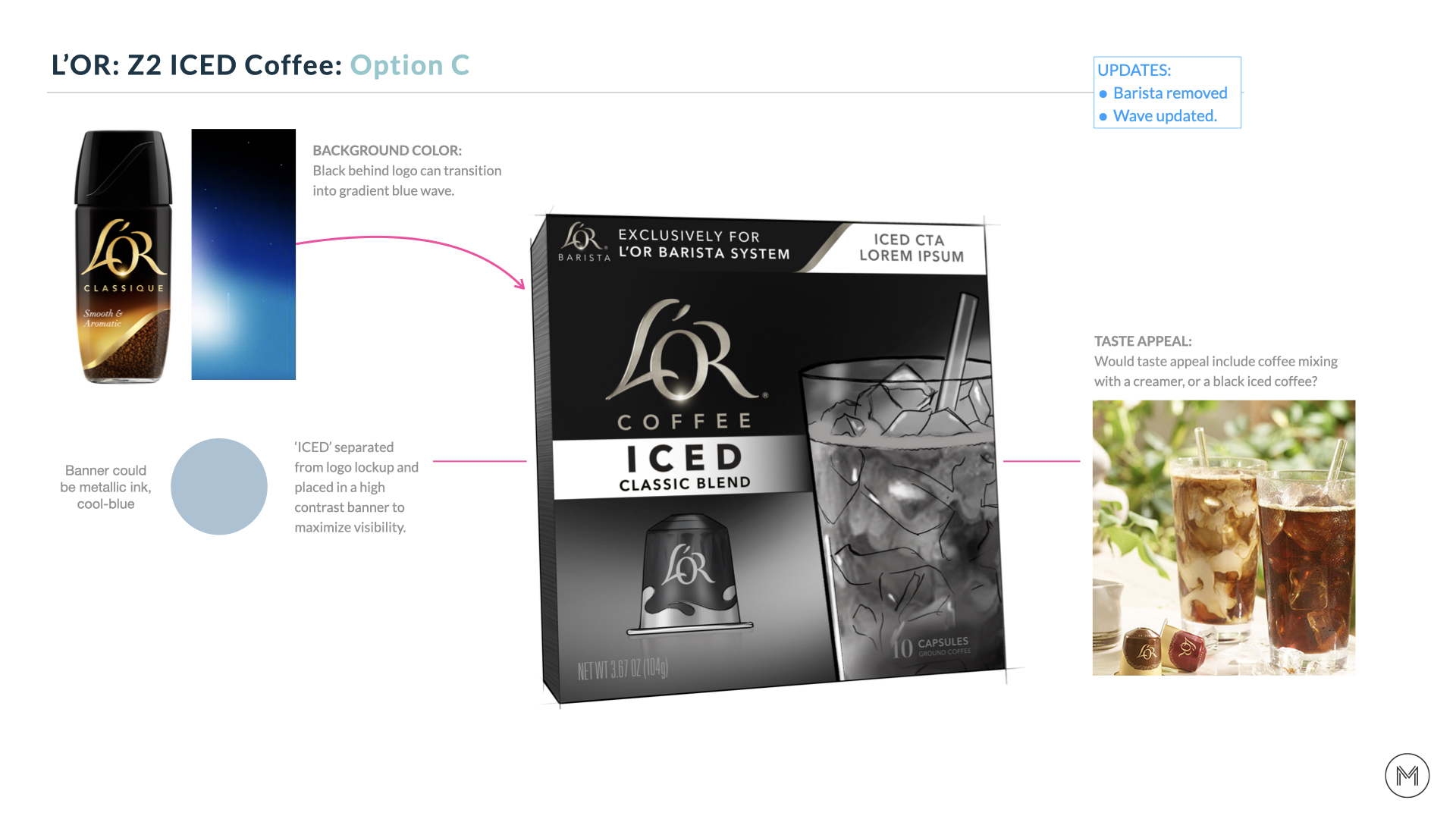
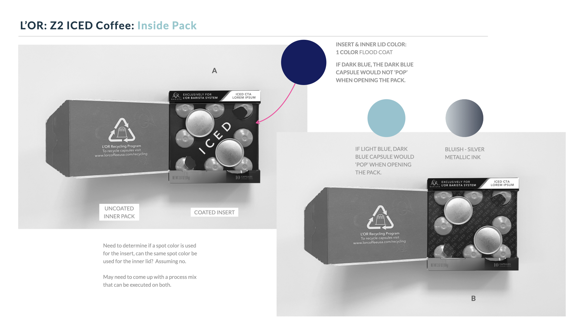
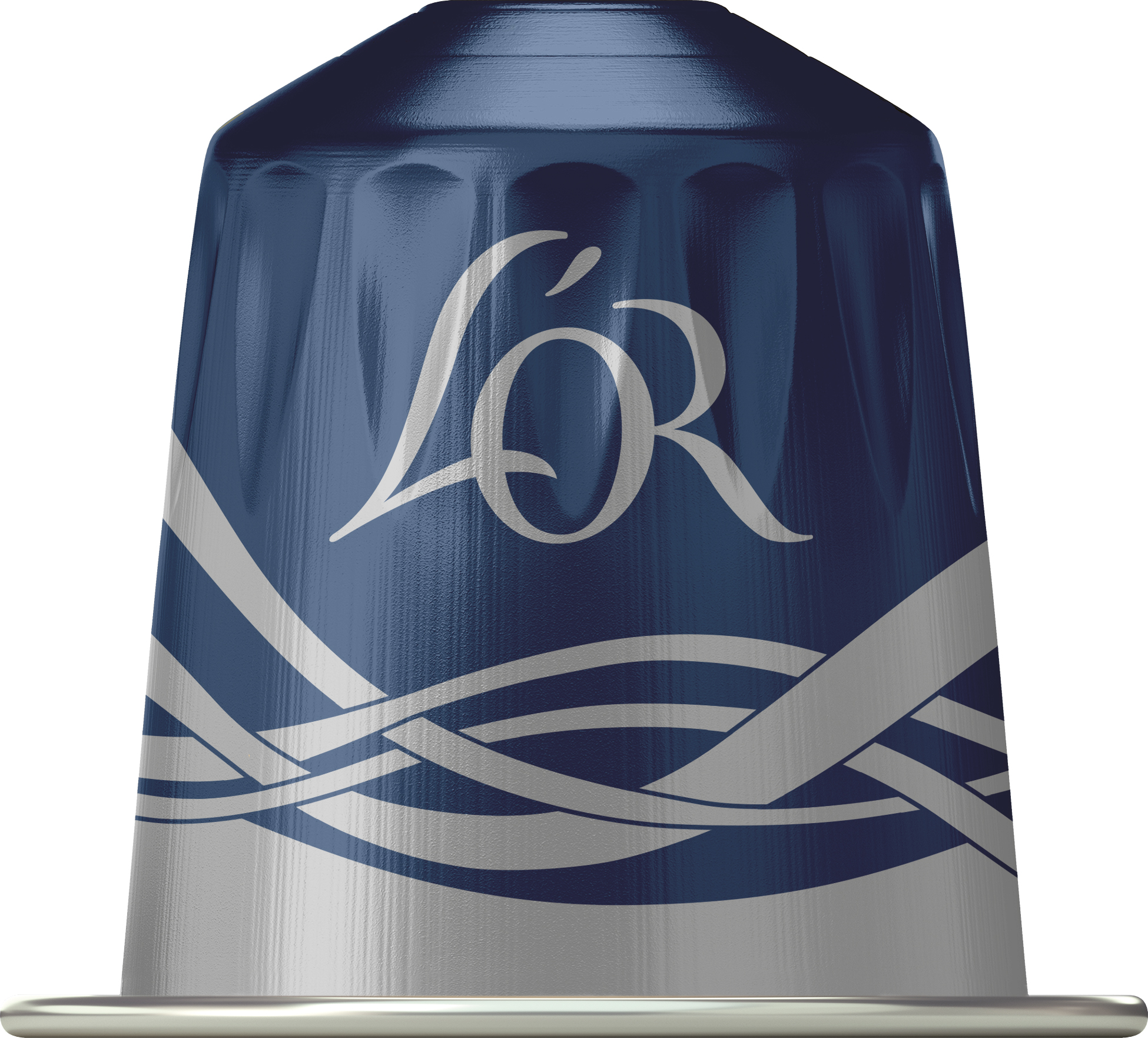
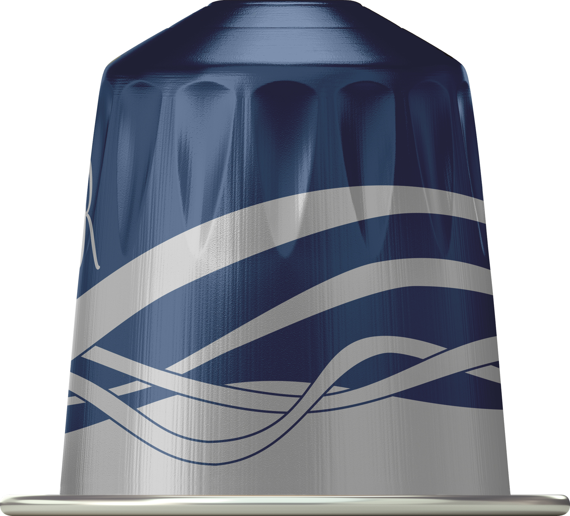
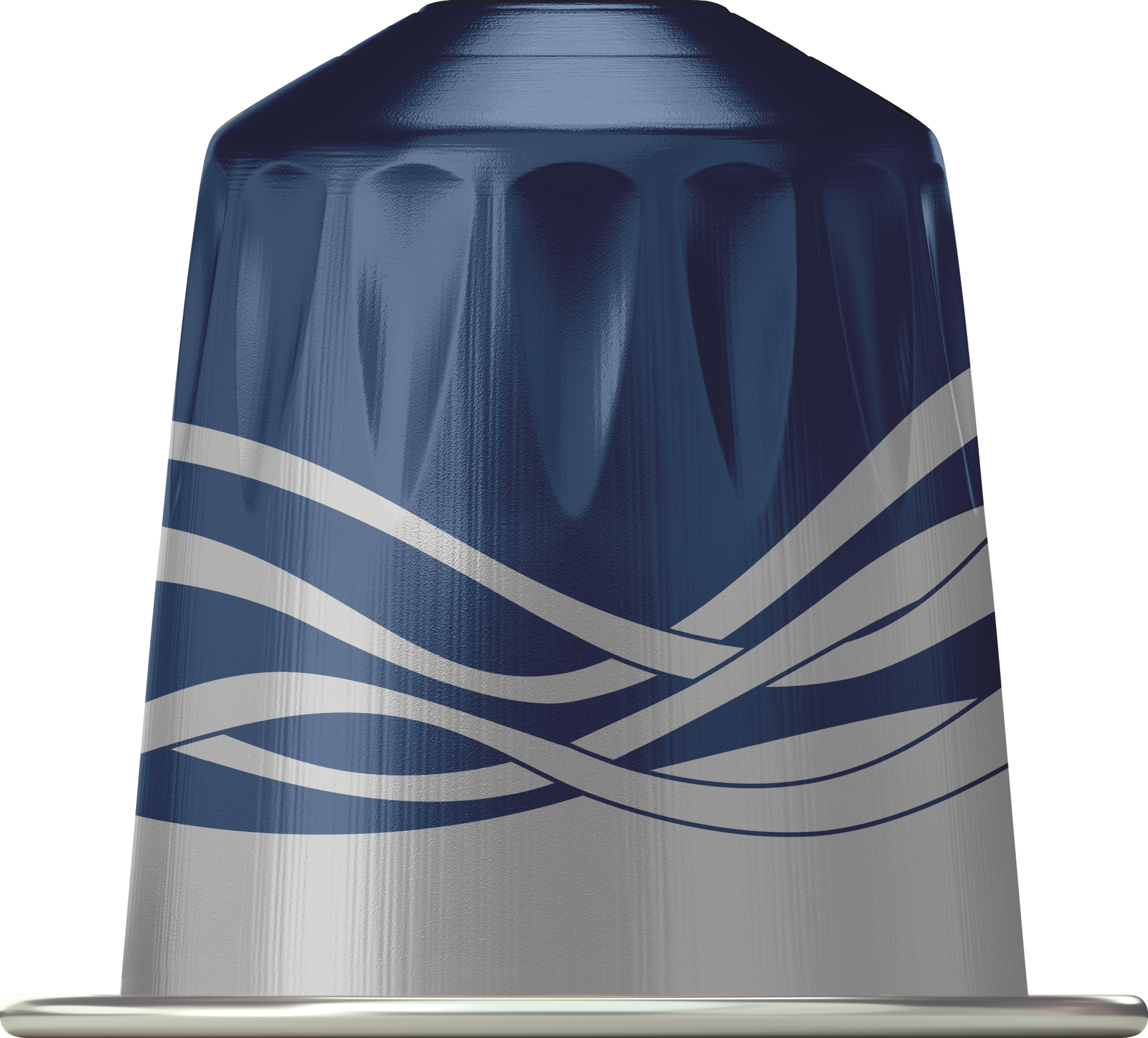
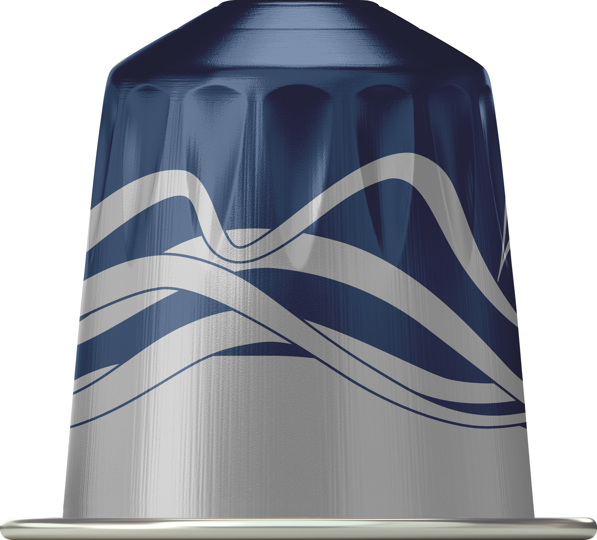
In addition to the packaging, we explored designs for the coffee capsule. Shown here is the selected concept.
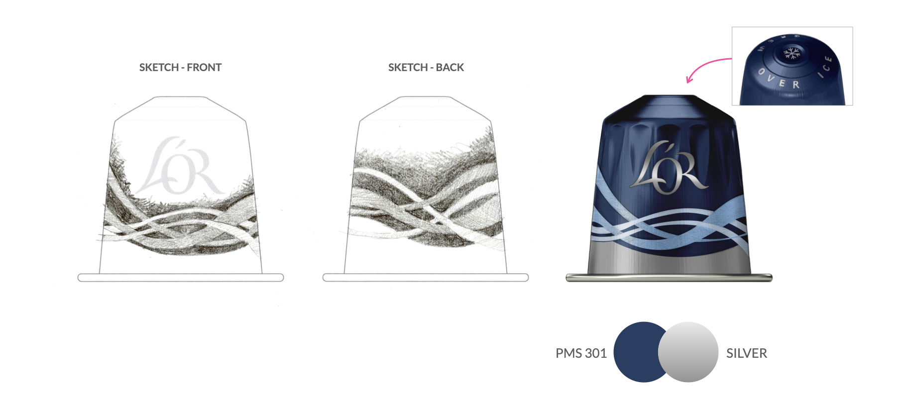
To wrap up the concepting phase, we added color to the approved package sketch to help the team better visualize their selection. The capsule artwork was also updated - a full graphic repeat was created, and capsule colors were limited to one.
Step 2: Creating the final art
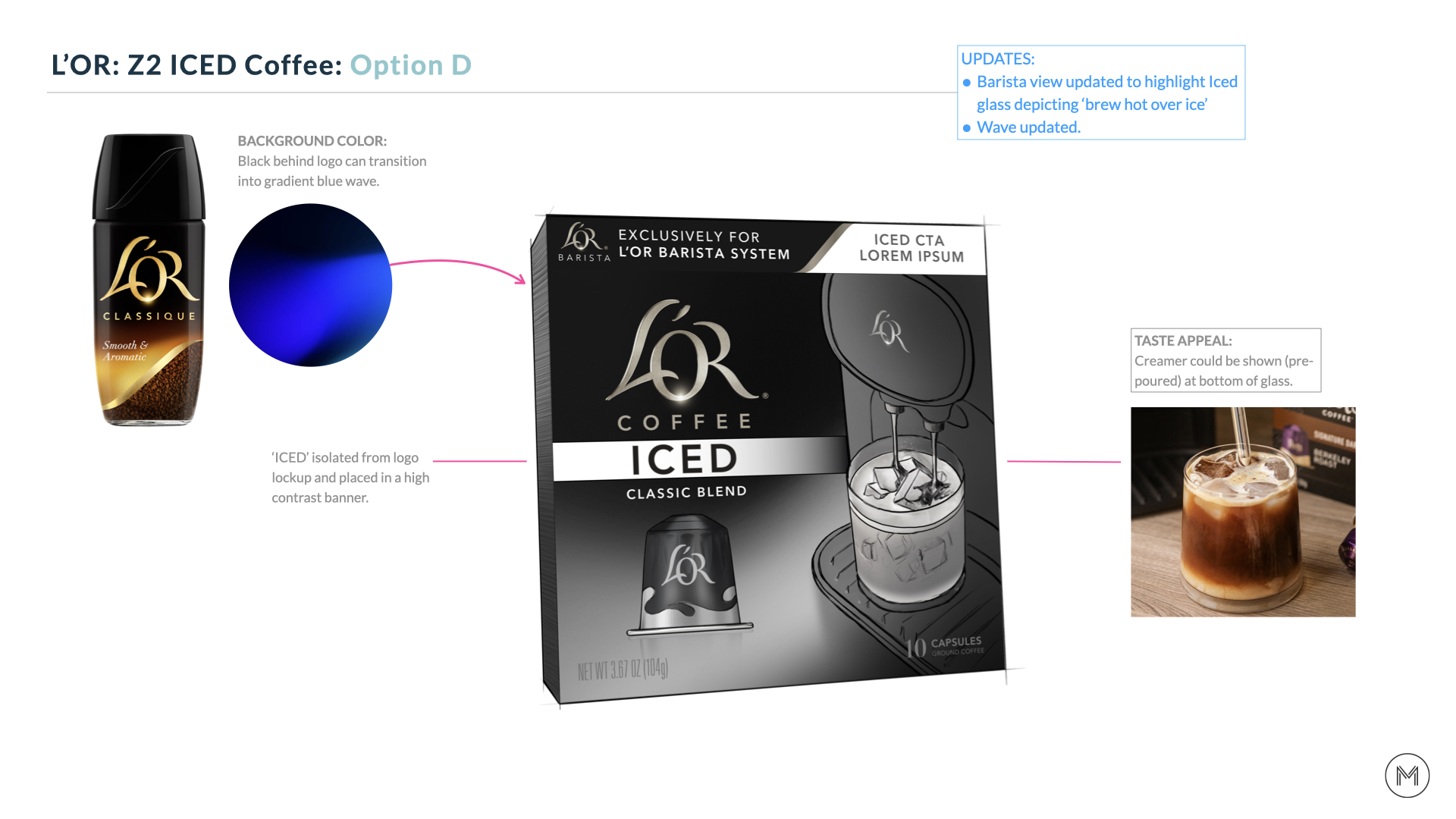
With initial ideas explored and an approved concept in hand, we start honing in on the final artwork and color. We needed to incorporate a few more key elements to finish off the design.
• The newly updated Barista [2.0] machine needed to be integrated with the correct glass, which posed a challenge - we only had a rendering (image) of the machine and a physical glass, so we had the glass photographed at the correct angle and merged the two to create the final visual.
• A more distinctive ice texture was added to the background to enhance the overall ICED appetite appeal and communication.

Step 3: Finalizing the Artwork
This phase is all about refinement, tightening the details, and making sure everything feels cohesive and shelf-ready. We finalize key elements like marketing copy and NLEA info so everything is accurate. Recommendations on ways to optimize the finish are made, and final 3D renderings are provided.
︎Images below by L’OR
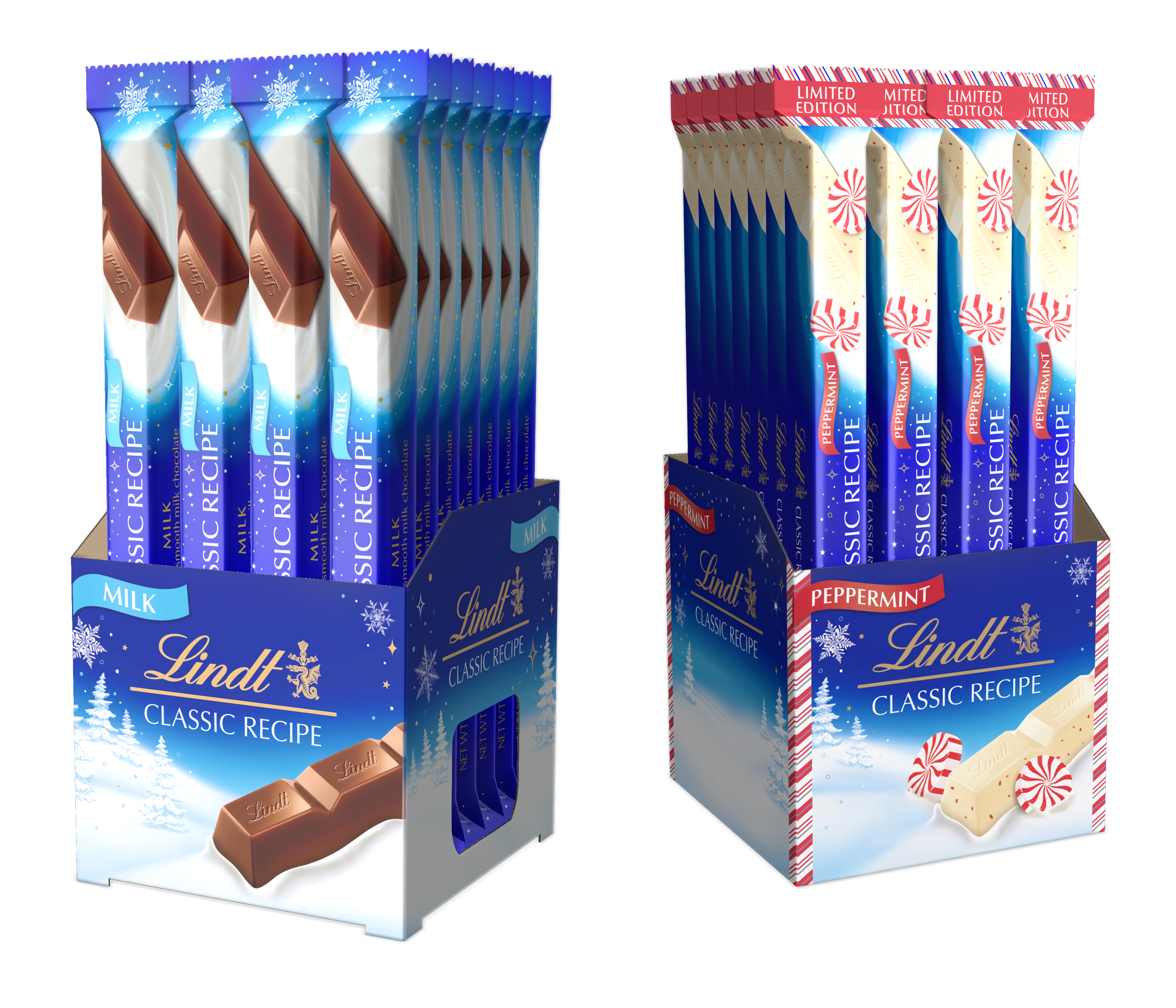
LINDT USA / Classic Recipe
THE BRIEF.
Lindt is expanding their range of products for Classic Recipe beyond bars and into other formats like spreads, individual wrapped pieces, and the Non-Dairy category. In each case, the objective is to extend the current Classic Recipe design language to these new products while utilizing the equities of the brand to ensure consistency and strengthen recognition on-shelf.
Lindt is expanding their range of products for Classic Recipe beyond bars and into other formats like spreads, individual wrapped pieces, and the Non-Dairy category. In each case, the objective is to extend the current Classic Recipe design language to these new products while utilizing the equities of the brand to ensure consistency and strengthen recognition on-shelf.
WHAT WE DID.
We worked with the Classic Recipe Brand Marketing team to determine which elements in the existing bar design architecture had to remain and those that could be removed.
The result was a relatively flexible design system that allowed for necessary adaptations while maintaining key brand assets.
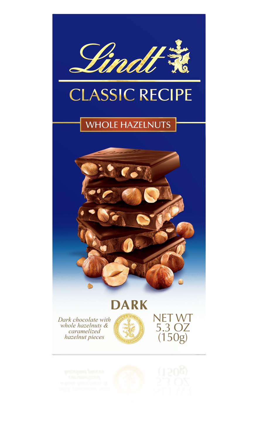
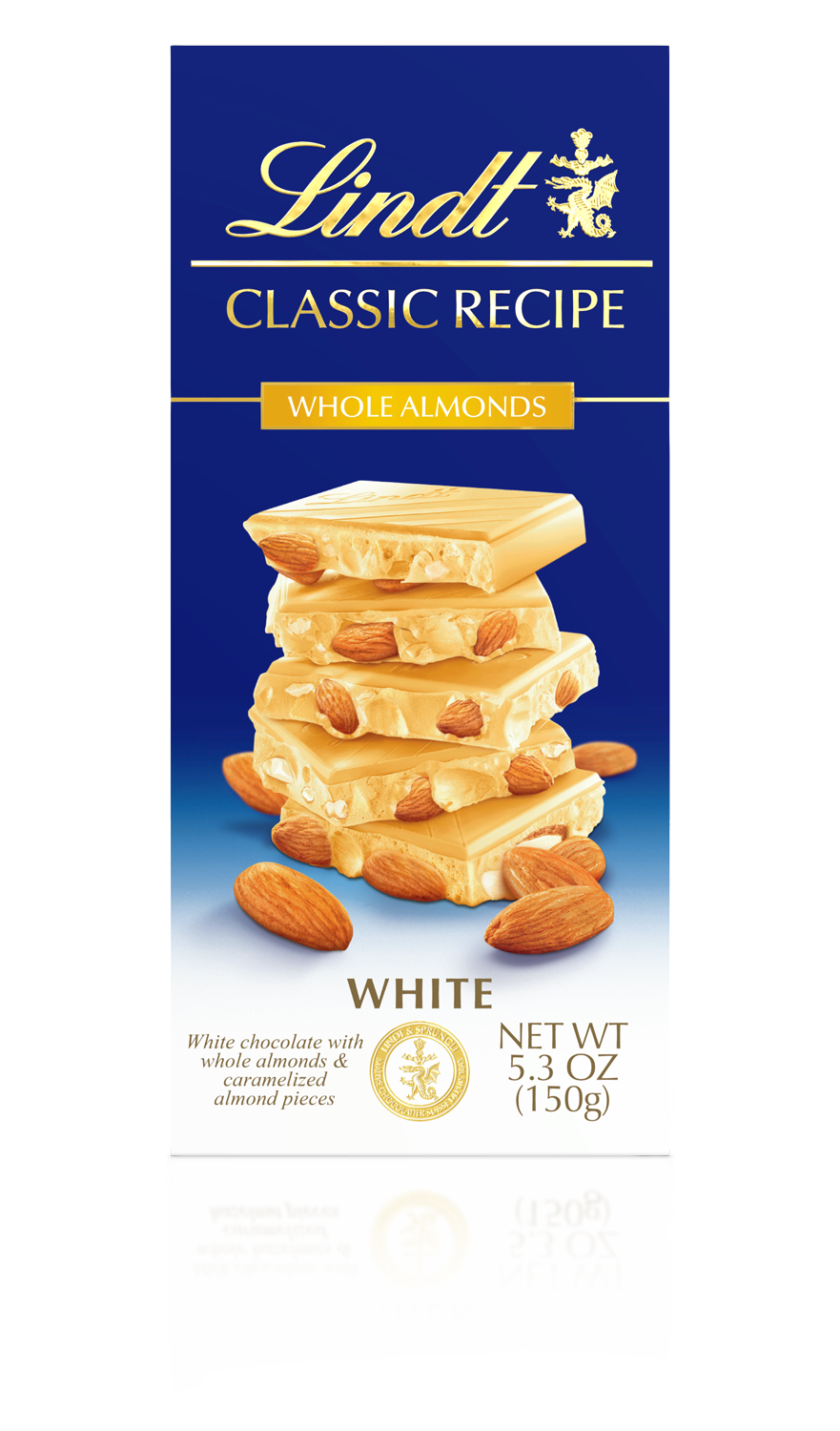
Lindt Classic Recipe’s core bar range set the design standard as we explored how the design architecture would adapt to new packaging formats and with new product innovations.

Lindt Classic Recipe + Gold Bar

Lindt Classic Recipe - Les Grande Bars (whole nuts)

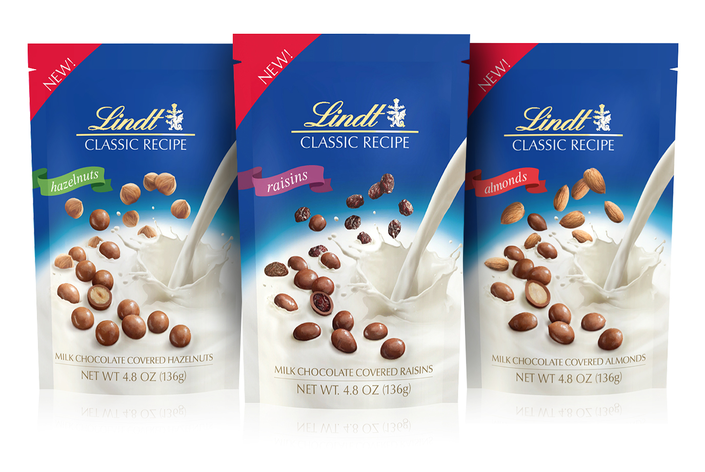
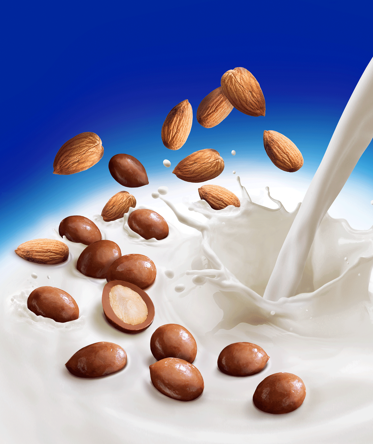
Lindt Classic Recipe - Panned
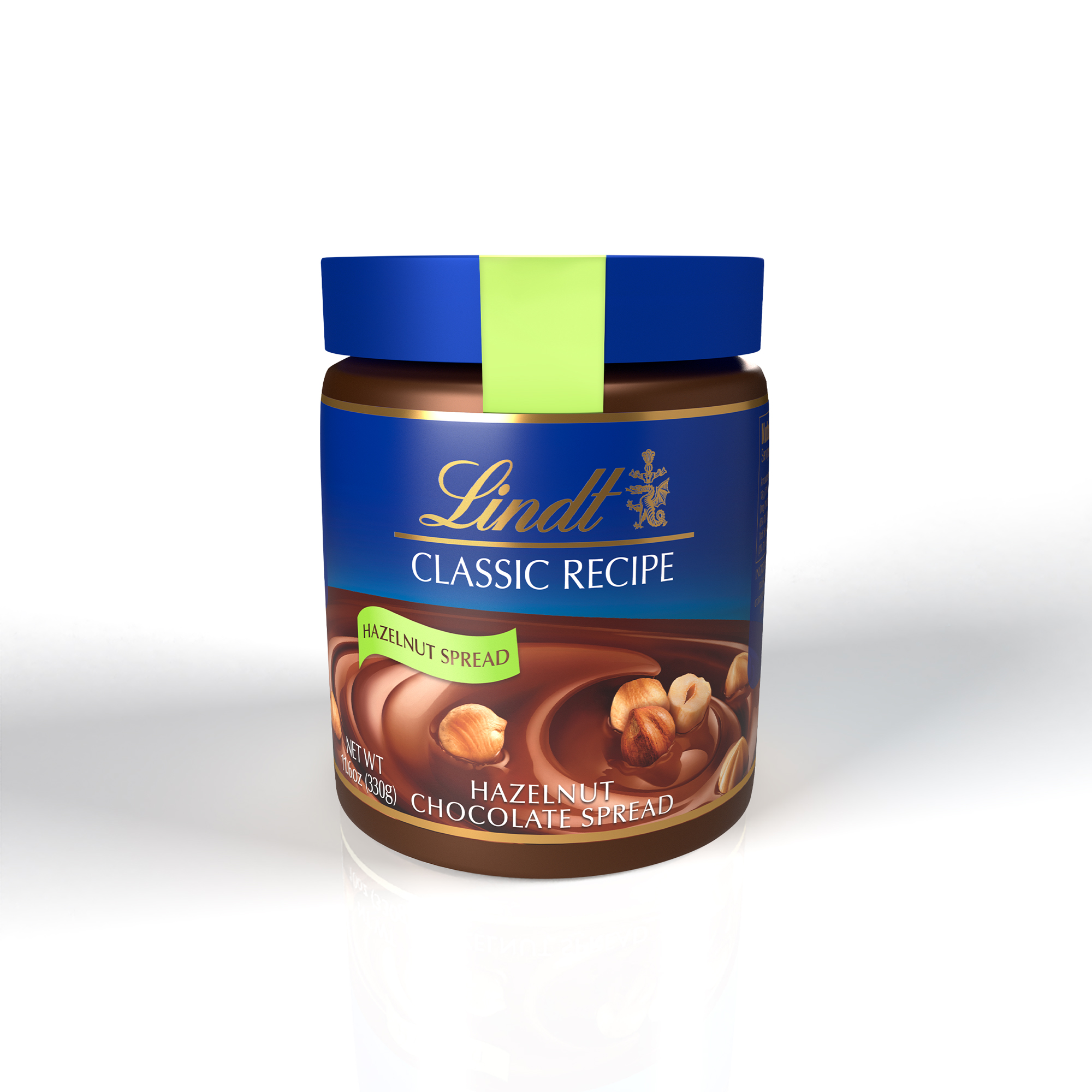
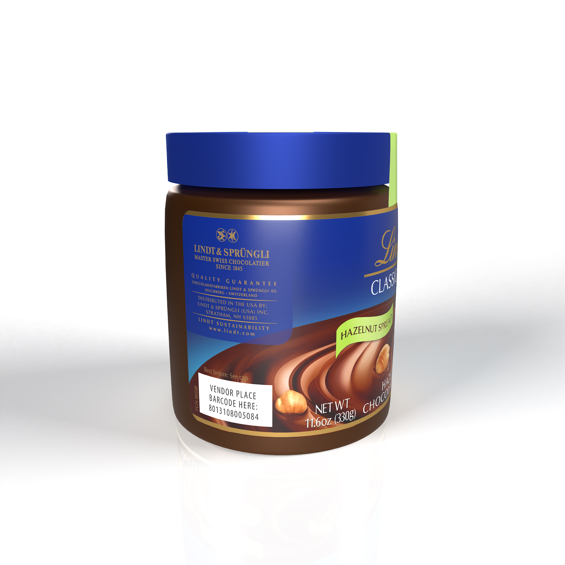
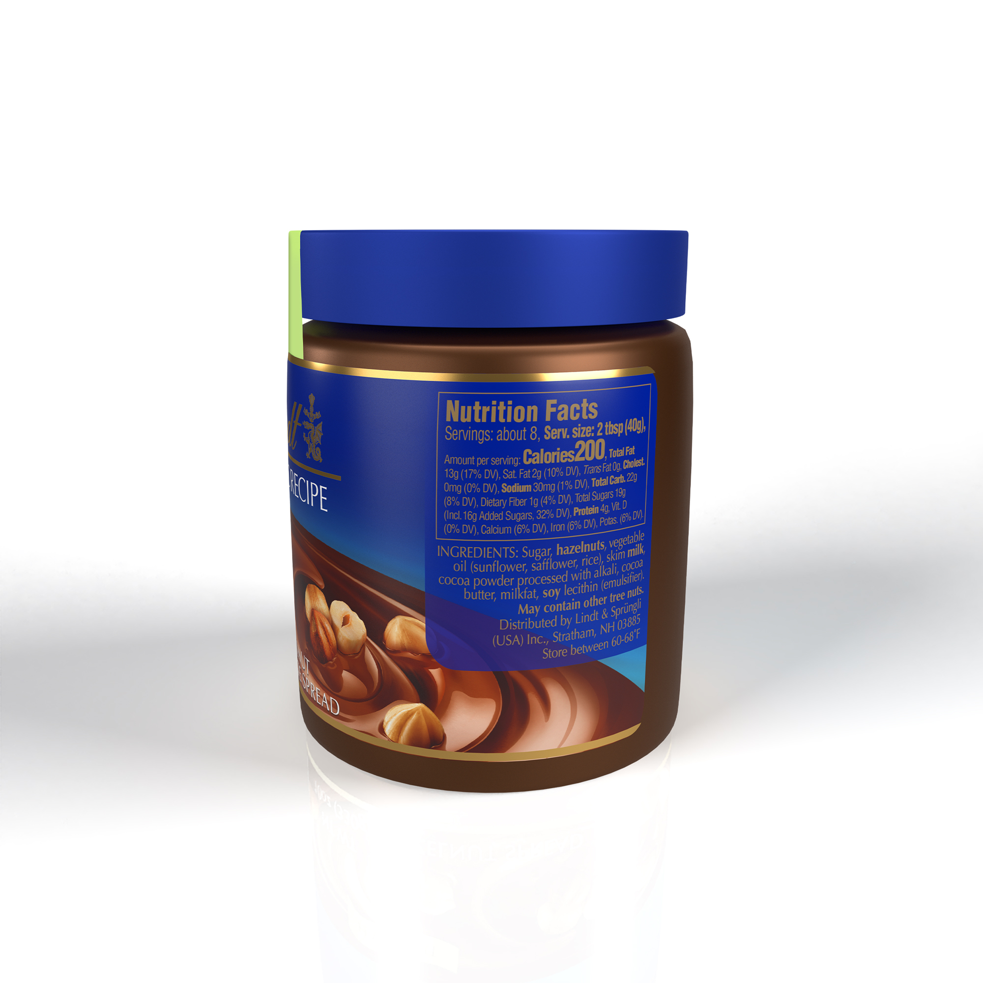
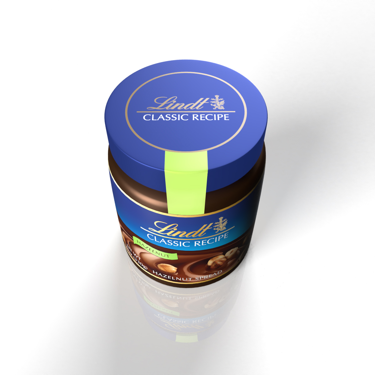
Lindt Classic Recipe - Hazelnut Spread
Lindt Classic Recipe - Holiday Pieces Pouch & Sticks with PDQ

Lindt Classic Recipe - S’mores Promotional Mailer

Mailer Insert

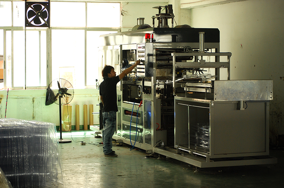
DYLAN’S / Color Wheel & Swatches
SHORT BRIEF.
In a meeting with Dylan's product development and creative teams, they floated the idea of a chocolate color wheel to showcase their full range of flavored squares.
In a meeting with Dylan's product development and creative teams, they floated the idea of a chocolate color wheel to showcase their full range of flavored squares.
WHAT WE DID.
Structural concepts and development of the outer PET circular structure, the inner tray, and label.


Working closely with one of our partner factories in southern China throughout development and was present during the initial production run. Below are a few of the pictures from the factory and of the early prototypes.

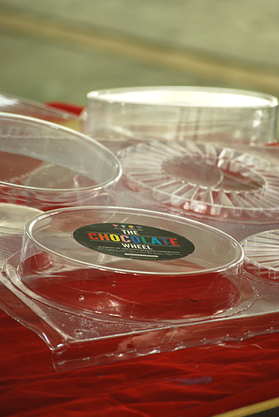
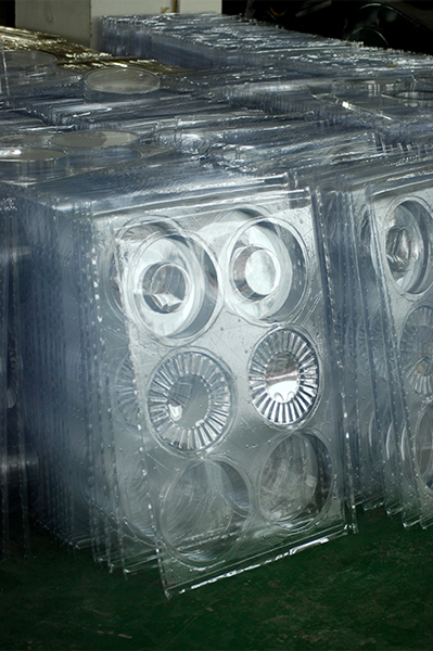
Initial prototypes.
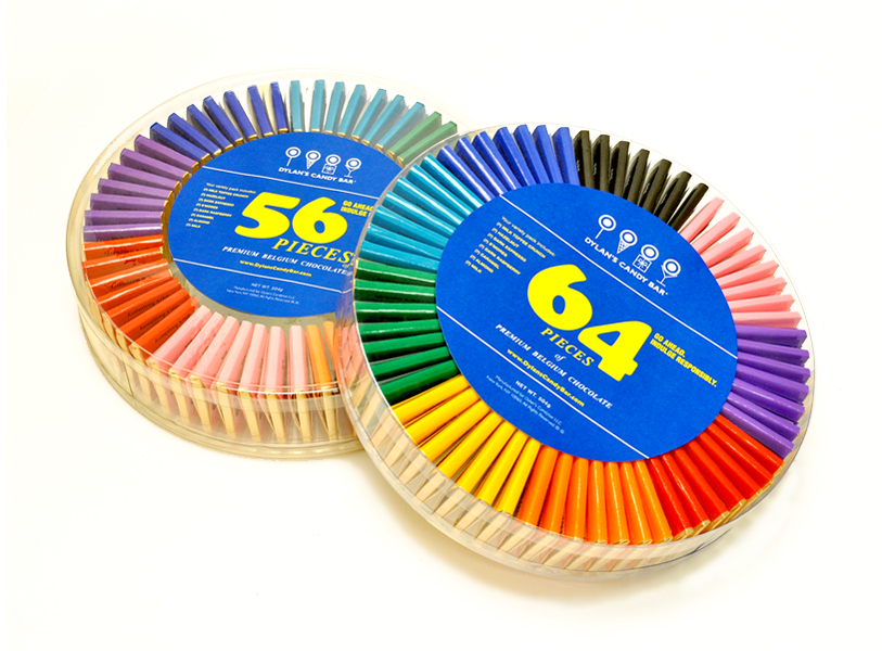
At the same time the ‘Chocolate Wheel’ was being developed, the ‘Chocolate Swatches’ packaging was also underway.

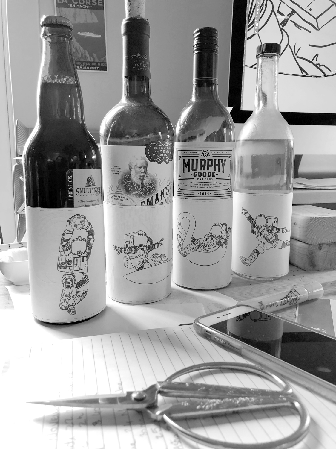
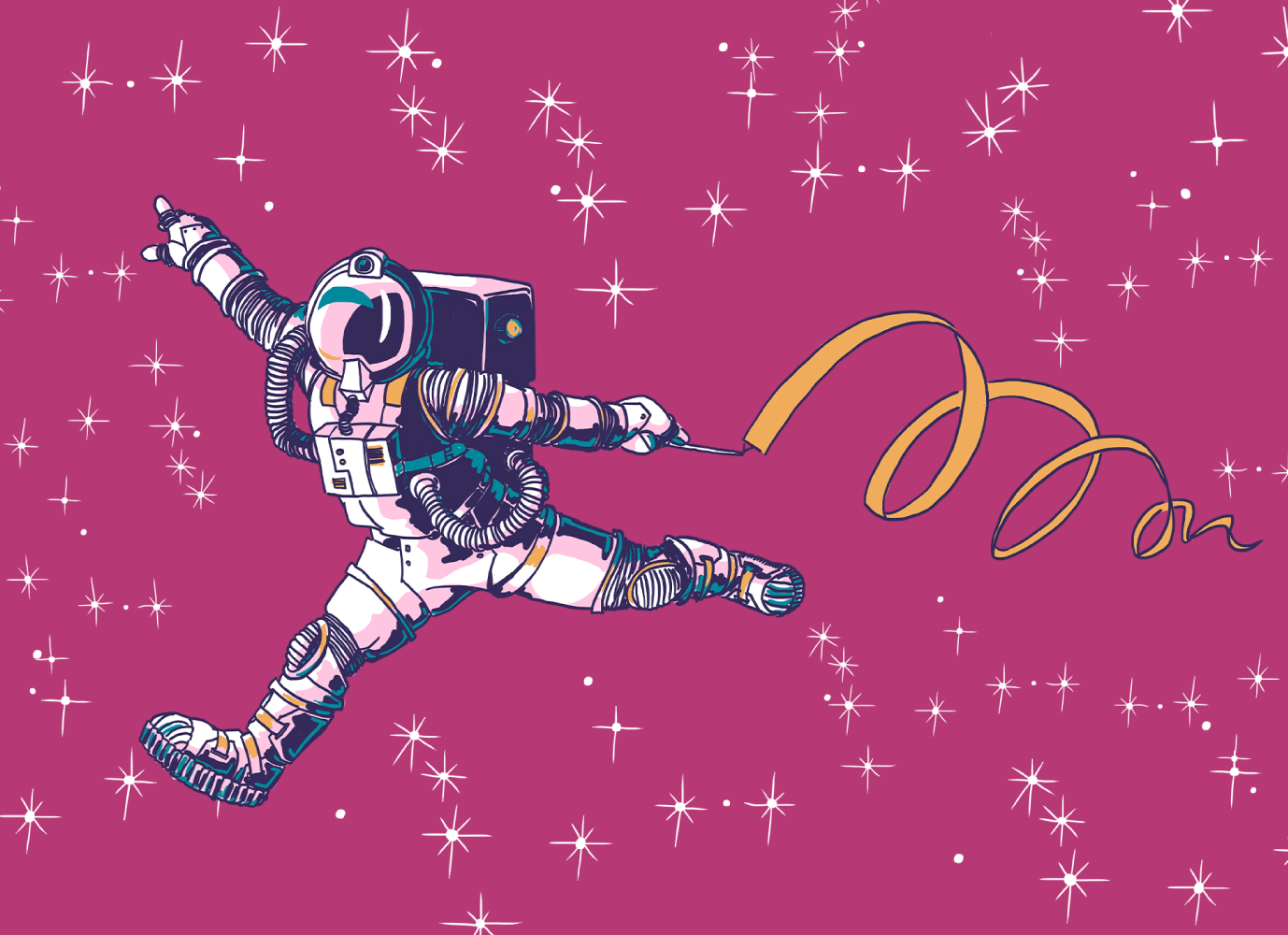
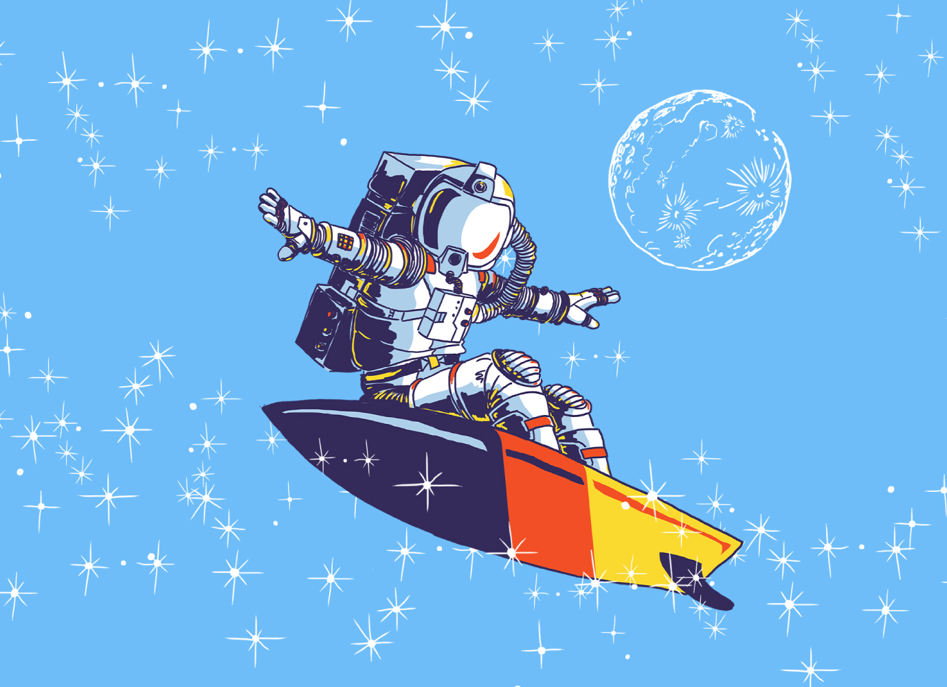
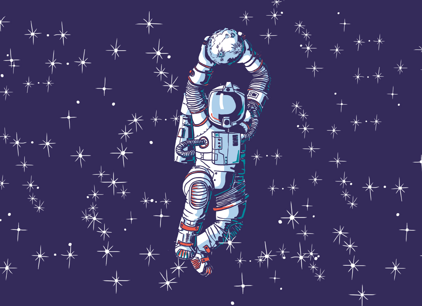
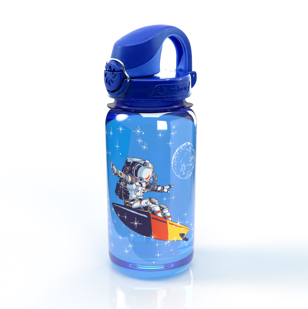
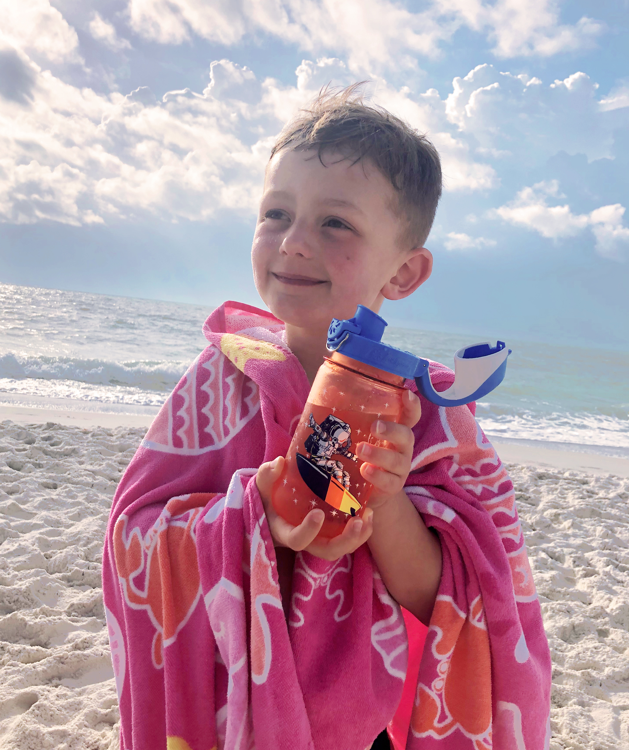
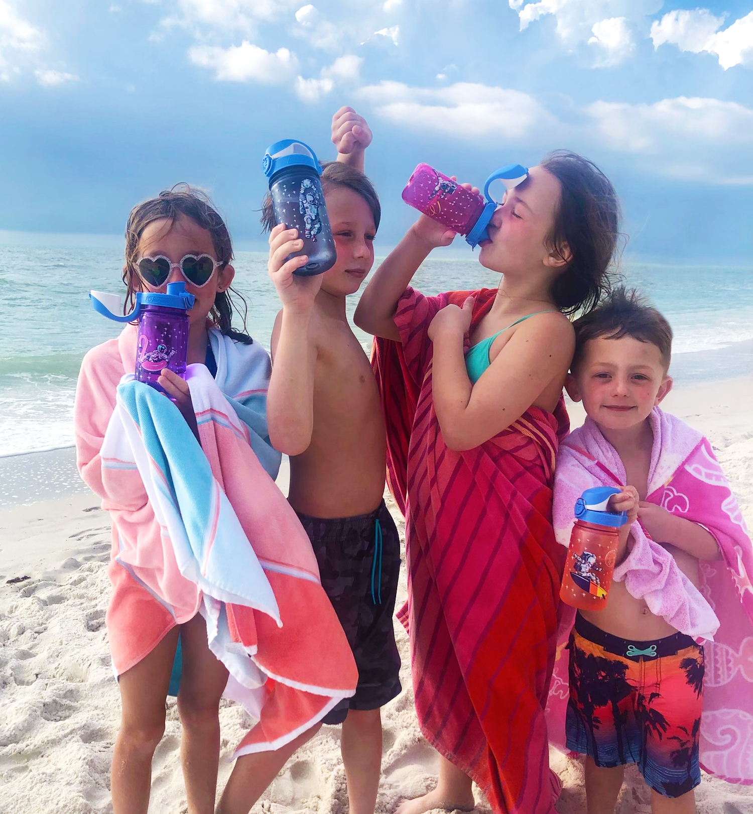
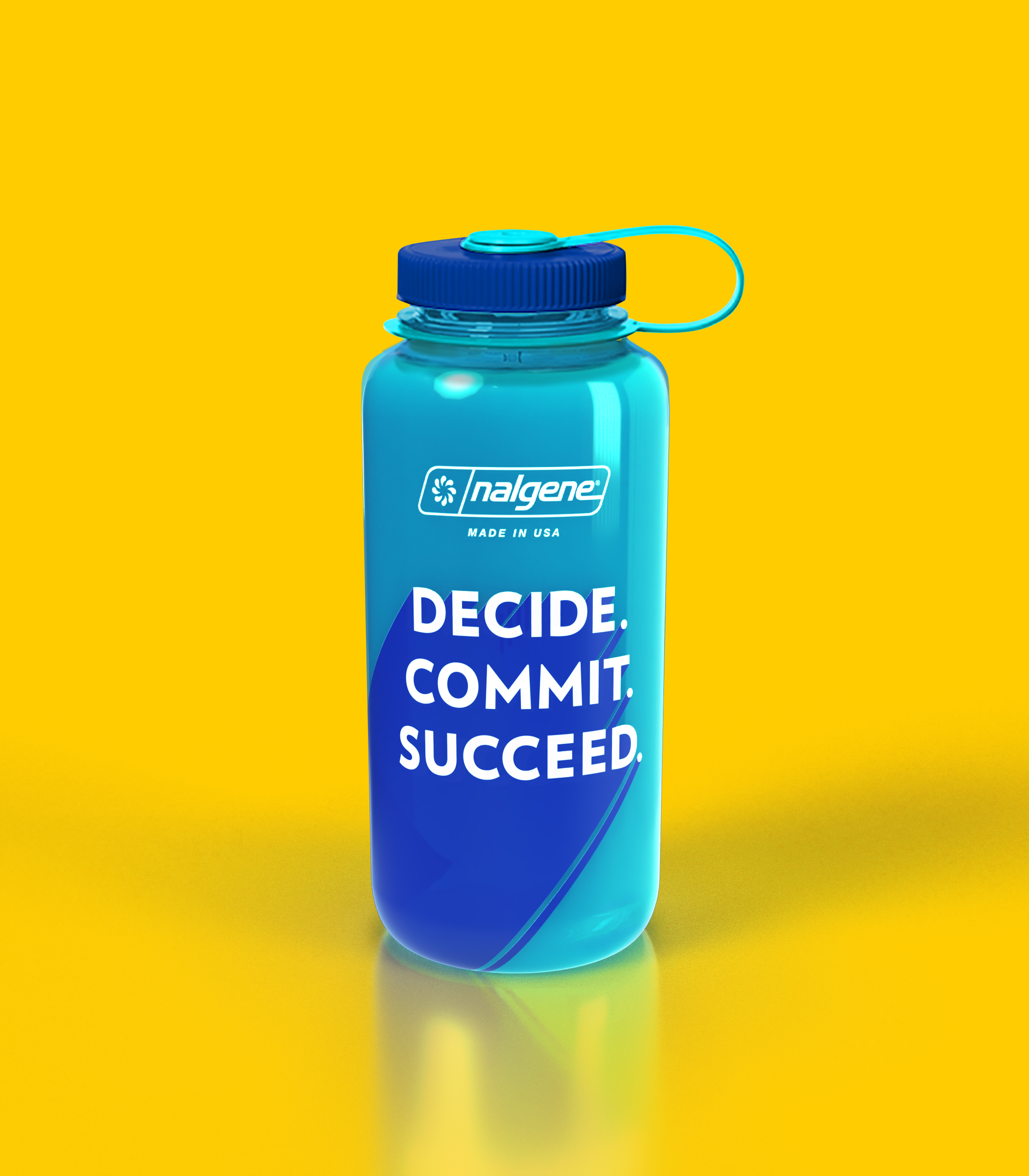
NALGENE / Astronaut Athlete Series
SHORT BRIEF.
The team at Nalgene engaged us to conduct trend research for content, design and illustrative styles to be developed into new bottle collections targeting Nalgene’s three core demograhics. Their team intentionally left the brief open and flexible during the research phase. For their On-The-Fly 12 oz bottle the target was children, aged 6-10.
The team at Nalgene engaged us to conduct trend research for content, design and illustrative styles to be developed into new bottle collections targeting Nalgene’s three core demograhics. Their team intentionally left the brief open and flexible during the research phase. For their On-The-Fly 12 oz bottle the target was children, aged 6-10.
WHAT WE DID.
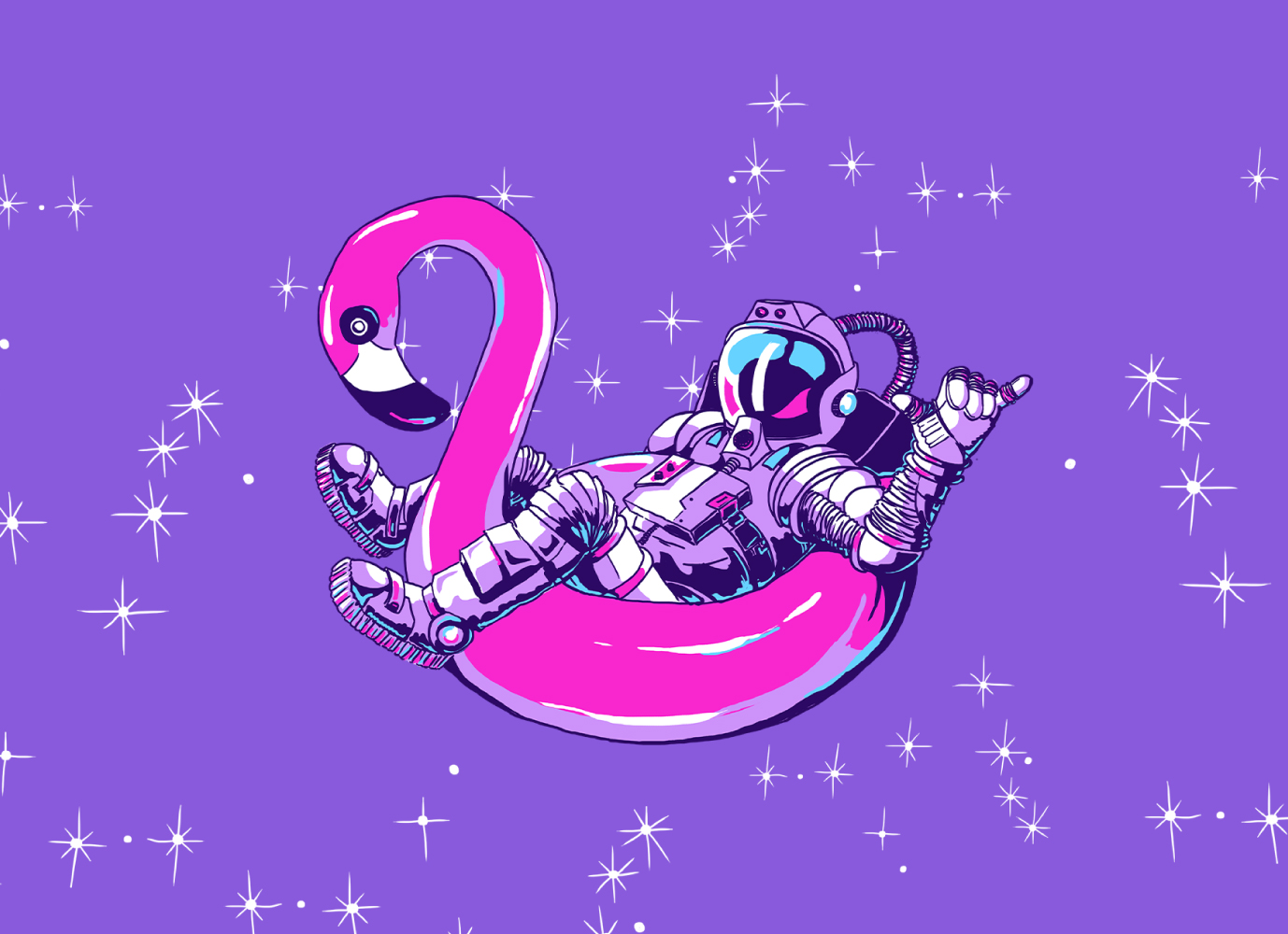
Altogether we identified 20 distinct trends that fit within the overarching design strategy. Five of those trends targeted the 6-10 age group. Through close collaboration with their marketing team, we narrowed down to the two illustrative concepts that best fit the aesthetic and tone of the brand. The Astronaut Athletes theme made the final cut.
Project Deliverables:
• Trend Research & Analysis
• Custom Illustrations
• 3D Renderings
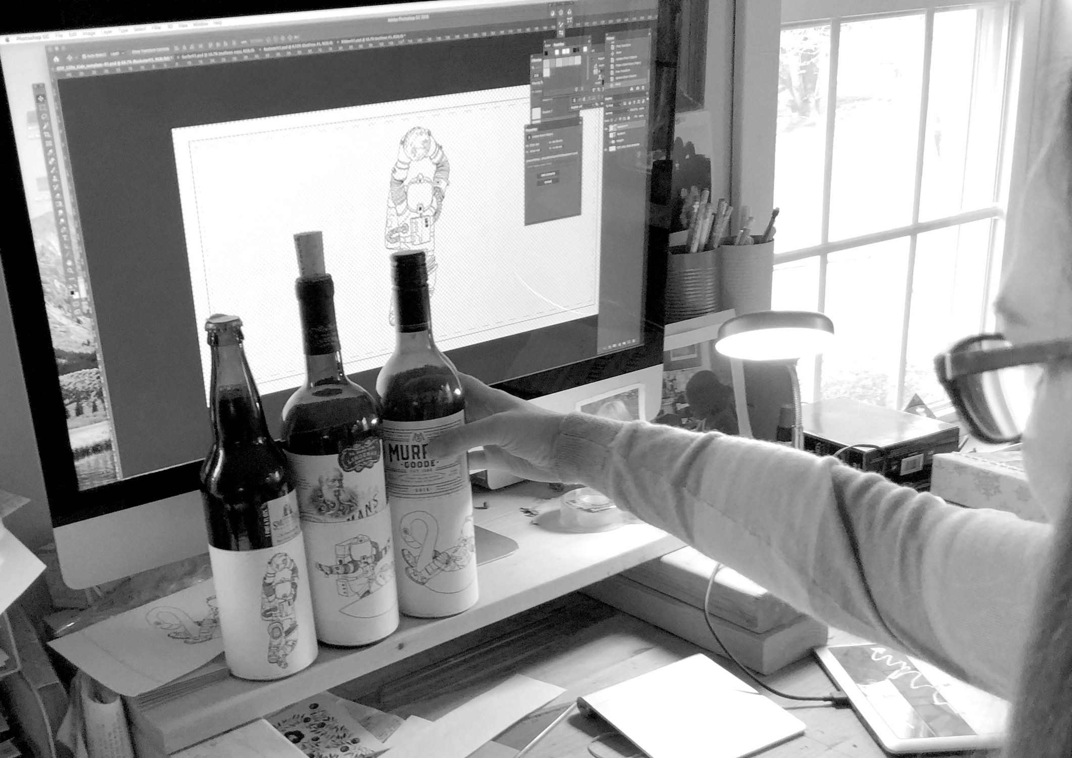
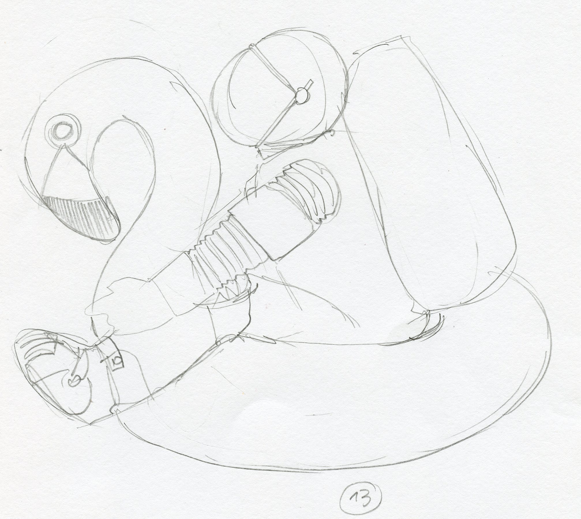
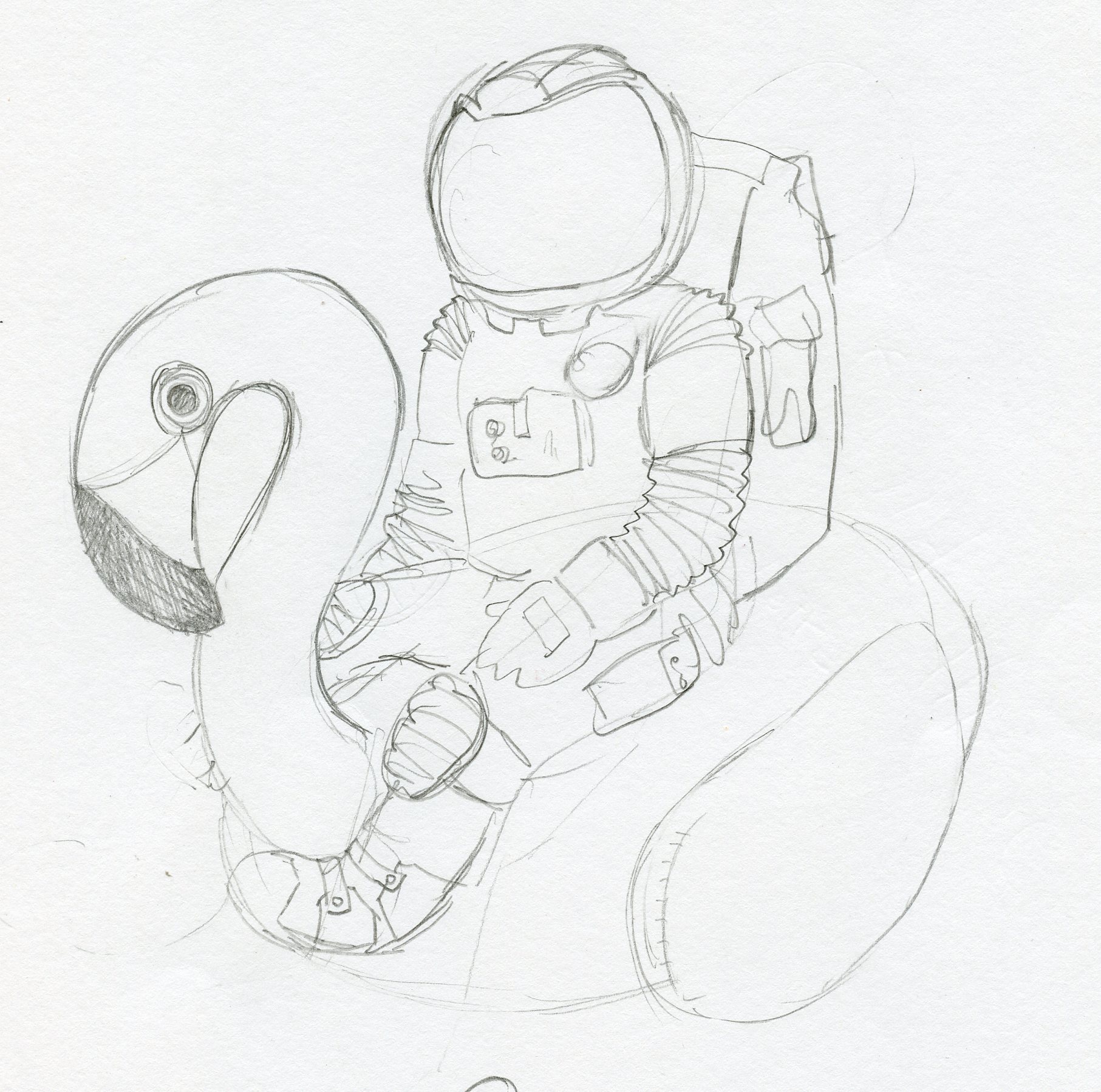
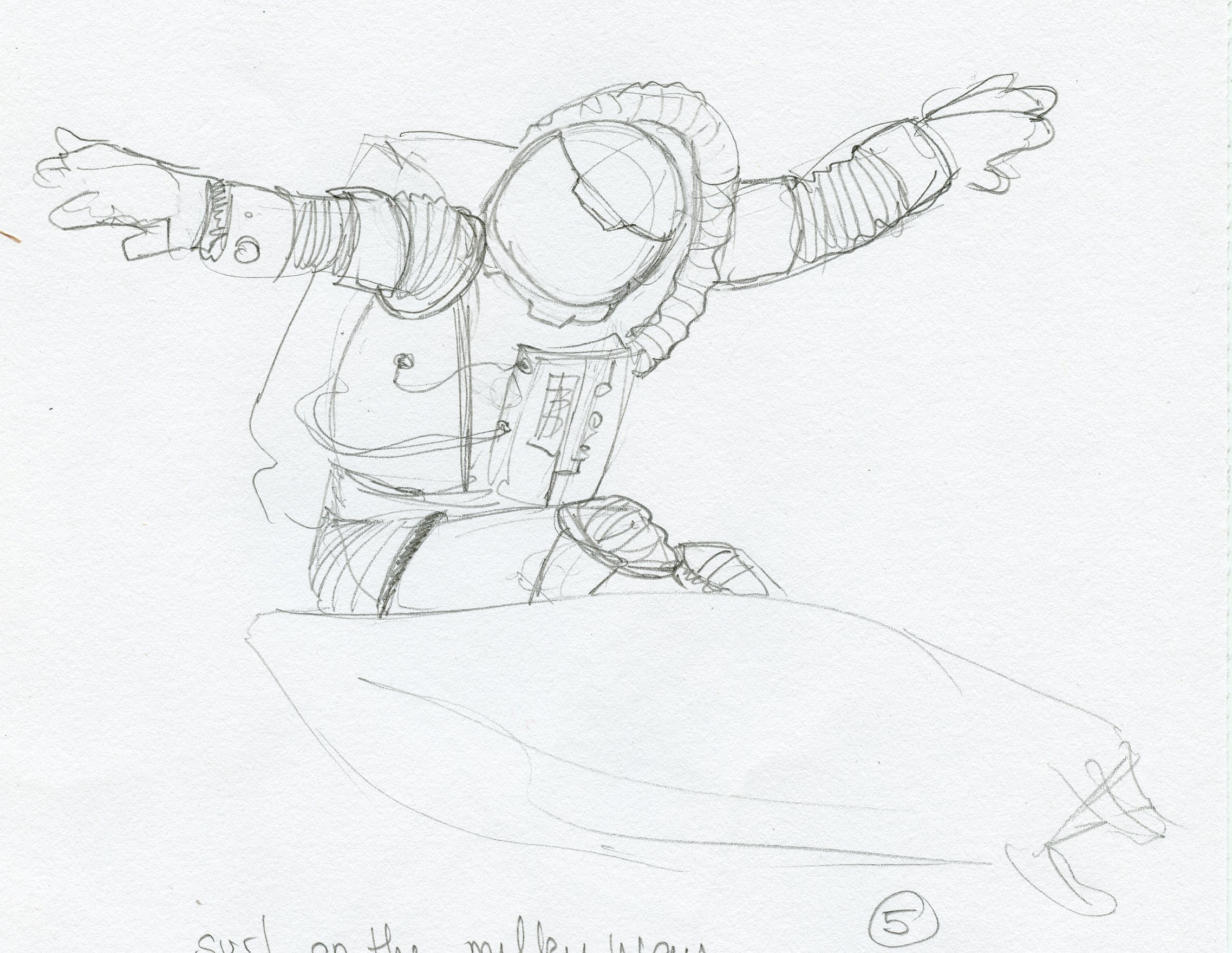
THE PROCESS.
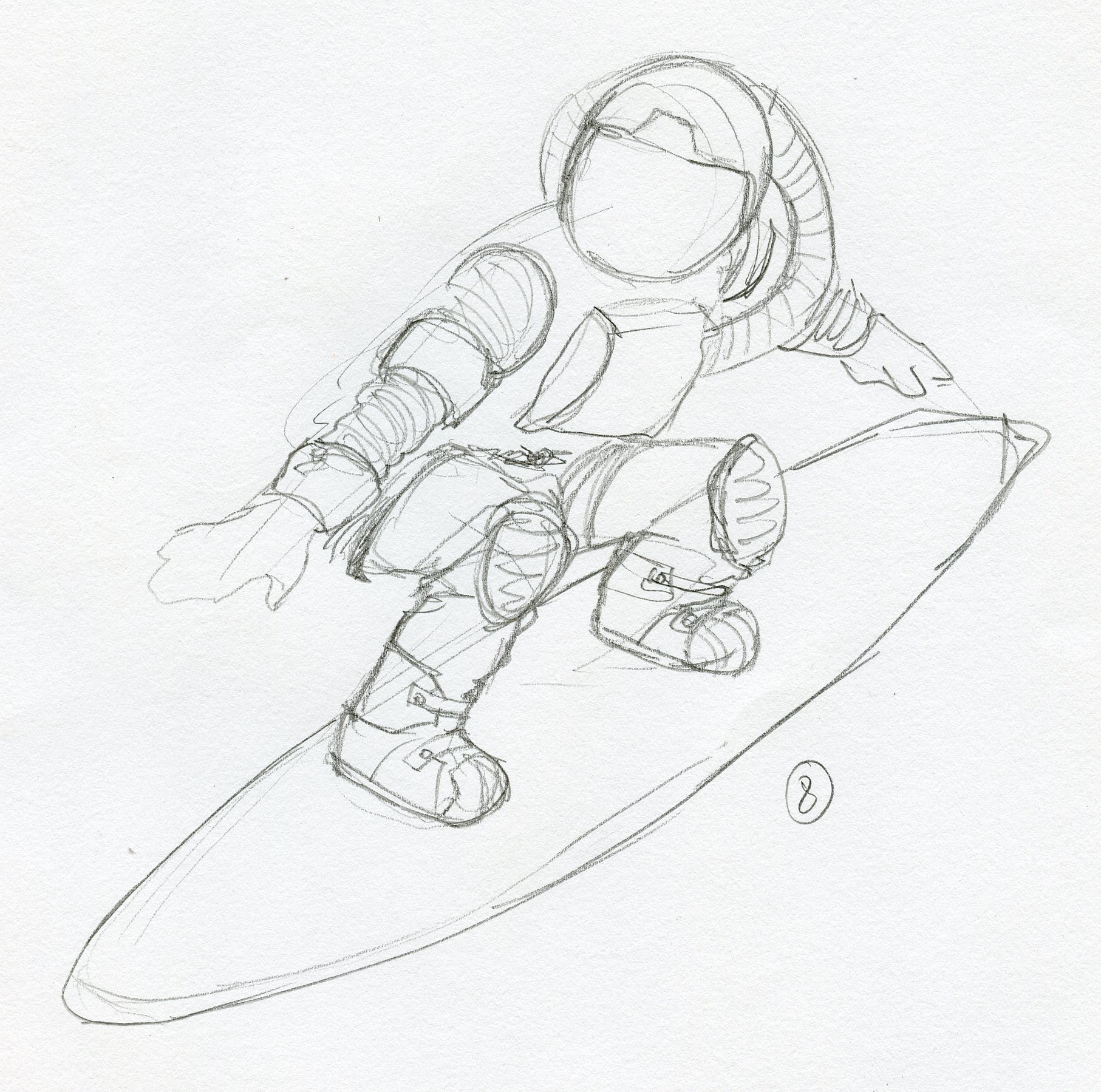
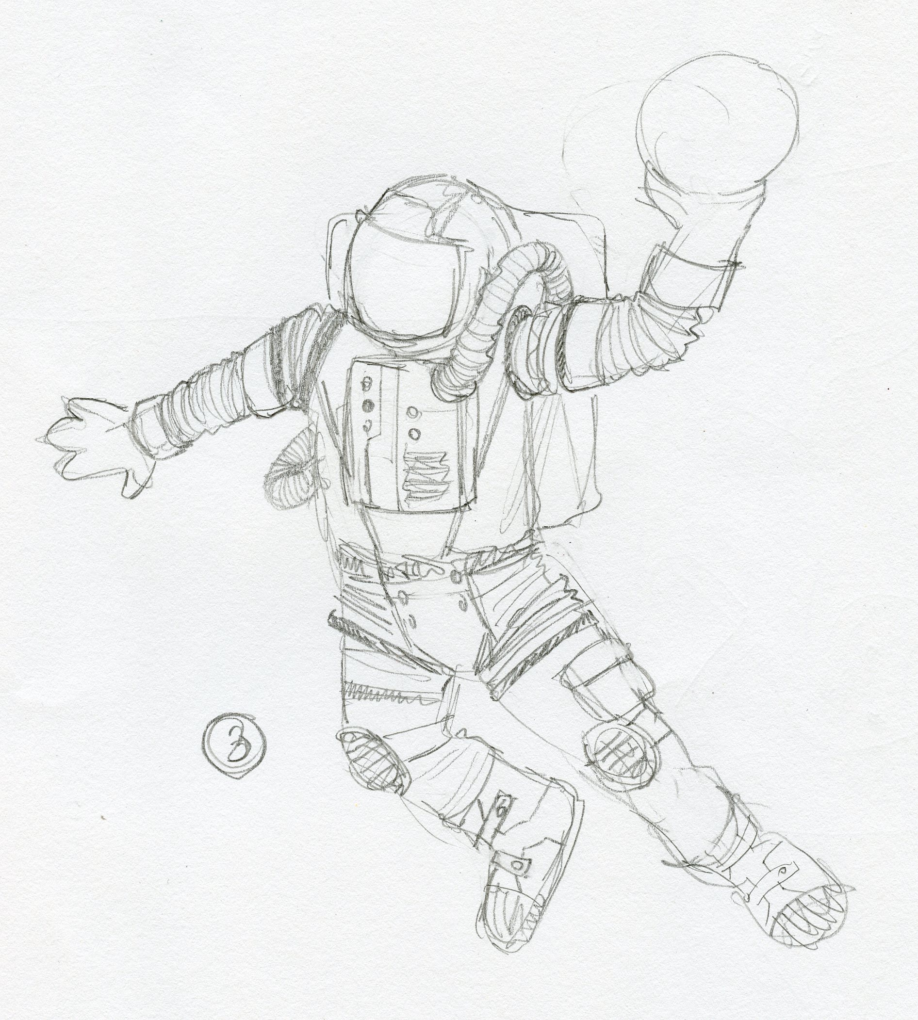
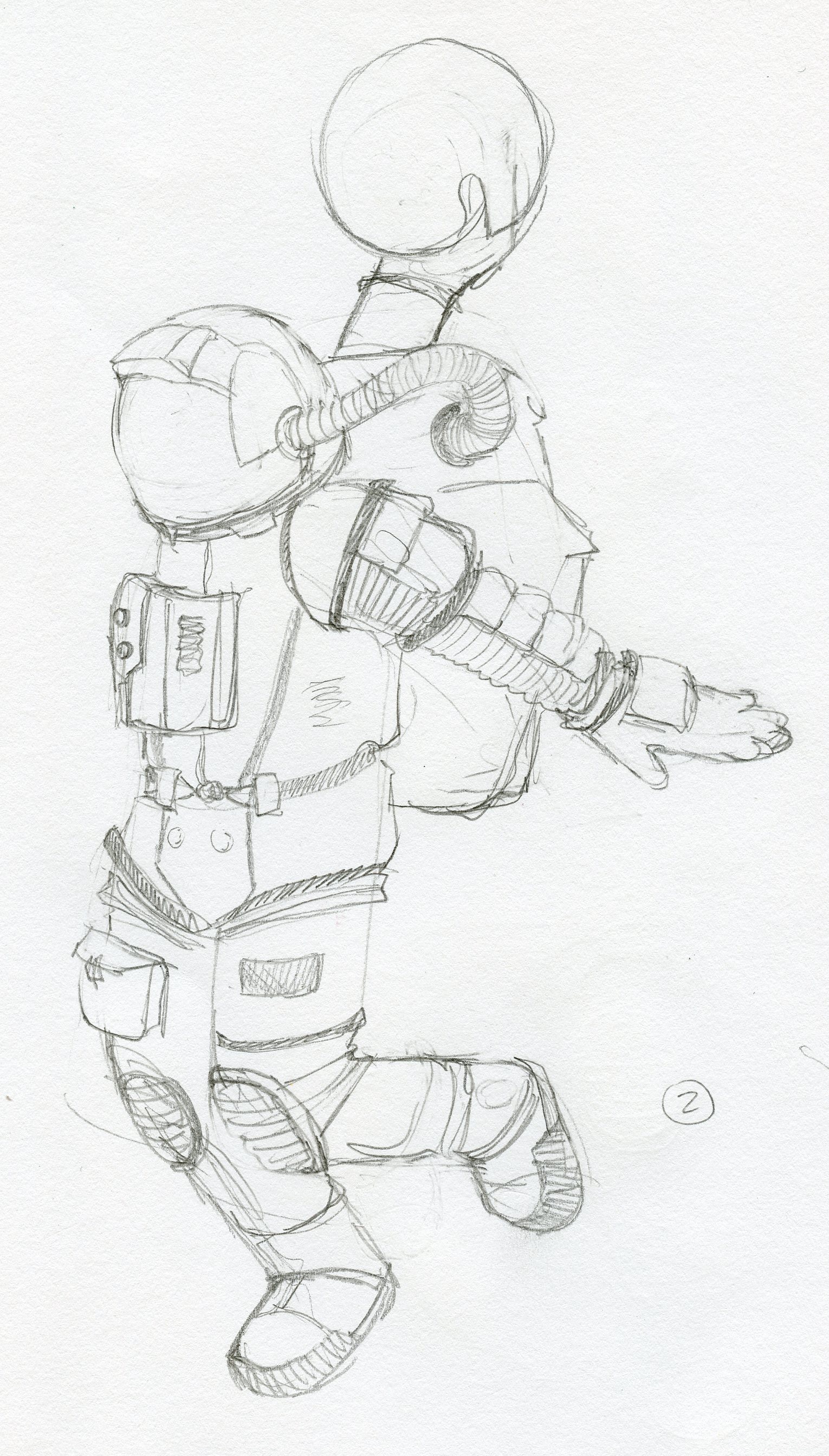
An integral part of our process is using rough concept sketches to align with our clients prior to developing refined illustrations or designs. It’s a great way to collaborate, allowing them to share their expertise and provide input for the creative direction of a project. This process is very efficient and allows us to move forward with minimal adjustments in the art development phase. Bottom line - we work side-by-side with our clients to ensure alignment throughout the creative process.
An integral part of our process is using rough concept sketches to align with our clients prior to developing refined illustrations or designs. It’s a great way to collaborate, allowing them to share their expertise and provide input for the creative direction of a project. This process is very efficient and allows us to move forward with minimal adjustments in the art development phase. Bottom line - we work side-by-side with our clients to ensure alignment throughout the creative process.

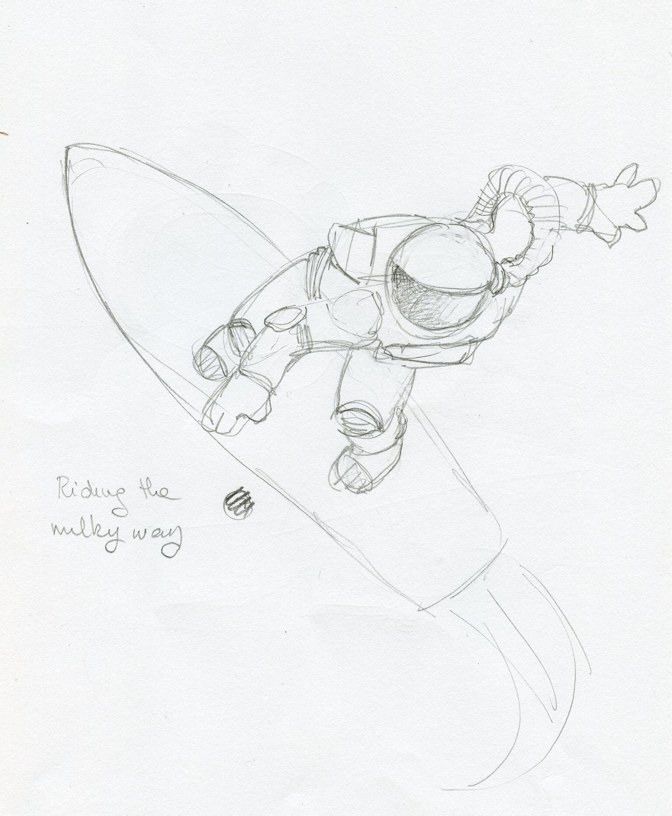

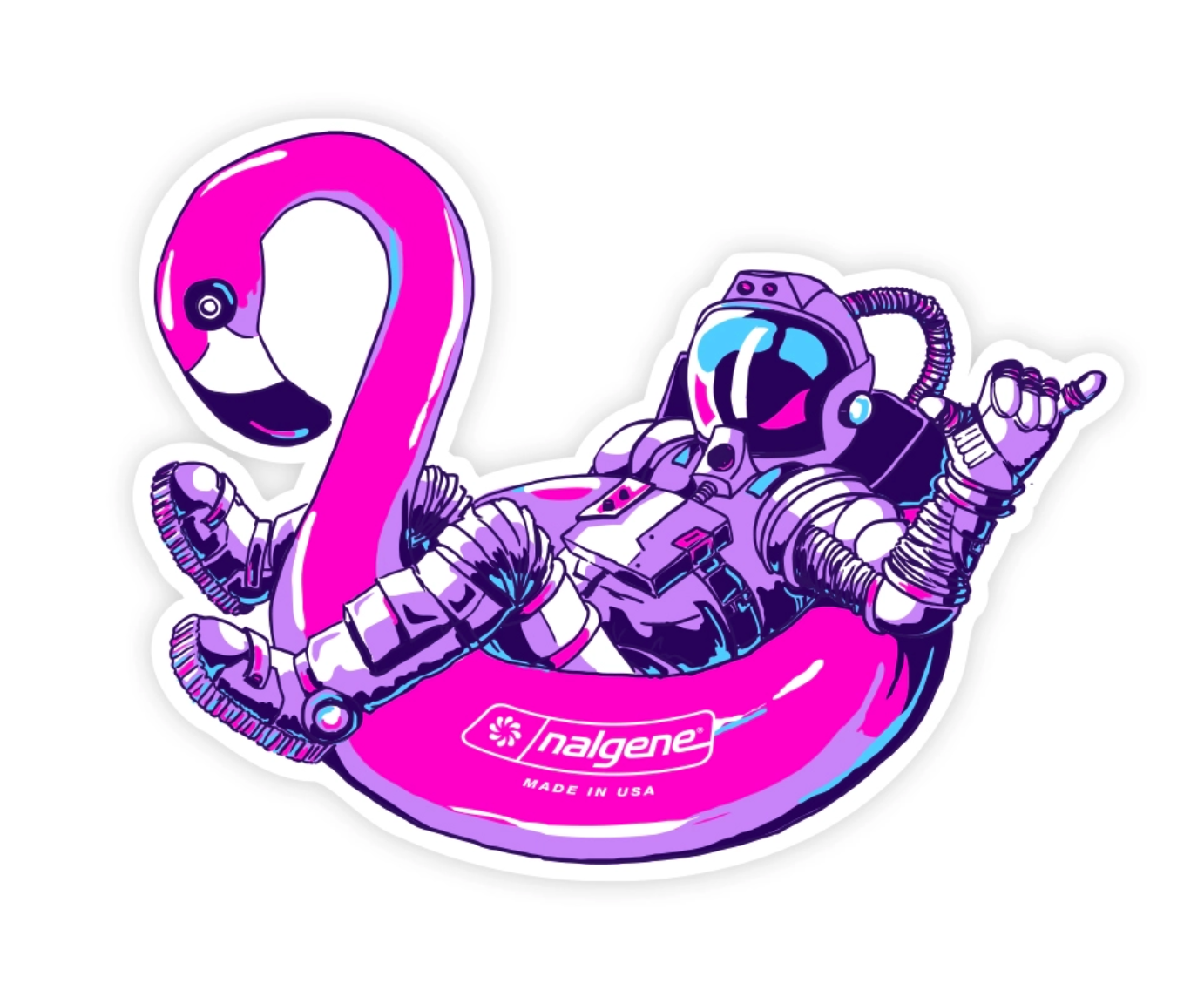
Final Illustrations
Final 3D Renderings
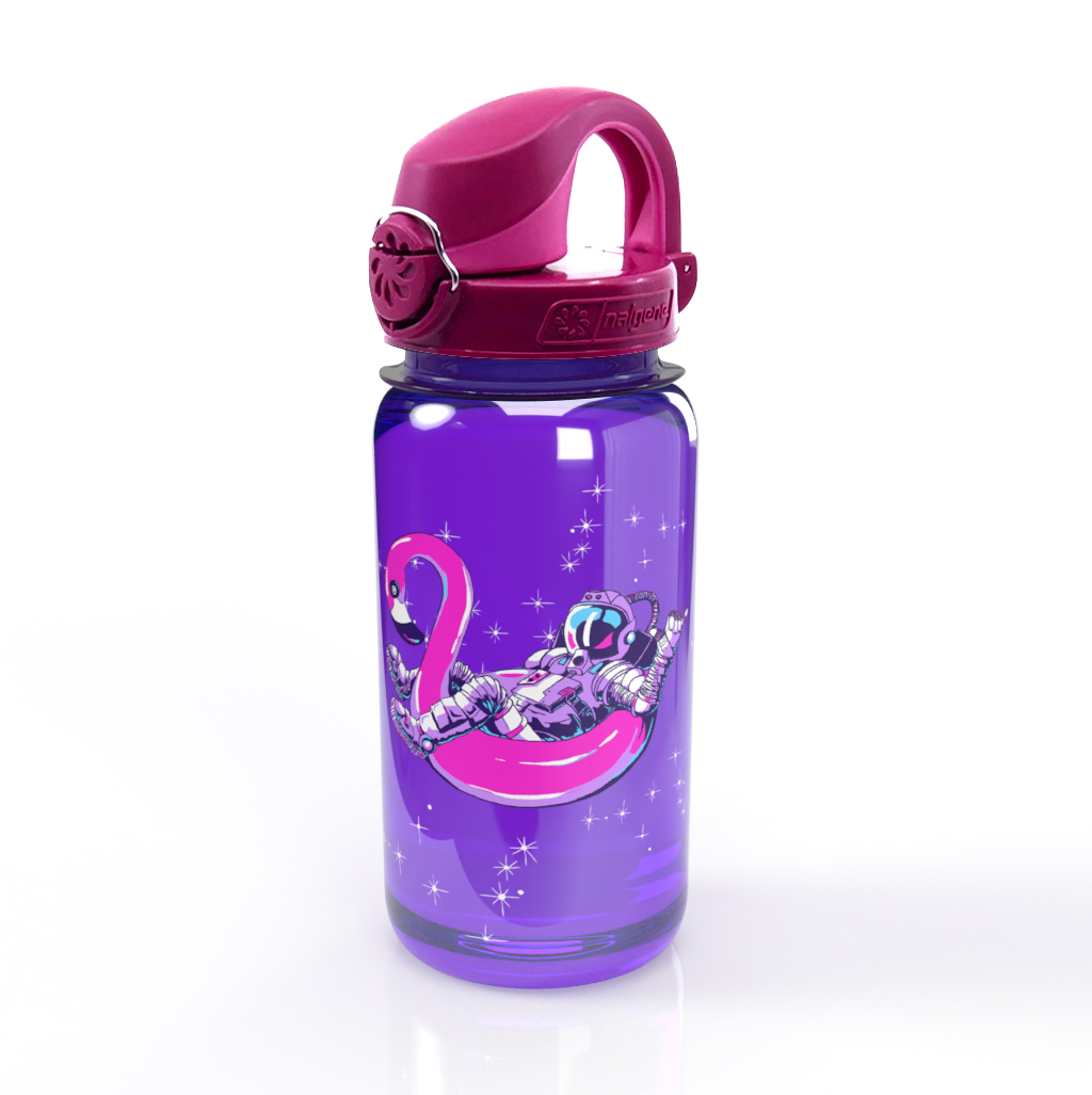


The illustrations were also
developed into bottle stickers.
developed into bottle stickers.

THE RESULT.
The Astronaut Athlete series launched on time, as part of their back-to-school promotion. There are some great online reviews like this:
The Astronaut Athlete series launched on time, as part of their back-to-school promotion. There are some great online reviews like this:
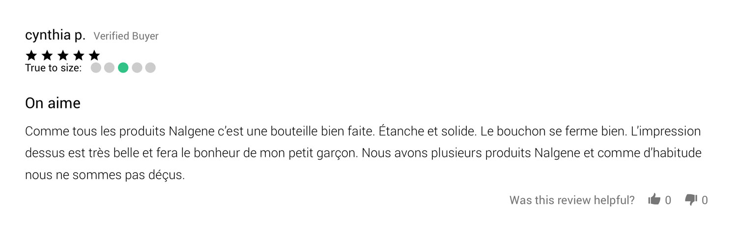
“Like all Nalgene products this is a well made bottle. Waterproof and strong. The cap closes well. The print on it is very beautiful and will make my little boy happy. We have several Nalgene products and as usual we are not disappointed.”


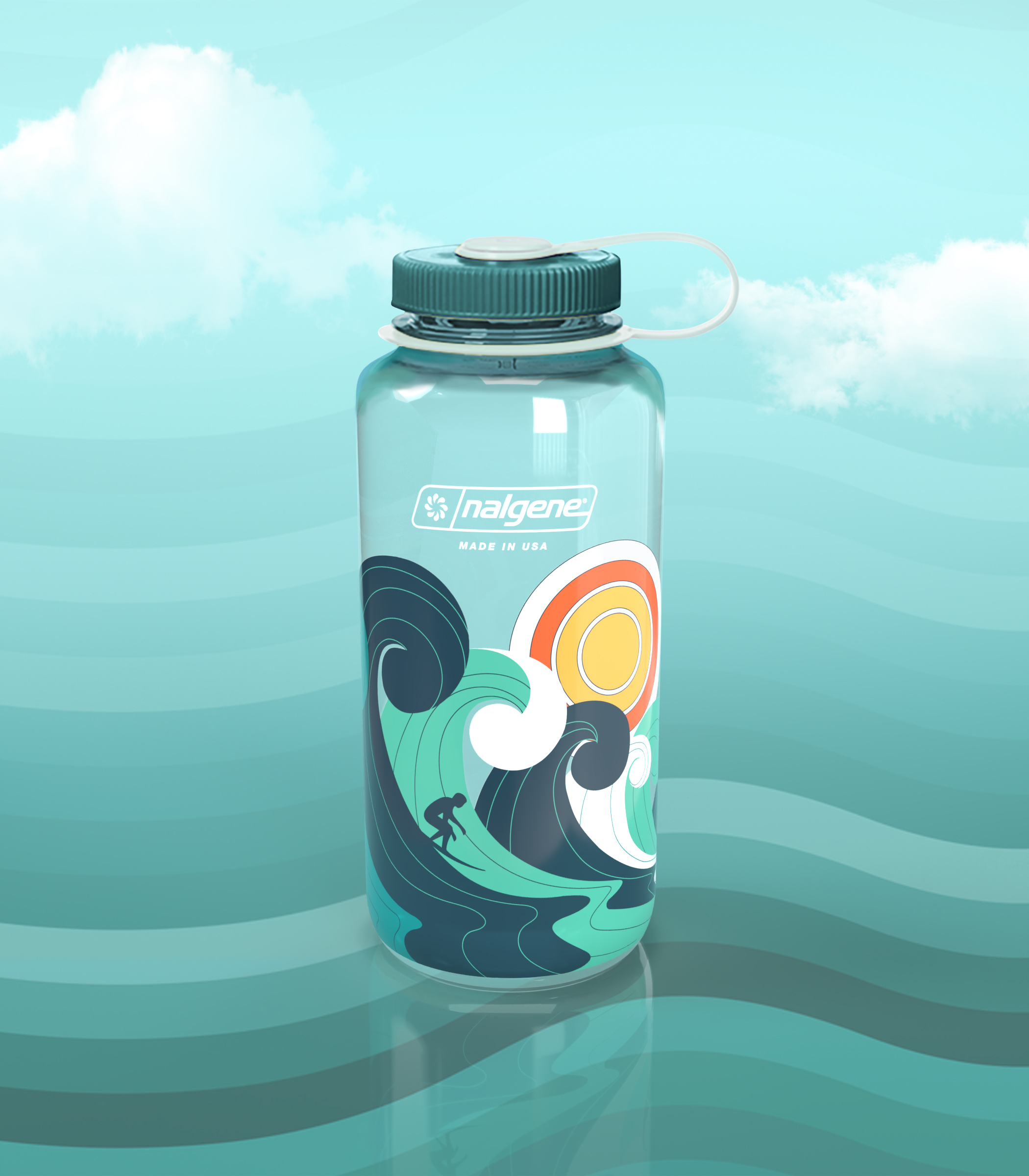
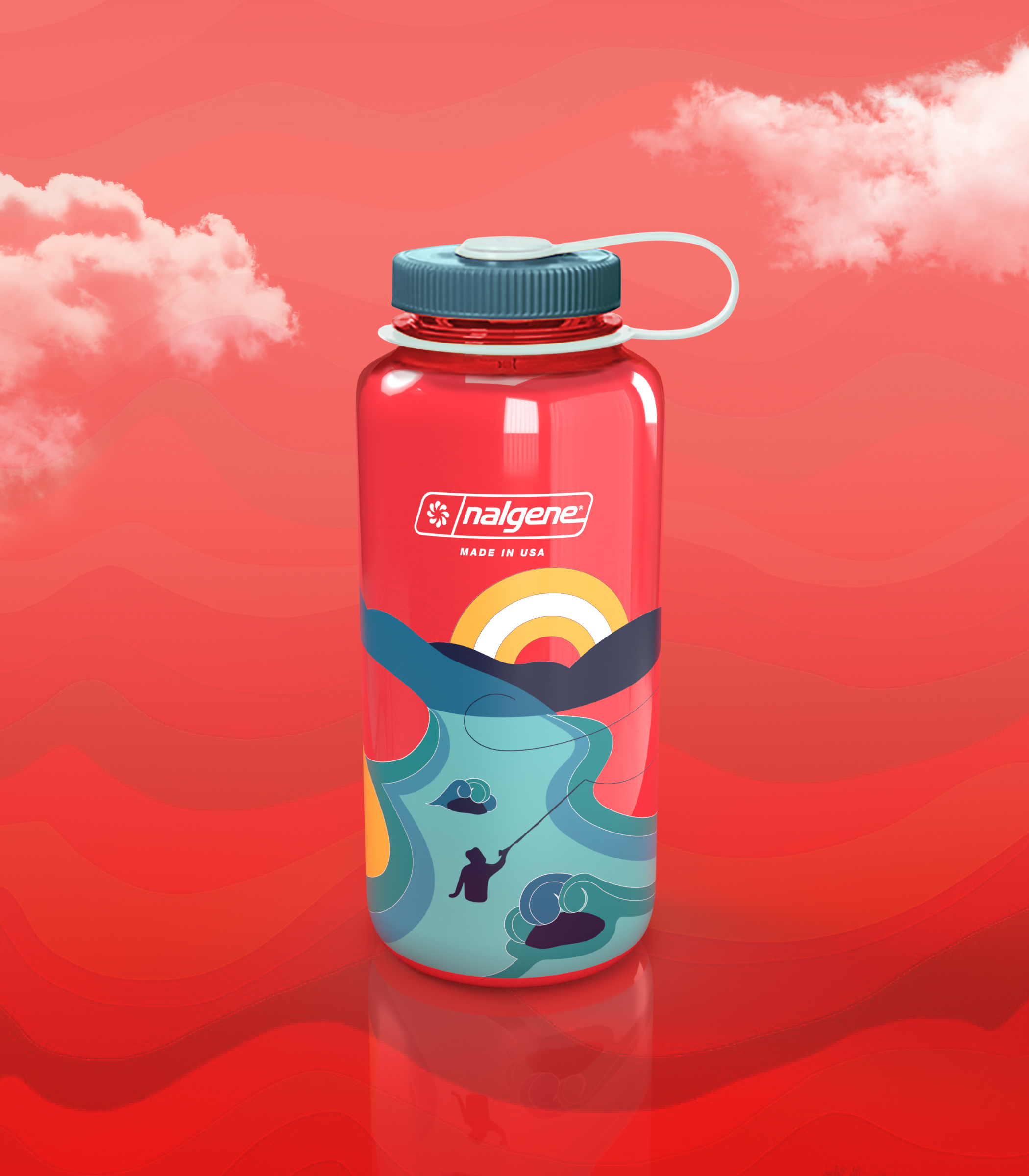
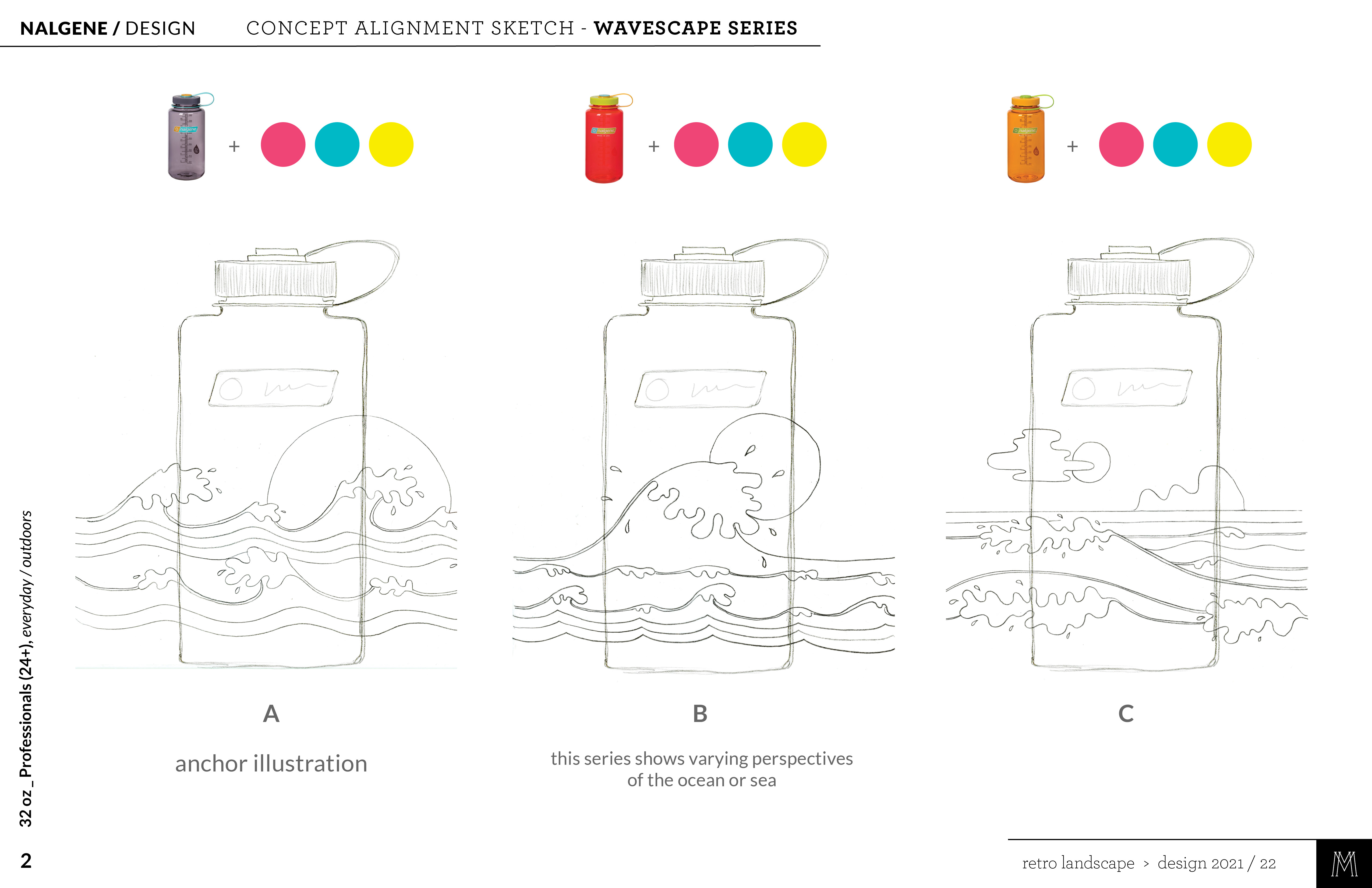
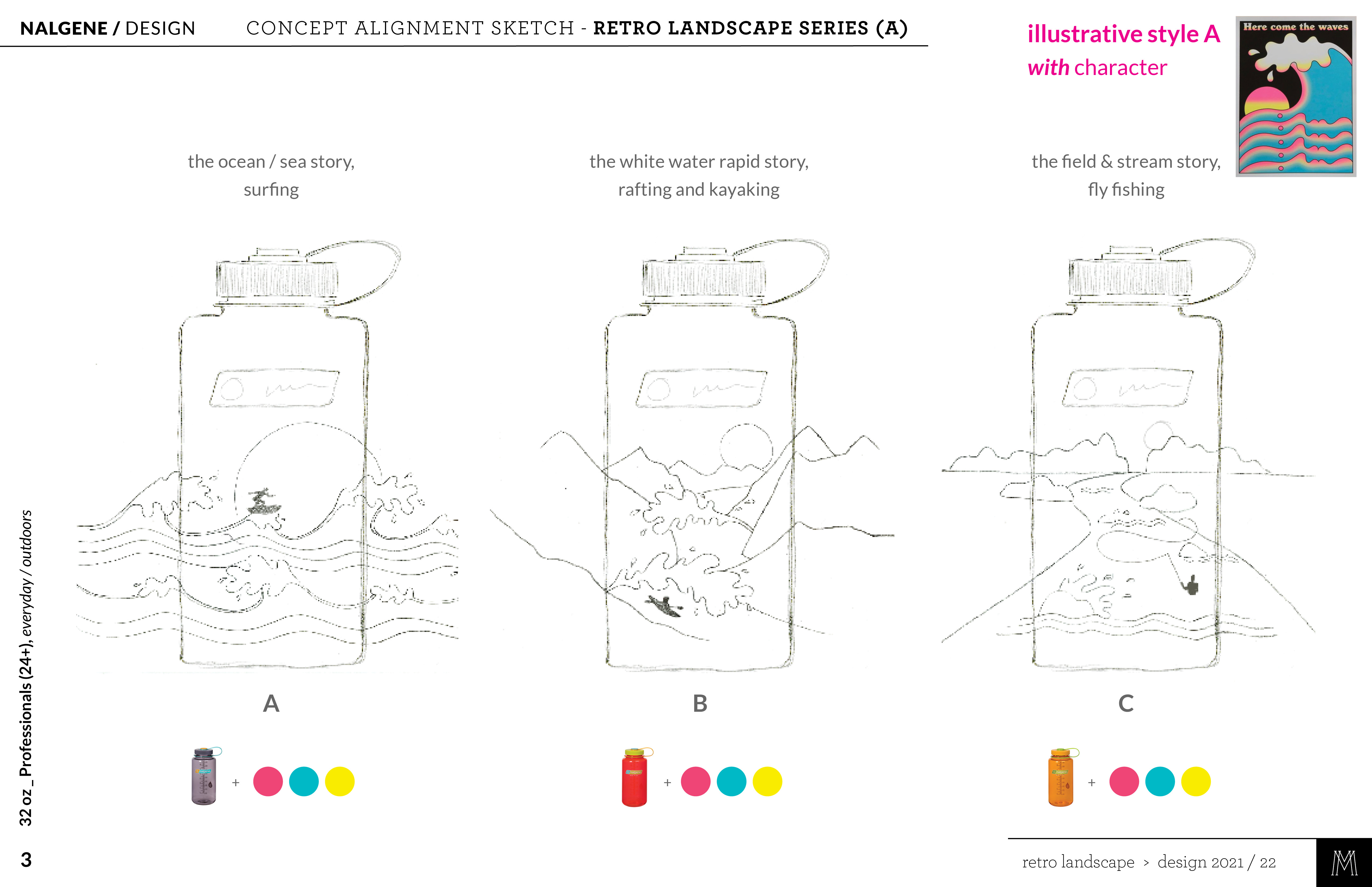
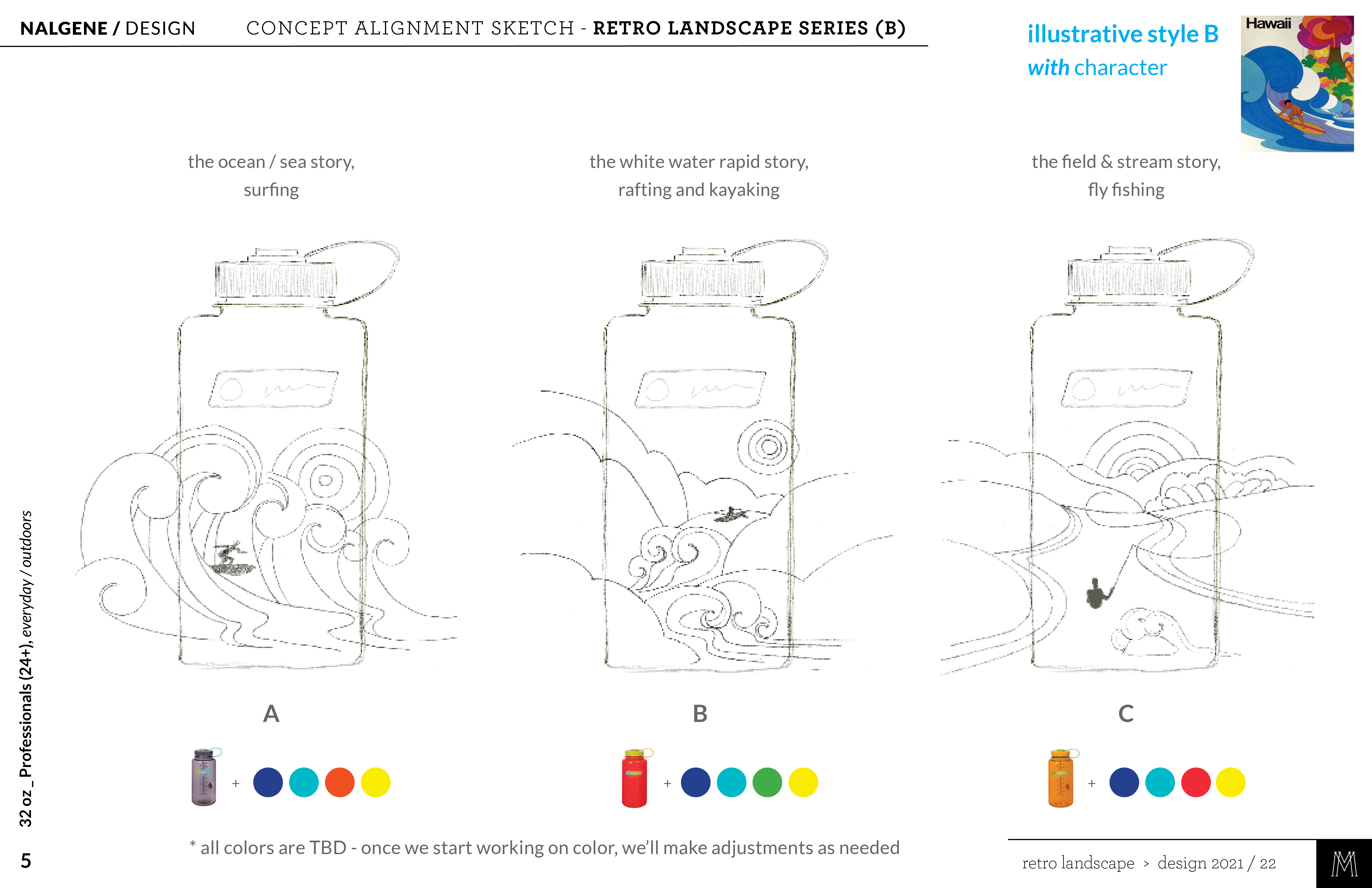
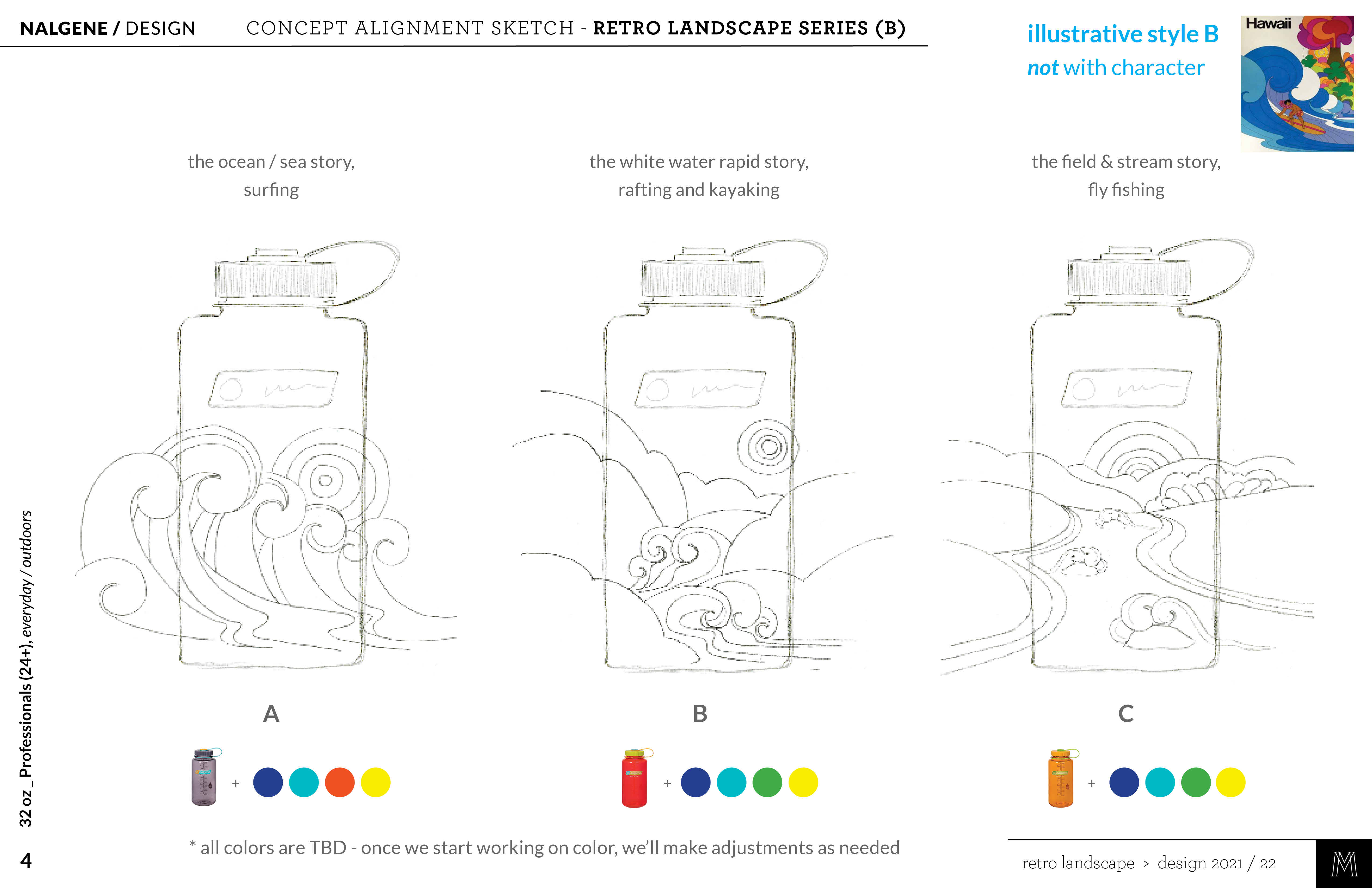
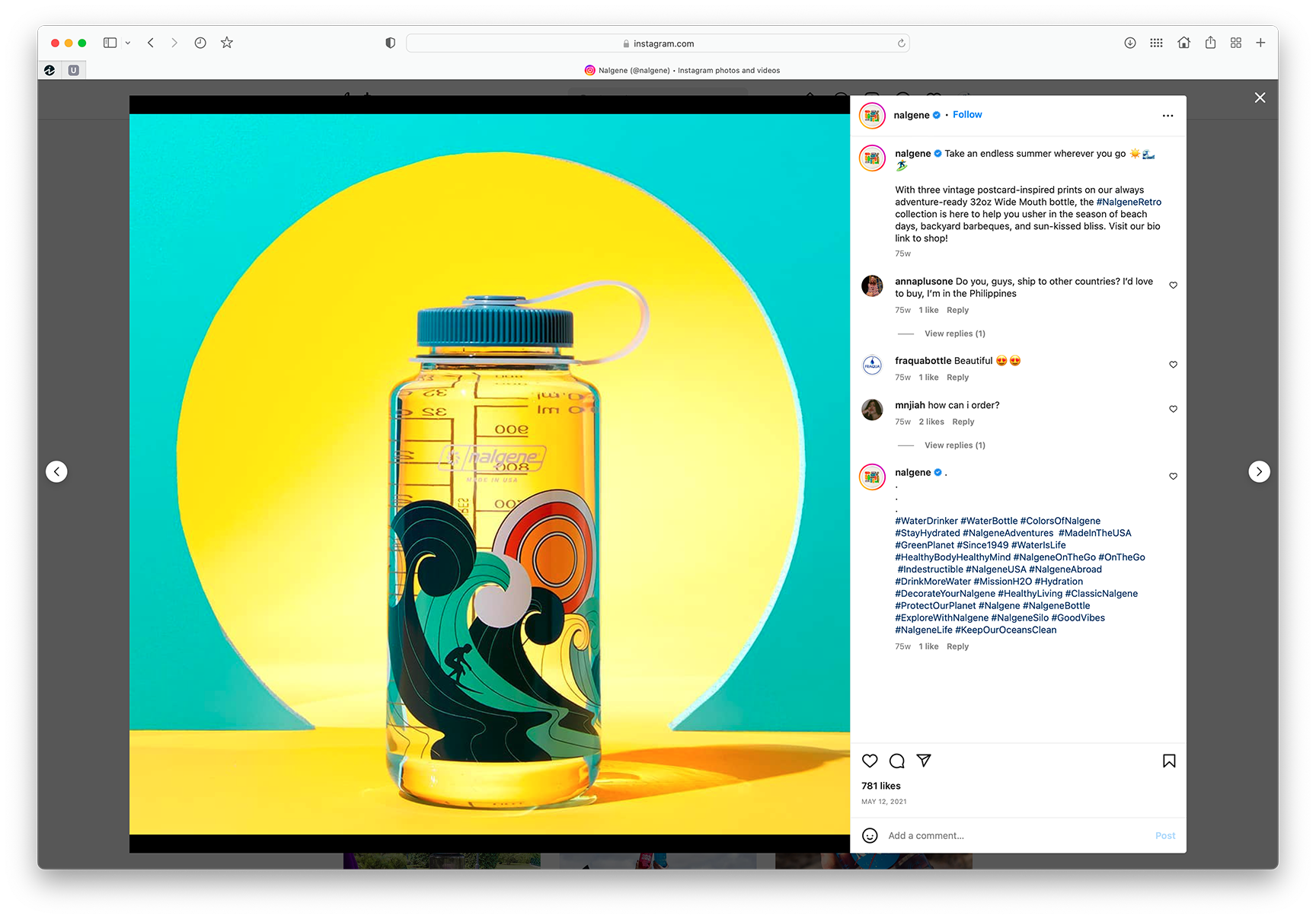
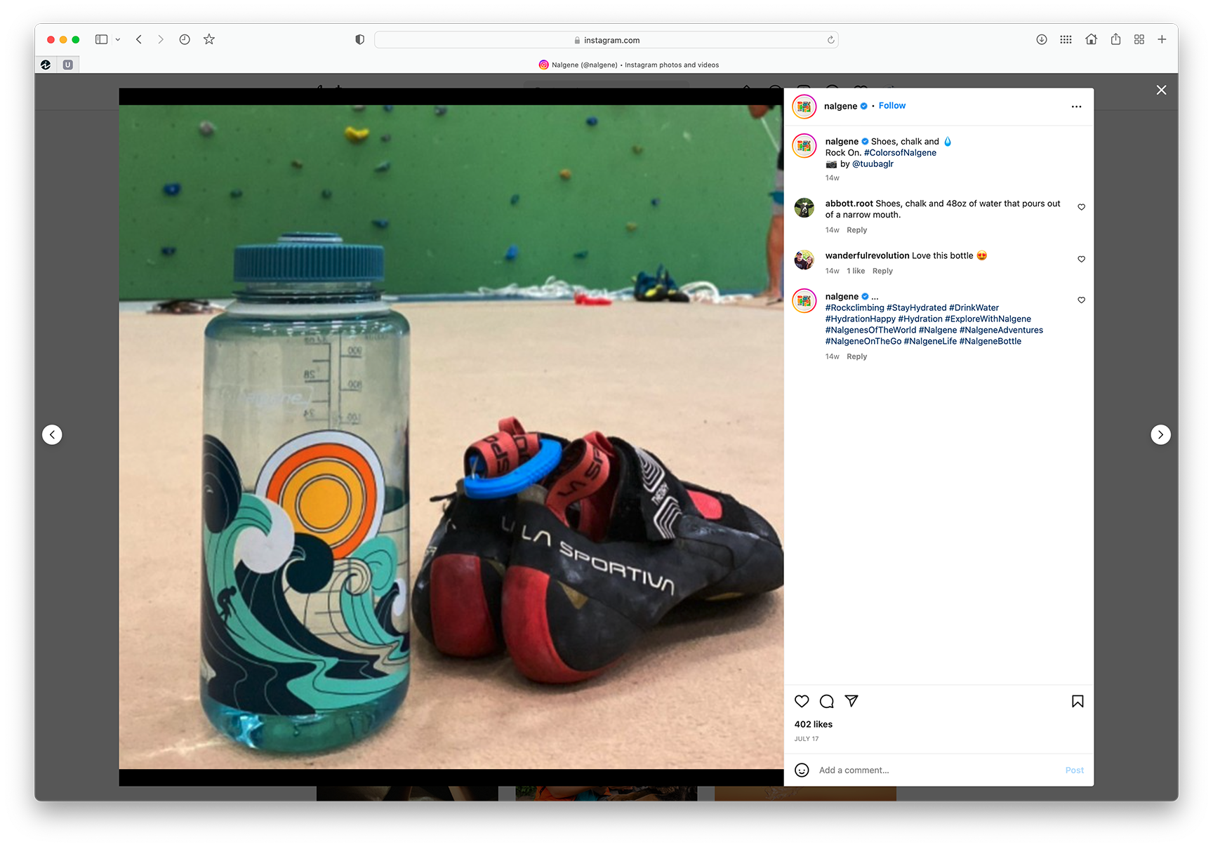
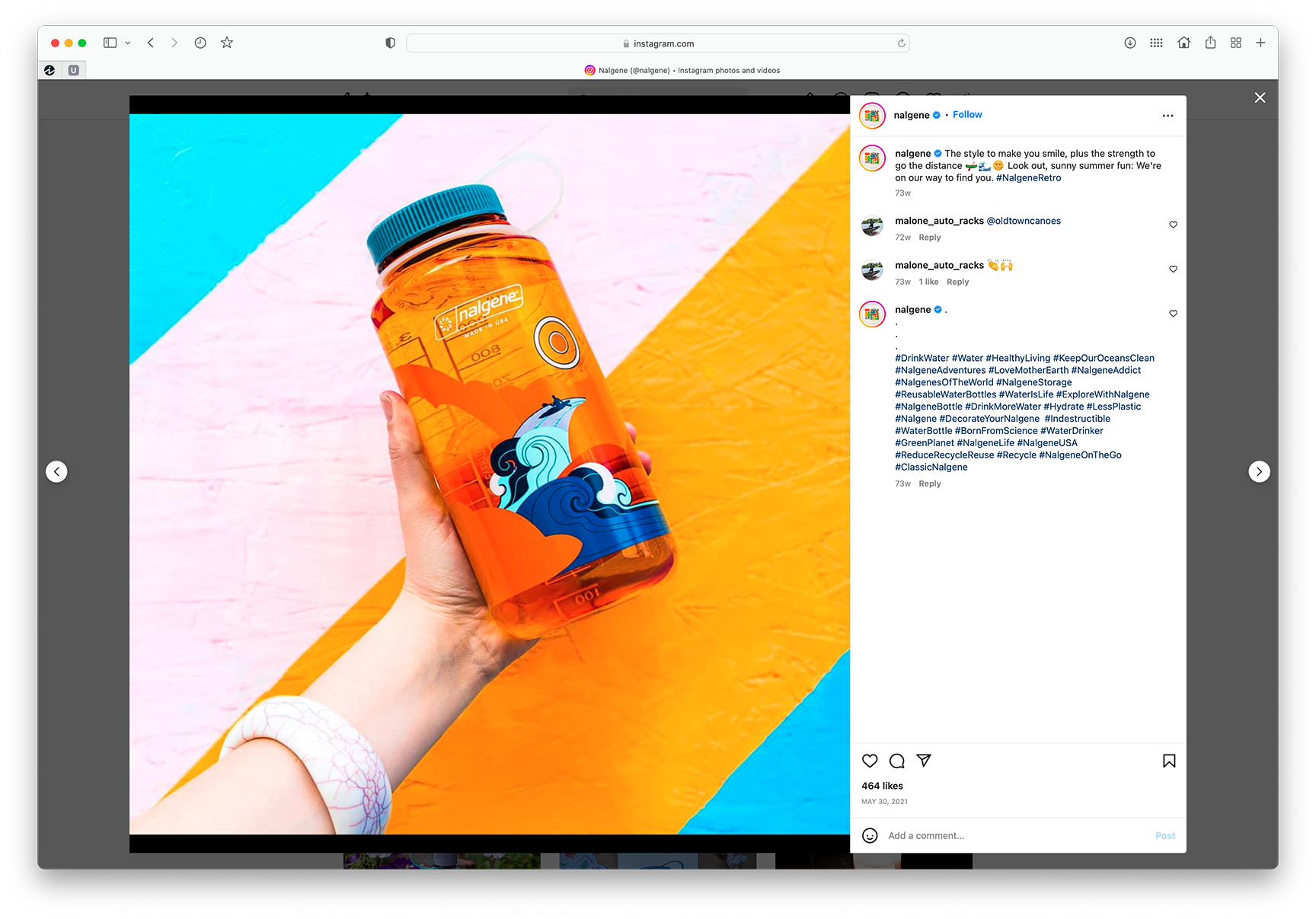
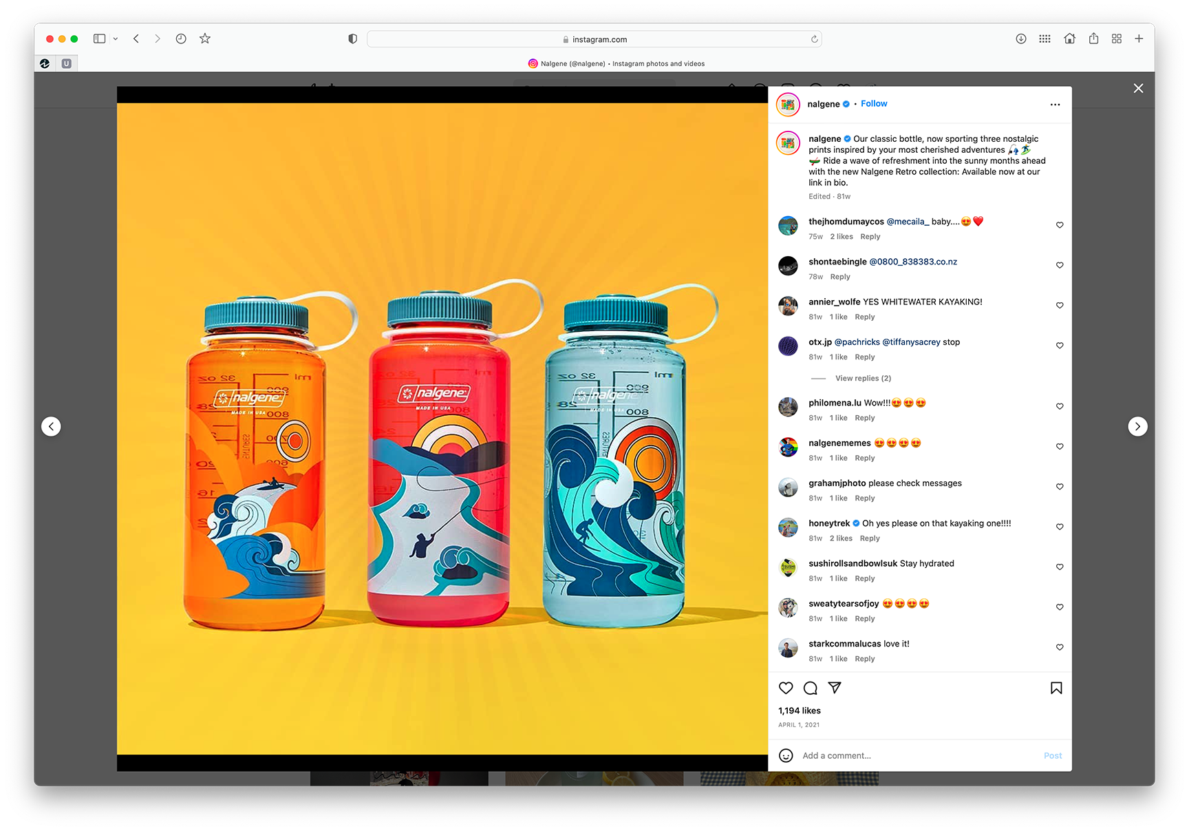
NALGENE / Retro Collection
SHORT BRIEF.
The marketing team at engaged us to conduct trend research on content, design and illustrative styles to be developed into new bottle collections over the next few years. One of several target groups was professionals (24+) and the work for this key demo focused around their iconic 32oz bottles. The Nalgene team intentionally left the brief open and flexible during the research phase.
The marketing team at engaged us to conduct trend research on content, design and illustrative styles to be developed into new bottle collections over the next few years. One of several target groups was professionals (24+) and the work for this key demo focused around their iconic 32oz bottles. The Nalgene team intentionally left the brief open and flexible during the research phase.
WHAT WE DID.
Altogether we identified 20 distinct trends that fit within their design strategy, 4 of which were aimed at the 24+ age group. With their marketing team’s input we narrowed down to the 5 illustrative concepts that best fit their long-term design strategy for the brand across a range of target audiences. The Retro collection below is one of those 5 selected design directions.
Project Deliverables:
• Trend Research & Analysis
• Custom Illustrations
• 3D Renderings

RESEARCH + ALIGNMENT SKETCHES
A key part of our process is using preliminary concept sketches to align with our clients prior to developing refined illustrations. It’s a great way to collaborate with the client, allowing them to share their expertise and make key decisions for the illustrations that ultimately become an expression of their brand.
We’re also typically working on short timelines, so it’s crucial that we get the work correct in the first pass or with minimal adjustments. We bring the client along on the creative journey, which ensures alignment along the way.


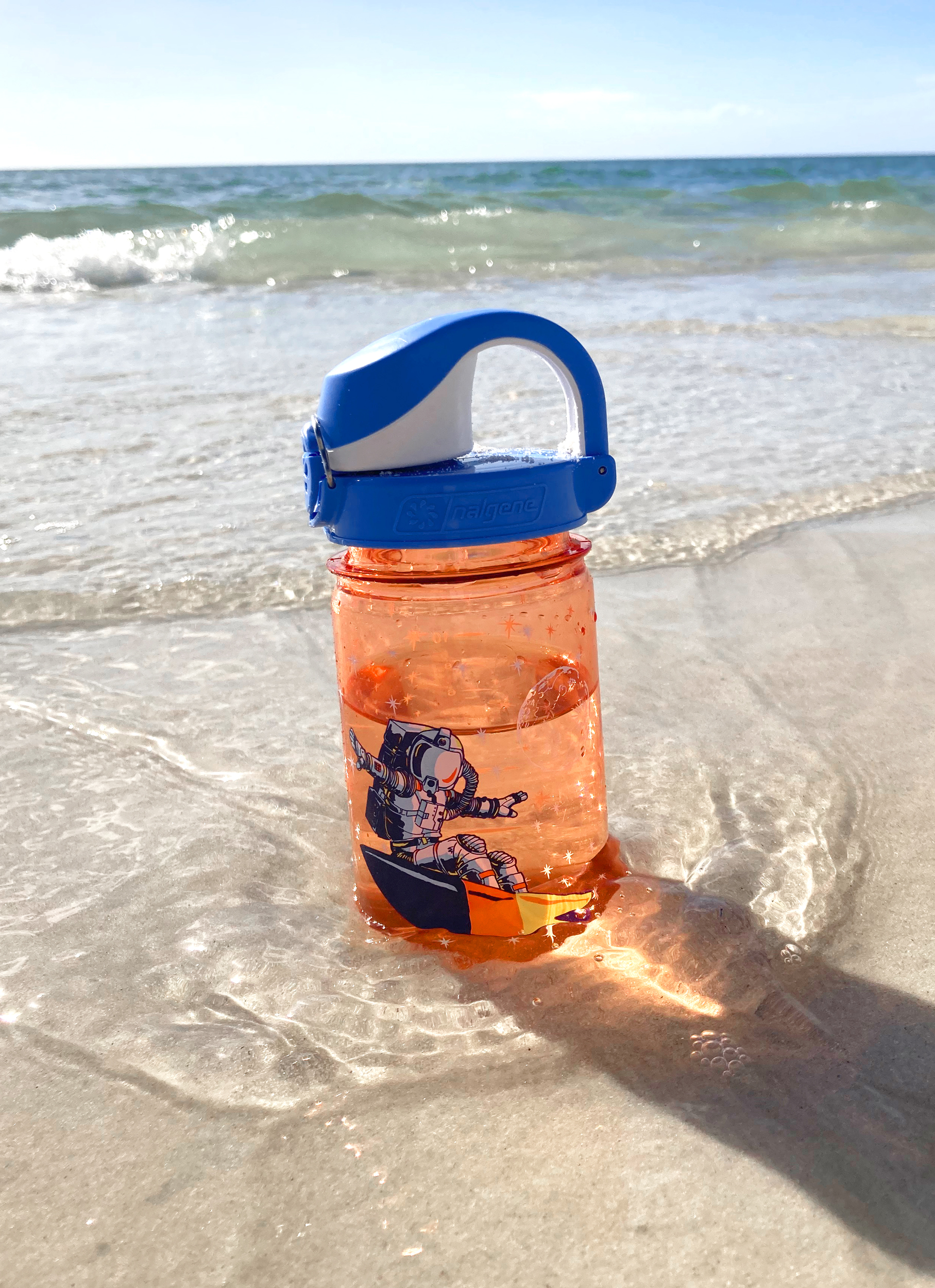
SOCIAL MEDIA
As Nalgene brand loyalists purchased their new bottles, they posted on social media to show off their new score. Plus some Nalgene brand posts!
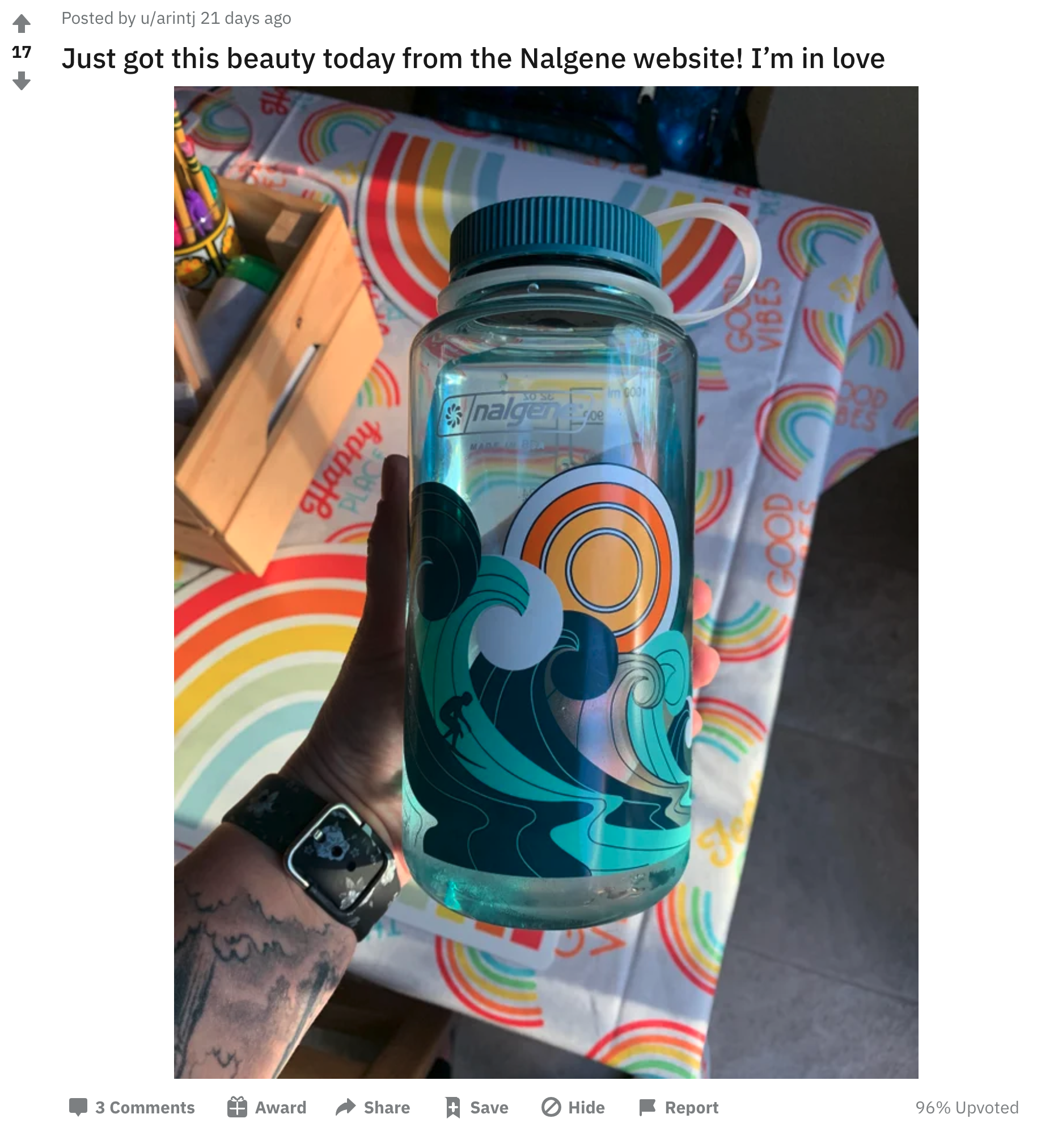
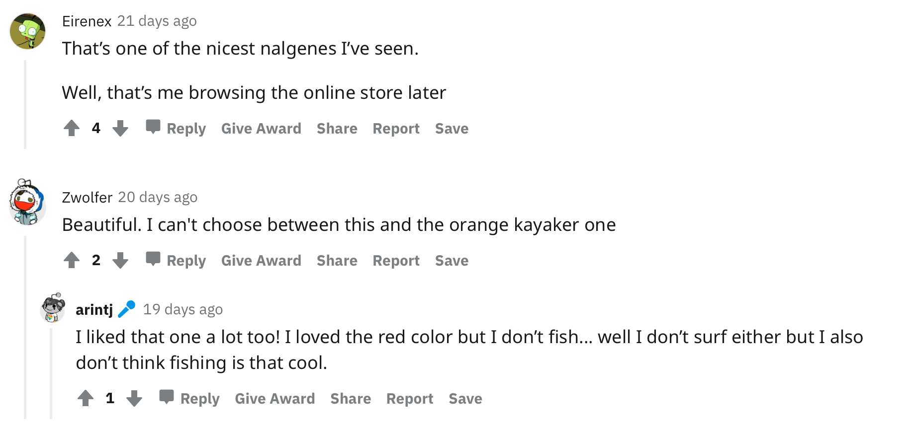
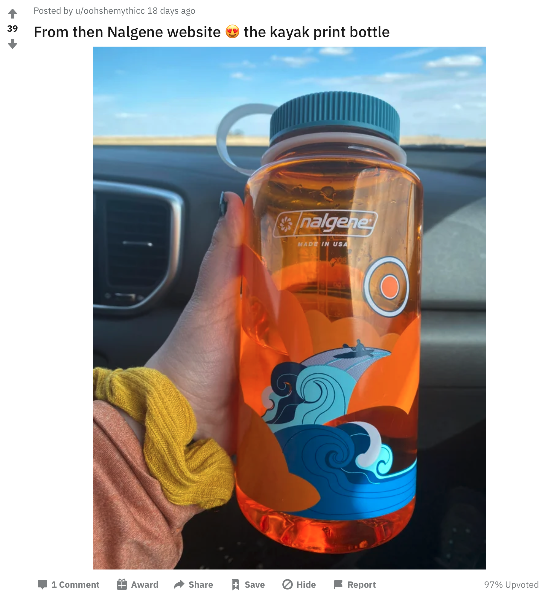

NALGENE’S WEBSITE

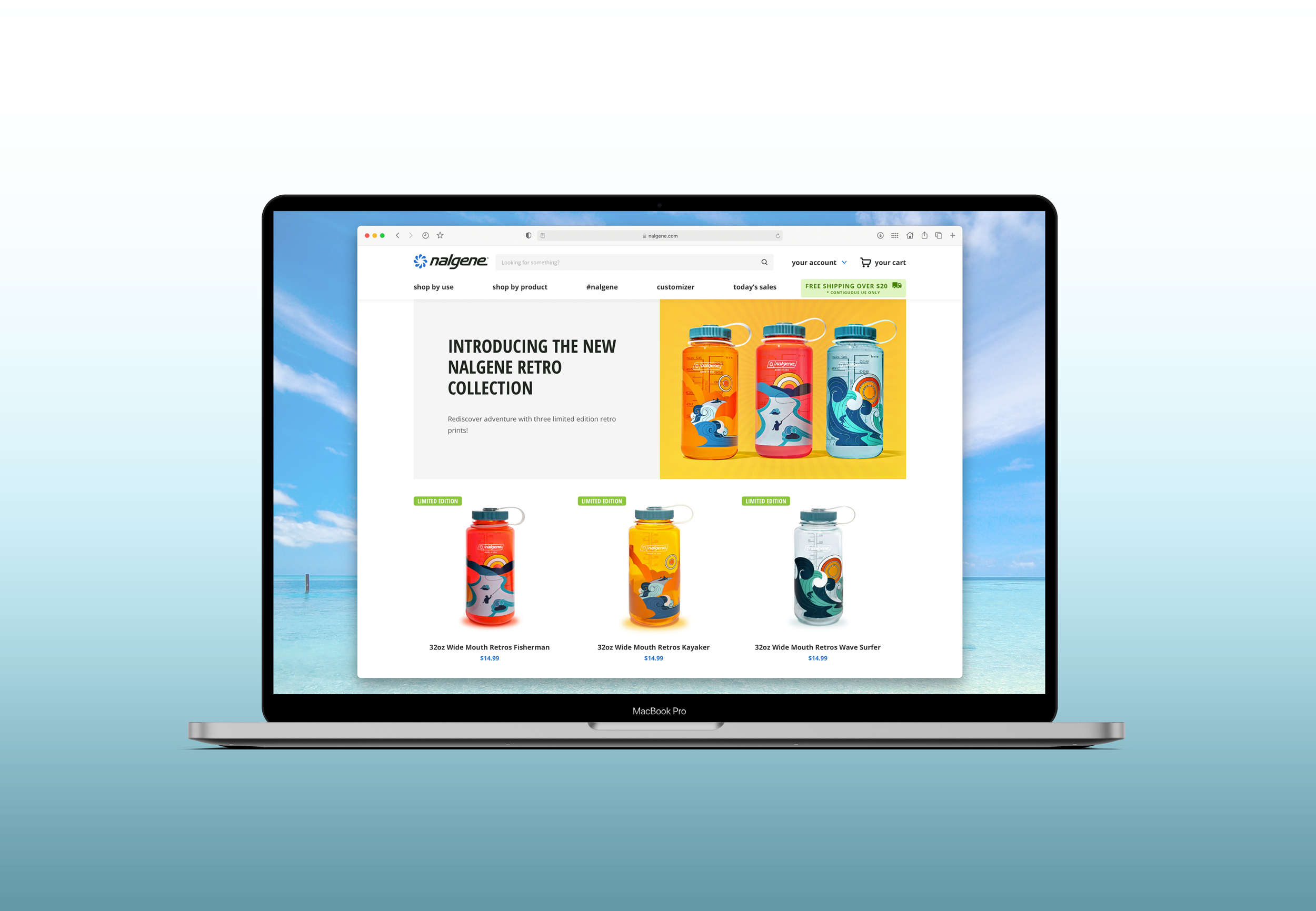
ADD’L SOCIAL POSTS

NALGENE / DSG’s Workout Bottles
THE BRIEF.
Develop various bottle collections to pitch to Dick’s Sporting Goods. Their Marketing team provided specific briefs, one of which focused on motivational sayings for those of you heading to the gym to get pumped up.
Develop various bottle collections to pitch to Dick’s Sporting Goods. Their Marketing team provided specific briefs, one of which focused on motivational sayings for those of you heading to the gym to get pumped up.
WHAT WE DID.
With research, we offered a variety of styles for the type treatment as well as a mix of proverbs to get folks psyched up to visit the gym and sweat. The Nalgene team ultimately landed on the final versions below.
Project Deliverables:
• Trend Research & Analysis
• Custom Type Treatments
• 3D Renderings


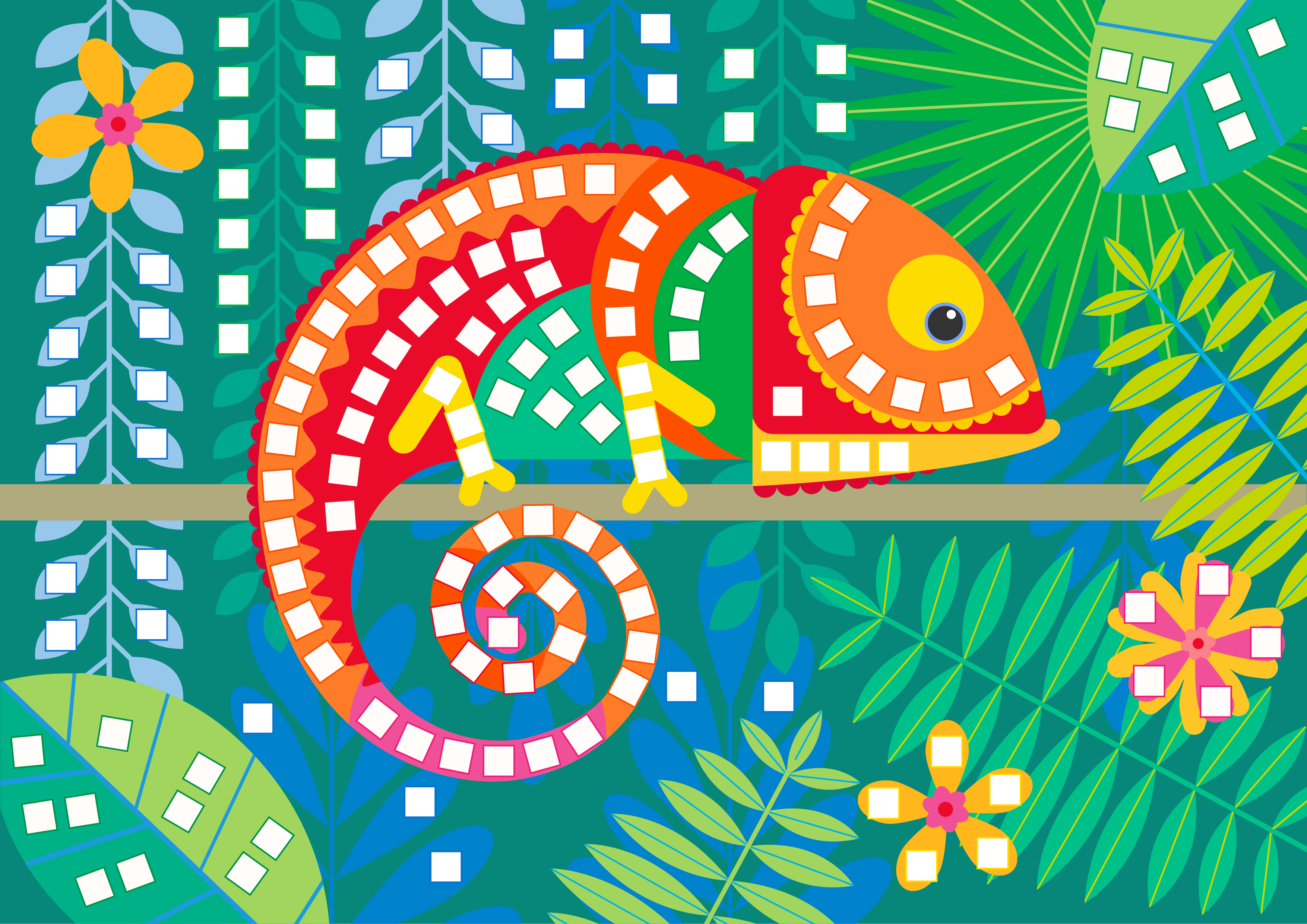
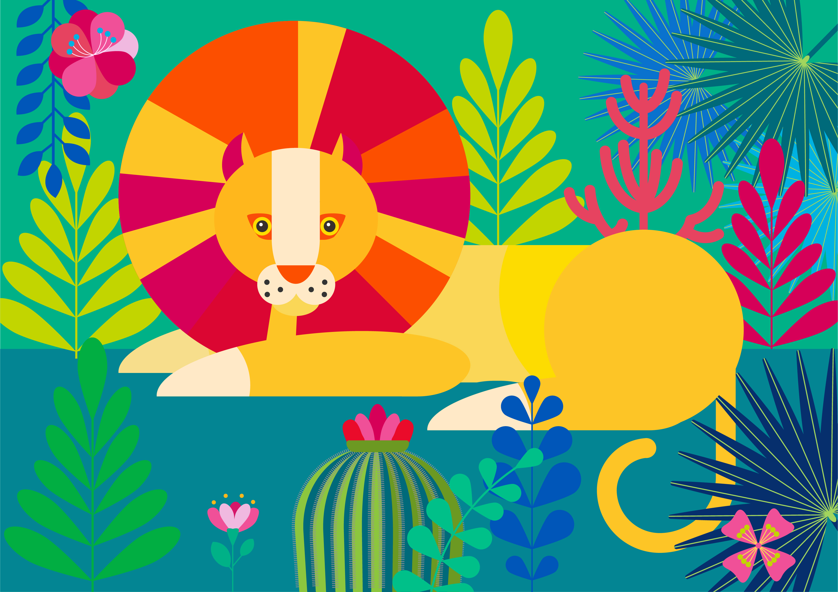
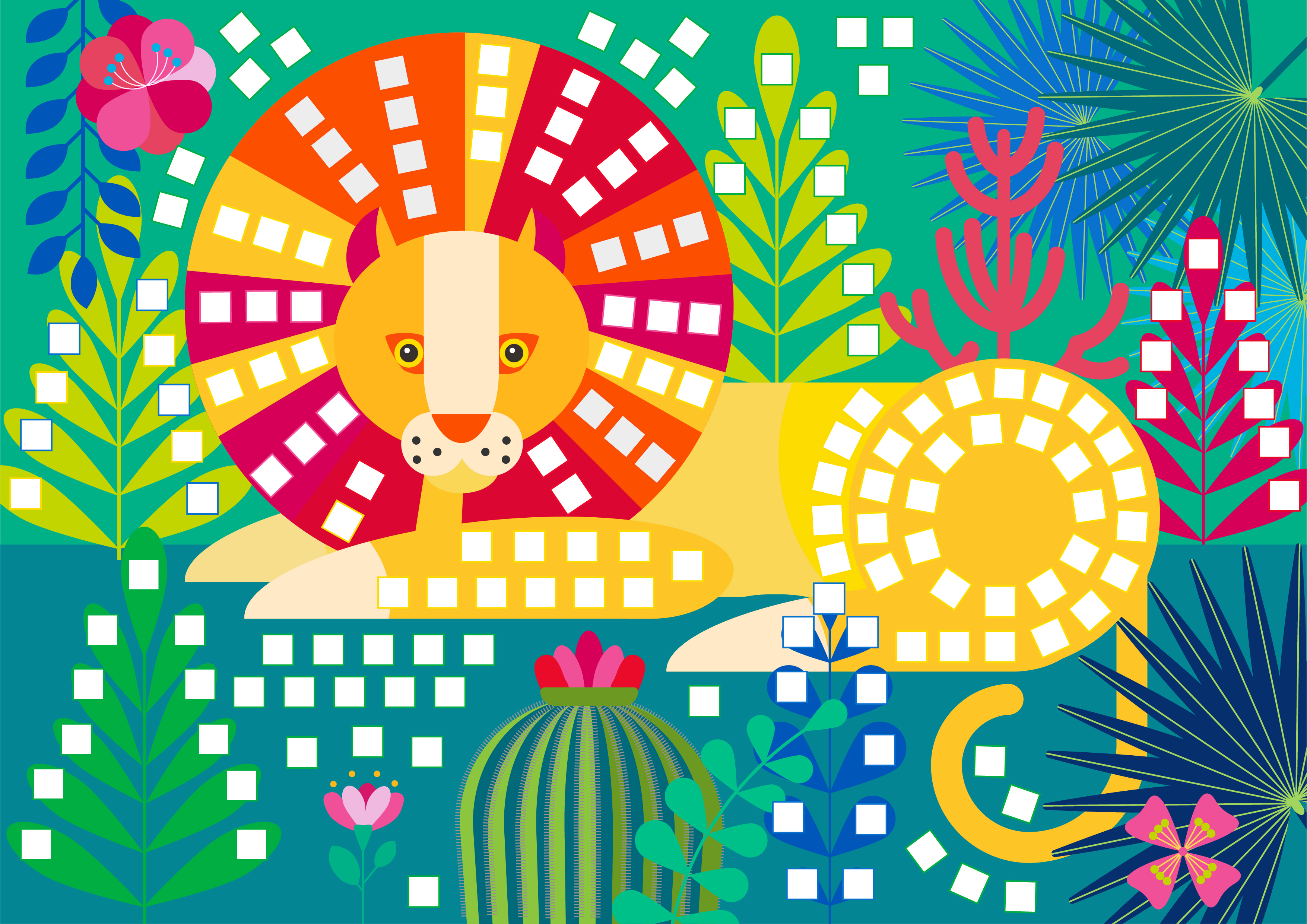
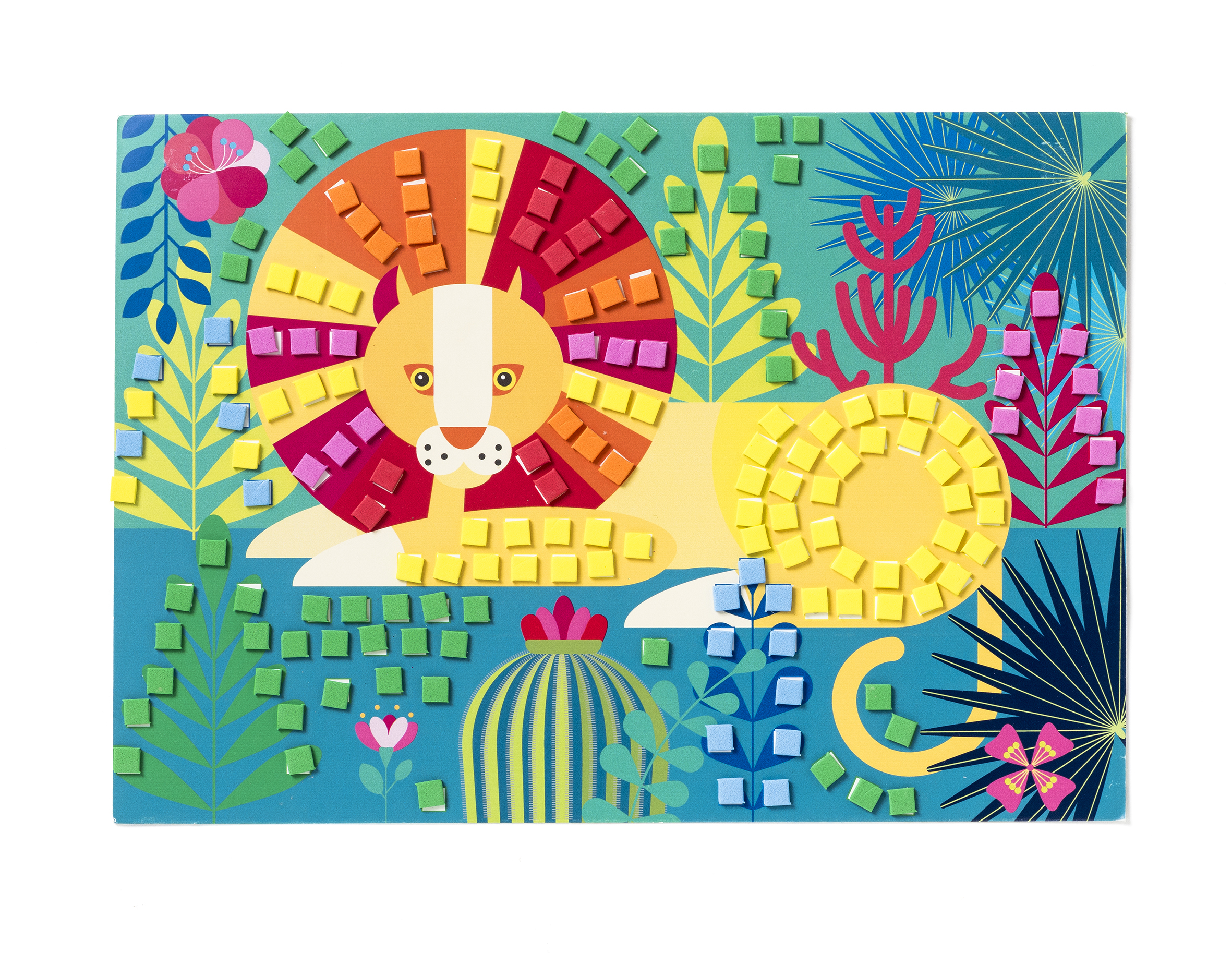
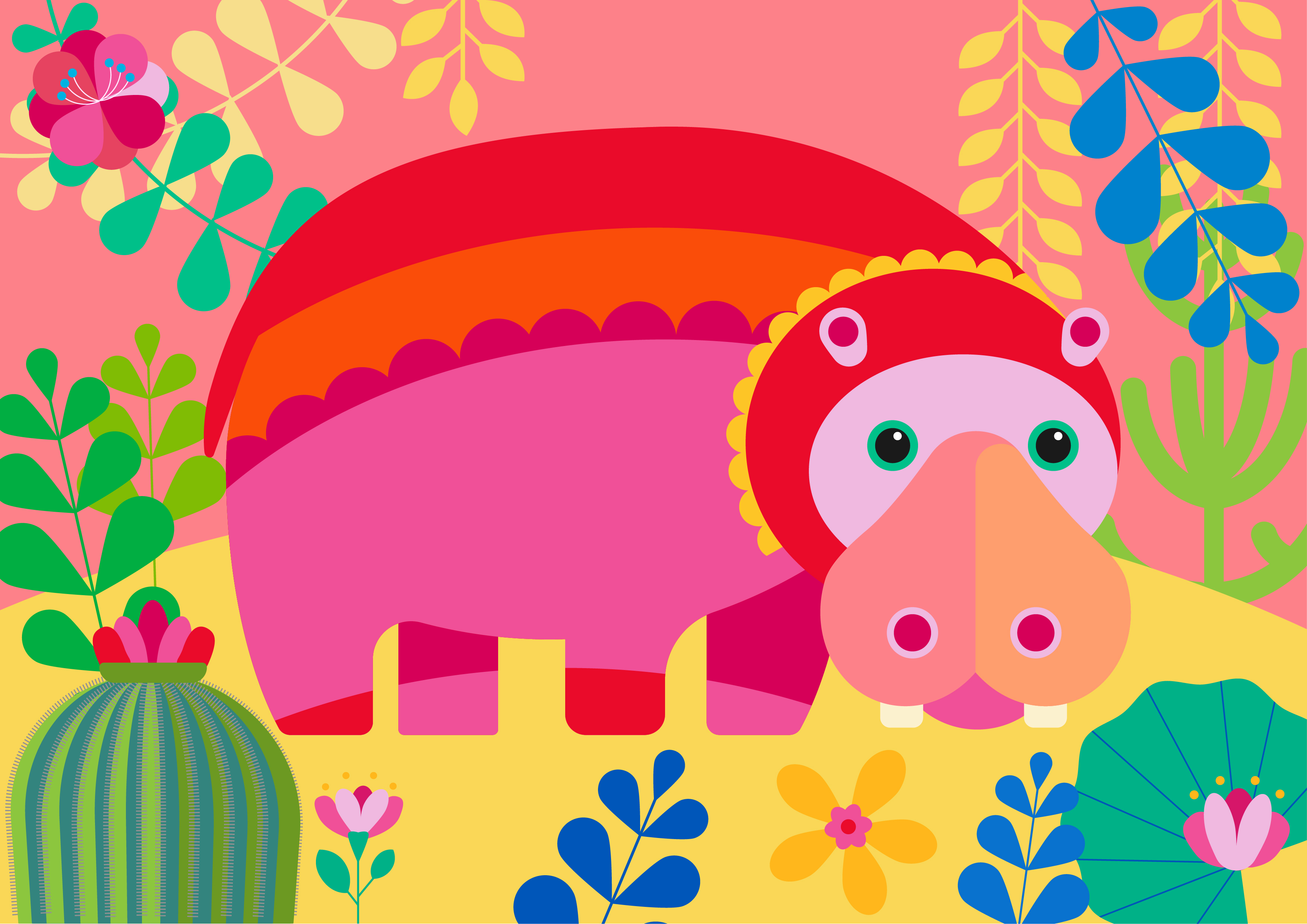
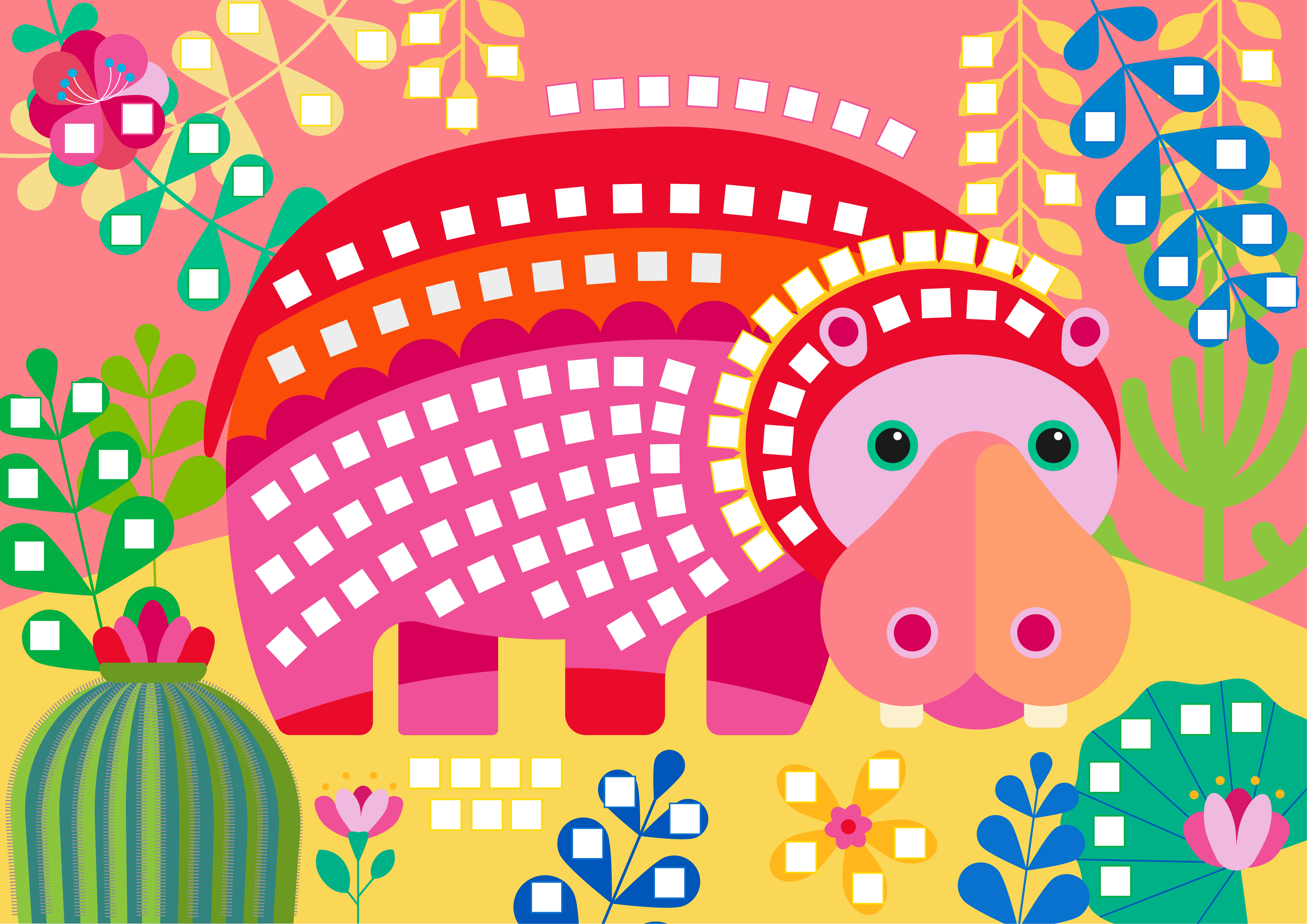
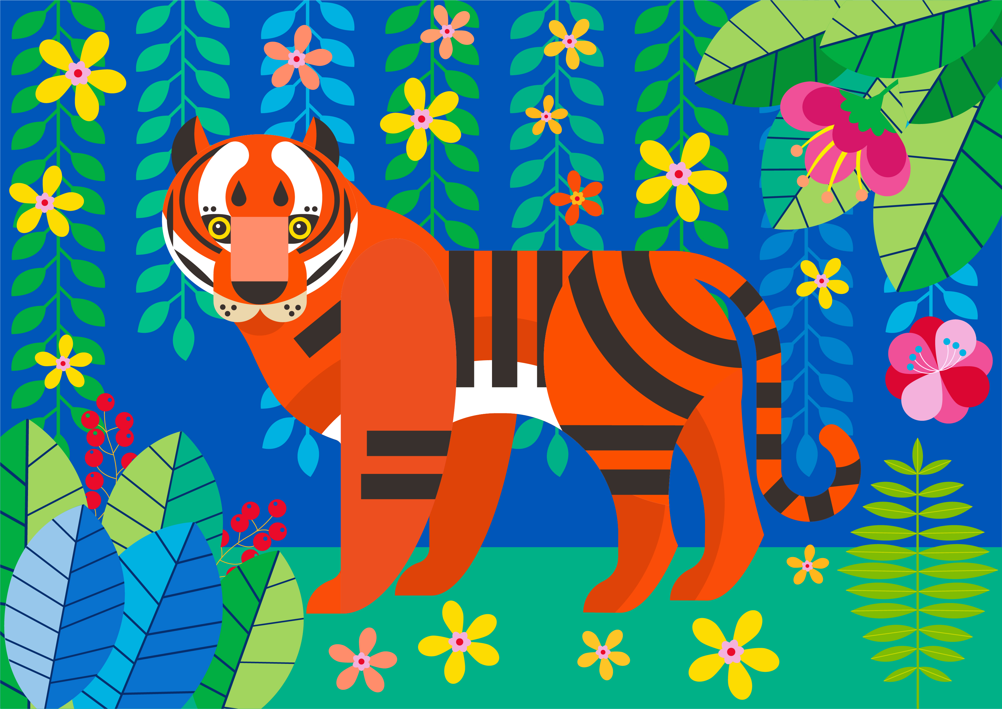
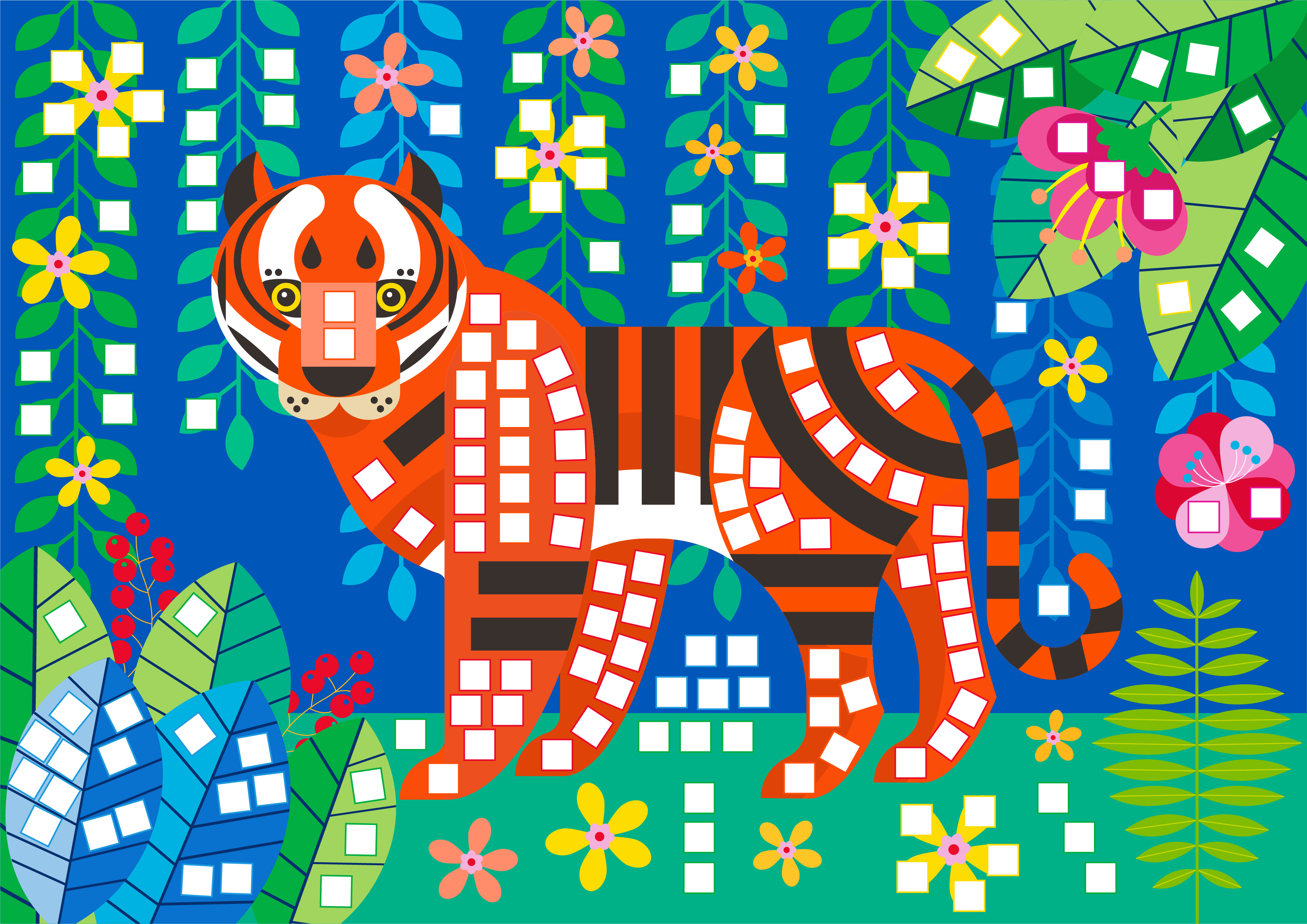
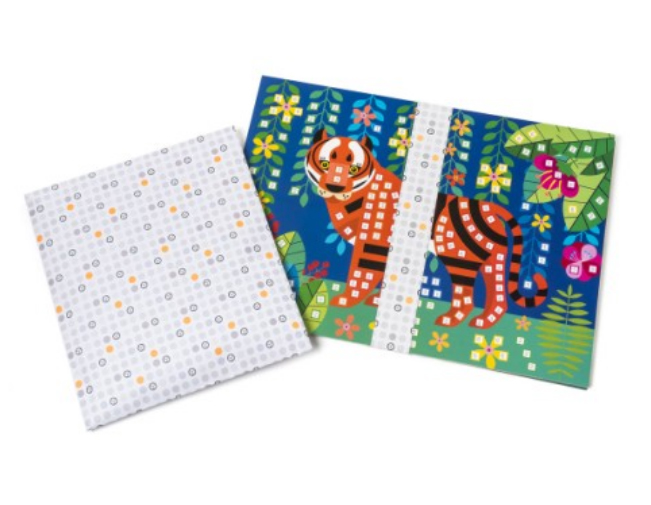
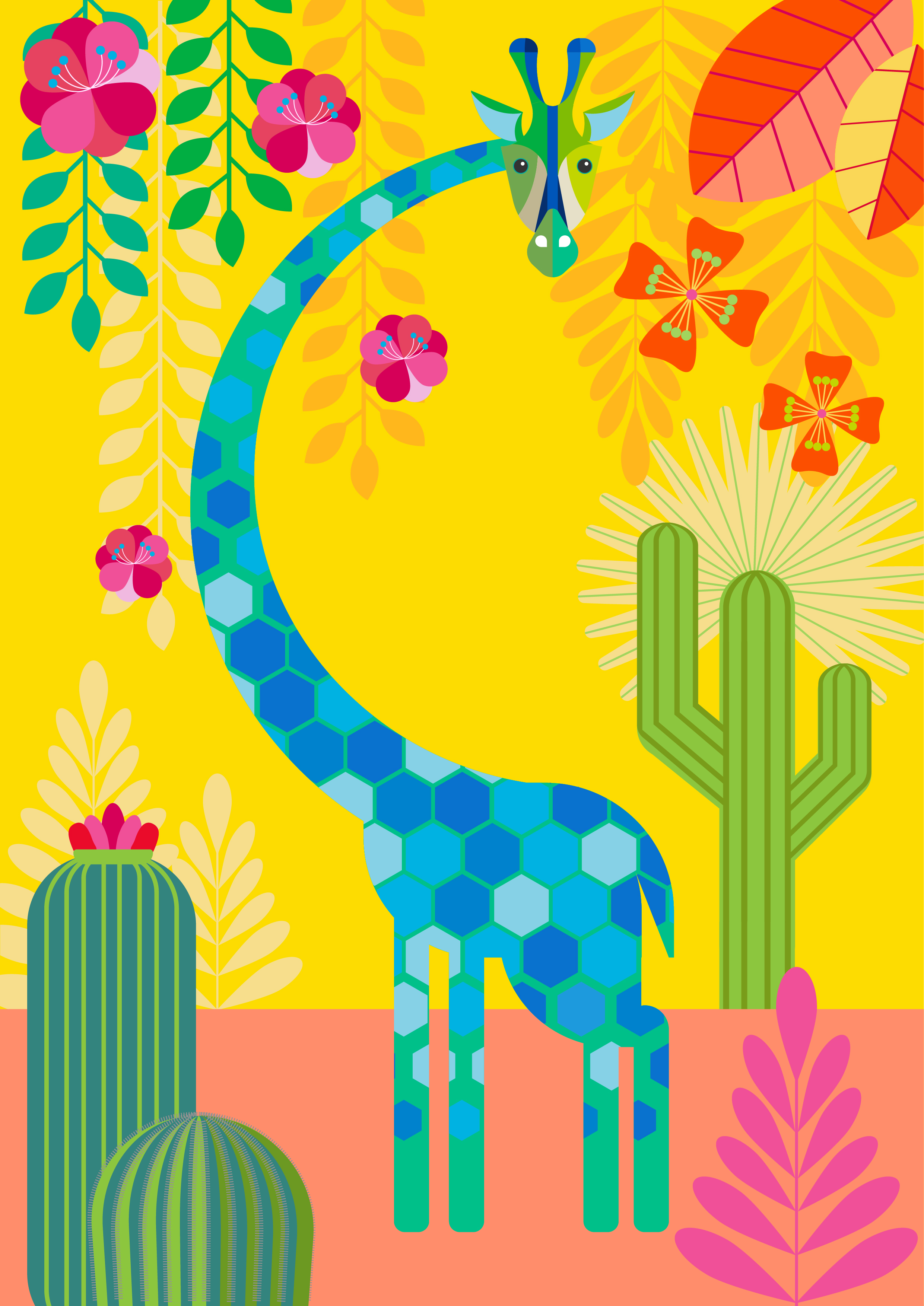
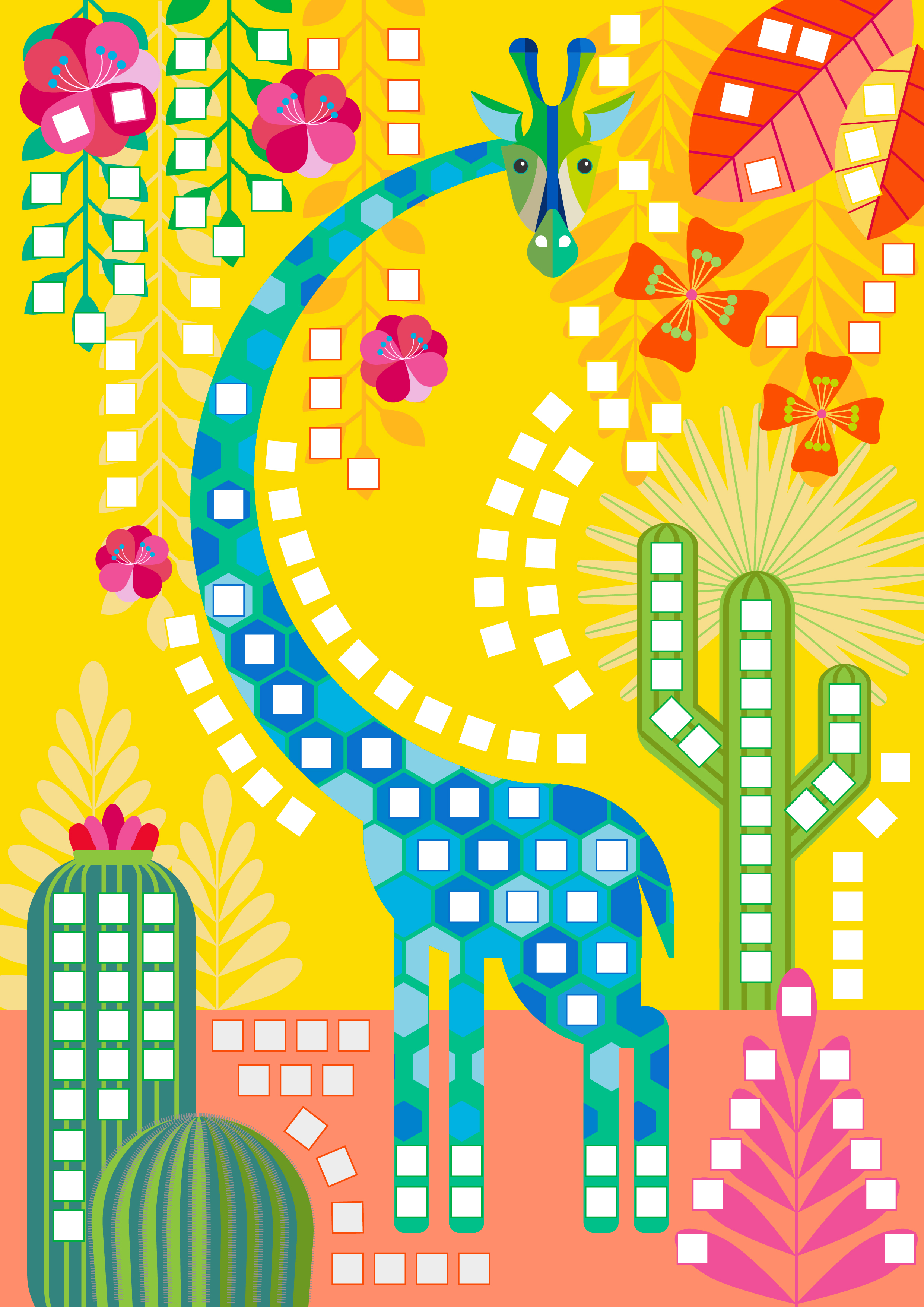
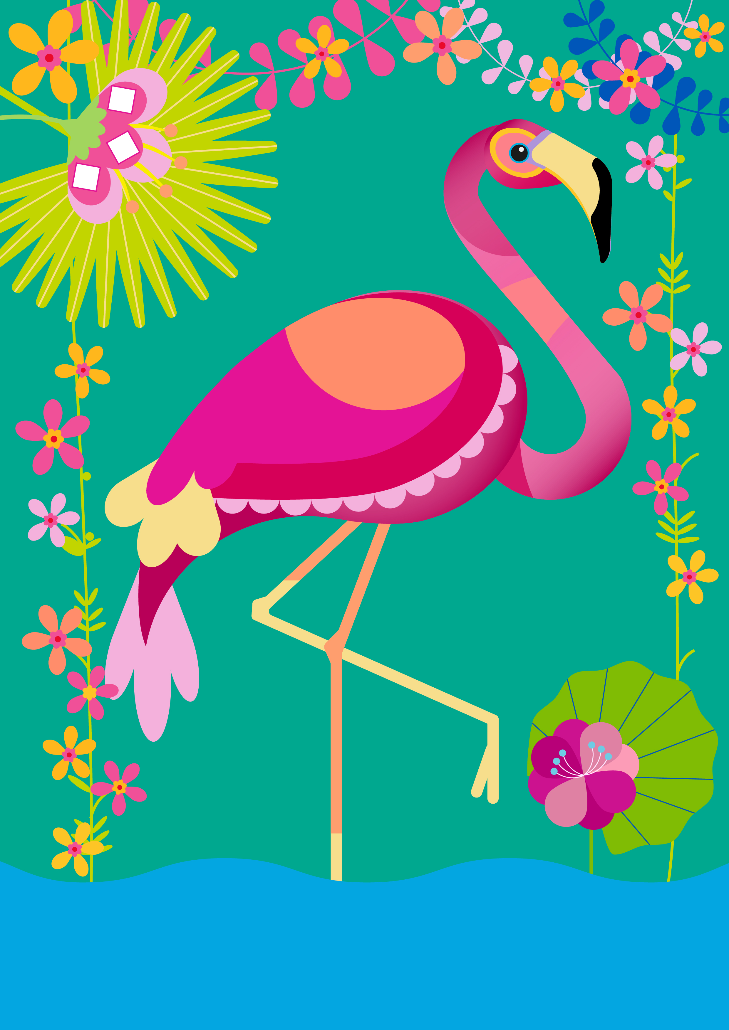
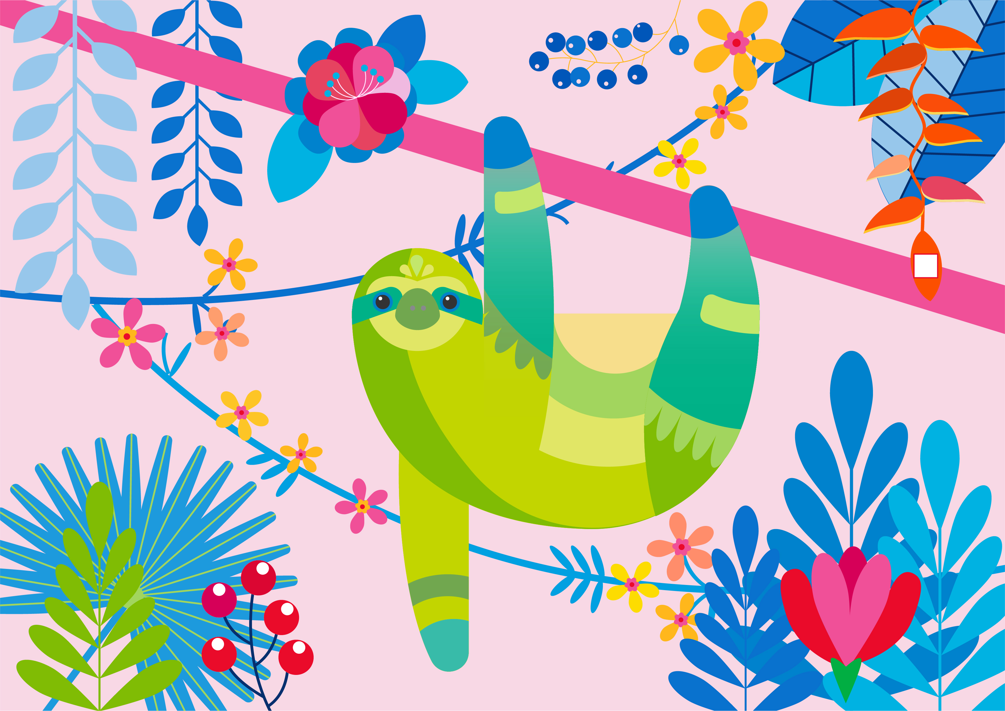
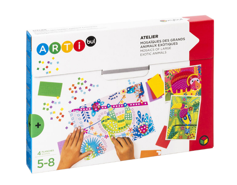
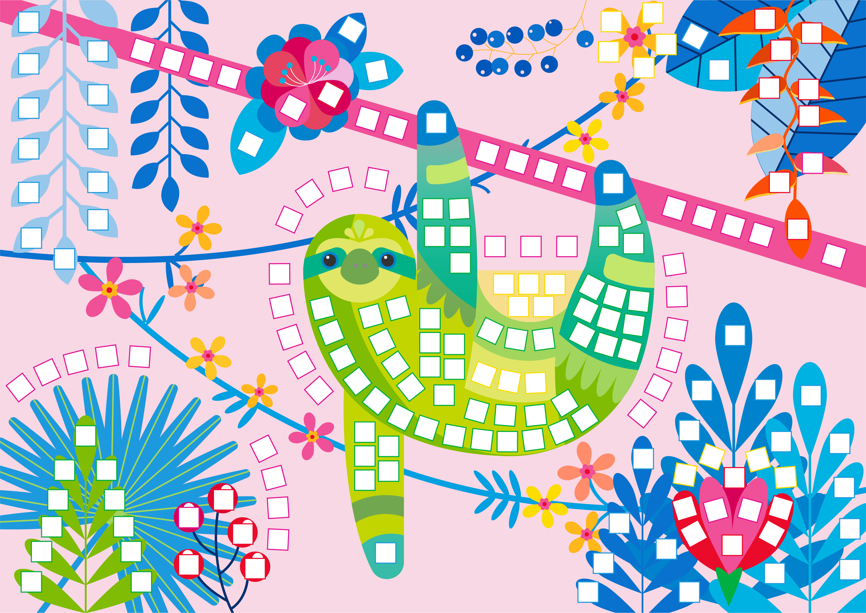
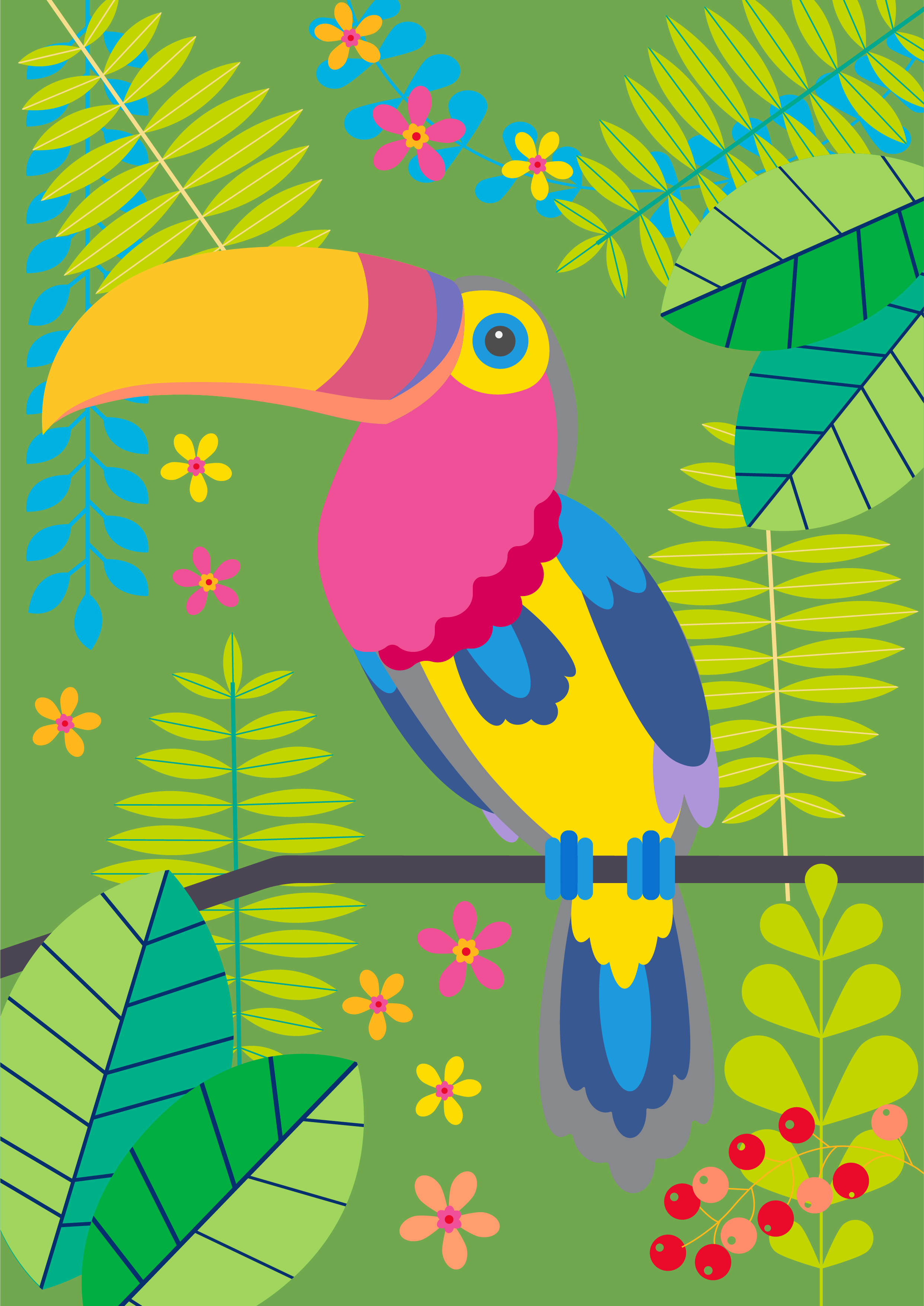
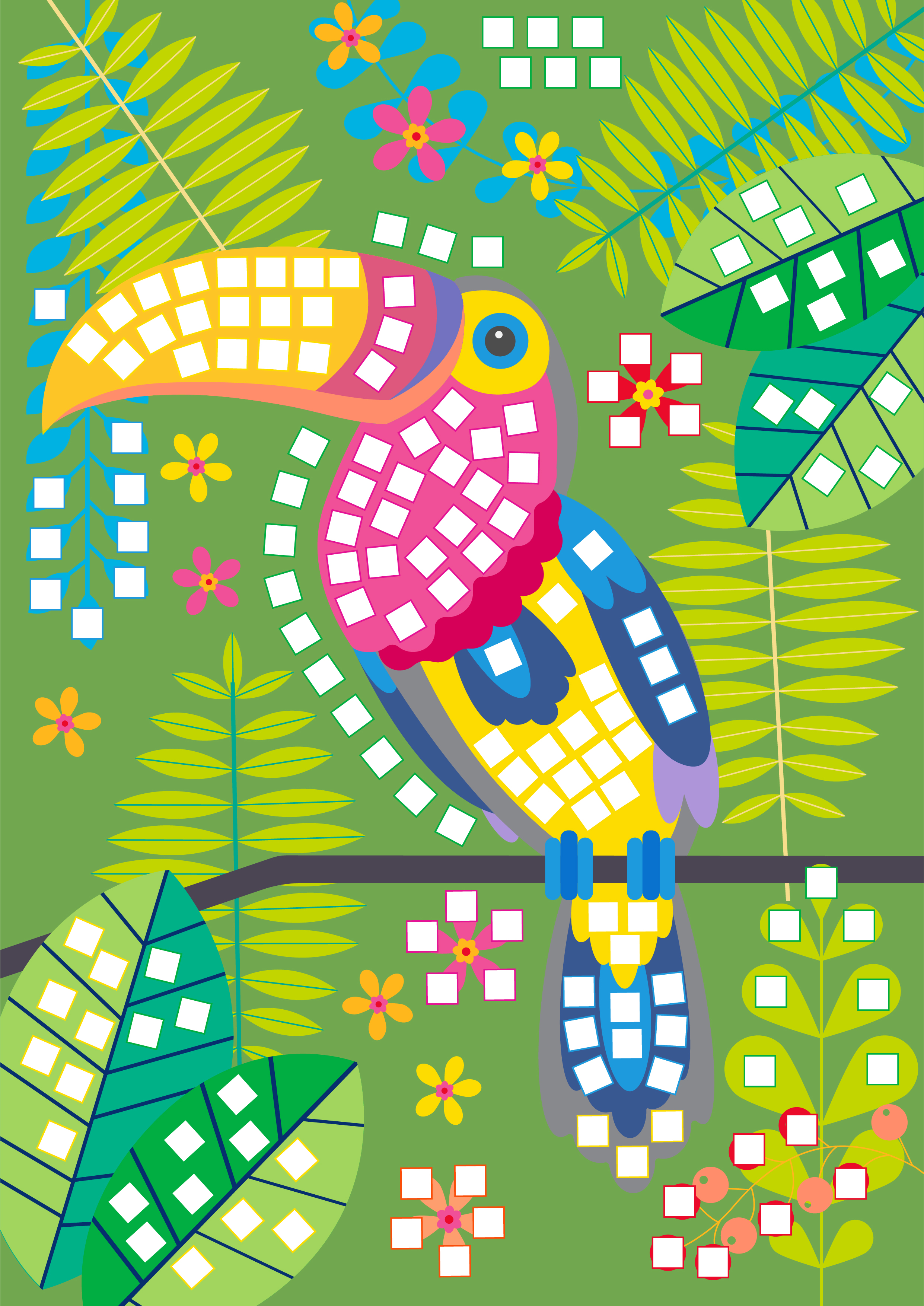
OXYBUL / Mosaic Foam Activity
SHORT BRIEF.
The mosaic foam activity is an art and craft activity for 5-8 year olds. Illustrations were based on a brief provided by Oxybul. Develop Jungle - Tropical illustrations for the foam activity that align closely to the OXybul brand aesthetic.
Technical challenges:
Using 6 different colors for the mosaic pieces to place throughout each illustration. Place approximately 30 mosaic pieces in each illustration.
Technical challenges:
Using 6 different colors for the mosaic pieces to place throughout each illustration. Place approximately 30 mosaic pieces in each illustration.
WHAT WE DID.
After researching and providing recommendations, Melanie collaborated with the Oxybul Product Development and Marketing team to determine which animals would resonate best with 5-8 year olds.
Project Deliverables:
• Research and recommendations for types of animals.
• 8 animal illustrations, with mosaic foam placement.
• 2 repeat patterns to use with the packaging system.


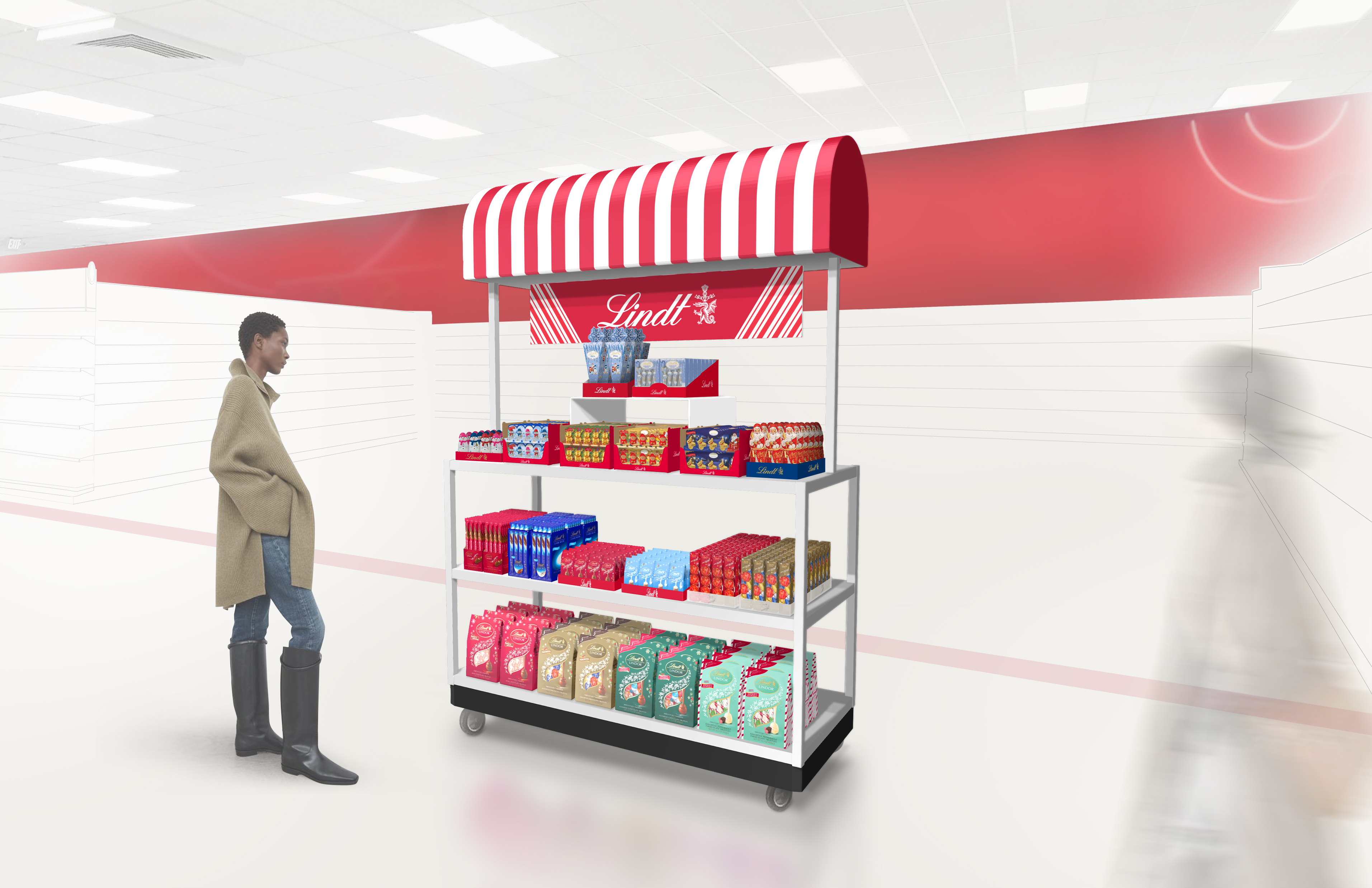
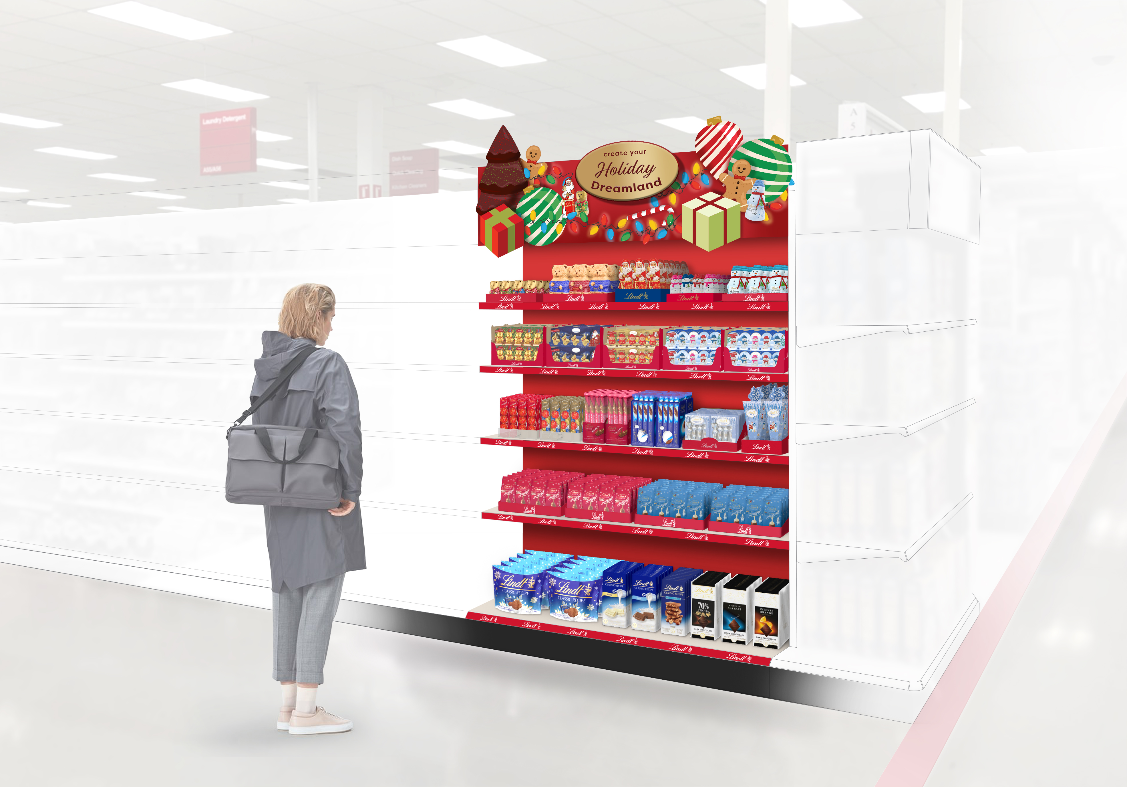
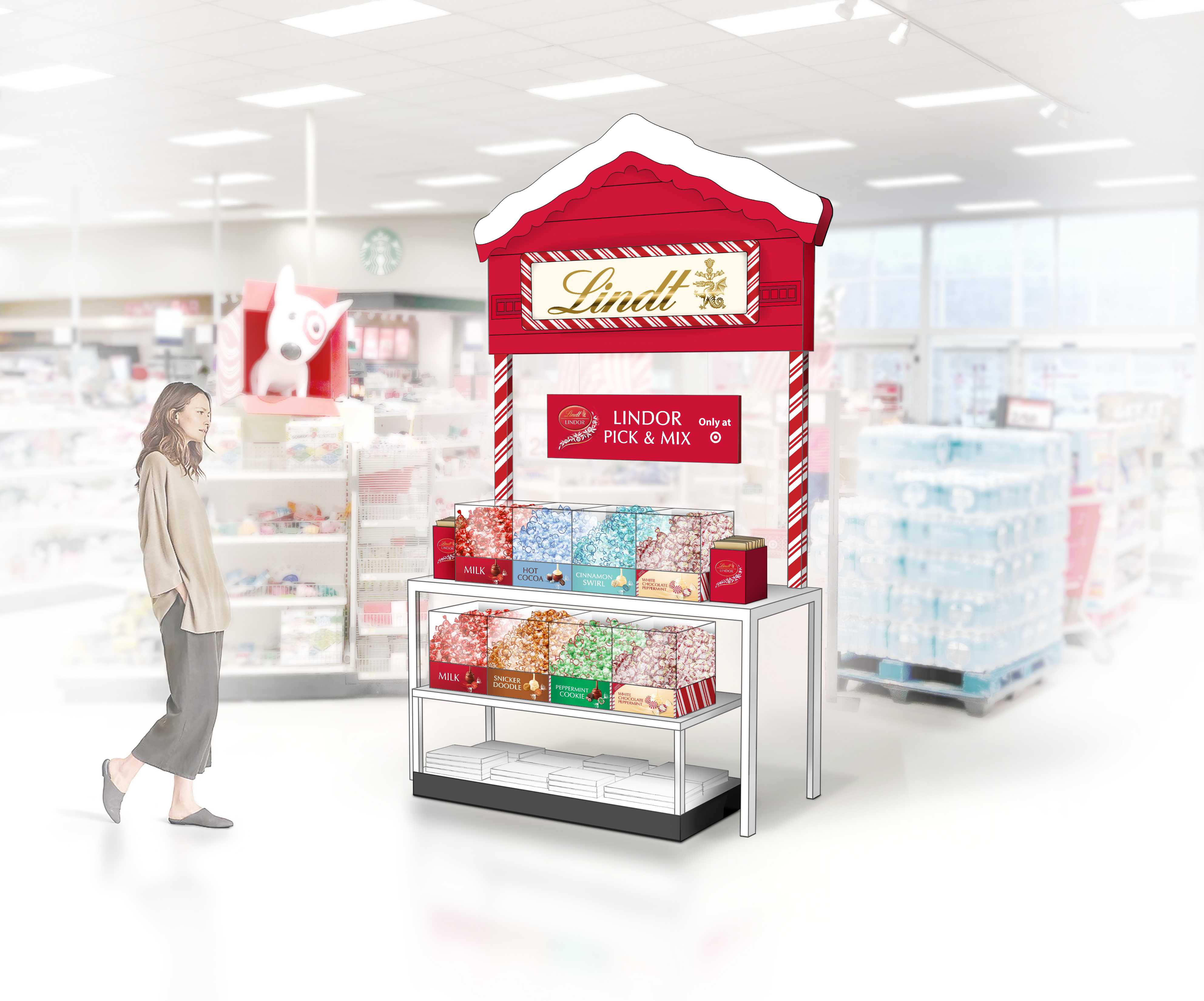
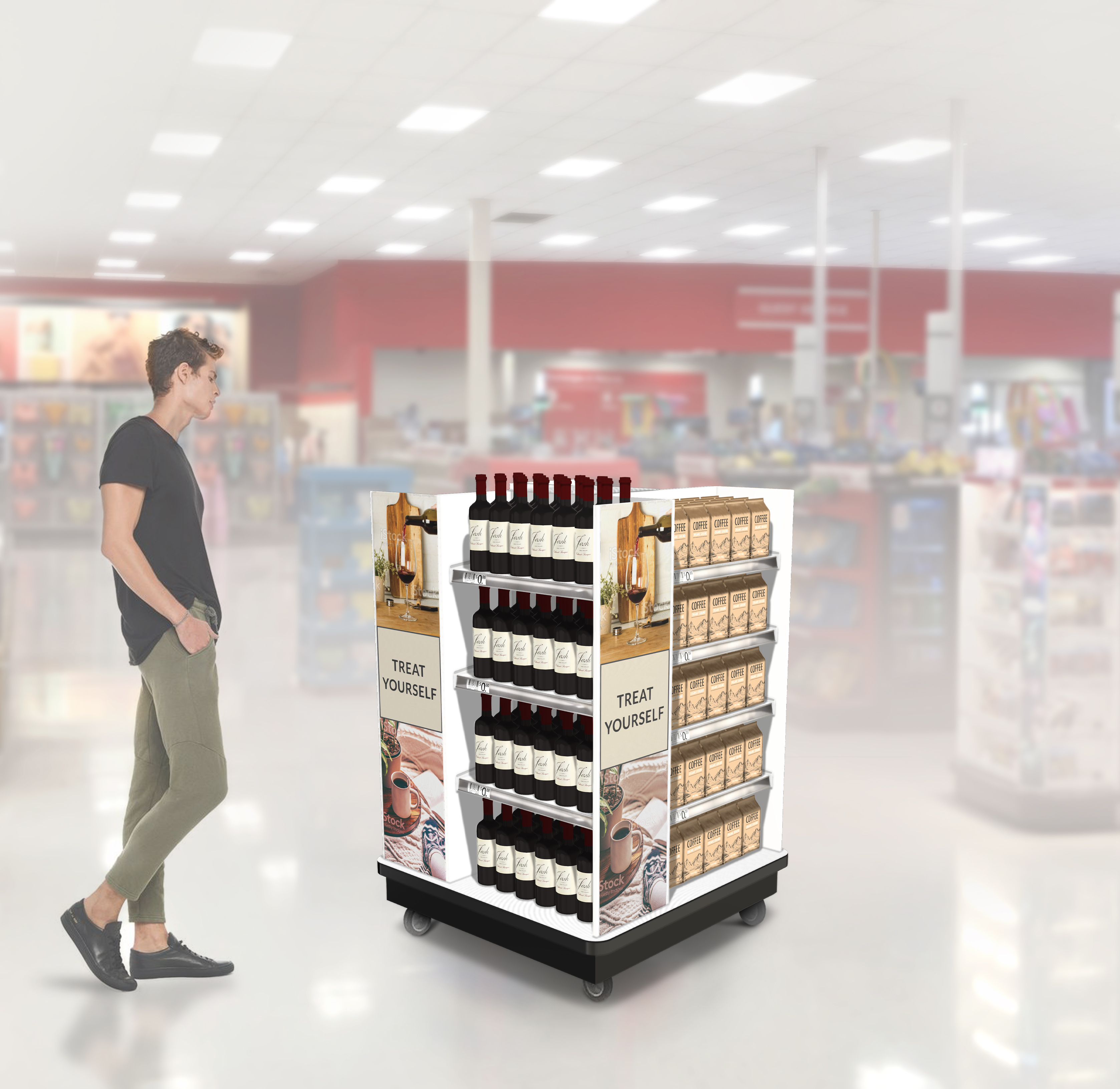
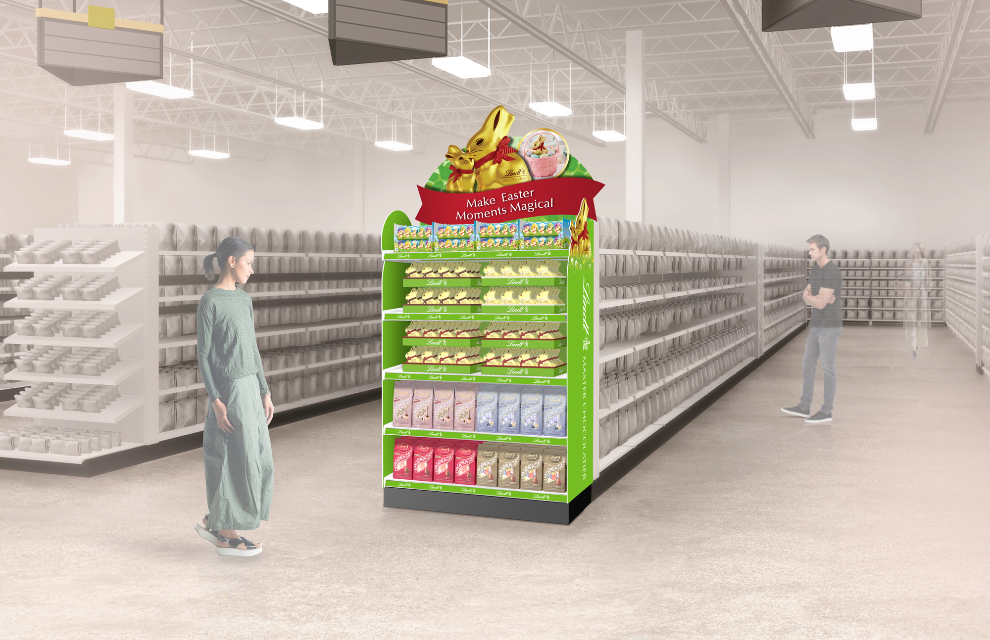
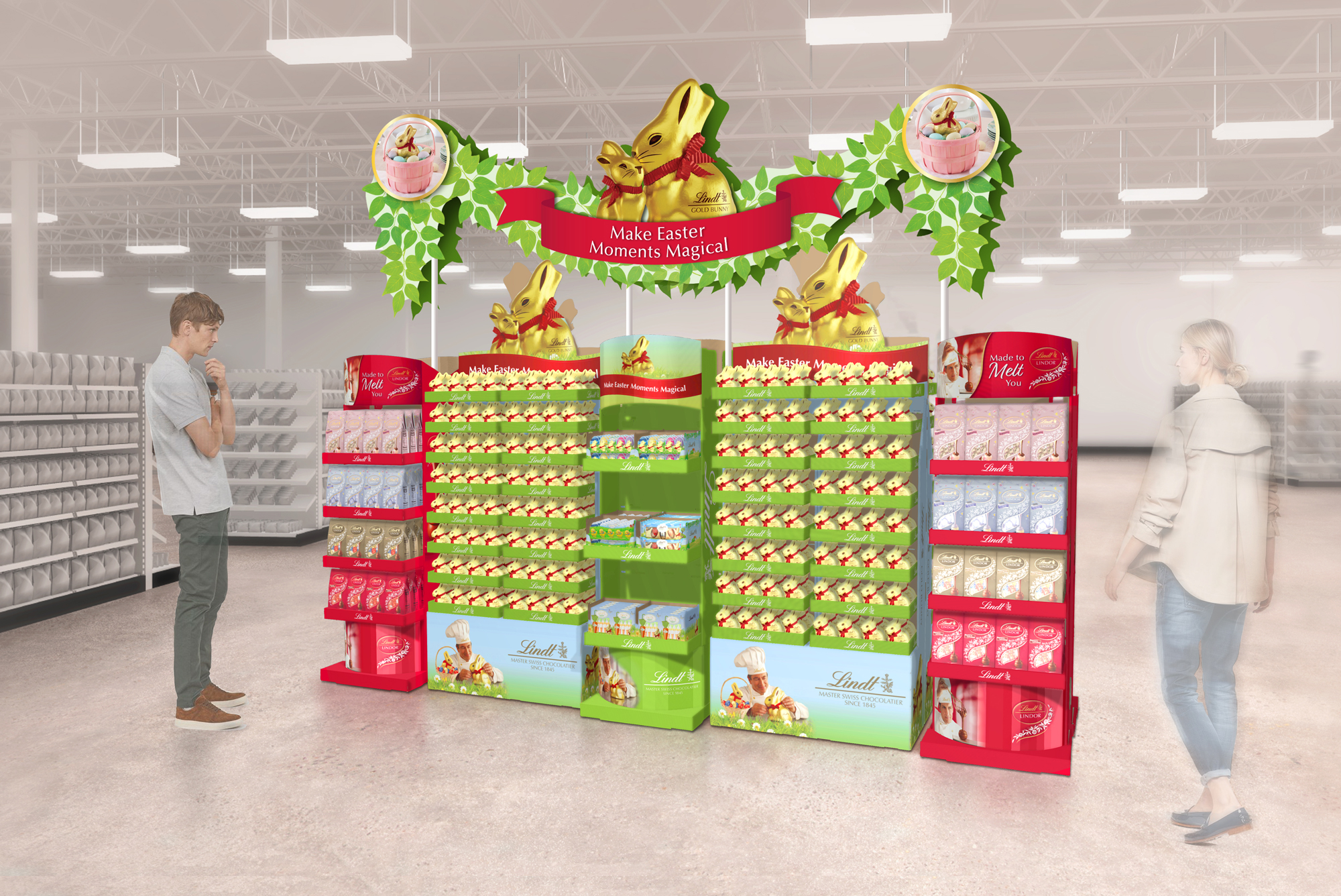
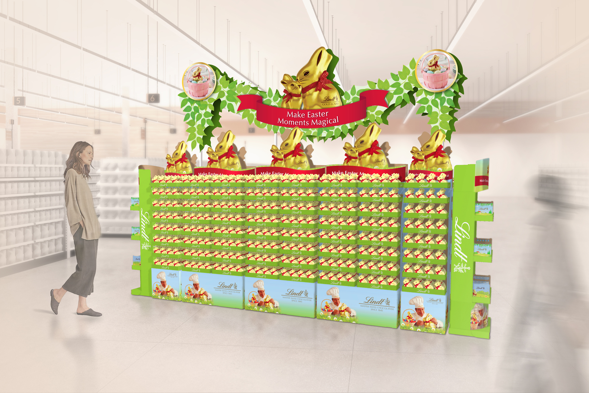
LINDT x TARGET/ In-store visualizations
SHORT BRIEF.
We regularly collaborate with the Lindt’s Sales & Shopper Marketing teams to create inspirational display renderings to be shared with Target buyers. As a category leader, it’s important that Lindt guides and inspires the buyer with merchandising concepts for new product launches and fresh seasonal programs. Some concepts are very Lindt-forward, while others look to elevate the premium category as a whole.
We regularly collaborate with the Lindt’s Sales & Shopper Marketing teams to create inspirational display renderings to be shared with Target buyers. As a category leader, it’s important that Lindt guides and inspires the buyer with merchandising concepts for new product launches and fresh seasonal programs. Some concepts are very Lindt-forward, while others look to elevate the premium category as a whole.
WHAT WE DID.
For each merchandising option, we started by sharing quick alignment sketches and visual inspiration to get the ideas flowing. Their team’s feedback helped guide the direction until we landed on a concept ready to bring to life. From there, we developed polished renderings and collaborated closely on product placement and signage along the way. Every rendering is shown in a Target store environment so the team and buyer can see how it would look in real life.
Project Deliverables:
- Endcap concept renderings
- In-Aisle concept renderings
- Tower & Table concept renderings
- Floor Display concept renderings
- Stand-alone Display / 4-way Display concept renderings
Aisle Display, Tower + Table combo: Seasonal
Endcaps: Rotational / New Brand Launch


Seasonal: Easter


Seasonal: Holiday

Pick & Mix concept
![]()
Stand-Alone 4-way Displays, Mixed Product
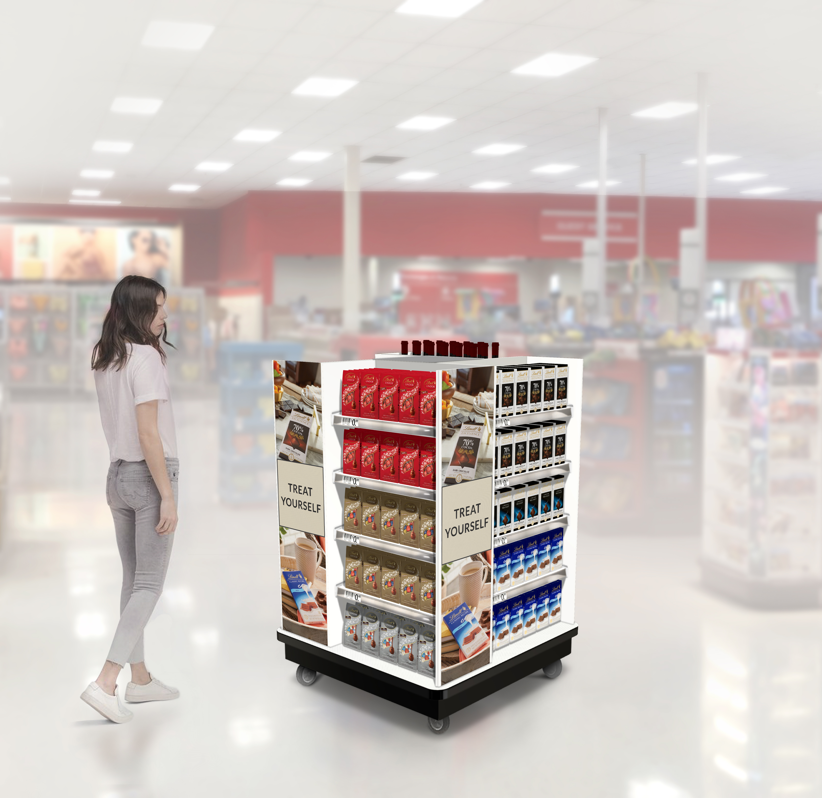
A nice win for the Lindt team! Production samples of displays at Lindt Sales office in Minneapolis.
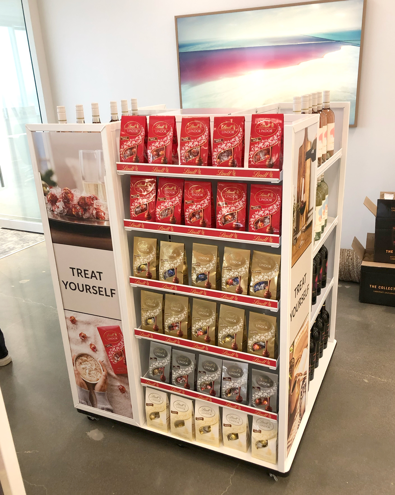

Text rec’d from our client:
Wanted to show you the Target 4-way come to life! This is going to be implemented into Target this year. Beautiful work! The Target buyer loves it!
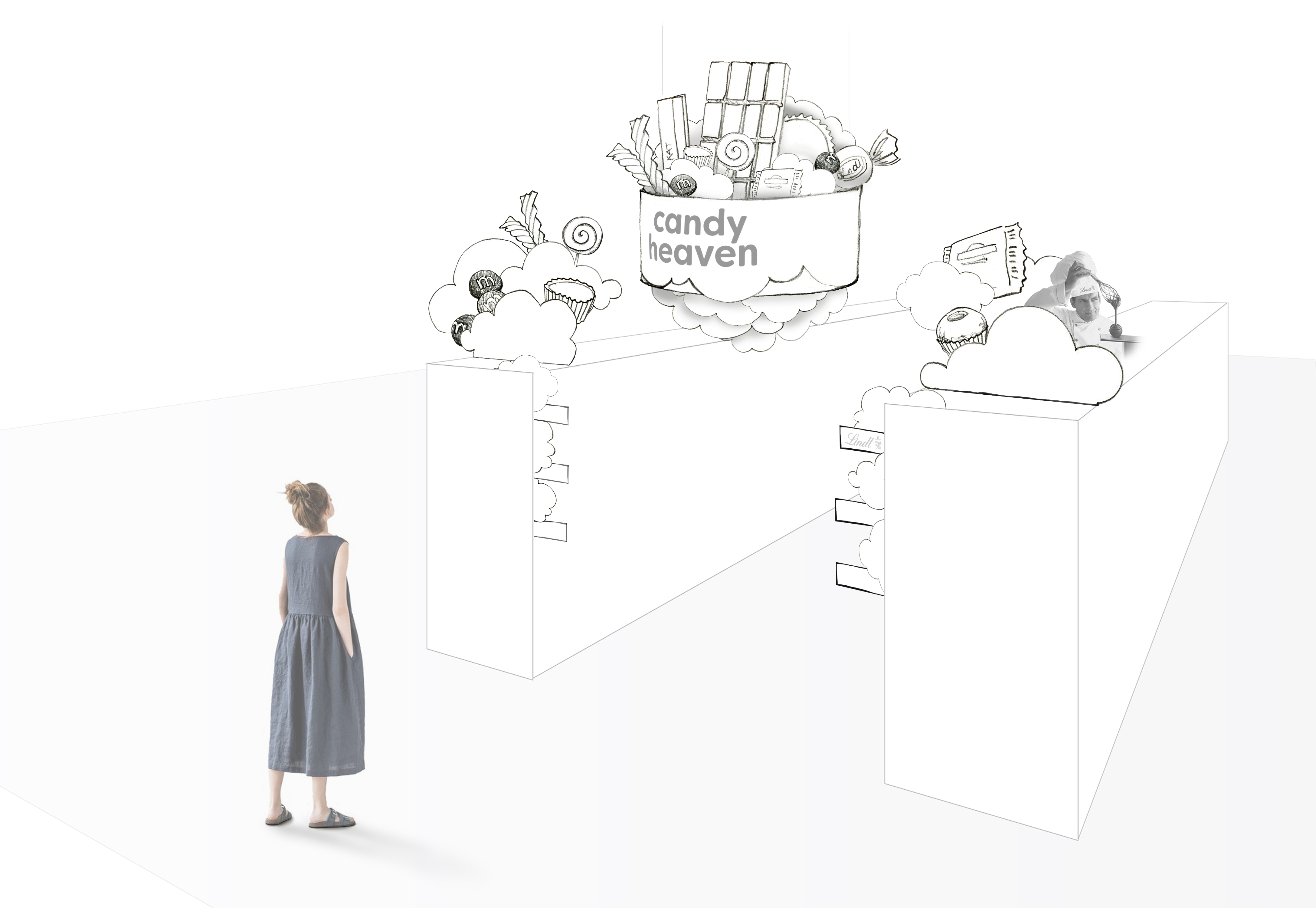
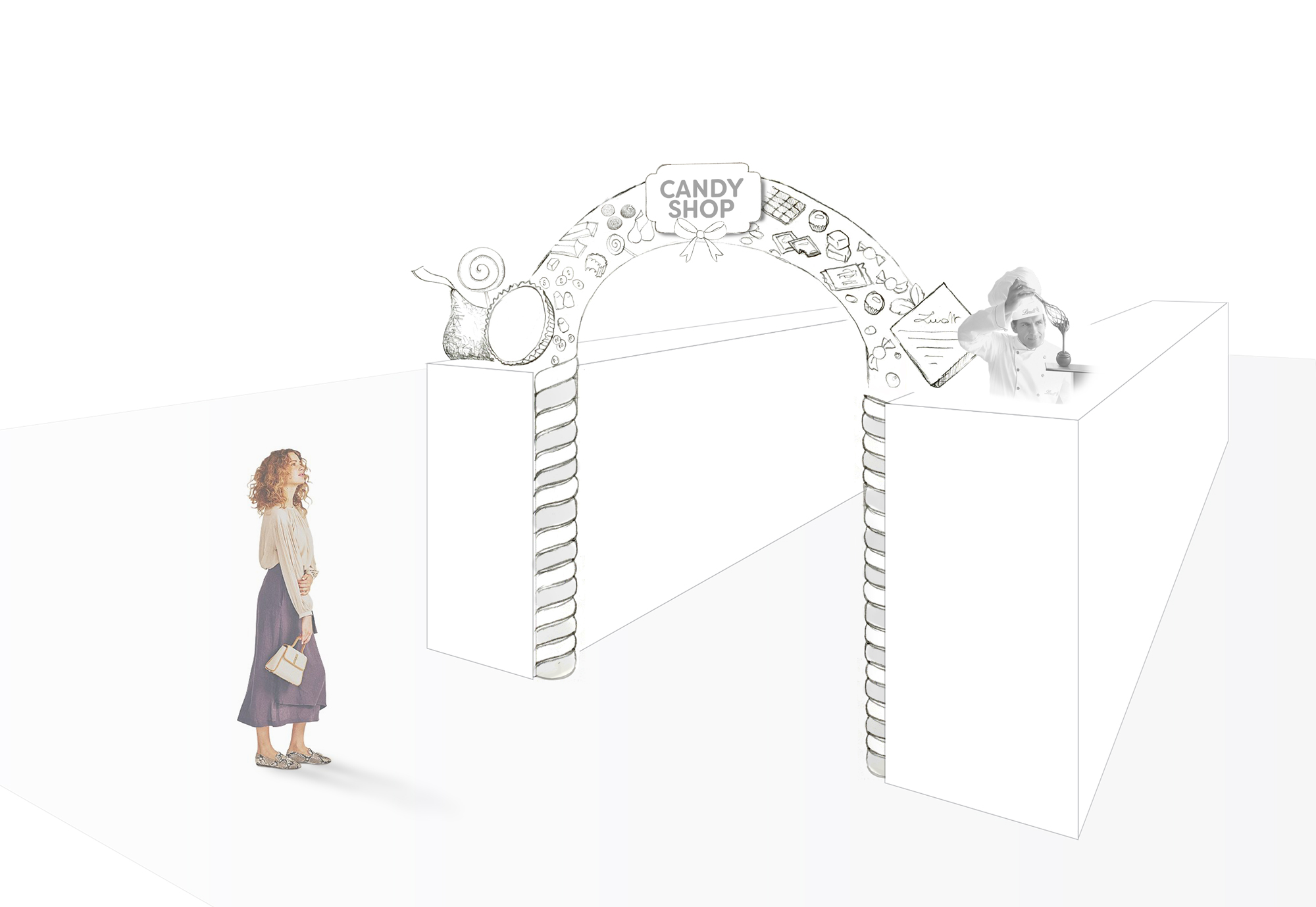
Total Category, GO BIG signage, Sketch concepts
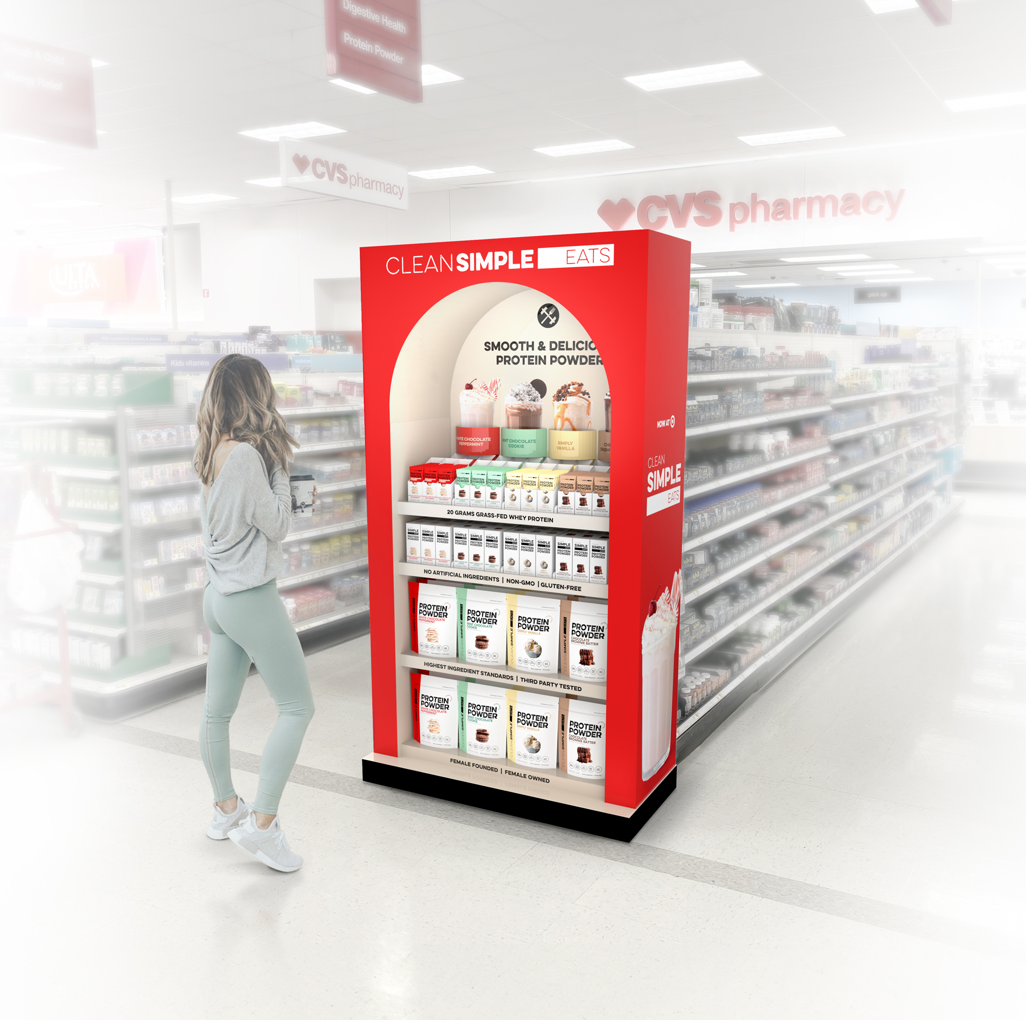
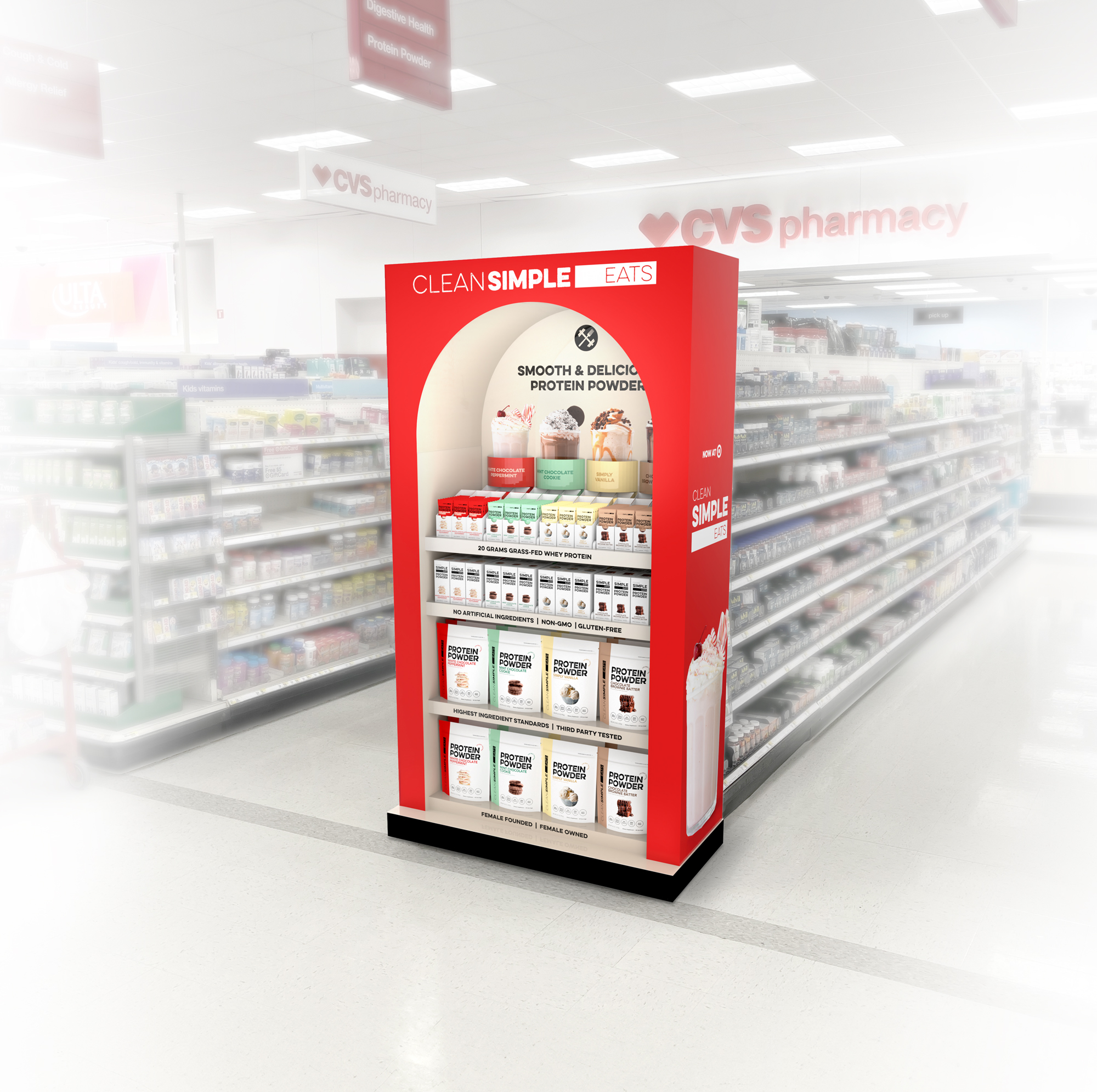
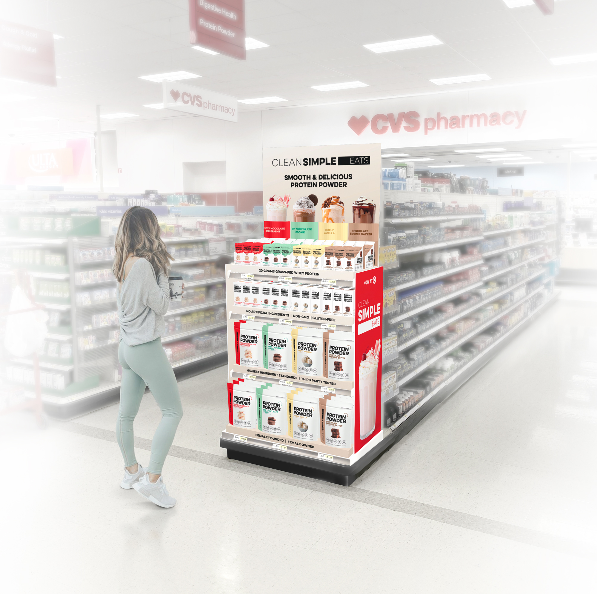
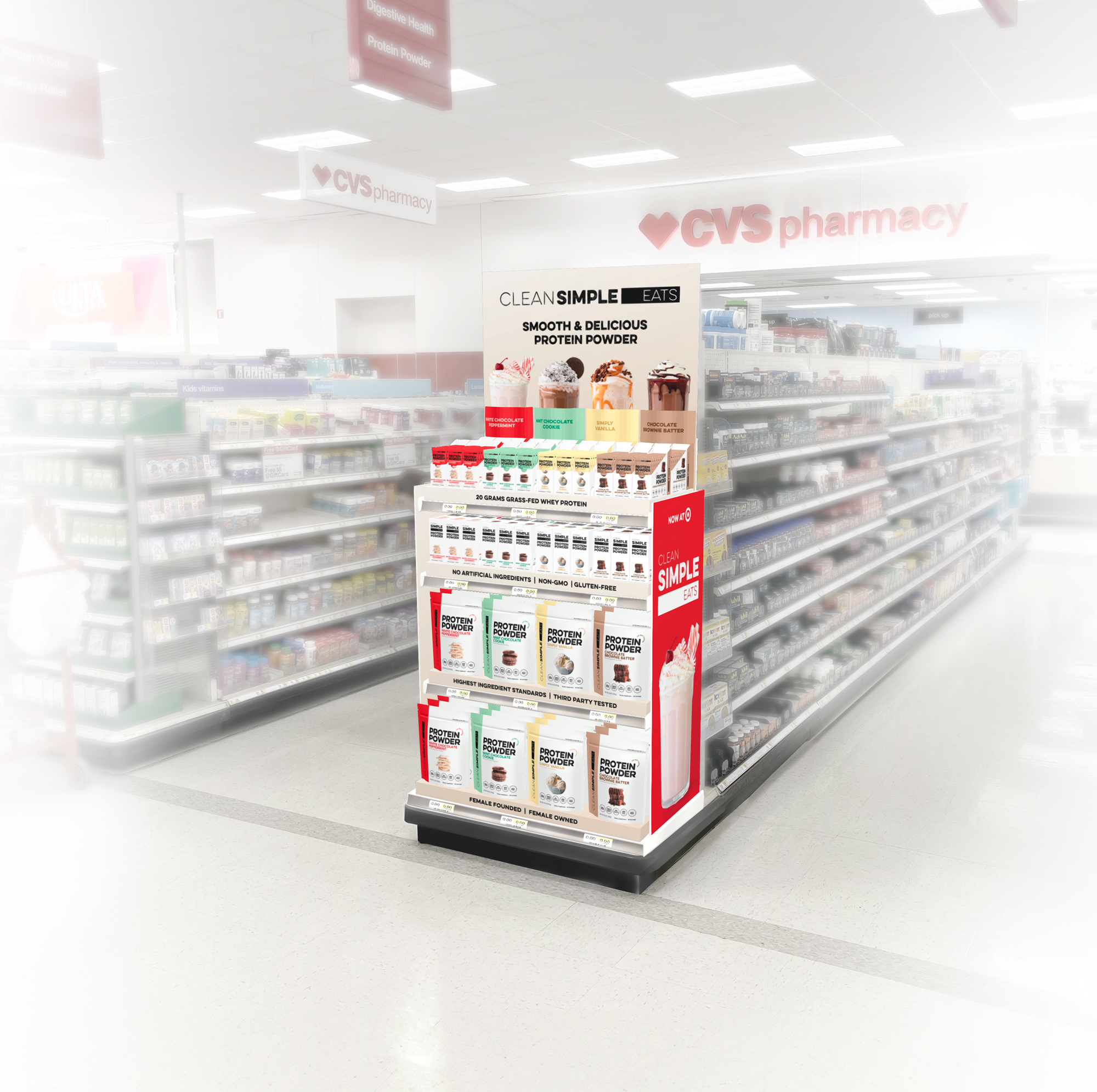
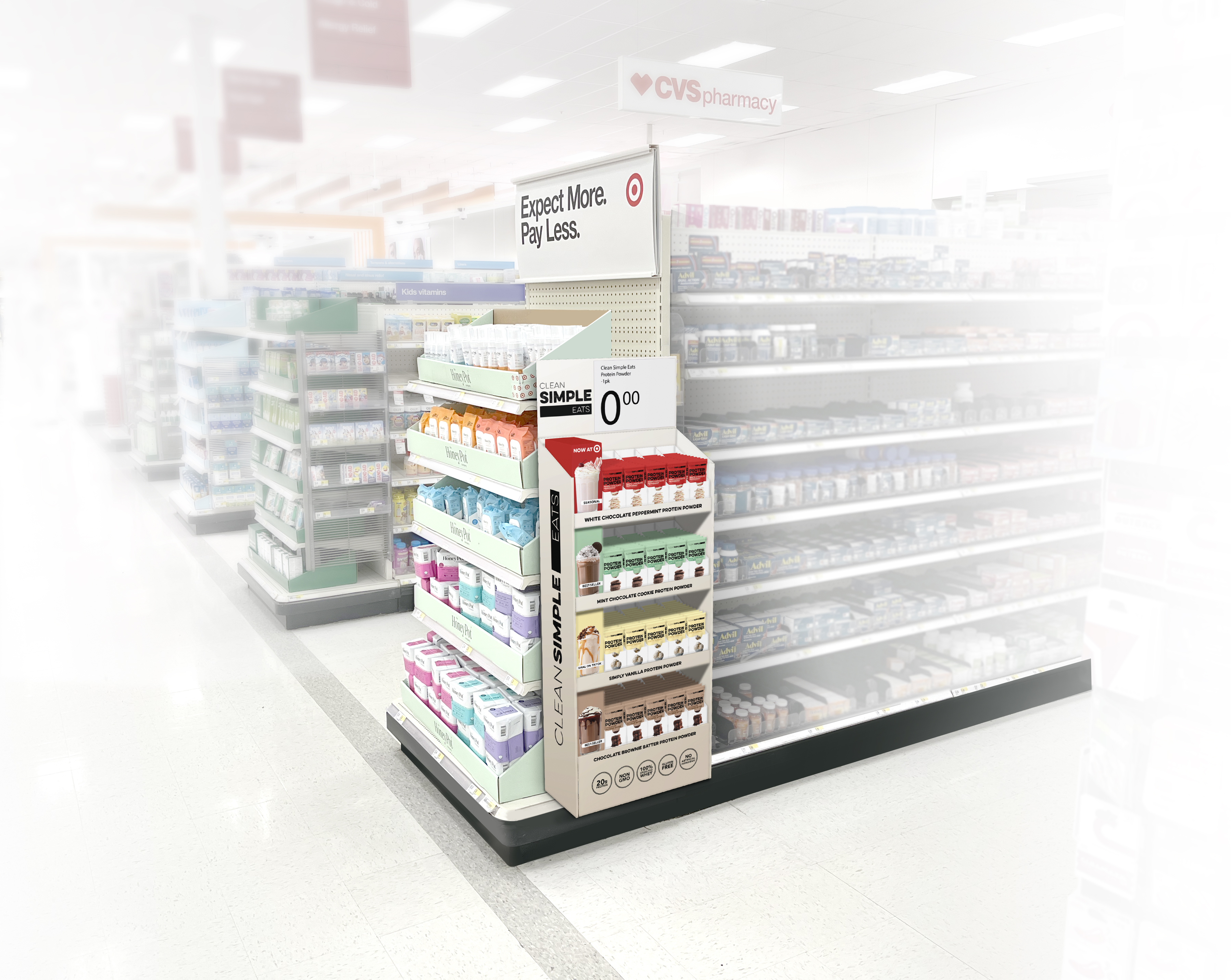
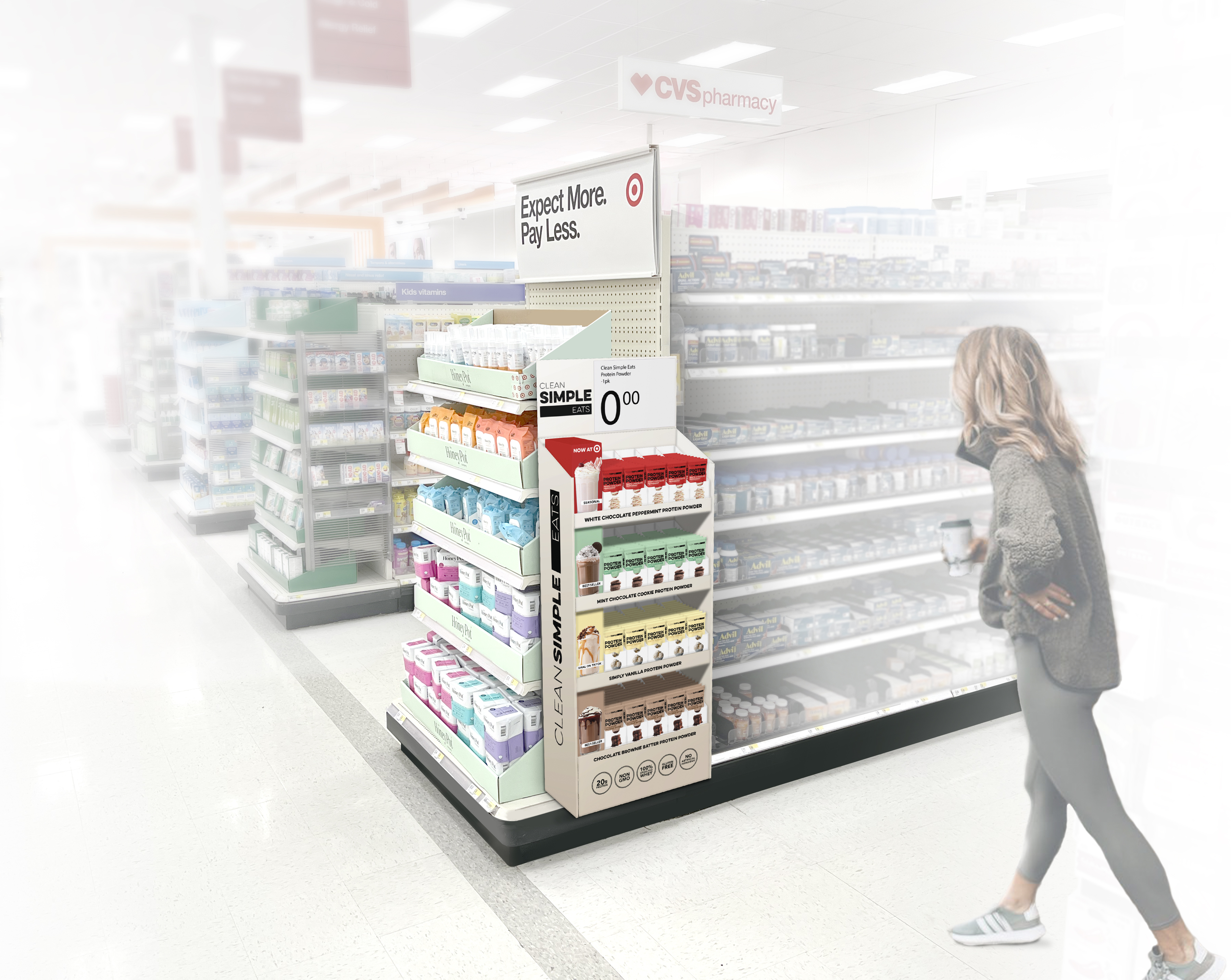
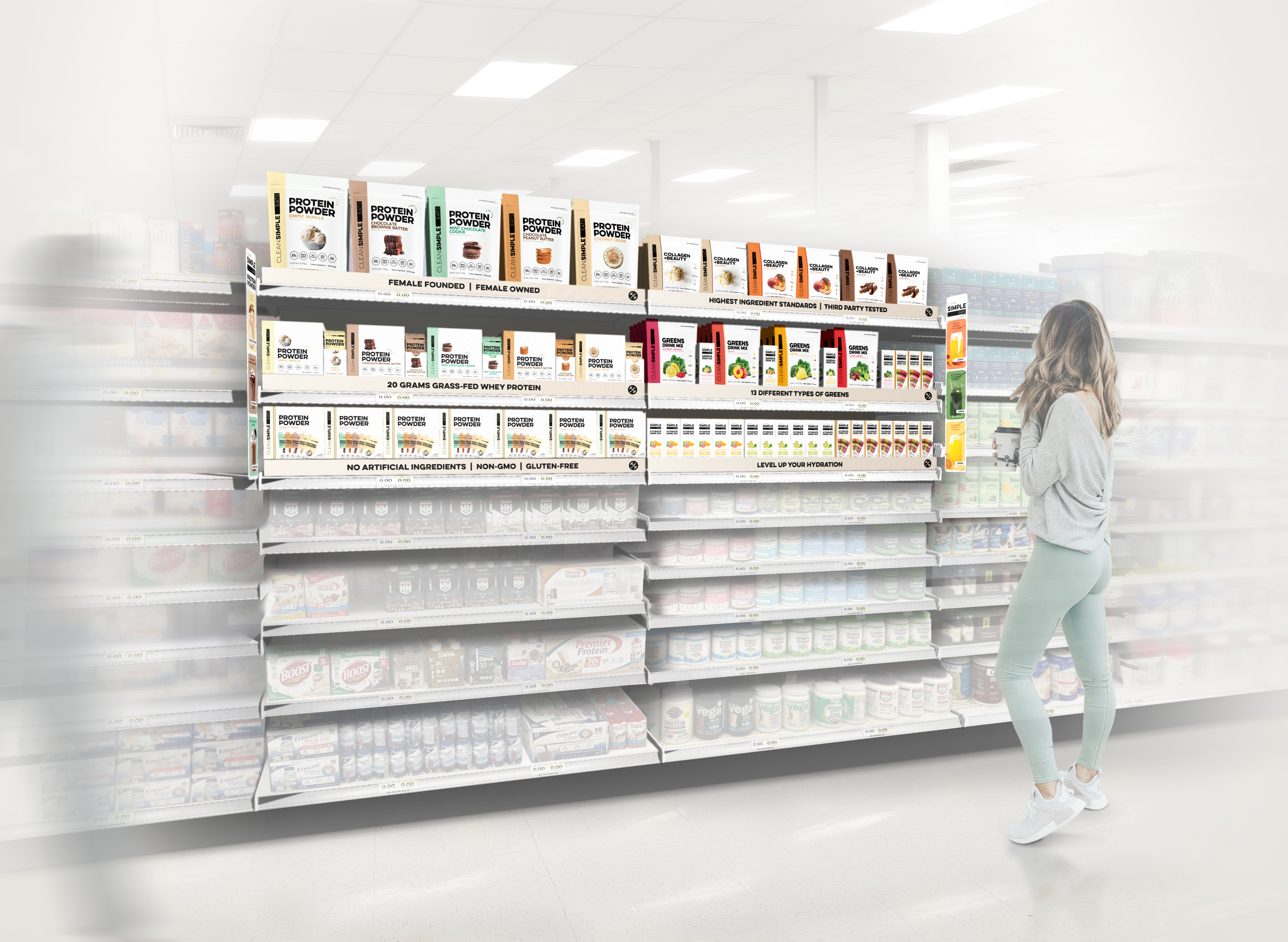
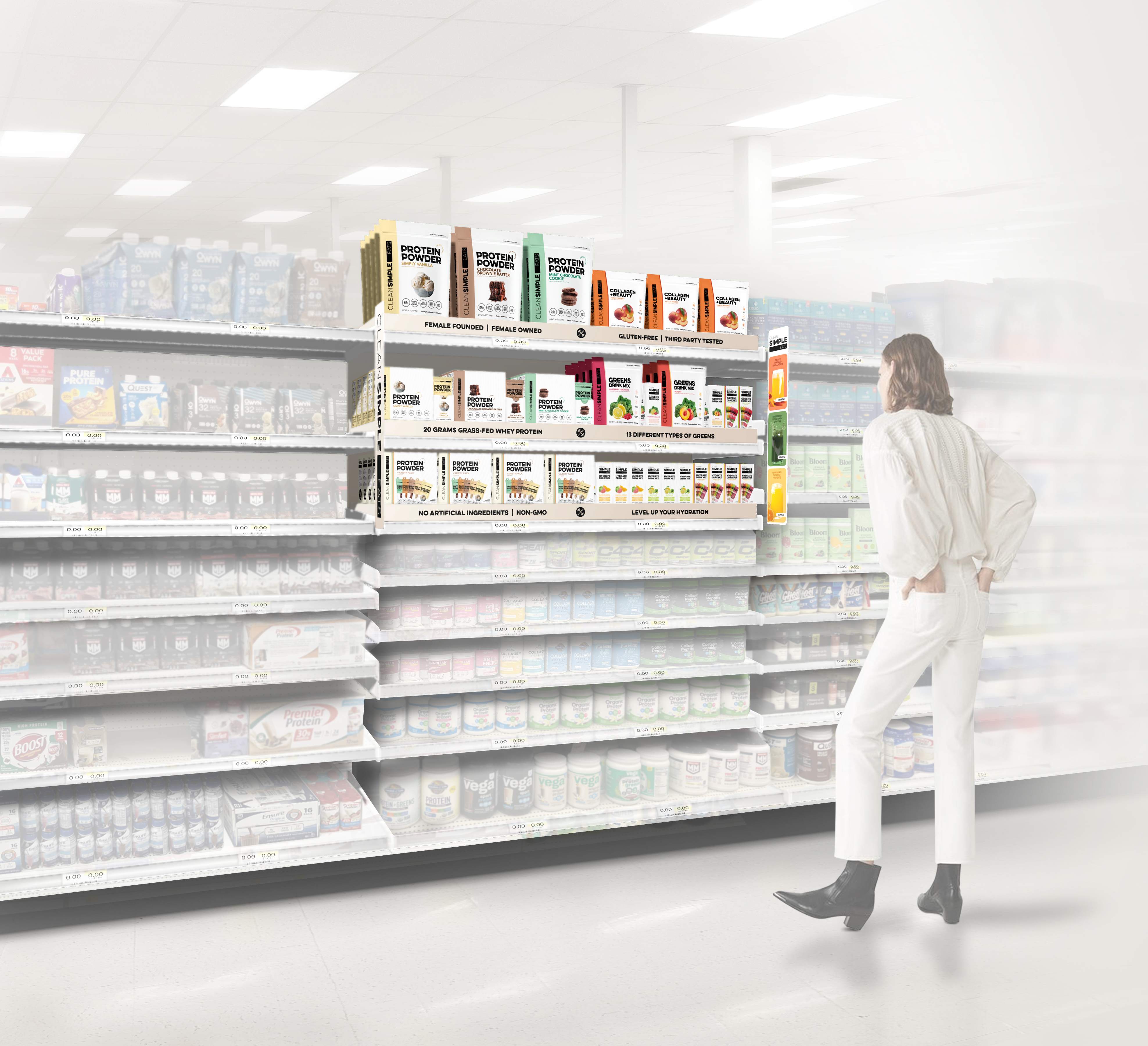
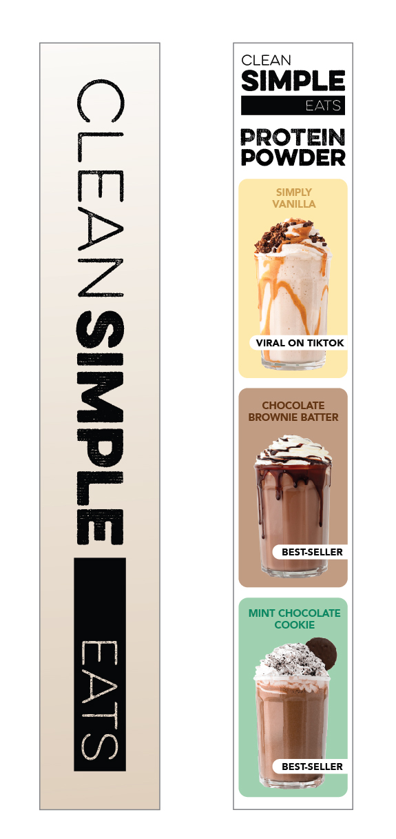
CLEAN SIMPLE EATS x TARGET
In-store visualizations
SHORT BRIEF.
Originally tasked with developing Q4 endcap renderings for Target, Clean Simple Eats saw an opportunity to do more. Their Marketing and Design teams used the brief to inspire buyers with future-facing solutions that positioned CSE as a long-term platform brand, not just a one-off. As a challenger brand aiming to gain traction at Target, it was crucial to balance creative storytelling with a clear understanding of Target’s display guidelines and to deliver concepts that would both educate and engage shoppers.
Originally tasked with developing Q4 endcap renderings for Target, Clean Simple Eats saw an opportunity to do more. Their Marketing and Design teams used the brief to inspire buyers with future-facing solutions that positioned CSE as a long-term platform brand, not just a one-off. As a challenger brand aiming to gain traction at Target, it was crucial to balance creative storytelling with a clear understanding of Target’s display guidelines and to deliver concepts that would both educate and engage shoppers.
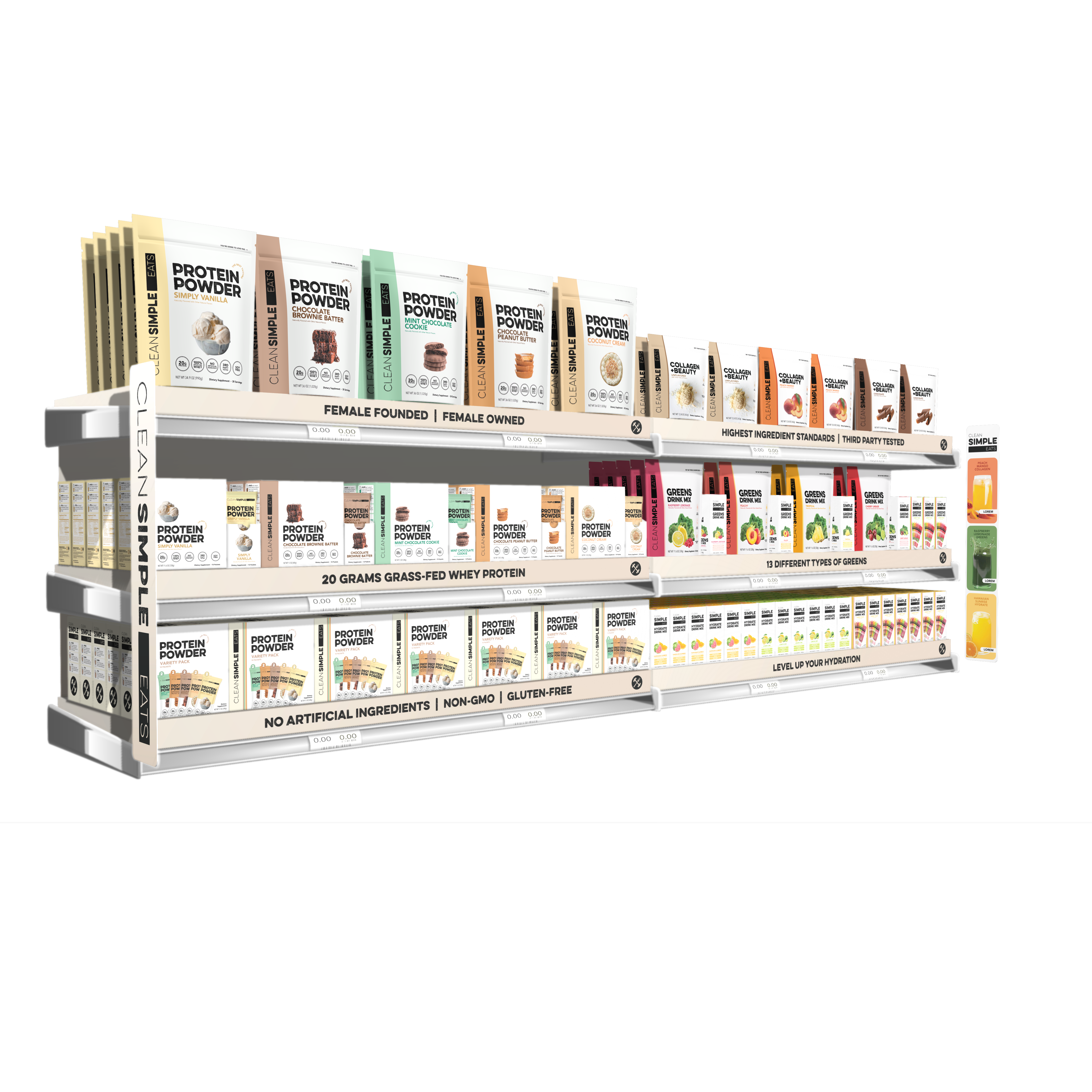
WHAT WE DID.
Using Target store environments as the context for the renderings, we worked closely with the CSE team to create on-shelf solutions across a variety of drink mix categories including protein powders, hydration, collagen and beauty, greens, and their newly launched (RTD) Ready to Drink protein. We developed 3D renderings for all of the skus included in the renderings, and worked closely with their team to execute structural and signage options while offering solutions for on-shelf communication / education.
Project Deliverables:
- (32) Packaging renderings
- Everyday & Q4 Endcap renderings
- In-aisle renderings
- Sidecap rendering
- Grocery & Front of Store renderings
- Ready-to-Drink (RTD) Pallet renderings
Endcaps
Following CSE’s meetings with Target, we rec'd this very kind note from CSE’s VP of Marketing, Britt Fusco.
Matt & Mel - wanted to just again express gratitude for all the work you guys did! We just got a list of things that were accepted for target April ‘25 (!!!!!) we’re screaming and just so incredibly grateful for all the work you did to help us get here!
Sidecap
Inline: Expanded Set / Best-Sellers Set with aisle blades and shelf risers including a focused mix of brand messaging and key visuals.

Ready to Drink,
Refrigerated Grocery and Front of Store


Ready to Drink, Inline Energy Drink Shelf

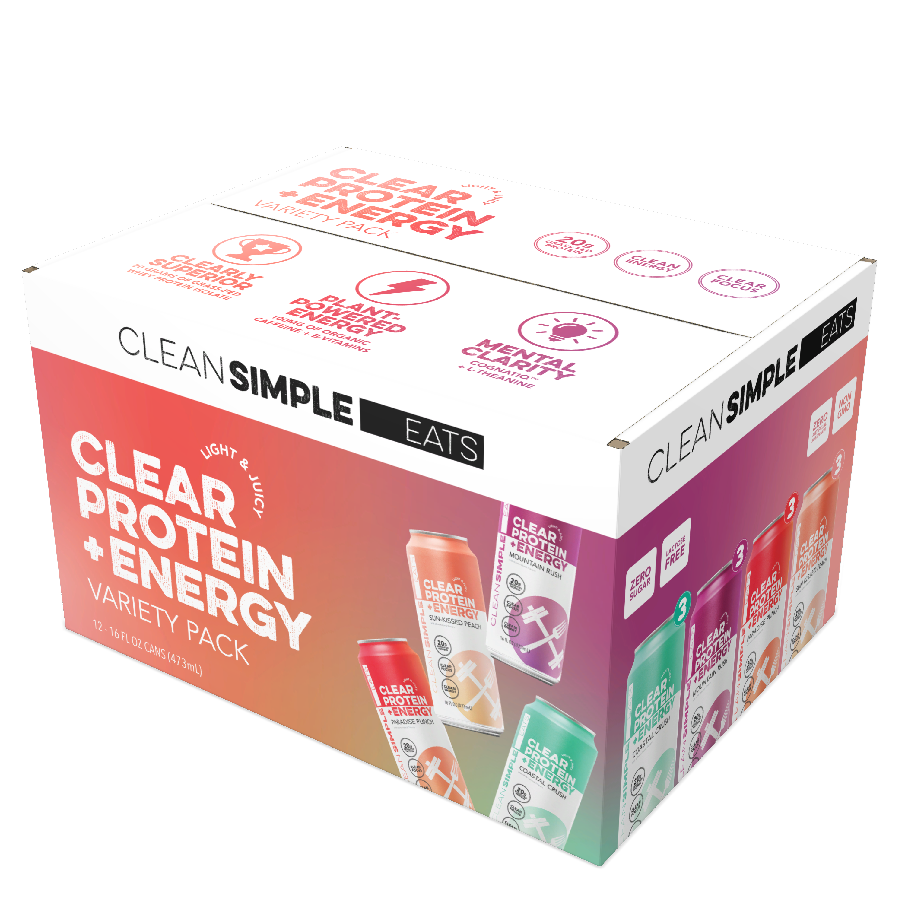


RTD - Clear Protein pallet + Protein pouch endcap rendering
RTD - Clear Protein + Energy pallet leading into the energy drink aisle
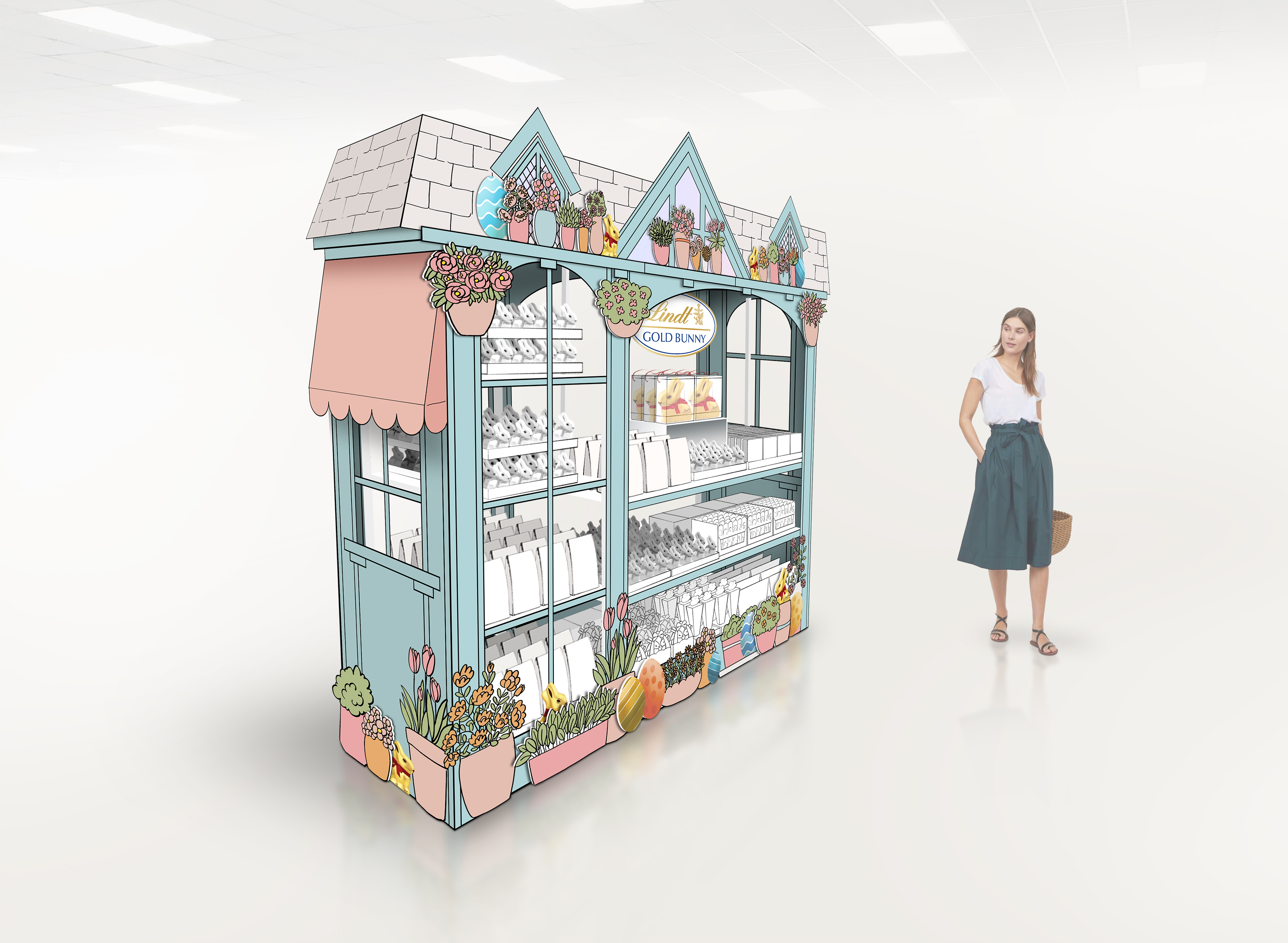
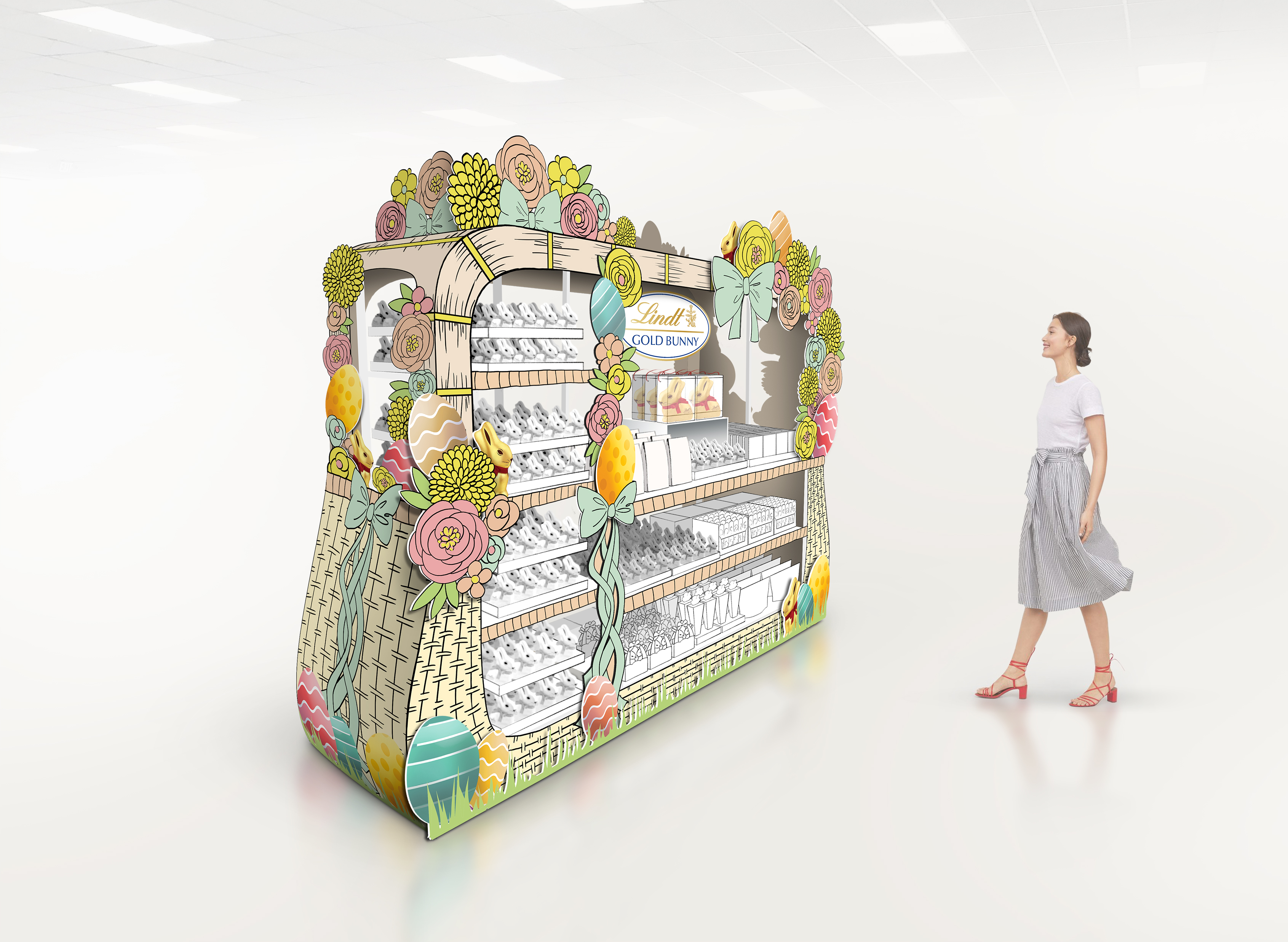
LINDT x KROGER/ In-store visualizations
SHORT BRIEF.
Develop Go Big Easter concepts for National Landscape with a specific focus on Kroger. We were to develop Go Big Easter Dress Up Kits for Endcaps, and a signage system for the floor display program. All of this was to be rendered in situ (the store environment).
Develop Go Big Easter concepts for National Landscape with a specific focus on Kroger. We were to develop Go Big Easter Dress Up Kits for Endcaps, and a signage system for the floor display program. All of this was to be rendered in situ (the store environment).
WHAT WE DID.
We collaborated with the Lindt Shopper Marketing team on product placement (POG) and signage development. We worked through a series of alignment sketches combined with inspiration, before moving onto final renderings. Lastly, both a Kroger specific store environment and a (universal) National environment were created to provide context for the renderings.
Project Deliverables:
- Go Big Endcap - signage design & concept renderings
- Go Big Floor Display - signage design & concept renderings
Endcaps: Easter Seasonal, National & Kroger store environments


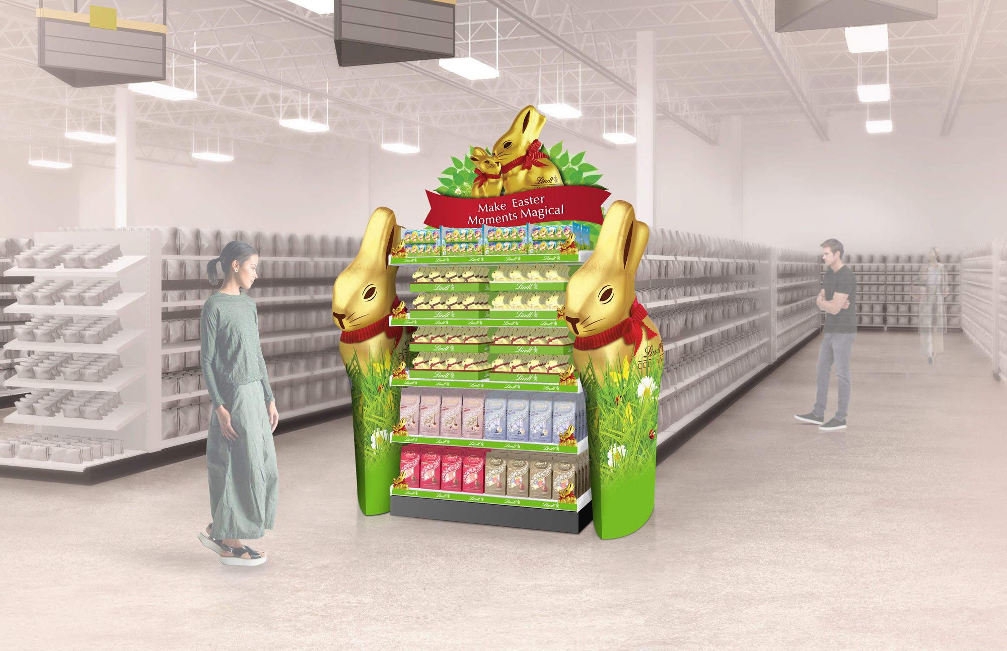
Floor Displays: Easter Seasonal


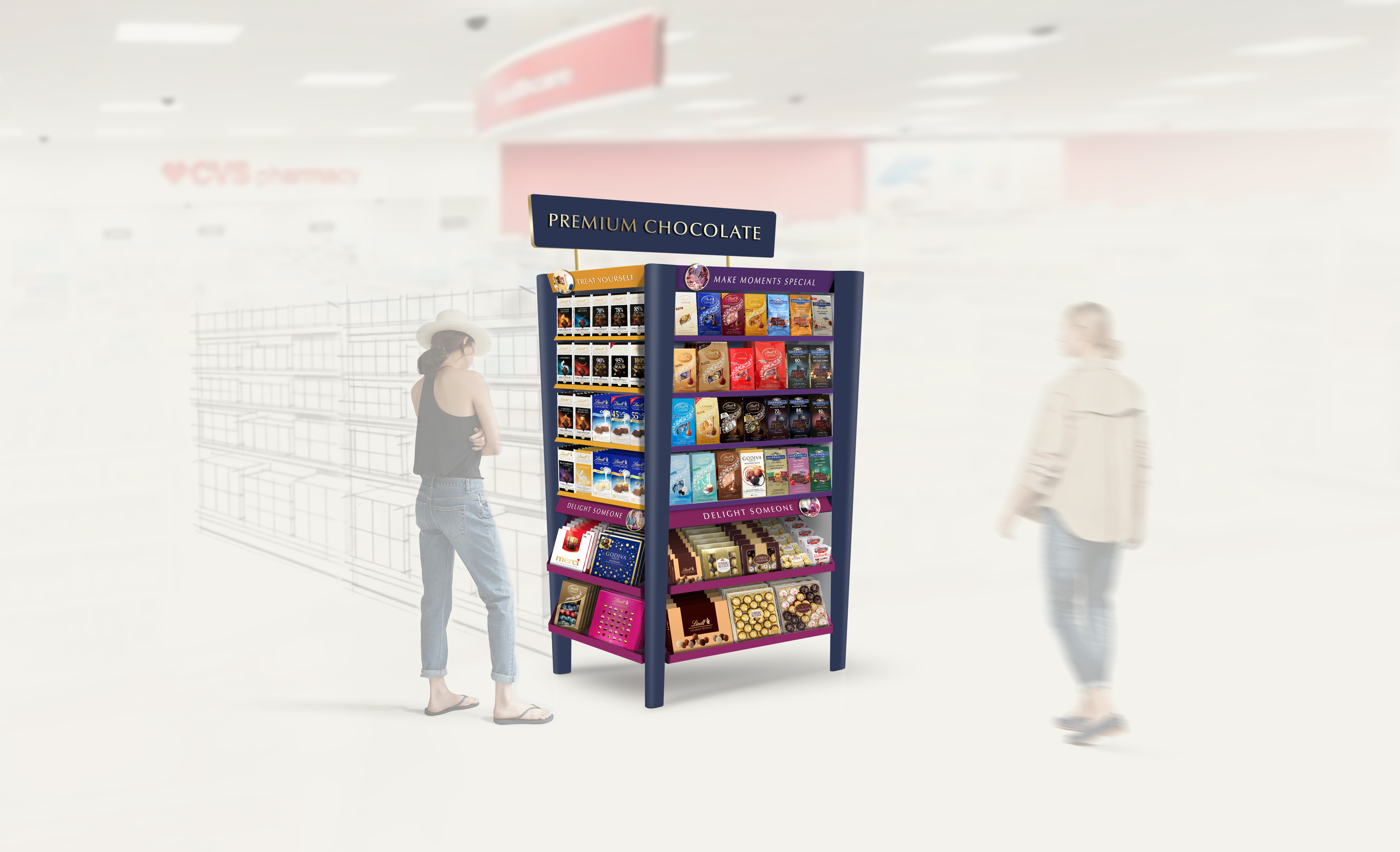
LINDT x CVS/ Endcaps & Displays
SHORT BRIEF.
These renderings were developed in partnership with Lindt USA's Customer Marketing Team for meetings with CVS. We always learn something new when working through these projects. We understand more about Lindt’s brand and merchandising strategy, which helps us provide relevant design solutions and allows us to move efficiently through the creative process.
WHAT WE DID.
To begin the process, we combine competitive research with inspiration and initial concept sketches. Once we’ve agreed on a direction, we start to execute the renderings. For some of these projects we work exclusively in the Adobe Suite - primarily in Photoshop. For others we use 3D software to create the display, and then bring the finished rendering into Photoshop to add context.
To begin the process, we combine competitive research with inspiration and initial concept sketches. Once we’ve agreed on a direction, we start to execute the renderings. For some of these projects we work exclusively in the Adobe Suite - primarily in Photoshop. For others we use 3D software to create the display, and then bring the finished rendering into Photoshop to add context.
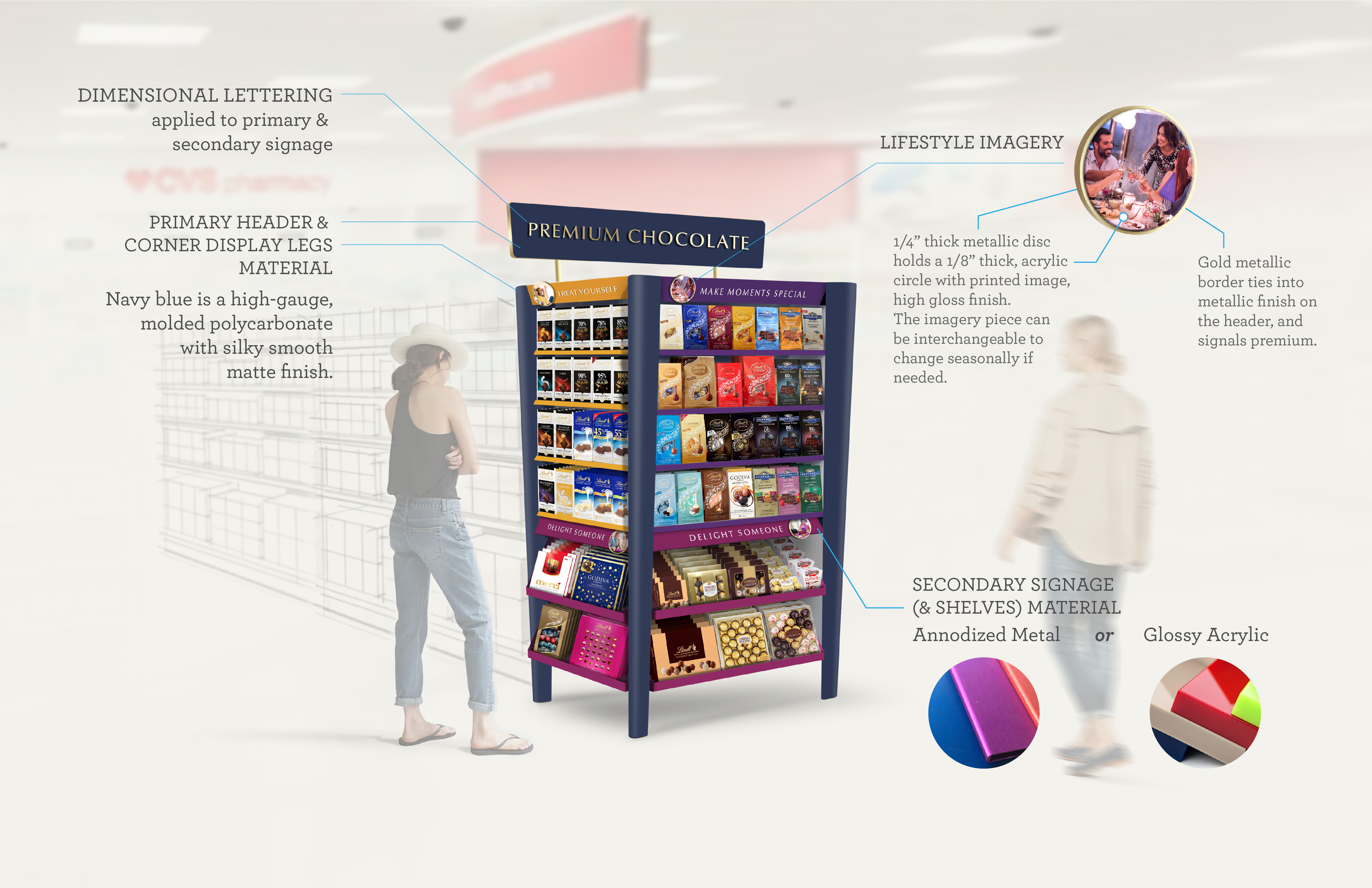
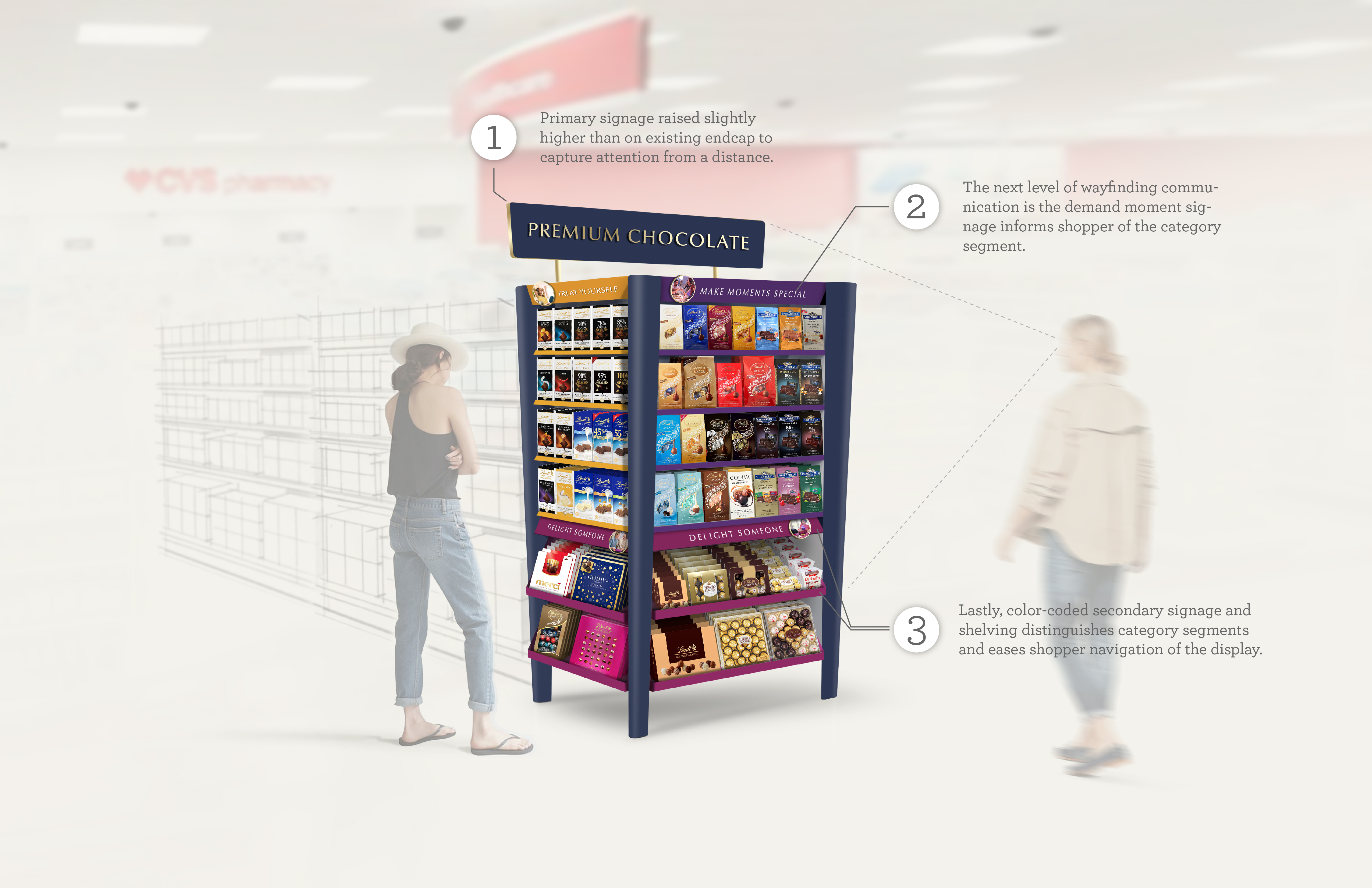
Permanent Premium Gifting Endcap
The endcap design below is currently being tested in 500 CVS stores nationwide. The goal was to provide an update to the existing (outdated) display, while integrating key strategic marketing initiatives that speak directly to consumers needs.

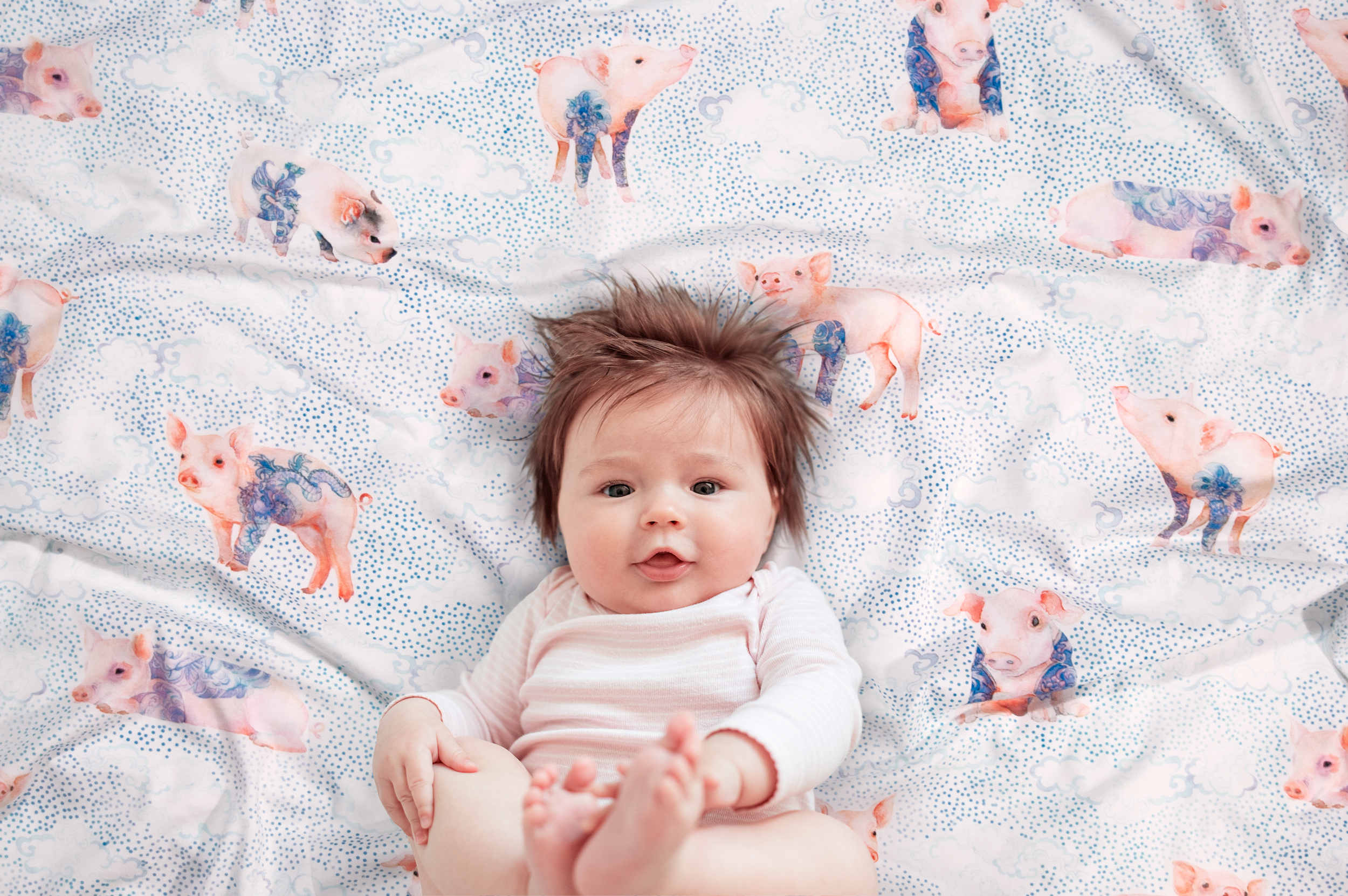
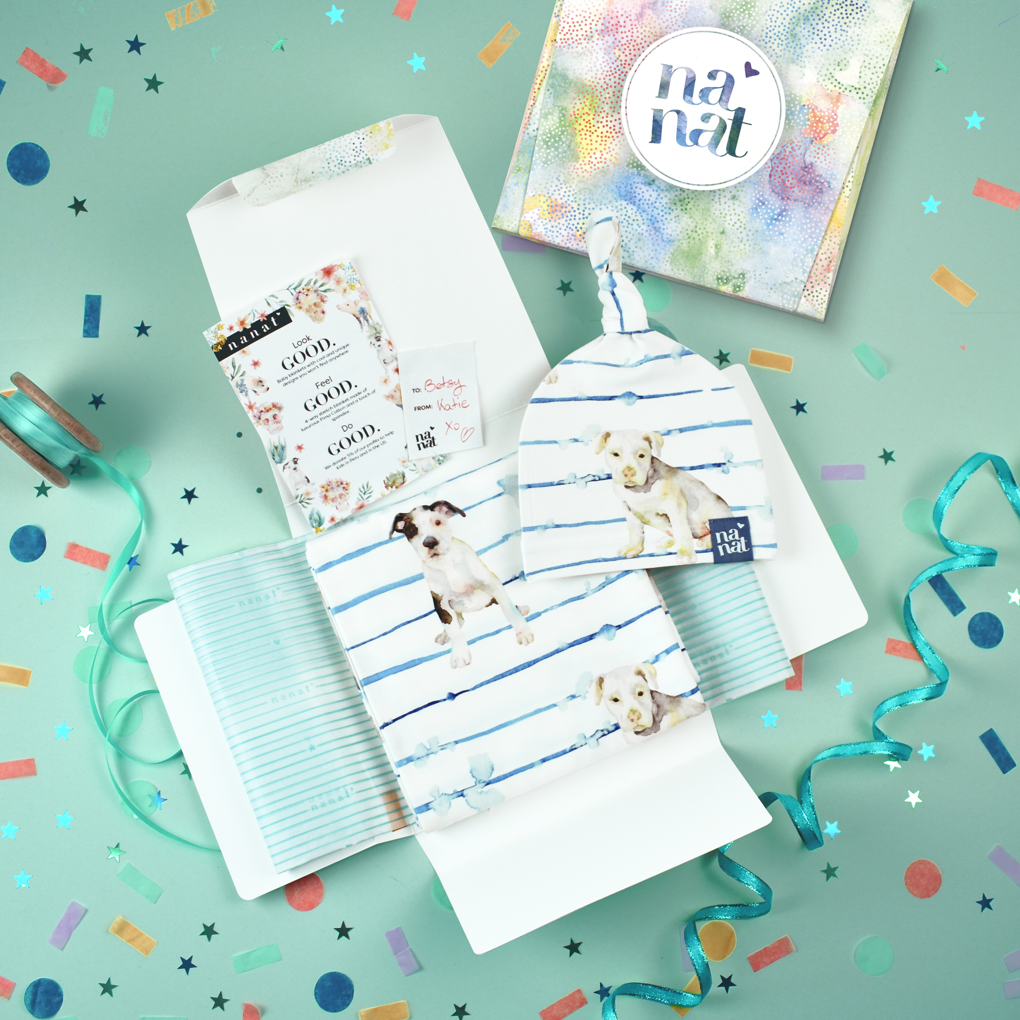
NANAT / Brand Design
SHORT BRIEF.
Brand Design. Craft a brand targeting new parents (25-40) and gift-givers (30-65) looking for uniquely designed baby blankets that children and adults can enjoy for both the artistic quality and the premium material.
Brand Design. Craft a brand targeting new parents (25-40) and gift-givers (30-65) looking for uniquely designed baby blankets that children and adults can enjoy for both the artistic quality and the premium material.
WHAT WE DID.
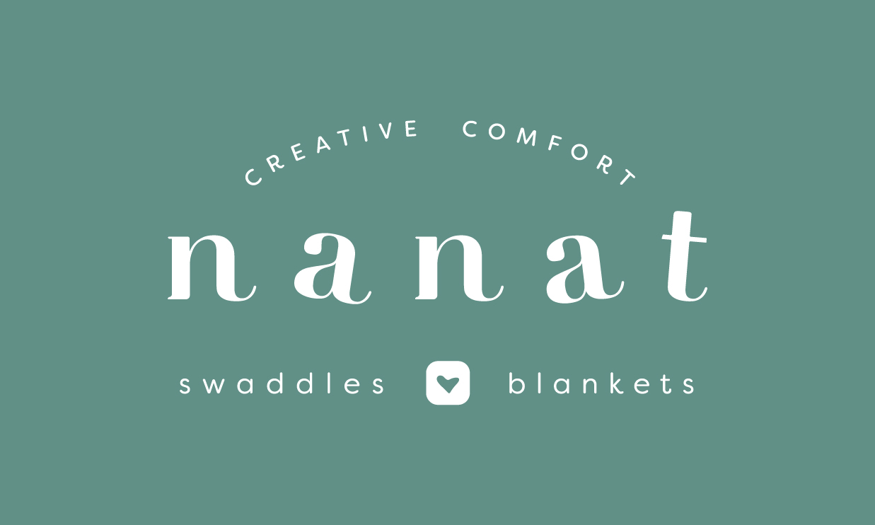
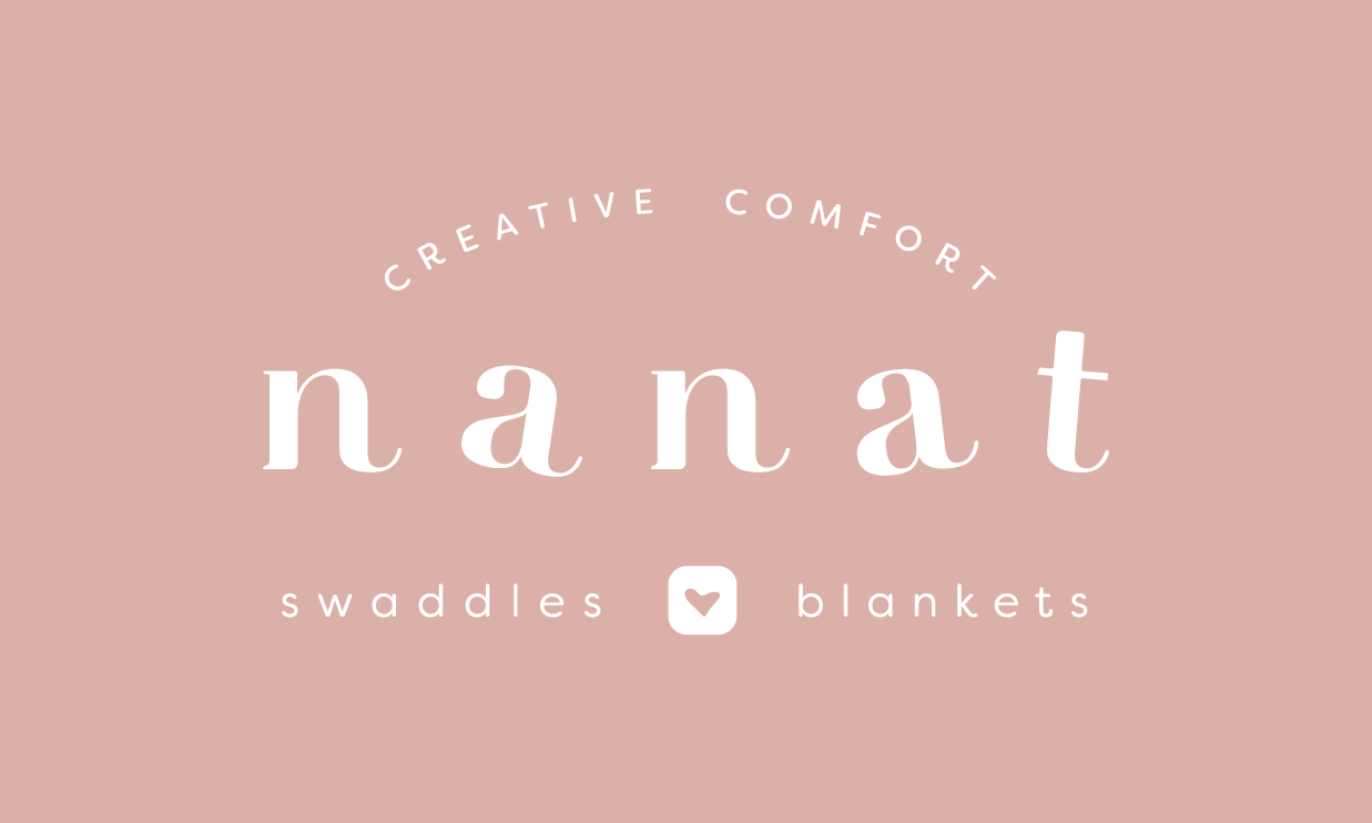
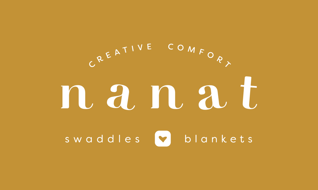
Before the design work began, we developed a brand roadmap which outlined nanat’s brand values, personality, message, tone, and more. From that roadmap, a concept for the brand’s visual expression emerged - elements of that work are shown below.
Brand Identity. The ‘nanat’ wordmark conveys an elegant yet playful feel. The visual system is both consistent and flexible, allowing for a cohesive rollout to various digital channels and print formats.
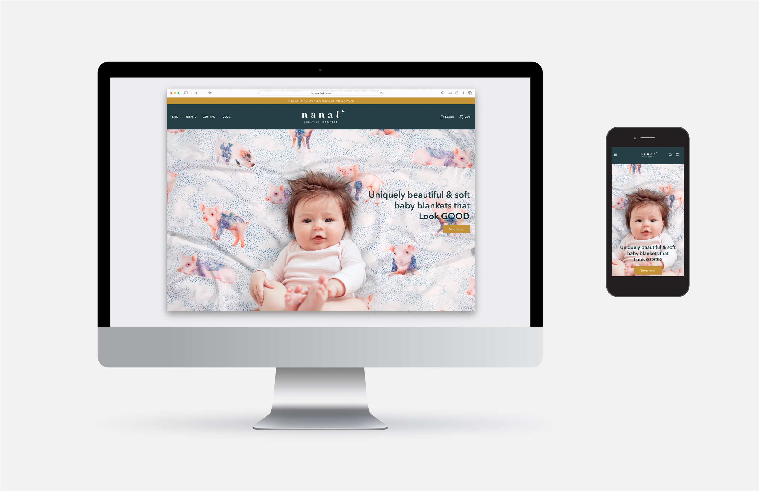
Visit the storefront > nanatbaby.com
Before the design work began, we developed a brand roadmap which outlined nanat’s brand values, personality, message, tone, and more. From that roadmap, a concept for the brand’s visual expression emerged - elements of that work are shown below.
Brand Identity. The ‘nanat’ wordmark conveys an elegant yet playful feel. The visual system is both consistent and flexible, allowing for a cohesive rollout to various digital channels and print formats.
Visit the storefront > nanatbaby.com
Identity Design
Secondary marks, social media badges, and icons


Seasonal logo treatment - spring promotion concept


Collateral mockup
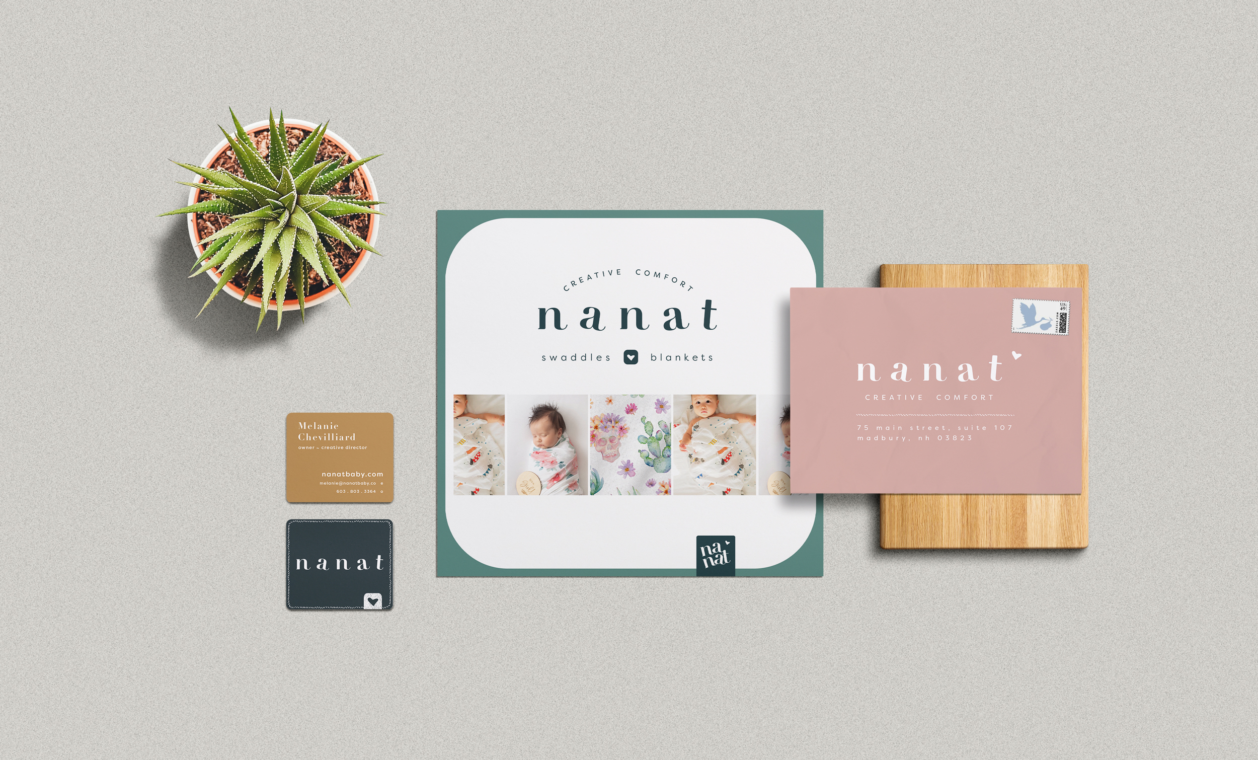
Brand Guidelines, Color and Typography


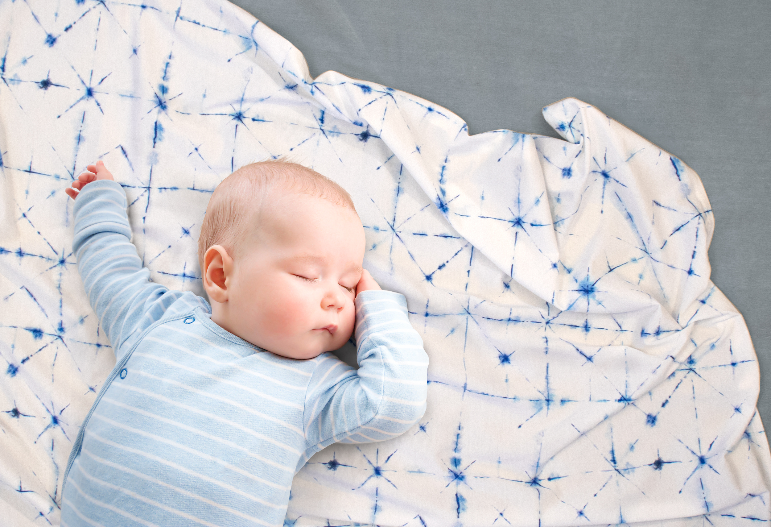
Blanket + Baby brand visuals
Photography by Matt & Mel’s
Photography by Matt & Mel’s


Digital Carousel - Shopify, Etsy
Packaging - Premium Giftbox (1PC), e-commerce exclusive
Primary structure is made with Mohawk’s 100% PC ultra-white uncoated paperboard with a beautiful clear foil stamp applied to the logo. Custom tissue, inner sticker, and marketing inserts are made from 100% recycled materials and use soy inks.
Primary structure is made with Mohawk’s 100% PC ultra-white uncoated paperboard with a beautiful clear foil stamp applied to the logo. Custom tissue, inner sticker, and marketing inserts are made from 100% recycled materials and use soy inks.


Packaging - Luxury Keepsake Giftbox (3PC), e-commerce exclusive
Rigid structure uses 100% recycled chipboard, and outer paper wrap made with FSC certified paper. Custom tissue, inner sticker, and marketing inserts are made from 100% recycled materials and use soy inks.
Rigid structure uses 100% recycled chipboard, and outer paper wrap made with FSC certified paper. Custom tissue, inner sticker, and marketing inserts are made from 100% recycled materials and use soy inks.
