

LINDT x TARGET/ In-store visualizations
SHORT BRIEF.
We regularly collaborate with the Lindt’s Sales & Shopper Marketing teams to create inspirational display renderings to be shared with Target buyers. As a category leader, it’s important that Lindt guides and inspires the buyer with merchandising concepts for new product launches and fresh seasonal programs. Some concepts are very Lindt-forward, while others look to elevate the premium category as a whole.
We regularly collaborate with the Lindt’s Sales & Shopper Marketing teams to create inspirational display renderings to be shared with Target buyers. As a category leader, it’s important that Lindt guides and inspires the buyer with merchandising concepts for new product launches and fresh seasonal programs. Some concepts are very Lindt-forward, while others look to elevate the premium category as a whole.
WHAT WE DID.
For each merchandising option, we started by sharing quick alignment sketches and visual inspiration to get the ideas flowing. Their team’s feedback helped guide the direction until we landed on a concept ready to bring to life. From there, we developed polished renderings and collaborated closely on product placement and signage along the way. Every rendering is shown in a Target store environment so the team and buyer can see how it would look in real life.
Project Deliverables:
- Endcap concept renderings
- In-Aisle concept renderings
- Tower & Table concept renderings
- Floor Display concept renderings
- Stand-alone Display / 4-way Display concept renderings
Aisle Display, Tower + Table combo: Seasonal

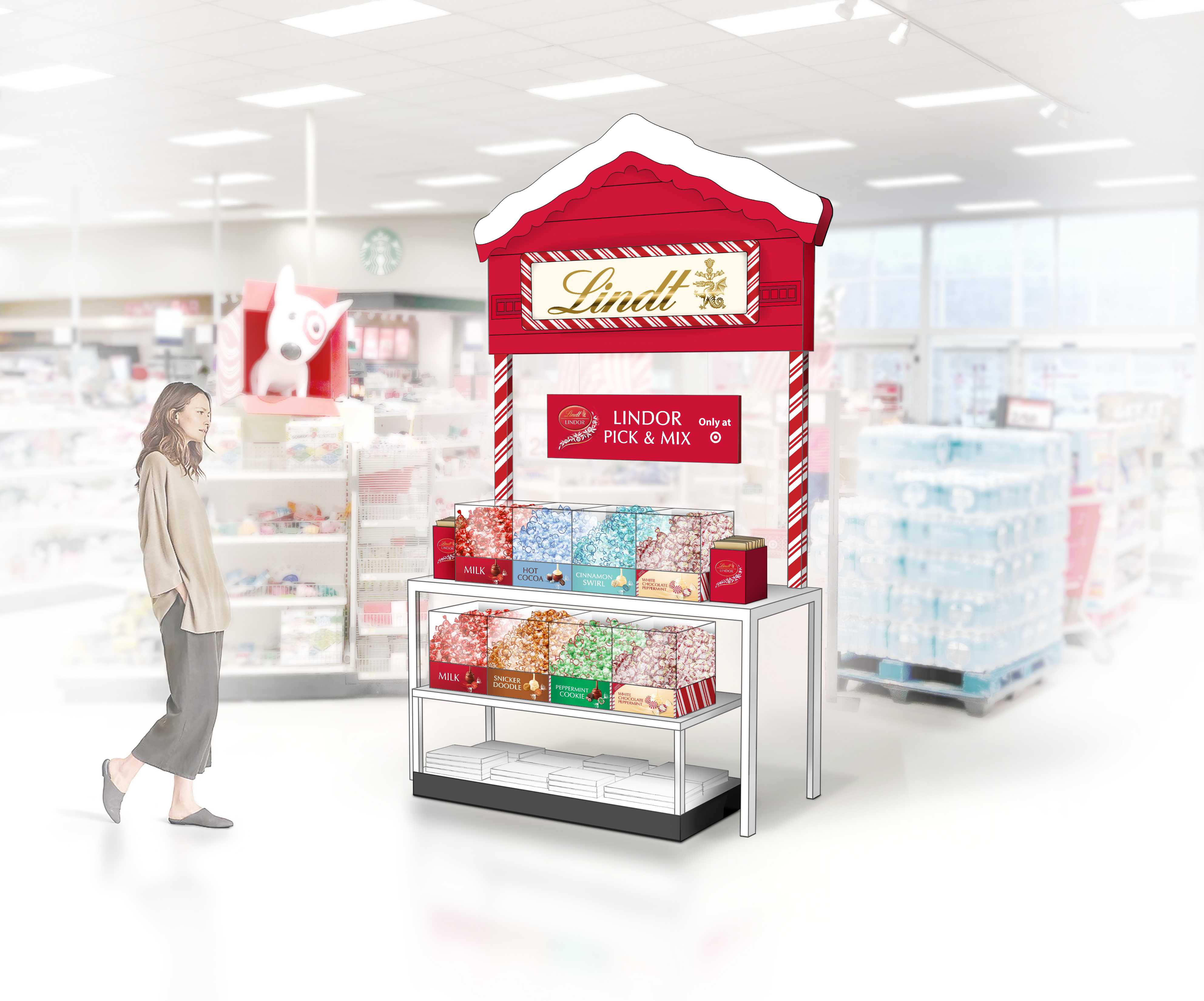
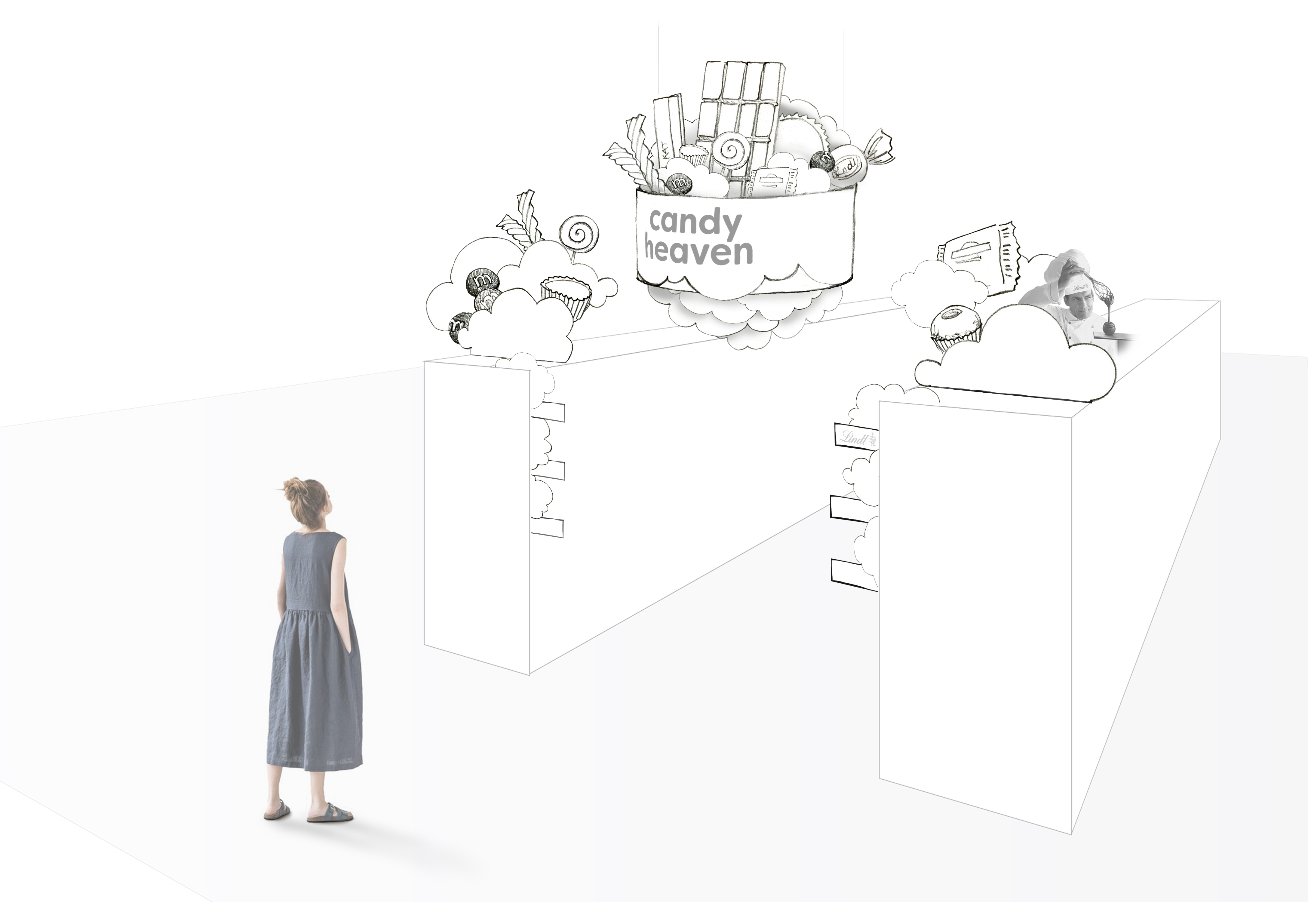
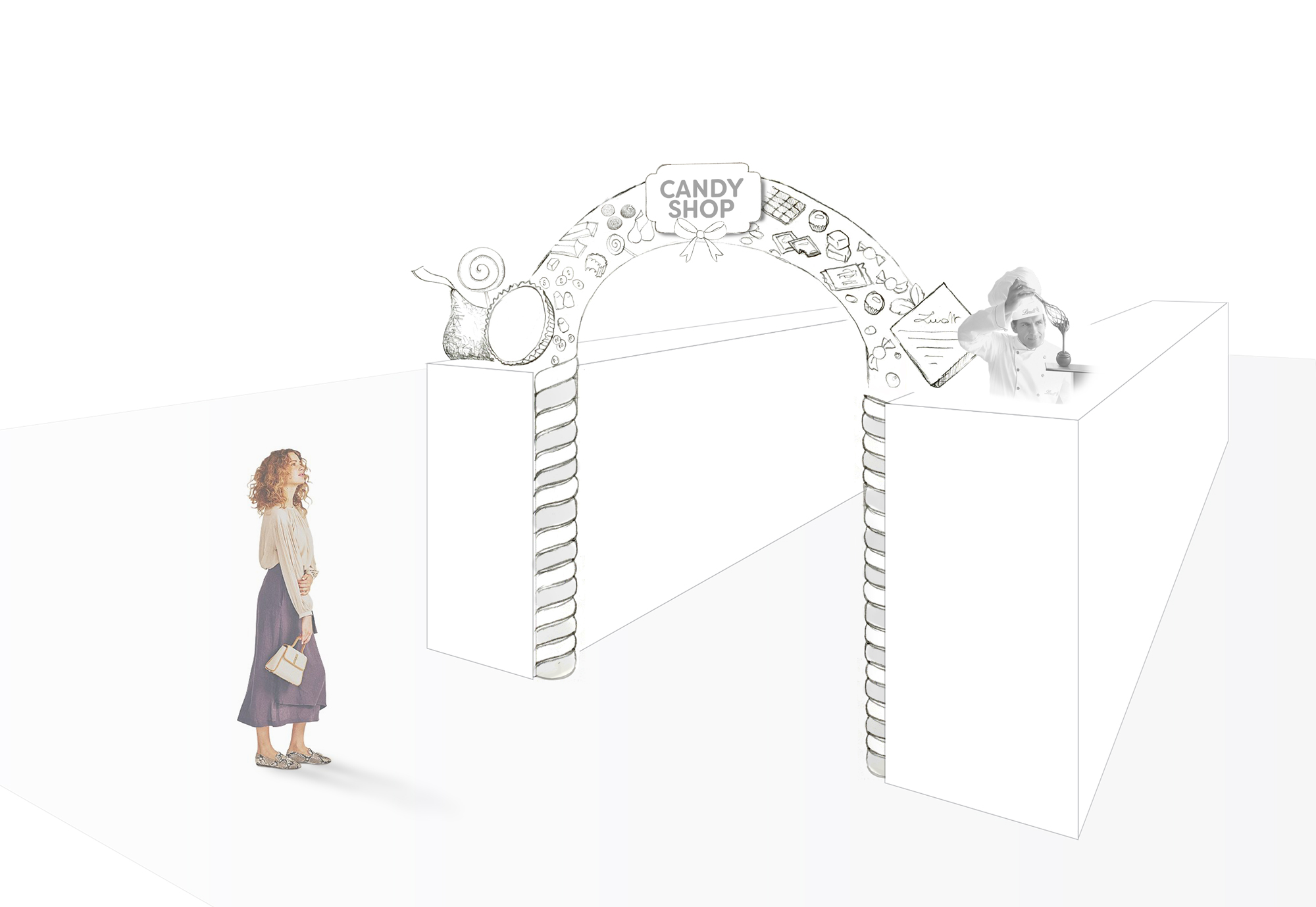
Front of Store: Pick & Mix concept
Endcap: New Brand Launch


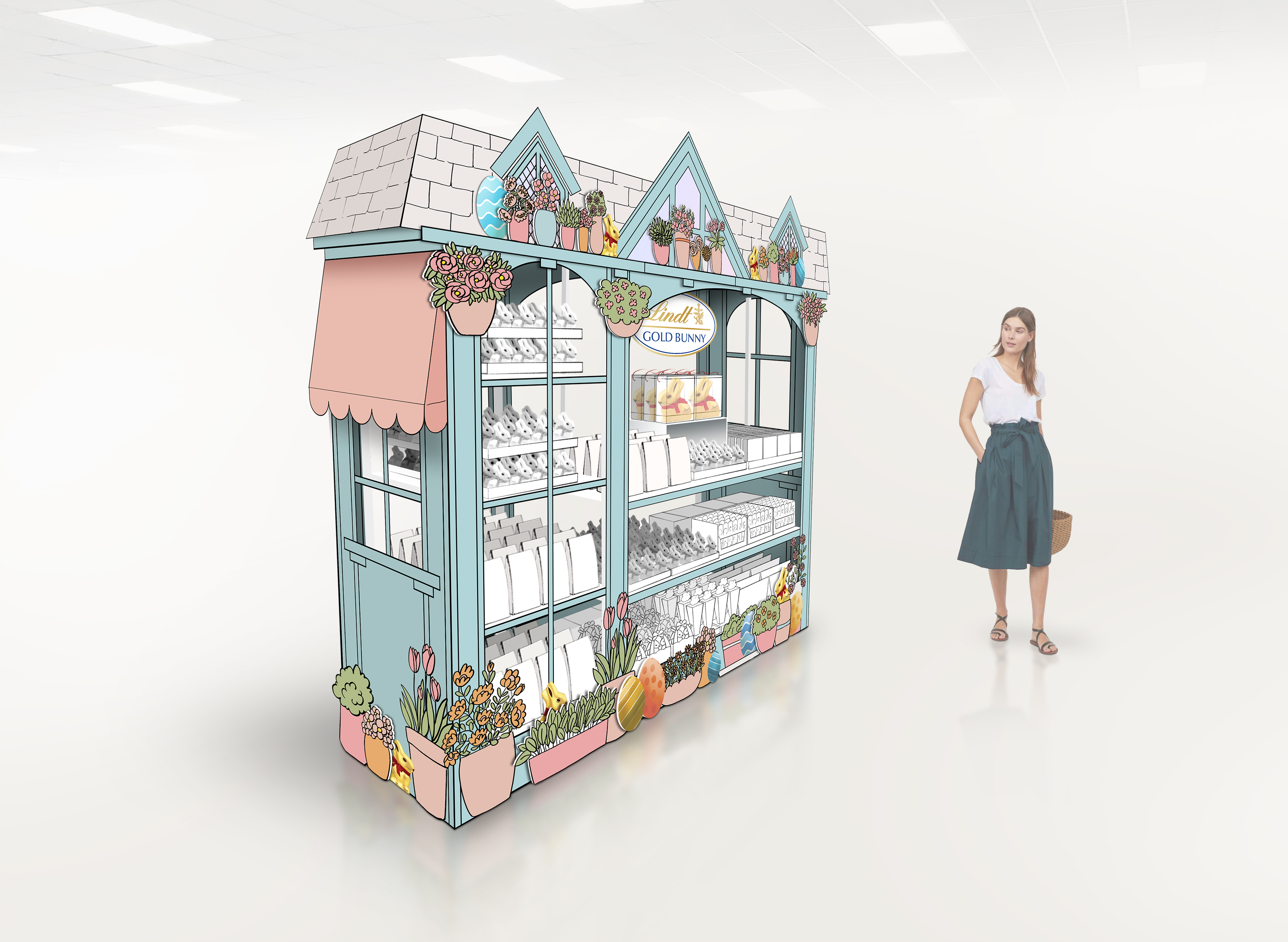
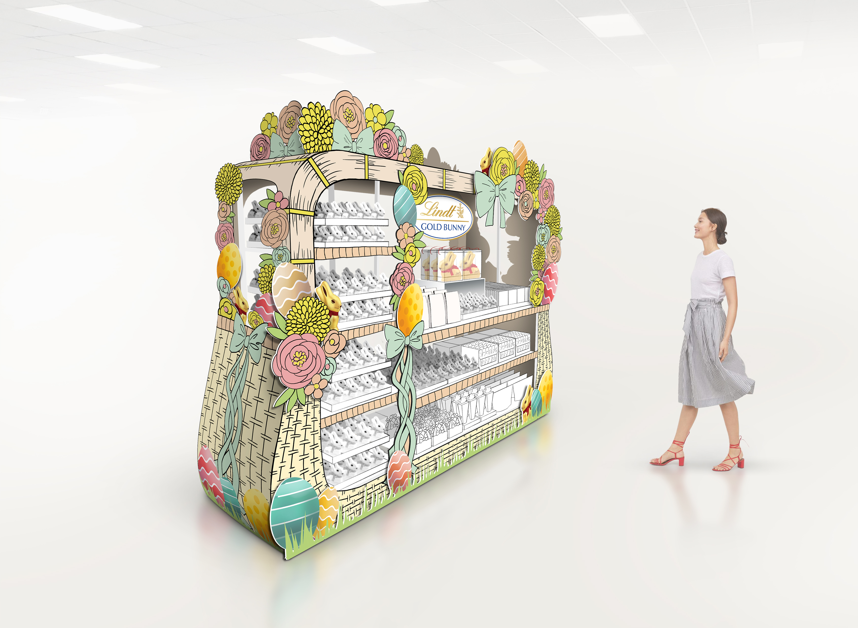
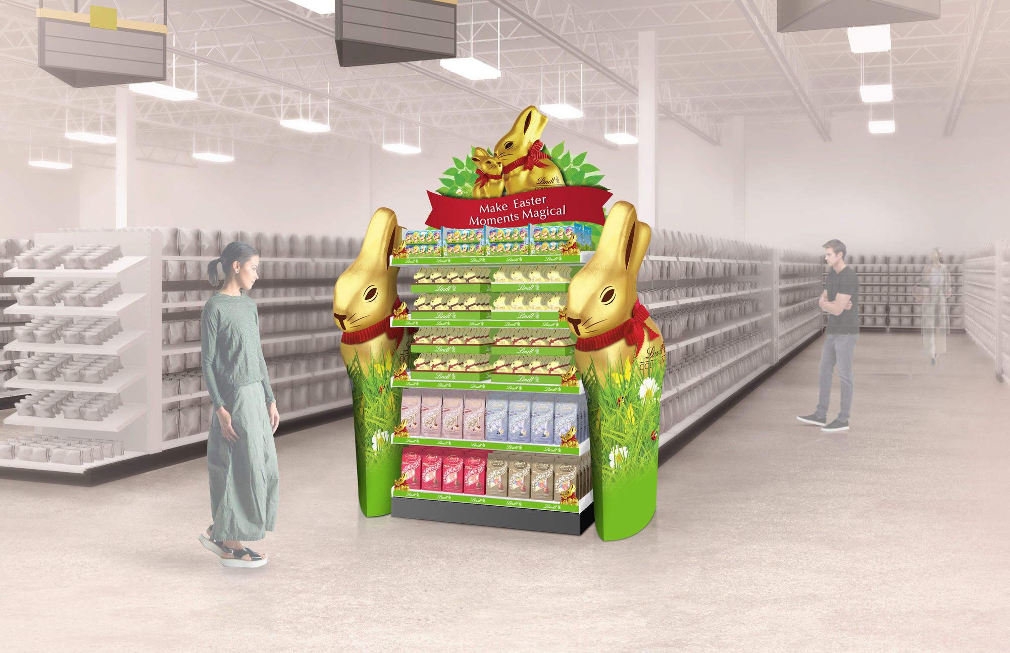
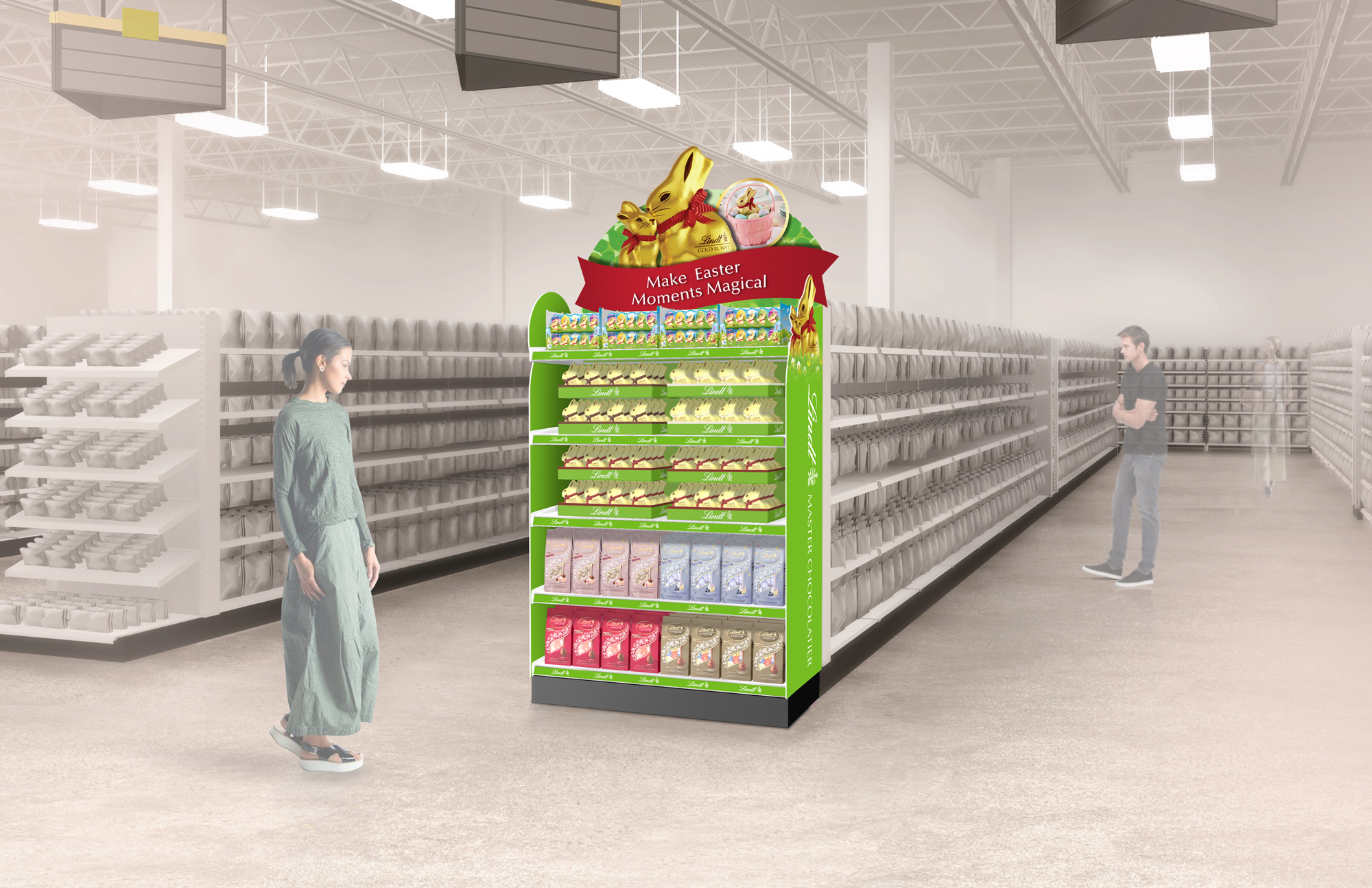
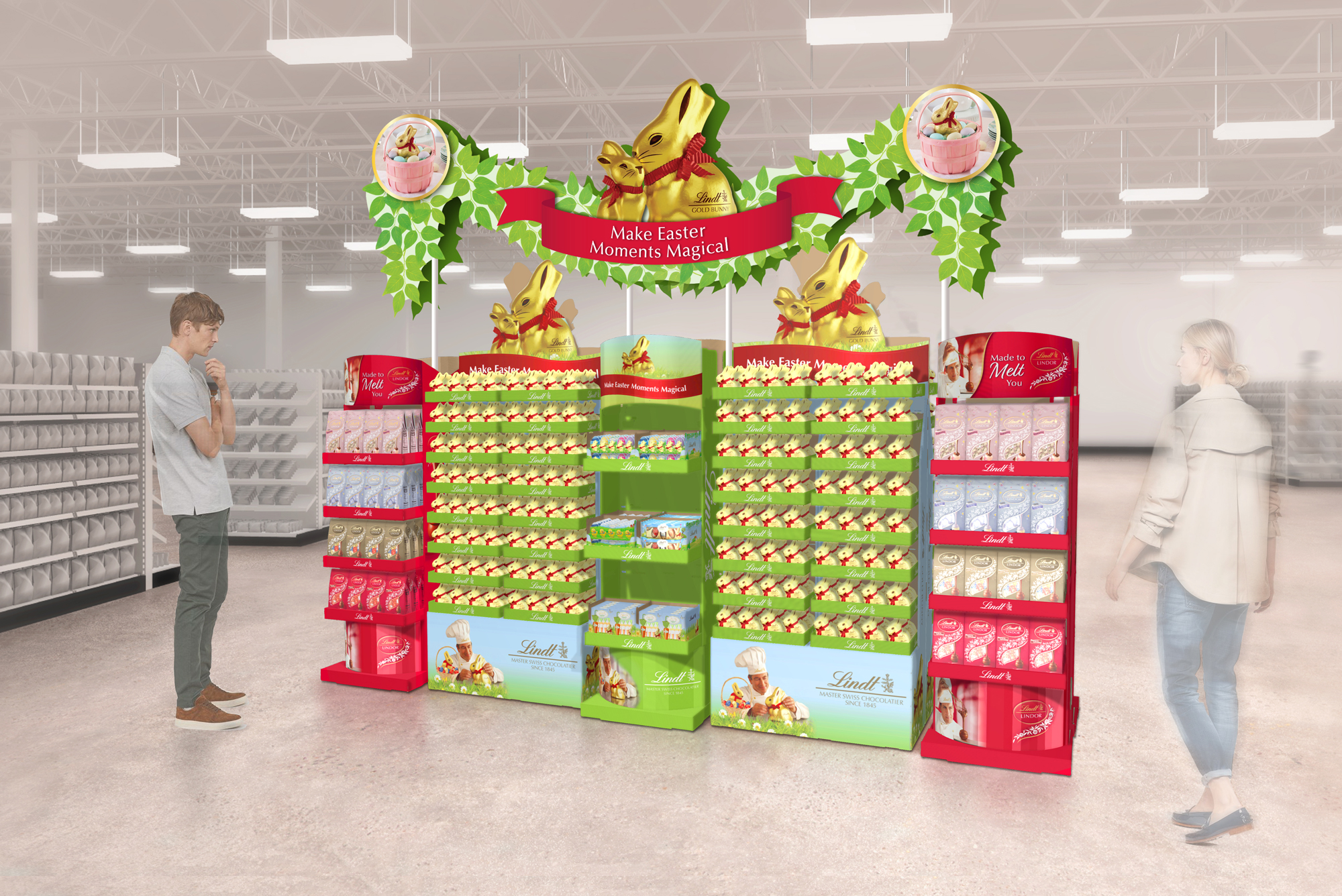
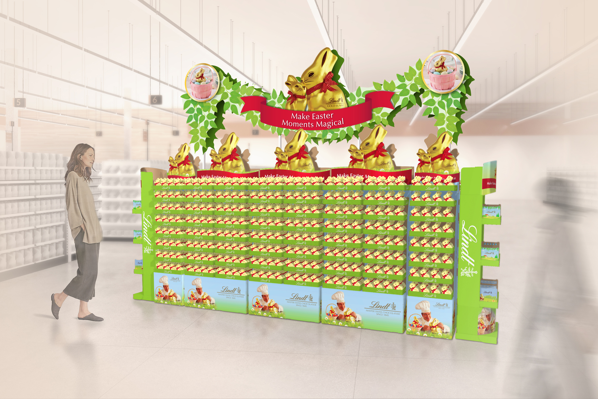
Seasonal: Easter


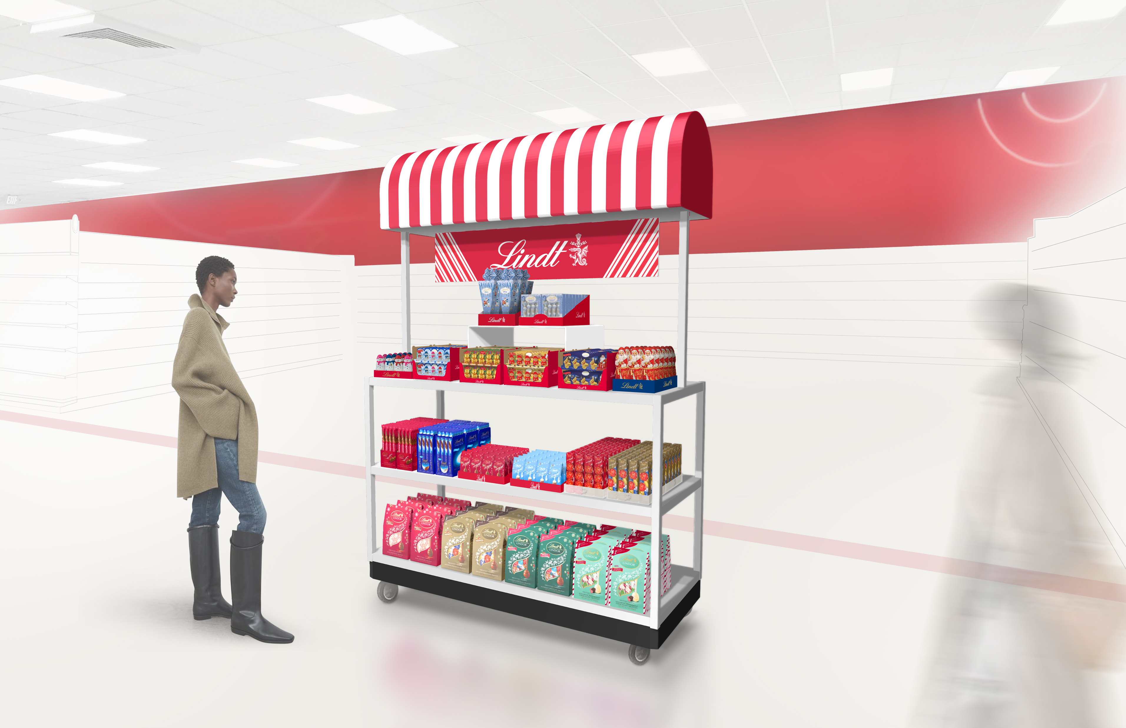
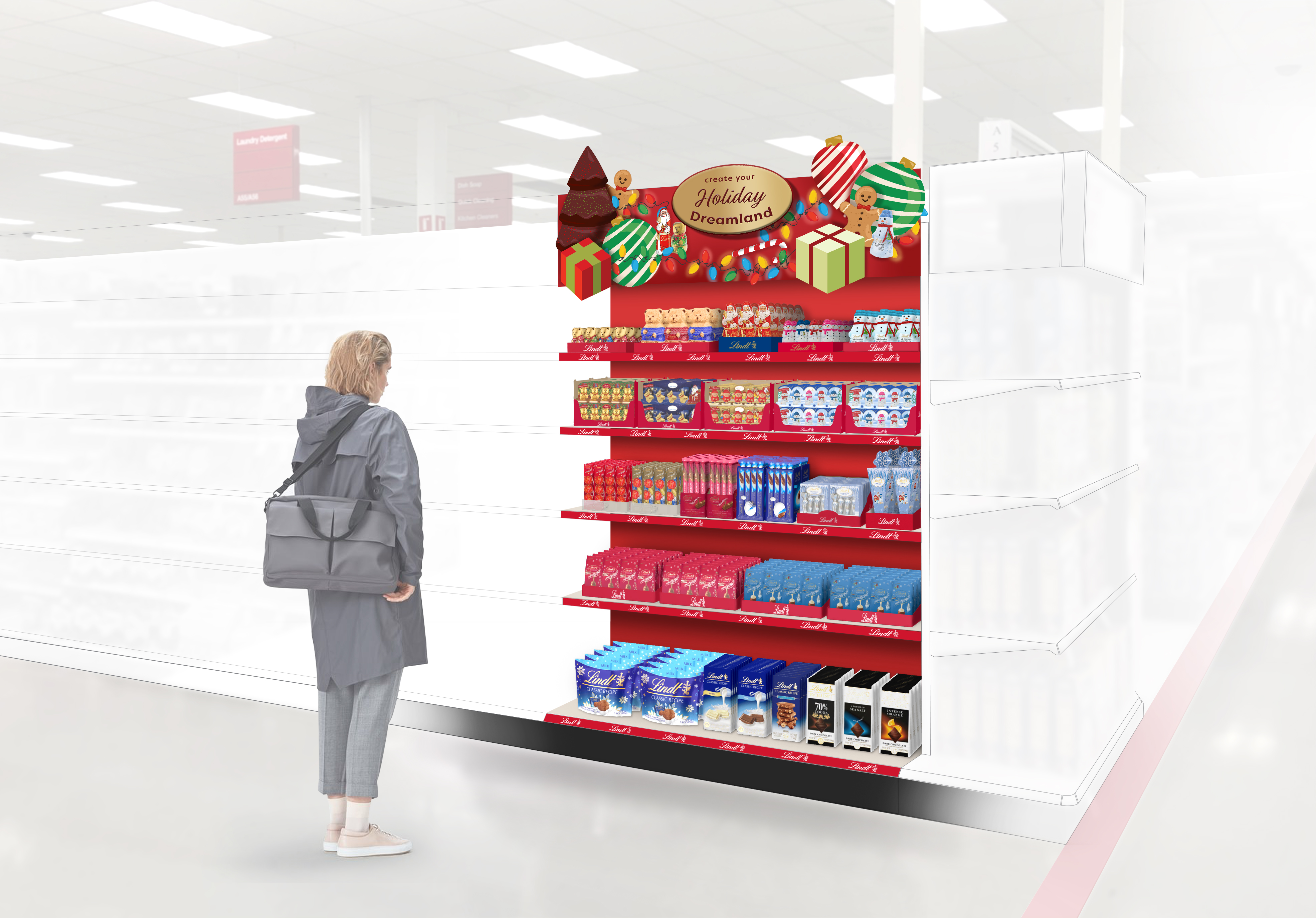
Seasonal: Holiday

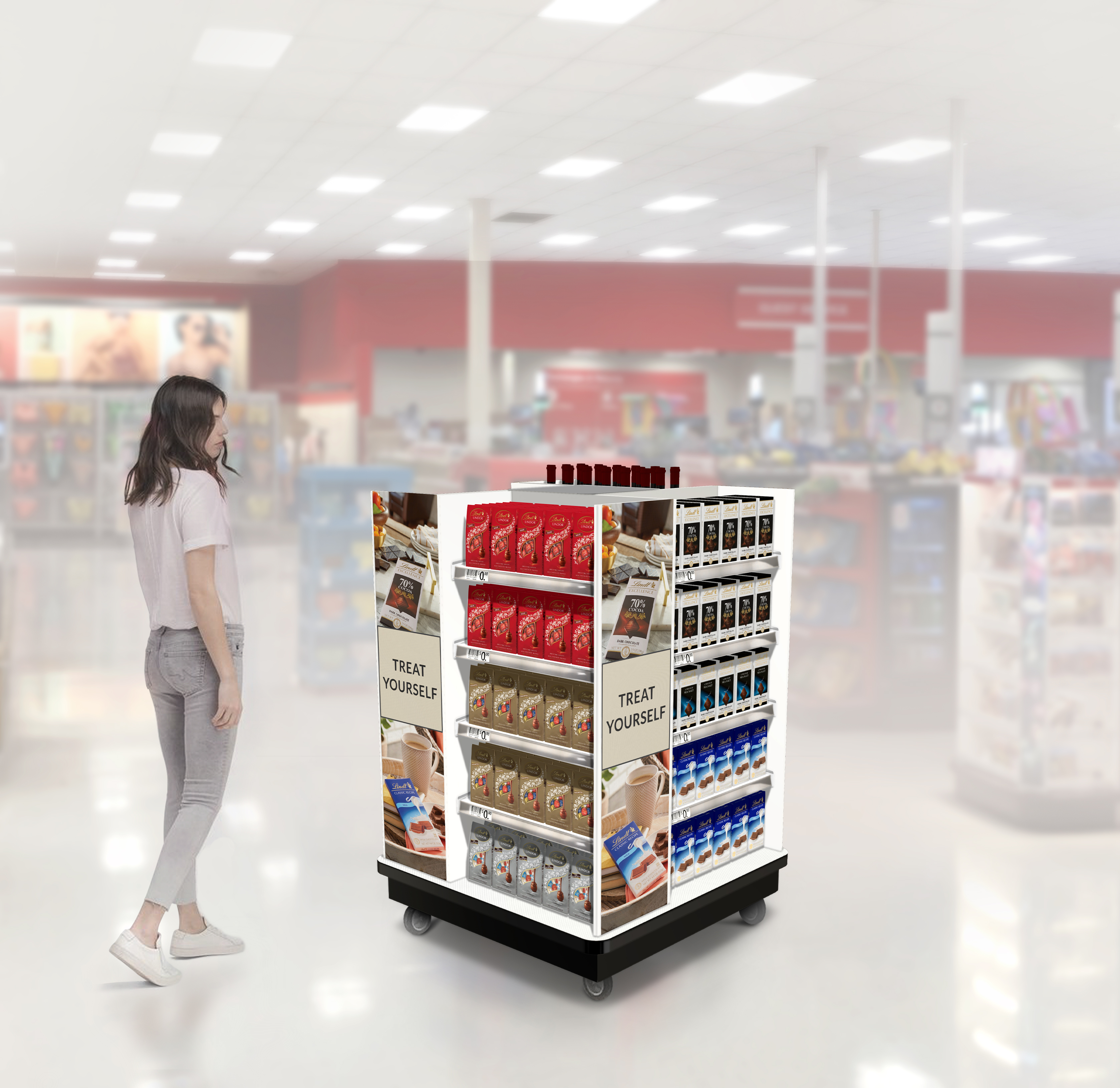
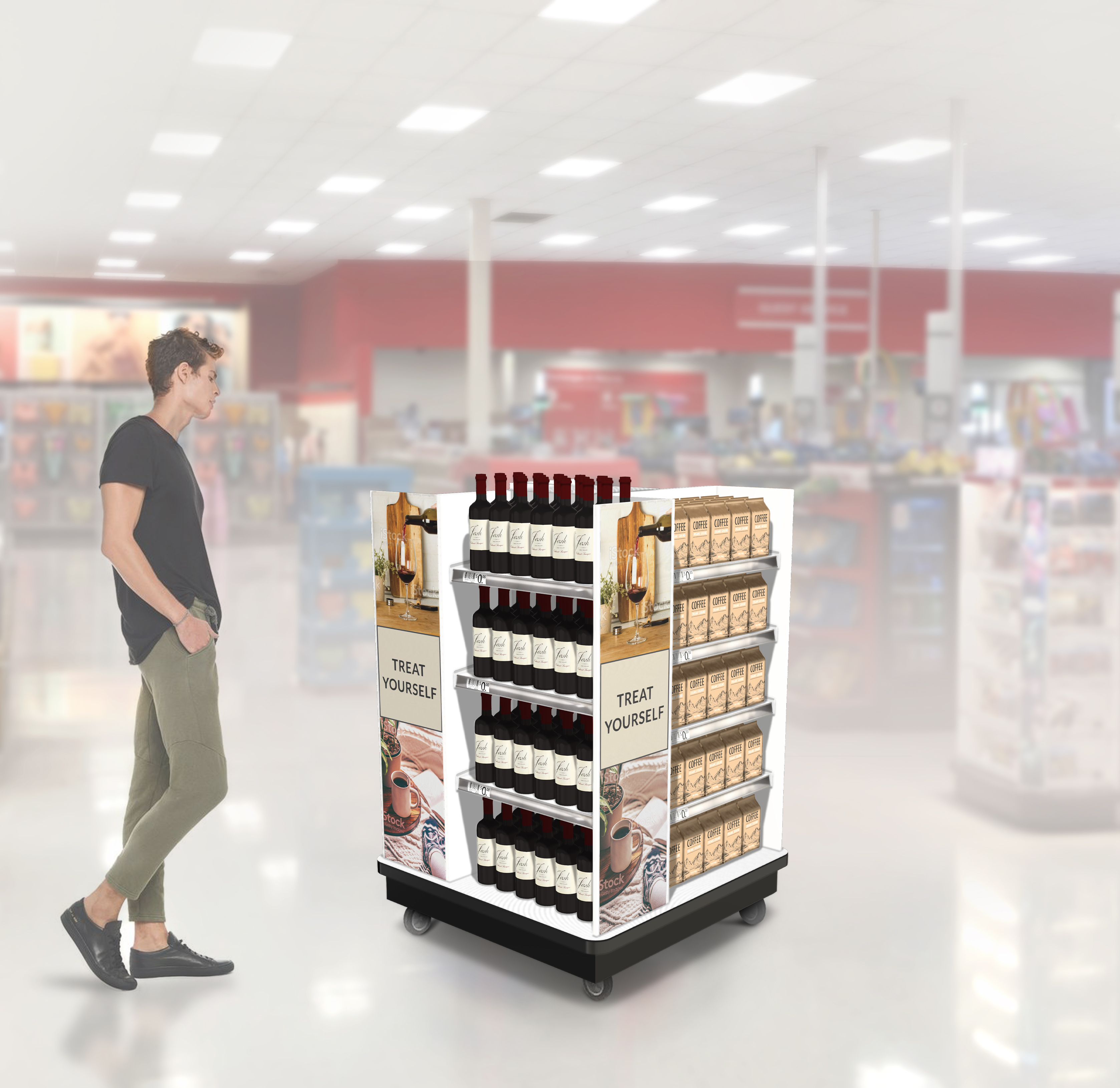
Stand-Alone 4-way Displays, Mixed Product
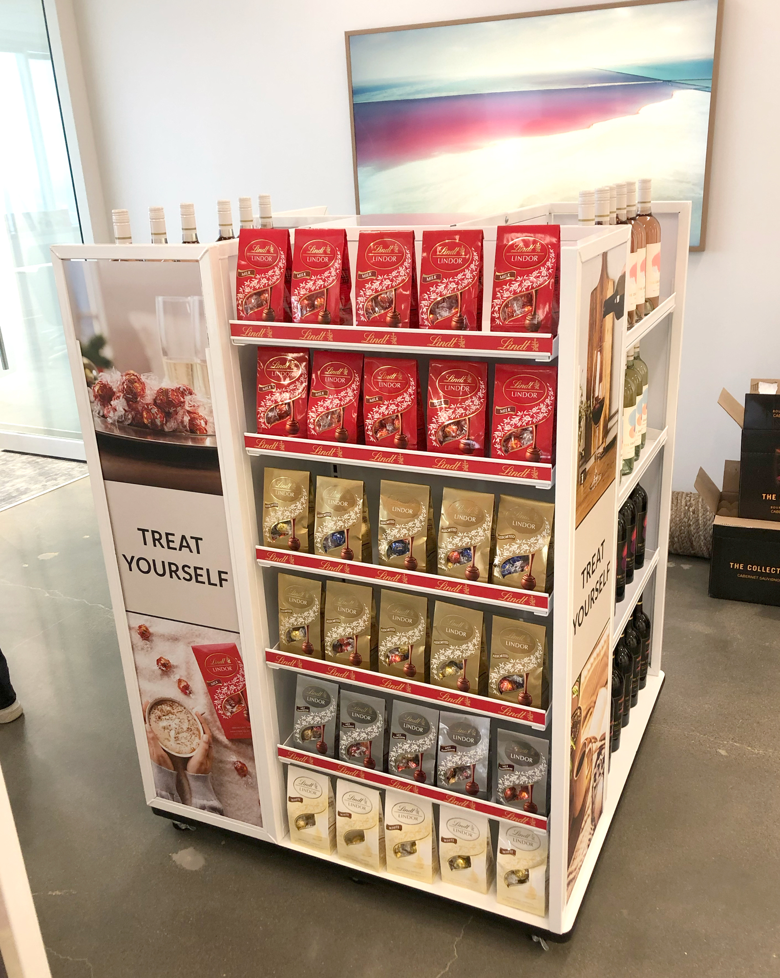
A nice win for the Lindt team! Production samples of displays at Lindt Sales office in Minneapolis.

Text rec’d from our client:
Wanted to show you the Target 4-way come to life! This is going to be implemented into Target this year. Beautiful work! The Target buyer loves it!
Total Category, GO BIG signage, Sketch concepts
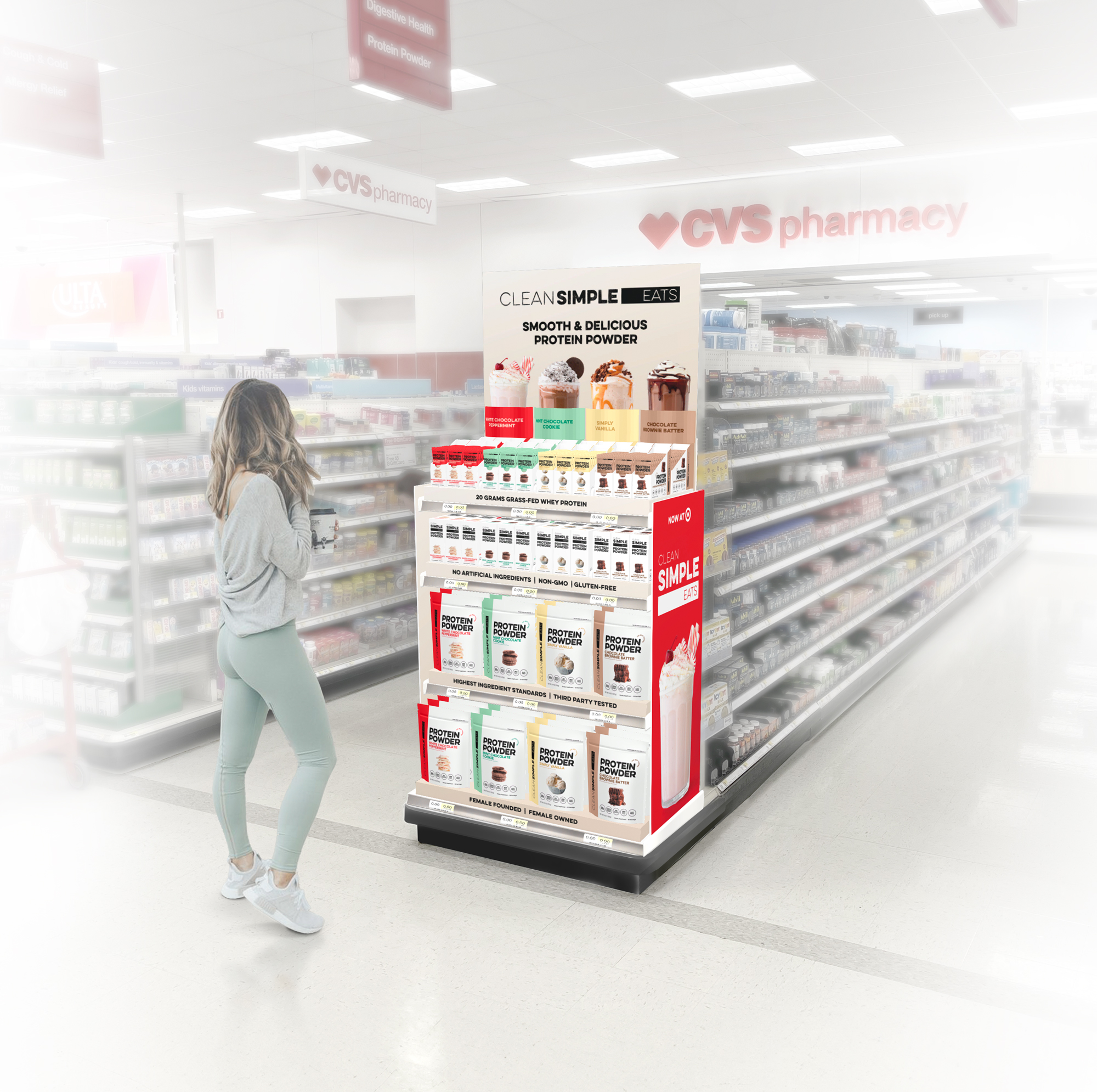
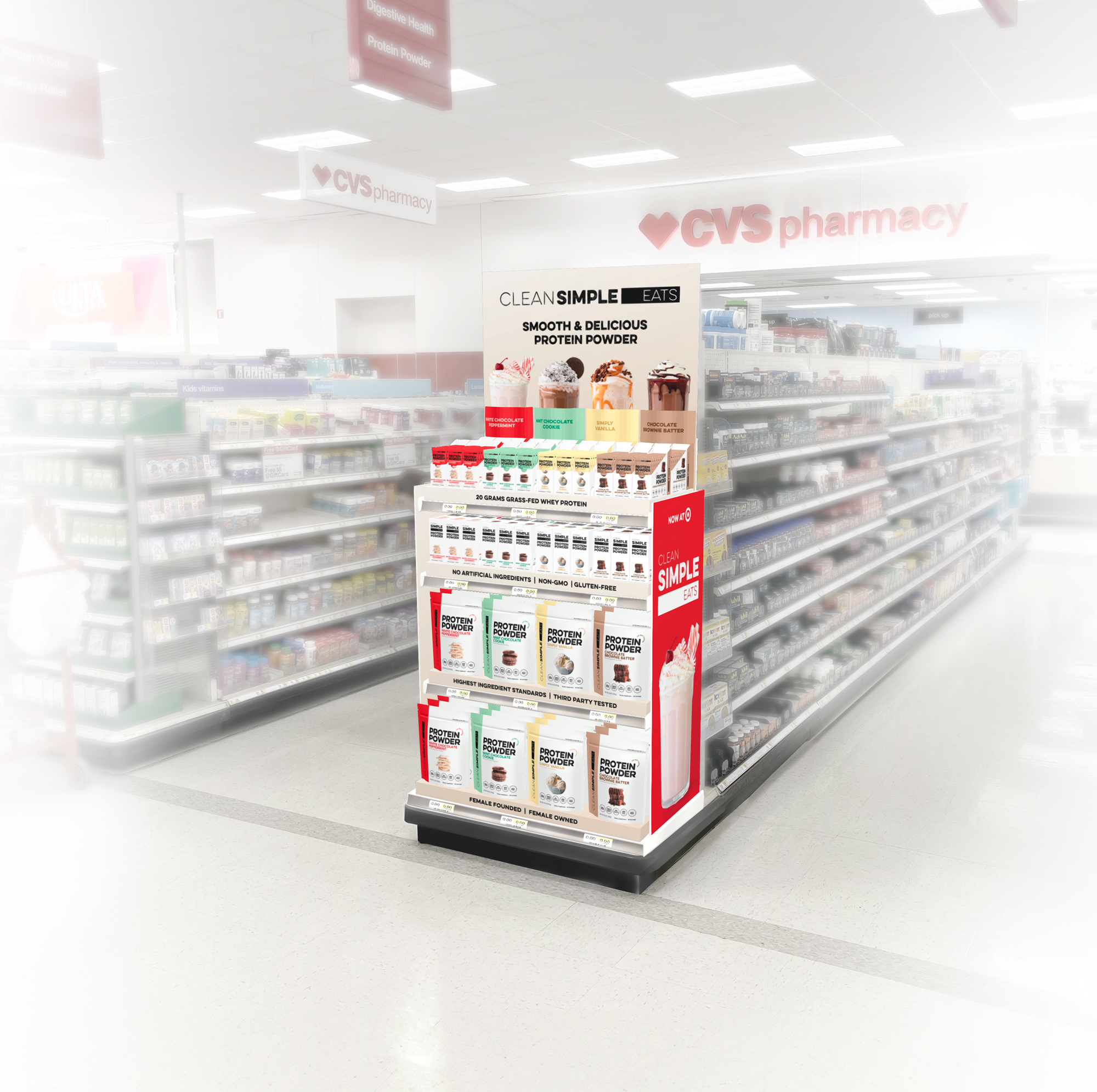
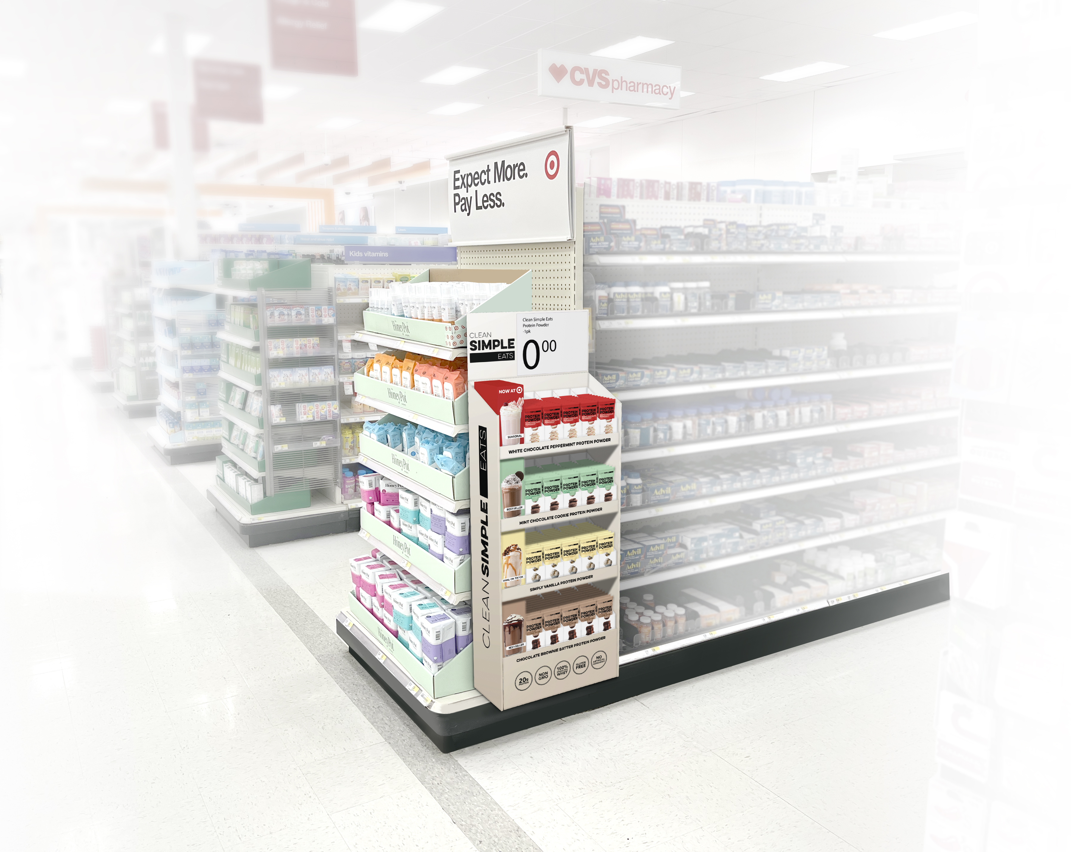
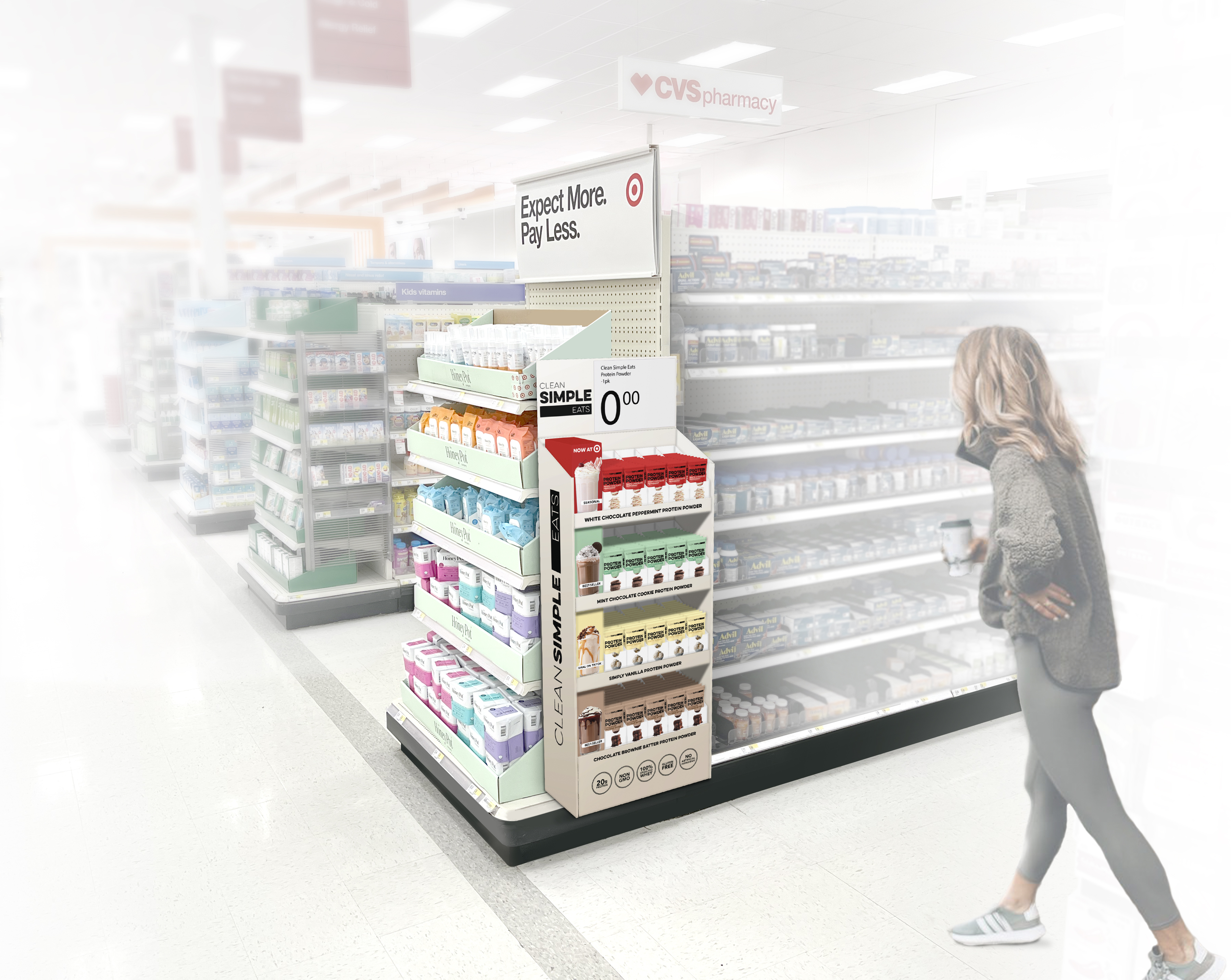
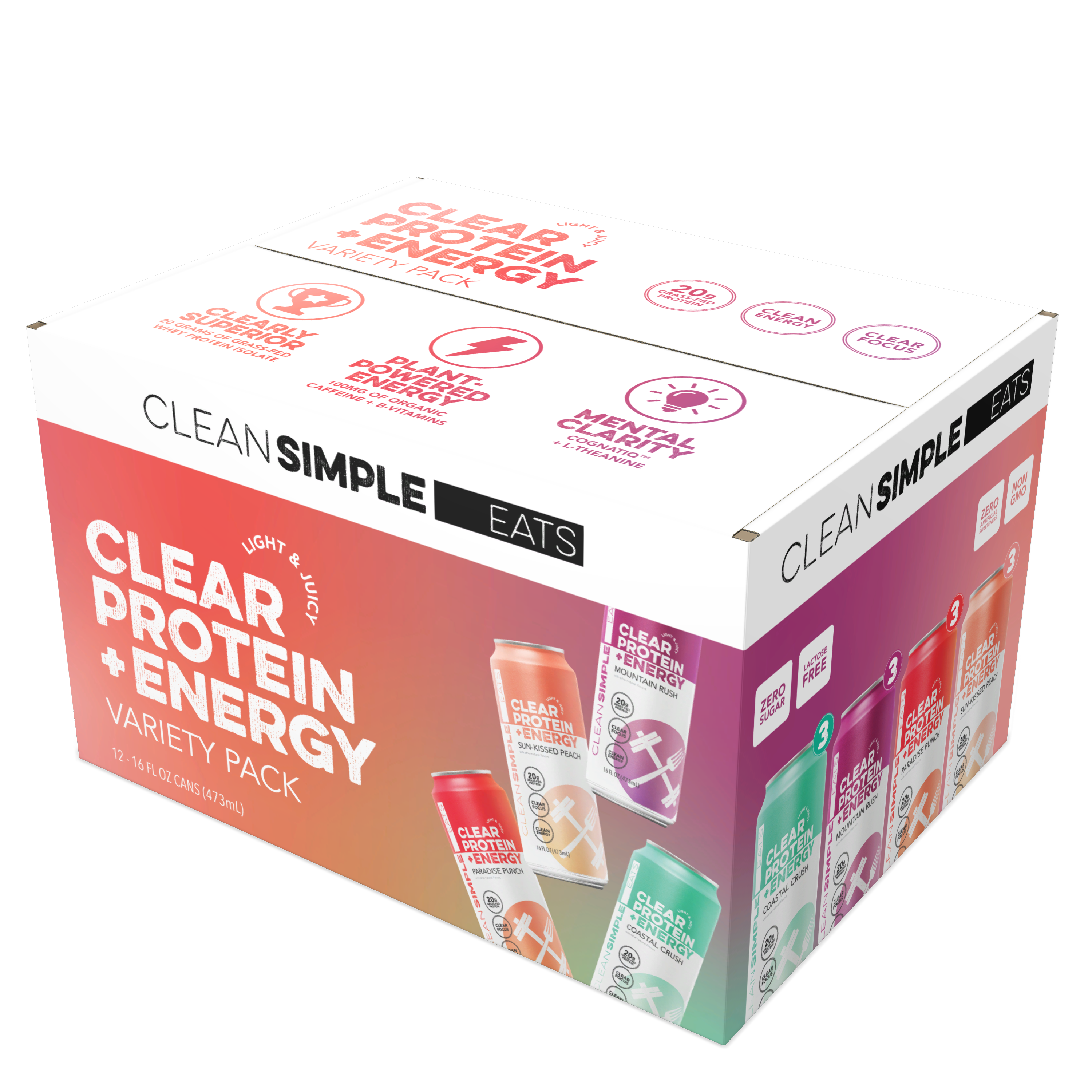
CLEAN SIMPLE EATS x TARGET /
In-store visualizations
SHORT BRIEF.
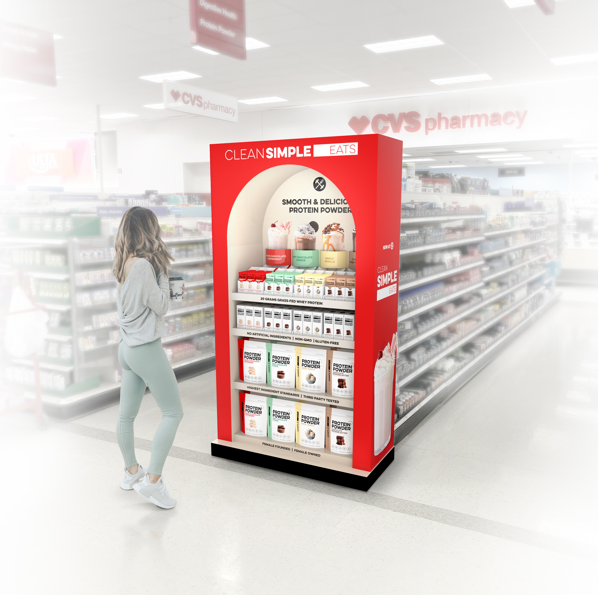
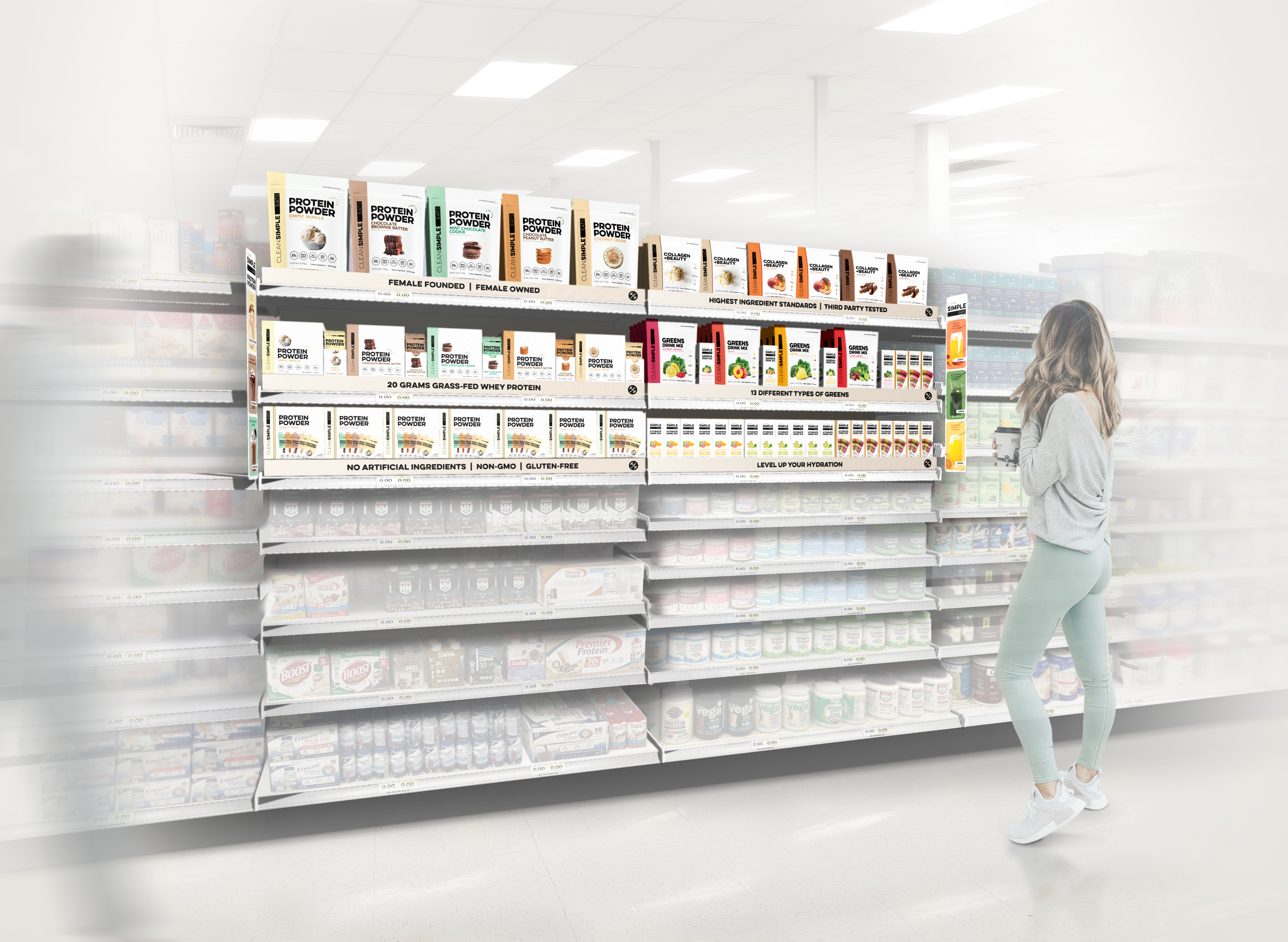
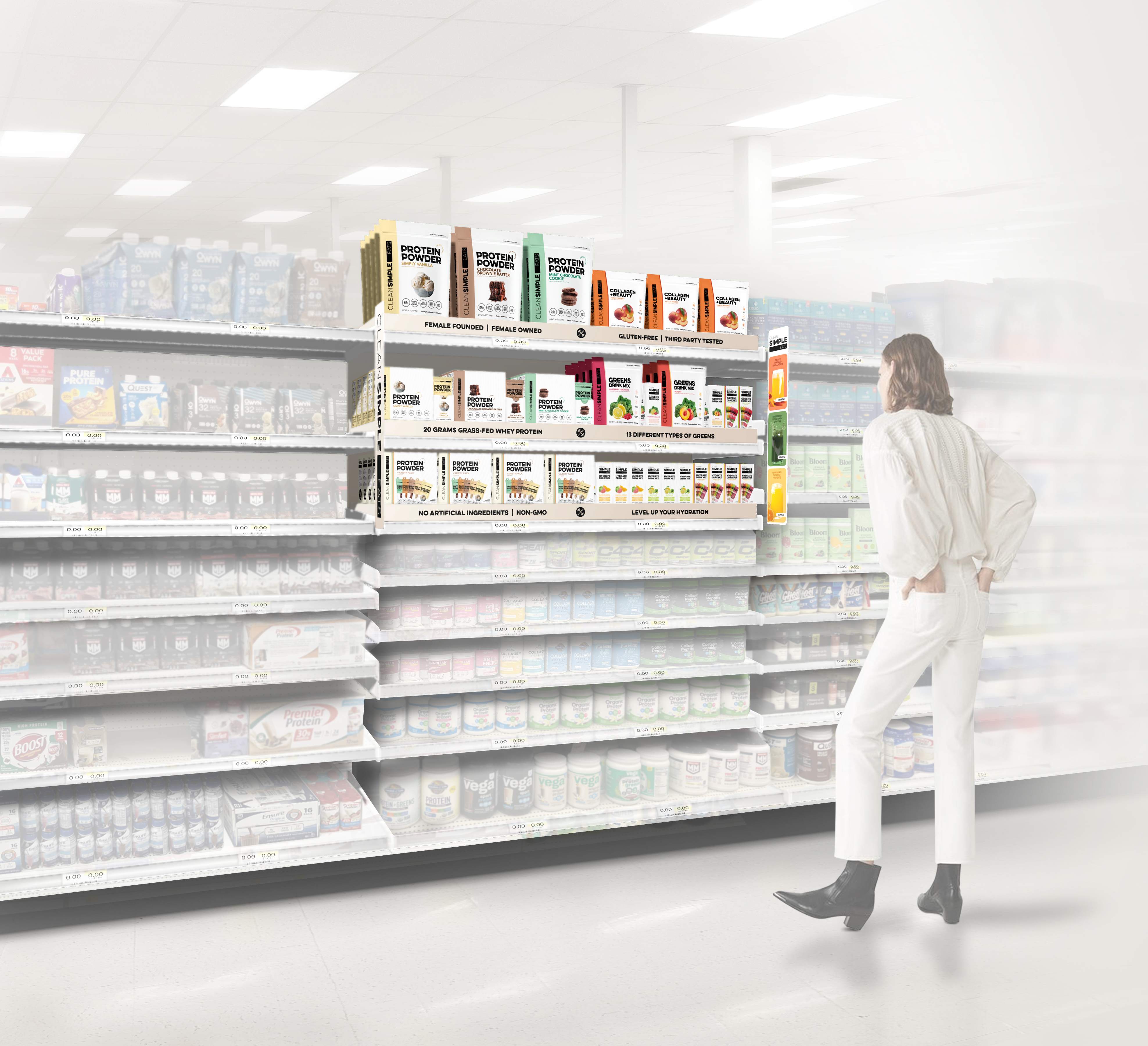
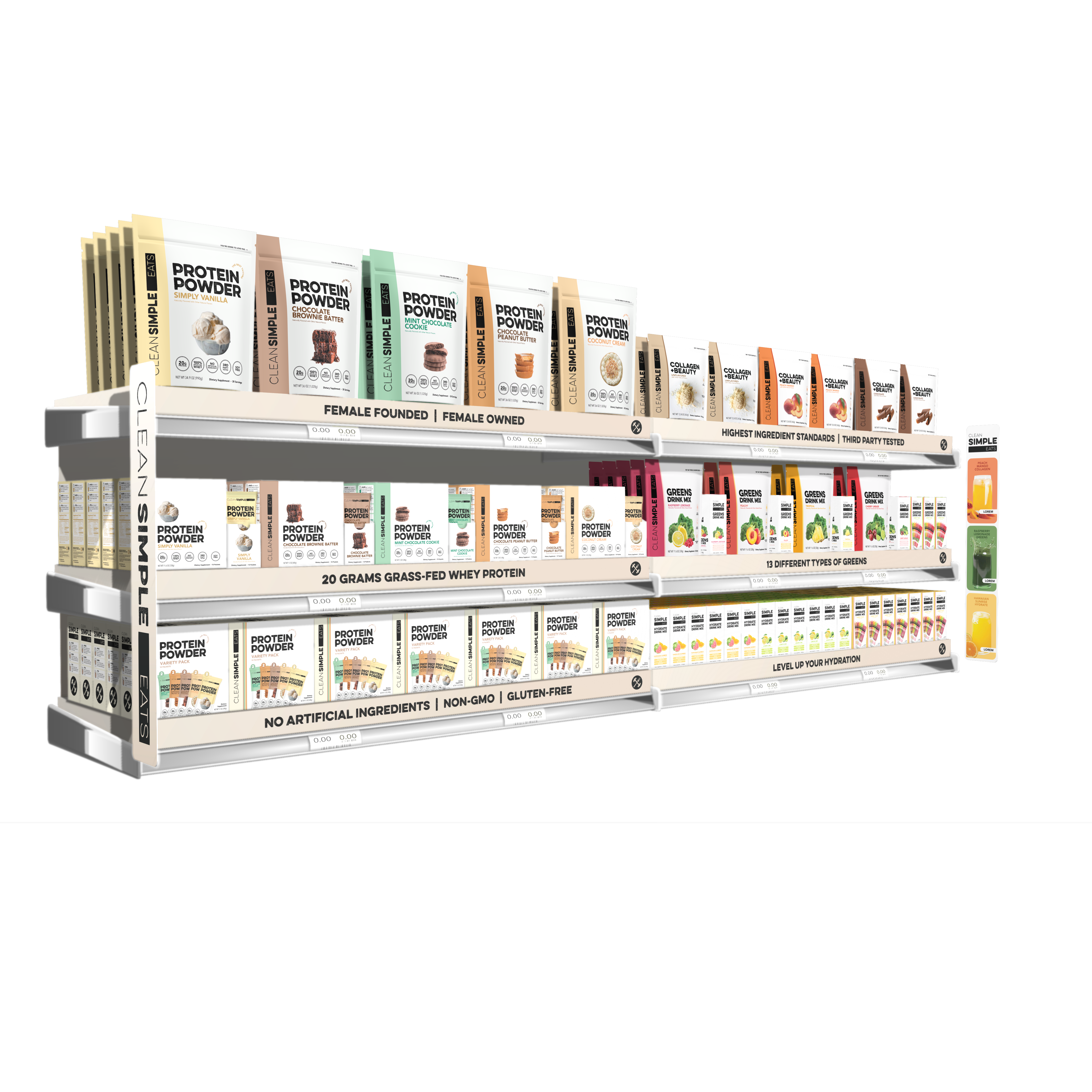
Originally tasked with developing Q4 endcap renderings for Target, Clean Simple Eats saw an opportunity to do more. Their Marketing and Design teams used the brief to inspire buyers with future-facing solutions that positioned CSE as a long-term platform brand, not just a one-off. As a challenger brand aiming to gain traction at Target, it was crucial to balance creative storytelling with a clear understanding of Target’s display guidelines and to deliver concepts that would both educate and engage shoppers.
Originally tasked with developing Q4 endcap renderings for Target, Clean Simple Eats saw an opportunity to do more. Their Marketing and Design teams used the brief to inspire buyers with future-facing solutions that positioned CSE as a long-term platform brand, not just a one-off. As a challenger brand aiming to gain traction at Target, it was crucial to balance creative storytelling with a clear understanding of Target’s display guidelines and to deliver concepts that would both educate and engage shoppers.
WHAT WE DID.
Using Target store environments as the context for the renderings, we worked closely with the CSE team to create on-shelf solutions across a variety of drink mix categories including protein powders, hydration, collagen and beauty, greens, and their newly launched (RTD) Ready to Drink protein. We developed 3D renderings for all of the skus included in the renderings, and worked closely with their team to execute structural and signage options while offering solutions for on-shelf communication / education.
Project Deliverables:
- (32) Packaging renderings
- Everyday & Q4 Endcap renderings
- In-aisle renderings
- Sidecap rendering
- Grocery & Front of Store renderings
- Ready-to-Drink (RTD) Pallet renderings
Endcaps
Following CSE’s meetings with Target, we rec'd this very kind note from CSE’s Marketing team.
Matt & Mel - wanted to just again express gratitude for all the work you guys did! We just got a list of things that were accepted for target April ‘25 (!!!!!) we’re screaming and just so incredibly grateful for all the work you did to help us get here!
Sidecap
Inline: Expanded Set / Best-Sellers Set with aisle blades and shelf risers including a focused mix of brand messaging and key visuals.

Ready to Drink,
Refrigerated Grocery and Front of Store


Ready to Drink, Inline Energy Drink Shelf


RTD - Clear Protein pallet + Protein pouch endcap rendering
RTD - Clear Protein + Energy pallet leading into the energy drink aisle
LINDT x KROGER/ In-store visualizations
SHORT BRIEF.
Develop Go Big Easter concepts for National Landscape with a specific focus on Kroger. We were to develop Go Big Easter Dress Up Kits for Endcaps, and a signage system for the floor display program. All of this was to be rendered in situ (the store environment).
Develop Go Big Easter concepts for National Landscape with a specific focus on Kroger. We were to develop Go Big Easter Dress Up Kits for Endcaps, and a signage system for the floor display program. All of this was to be rendered in situ (the store environment).
WHAT WE DID.
We collaborated with the Lindt Shopper Marketing team on product placement (POG) and signage development. We worked through a series of alignment sketches combined with inspiration, before moving onto final renderings. Lastly, both a Kroger specific store environment and a (universal) National environment were created to provide context for the renderings.
Project Deliverables:
- Go Big Endcap - signage design & concept renderings
- Go Big Floor Display - signage design & concept renderings
Endcaps: Easter Seasonal, National & Kroger store environments


Floor Displays: Easter Seasonal


LINDT / Displays for What’s New
SHORT BRIEF.
Develop floor displays that drive consistency within each Lindt sub-brand while allowing new products and seasonal releases to stand out in-store.
The work focuses on consistent use of core brand assets (especially key colors, Master Chocolatier imagery, and appetite appeal) to help shoppers quickly recognize the brand while navigating the store. Flavor innovation is highlighted within the established design system.
For Lindor, seasonal display programs introduce structural variation through custom diecut headers, creating moments of excitement while staying consistent with the overall display approach.
The result supports ongoing launches, reinforces brand recognition, and allows each sub-brand to evolve without starting from scratch.
WHAT WE DID.
In the case of Excellence, the marketing team came to us with a brief to streamline the graphic system while aligning with global display standards. A key focus was improving the dark chocolate flavor meter, an educational tool designed to help “new to dark” shoppers quickly understand sweetness vs. bitterness at a glance.
For all displays work, the 3D display renderings that we create provide the team with flexible views that are used within presentations to internal stakeholders and for sell-in with retailers.
Excellence - On this display we’re using the wing to disrupt and callout the new flavor drop, and on the body we’re improving clarity for ‘new to dark’ shoppers by educating them on taste profiles and where to start. 3D renderings are used throughout the process to help marketing teams visualize the displays.


Classic Recipe uses the same structure as Excellence. DBA’s are expressed differently, while the innovation wing creates a clear callout for new flavor releases.


Lindor - Flavor innovation is highlighted through graphic cues that maintain continuity with the Lindor brand.


The system expands to include structural variation, with diecut headers creating distinct seasonal moments.


