WORK        ABOUT                                                                                      LET’S TALK ︎︎︎  


Package Design ︎︎︎
Illustration ︎︎︎
Branding & Collateral ︎︎︎


NANAT / Brand Design


SHORT BRIEF.
Brand Design. Craft a brand targeting new parents (25-40) and gift-givers (30-65) looking for uniquely designed baby blankets that children and adults can enjoy for both the artistic quality and the premium material.
WHAT WE DID.
Before the design work began, we developed a brand roadmap which outlined nanat’s brand values, personality, message, tone, and more.  From that roadmap, a concept for the brand’s visual expression emerged - elements of that work are shown below.

Brand Identity. The ‘nanat’ wordmark conveys an elegant yet playful feel. The visual system is both consistent and flexible, allowing for a cohesive rollout to various digital channels and print formats.

Visit the storefront > nanatbaby.com


Identity Design


Secondary marks, social media badges, and icons


Seasonal logo treatment - spring promotion concept


Collateral mockup
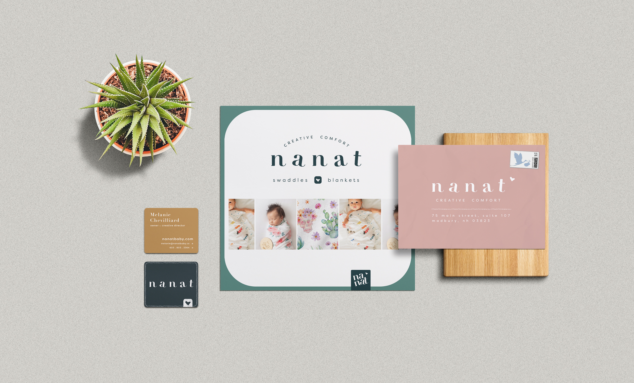

Brand Guidelines, Color and Typography


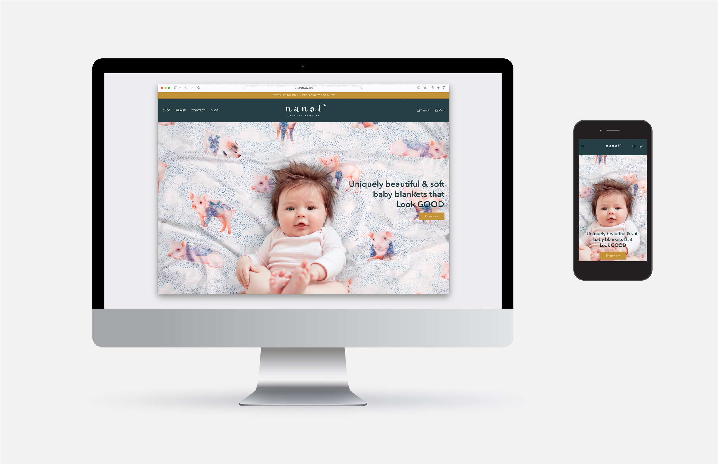
Desktop and mobile mockups - visit the storefront nanatbaby.com


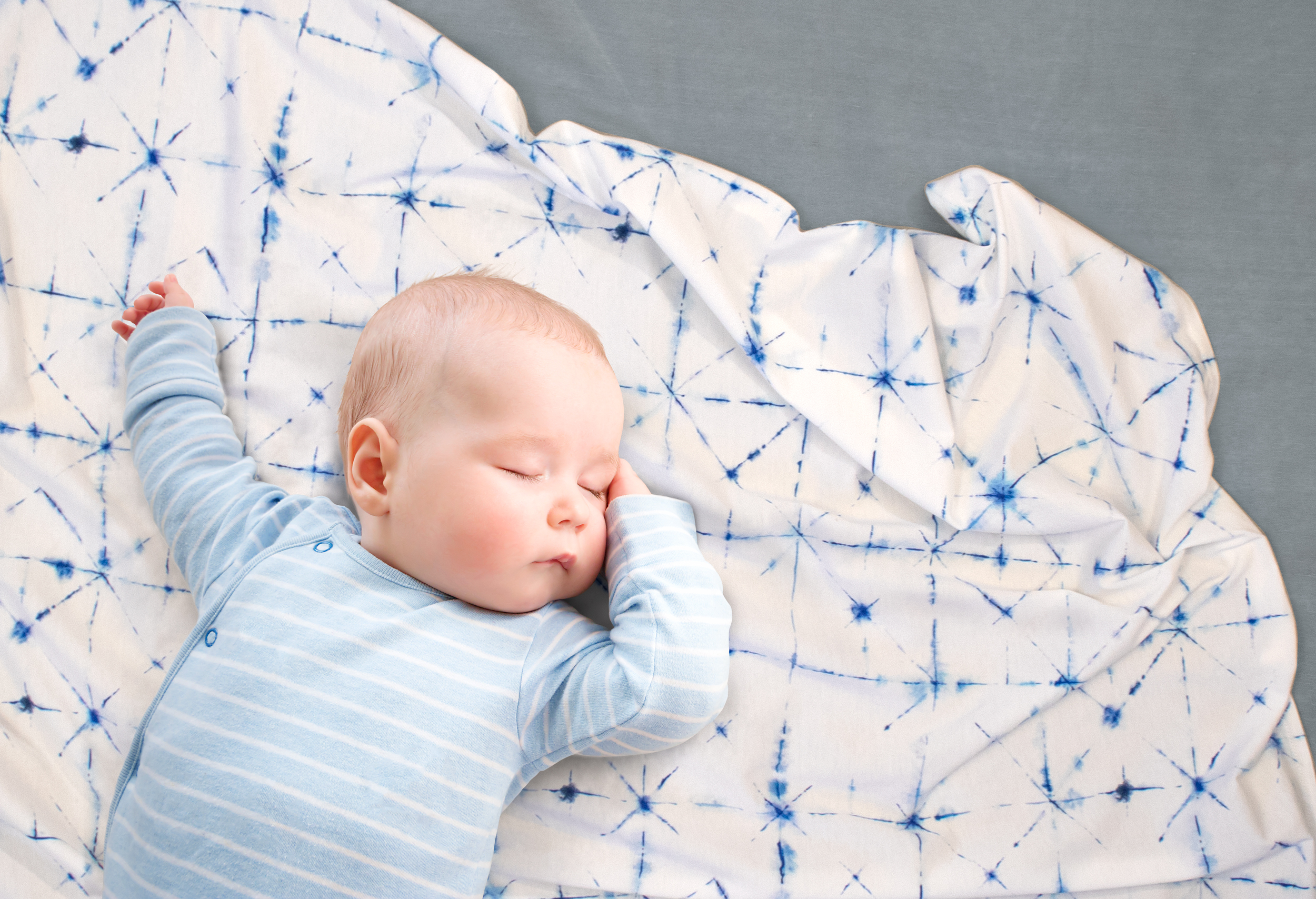
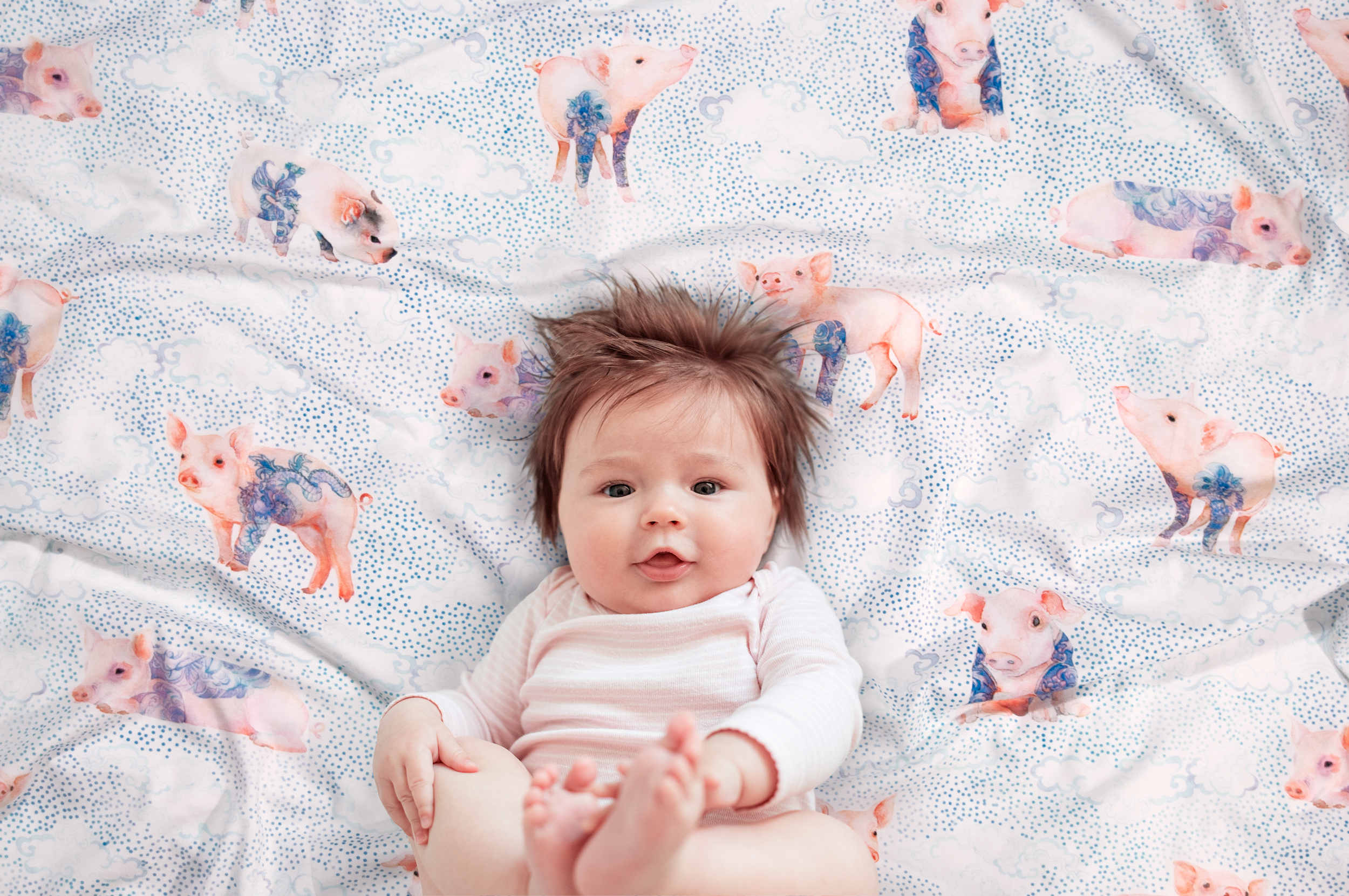
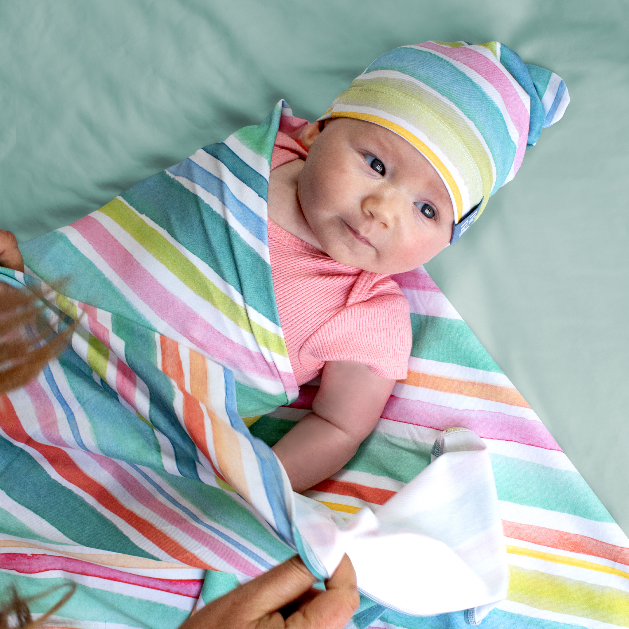
Blanket + Baby brand visuals
Photography by Matt & Mel’s


Digital Carousel - Shopify, Etsy


Packaging - Premium Giftbox (1PC), e-commerce exclusive

Primary structure is made with Mohawk’s 100% PC ultra-white uncoated paperboard with a beautiful clear foil stamp applied to the logo.  Custom tissue, inner sticker, and marketing inserts are made from 100% recycled materials and use soy inks.


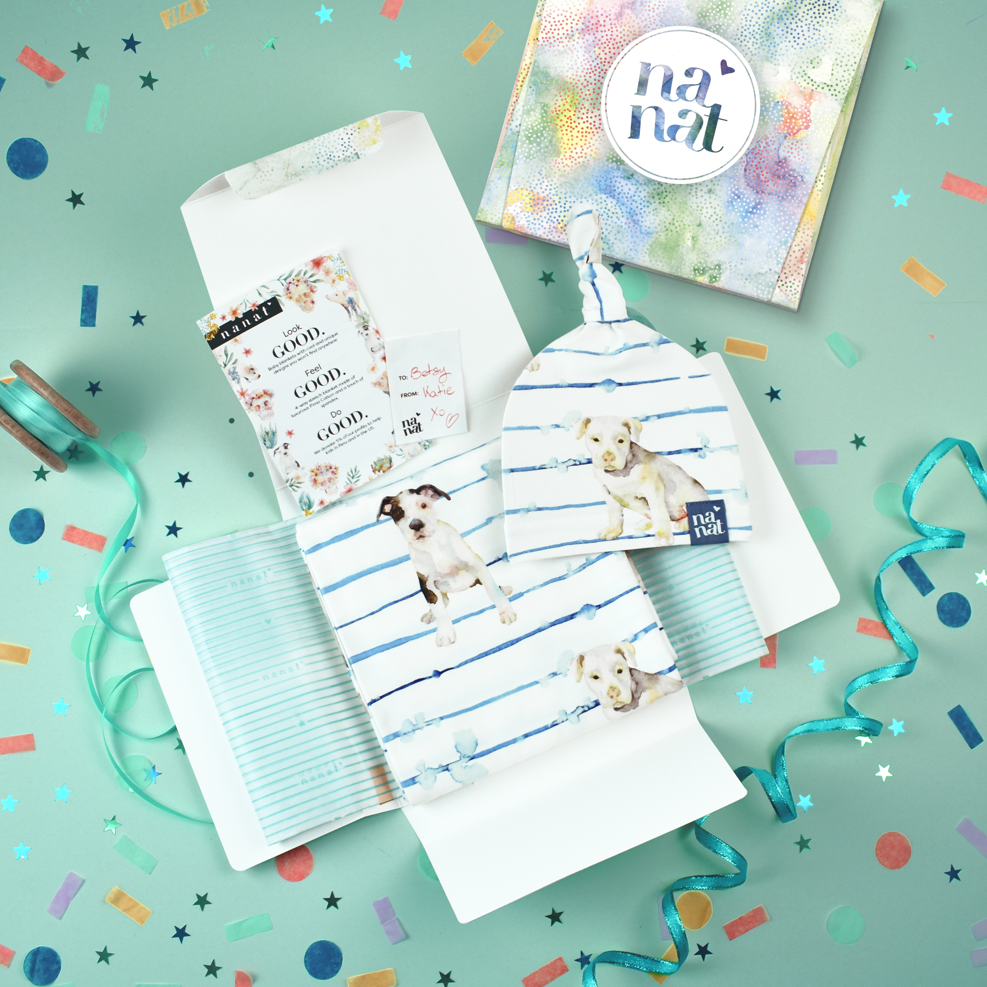


Packaging - Luxury Keepsake Giftbox (3PC), e-commerce exclusive

Rigid structure uses 100% recycled chipboard, and outer paper wrap made with FSC certified paper. Custom tissue, inner sticker, and marketing inserts are made from 100% recycled materials and use soy inks.




FLOCK DESIGN HOUSE / Brand Identity & Collateral


SHORT BRIEF.
Interior Designers Anita Magyar & Kristin Peterson-Damle were looking for an identity system that captured the spirit of their new firm. They wanted a dynamic visual language that told their story - it needed to be rebellious and energetic, yet sophisticated and reflective of their eclectic style.
WHAT WE DID.
One of the highlights of the project was designing their letter-pressed business cards, made by Studio on Fire. The custom size, ultra-heavy matte stock, blind embossed front, and the metallic ink used to decorate both sides and the edges, all come together to make a powerful statement about their brand. Without saying a word, the cards reinforce a critical piece of Flock's brand message - a relentless commitment to quality and total dedication to style.

Project Deliverables:
• Logo design
• Stationary, business cards
• Trade show postcards and folders
• Office and Trade Show signage


NORTH 8th / Logo Design


SHORT BRIEF.
Logo Design for a start-up women's clothing & accessory design company based in L.A. Owners Kalyna Kutny & Sarah Durlacher were looking to explore logos that captured the personality of their young yet elegant style, while conveying a level of sophistication.
WHAT WE DID.
We worked through a variety of hand-drawn options and ended up with the hand-scripted primary & secondary logomarks seen here. Also shown is a small part of the exploratory process using sharpies on kraft paper. 


LINDT USA CORPORATE/ Branding & Collateral


SHORT BRIEF.
One of the most rewarding projects was an overhaul of the Human Resource department's communication materials, and the subsequent marketing campaigns. The project was complex in terms of scope, timeline, and the expectations for creative - the aesthetic had to ladder back to the Lindt parent brand, but in a contemporary way that satisfied the client (HR) and would gain approval from Marketing.
WHAT WE DID.
In the end, the project which included a dedicated Careers web site, an Employee Handbook, an Employee Benefits Guide, and several other printed and digital assets for recruiting purposes, was very well-received.
I had the pleasure of working with the very talented Gabi Hale on this project. Gabi supported by further developing our approved look and feel and adapting that across a wide range of printed collateral. We ended up with a dynamic yet cohesive identity system for Lindt Careers.

Visit the new Careers site


LINDT - LINDOR / Everyday Photoshoot


THE BRIEF.
We worked in close collaboration with the Lindor Brand team to develop a series of everyday brand assets that could be used across POS, social media, and for other digital and print applications.
WHAT WE DID.
We ideated on shots for sharing and hosting, personal indulgence, and gifting occasions. In addition to contributing concepts for the shoot, we delivered a pre-production brief that included the following:

• research and inspiration for each of the desired shots
• sketches illustrating how each shot would be composed
• sketches of how each shot would be placed on POS
• prop research and guide
• general guidance for lighting + styling notes
• overall color pallet for the shoot


PRE-PRODUCTION PLANNING  A tremendous amount planning goes into these shoots, but it's critical to getting the best results.  If done properly all of the stakeholders have a clear idea of how each shot will be executed and an opportunity to provide feedback (prior to the shoot). Once we aligned internally, we ran all of the planning by our photographer and prop/food stylist in advance of the shoot to allow for their input as well. As a result, the shoot went smoothly, and the finished images were well-received by Brand.


FOLLOW

Check us out on ︎

MATT & MEL’S
© 2018 - 2024