
DOWNEAST / Cider House Exclusive Series
SHORT BRIEF.
The Cider House Exclusive Series highlights the premium, experimental side of Downeast Cider. Each limited-release flavor pairs unexpected, seasonal ingredients with a more refined, artisanal aesthetic while still staying true to the brand’s approachable personality. The goal: maintain loyalty among core fans while attracting new consumers with a more elevated palate.
The Cider House Exclusive Series highlights the premium, experimental side of Downeast Cider. Each limited-release flavor pairs unexpected, seasonal ingredients with a more refined, artisanal aesthetic while still staying true to the brand’s approachable personality. The goal: maintain loyalty among core fans while attracting new consumers with a more elevated palate.
WHAT WE DID.
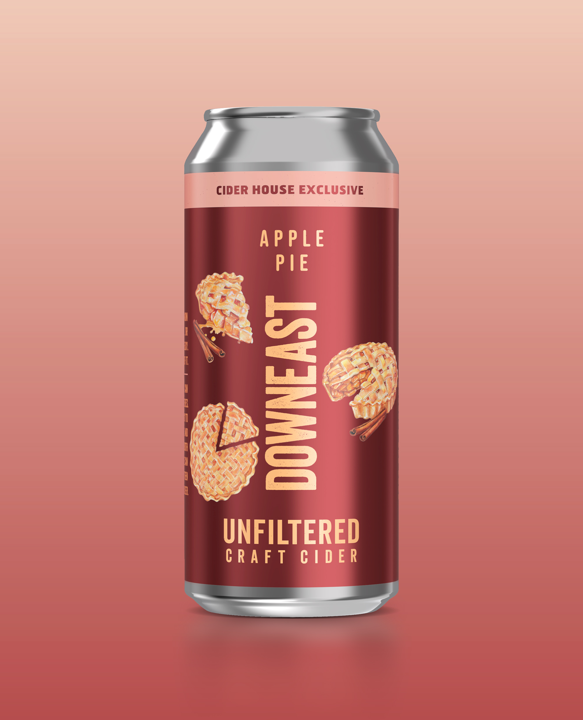
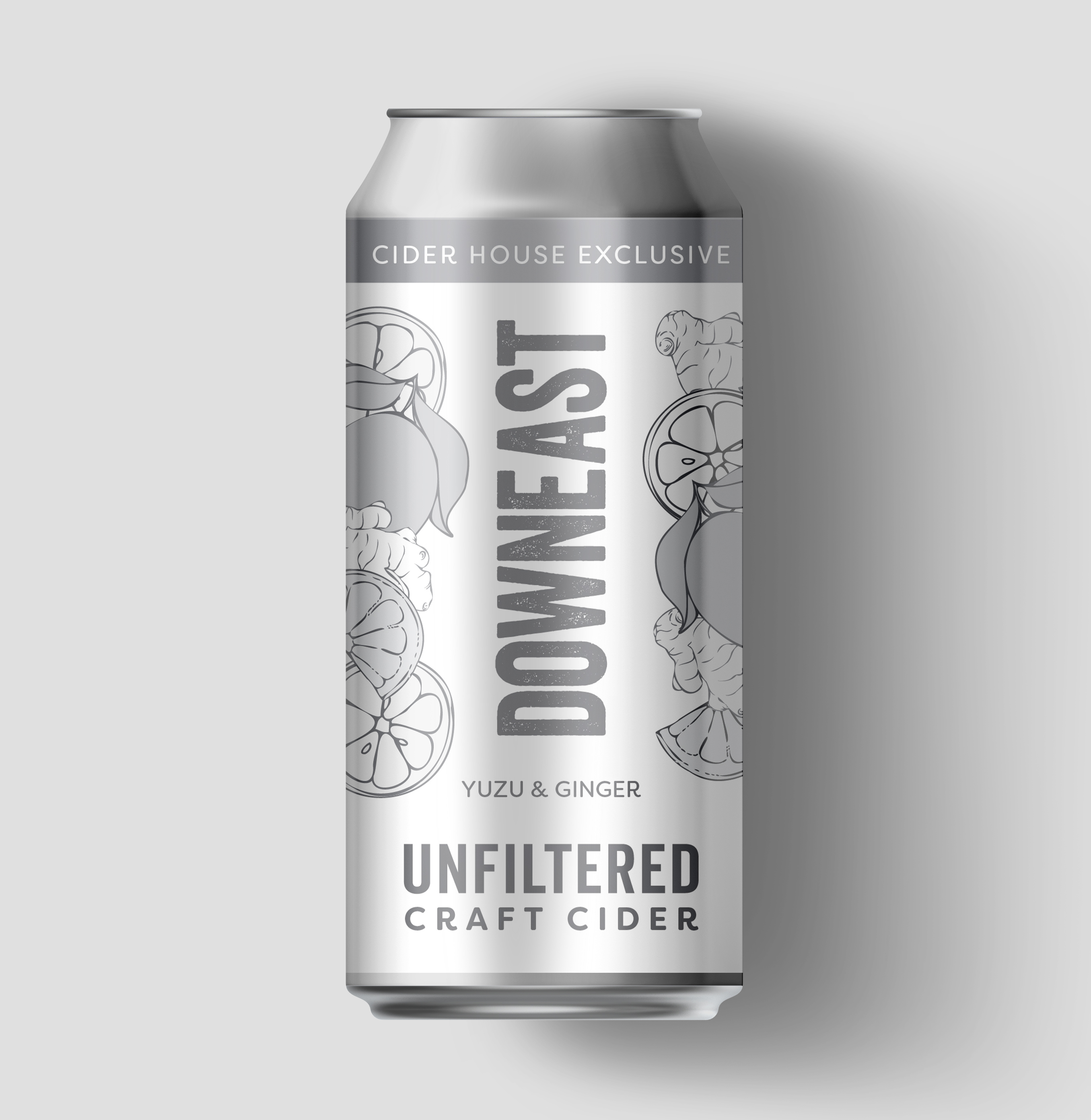
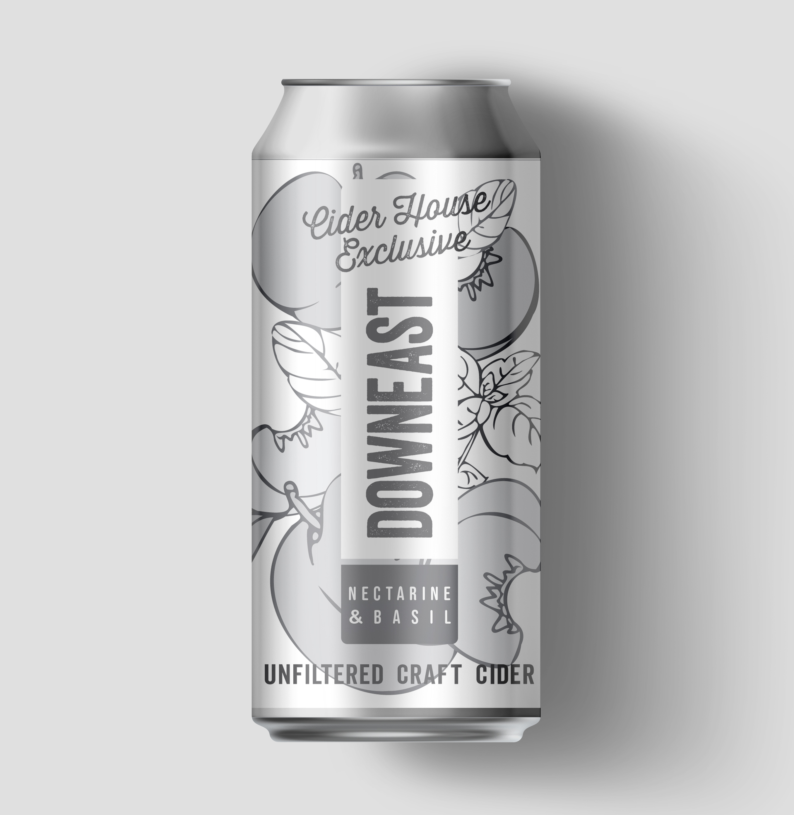
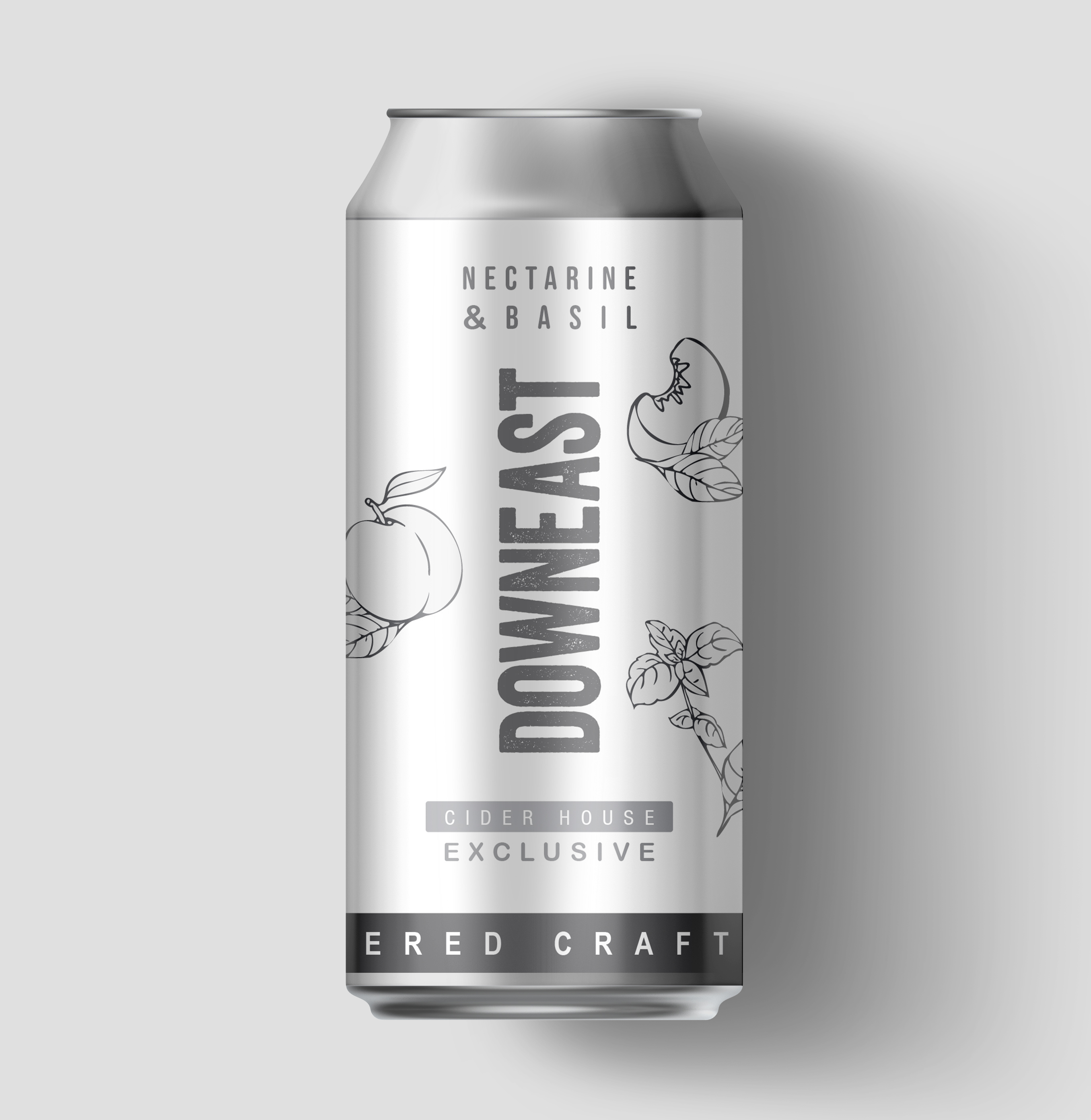
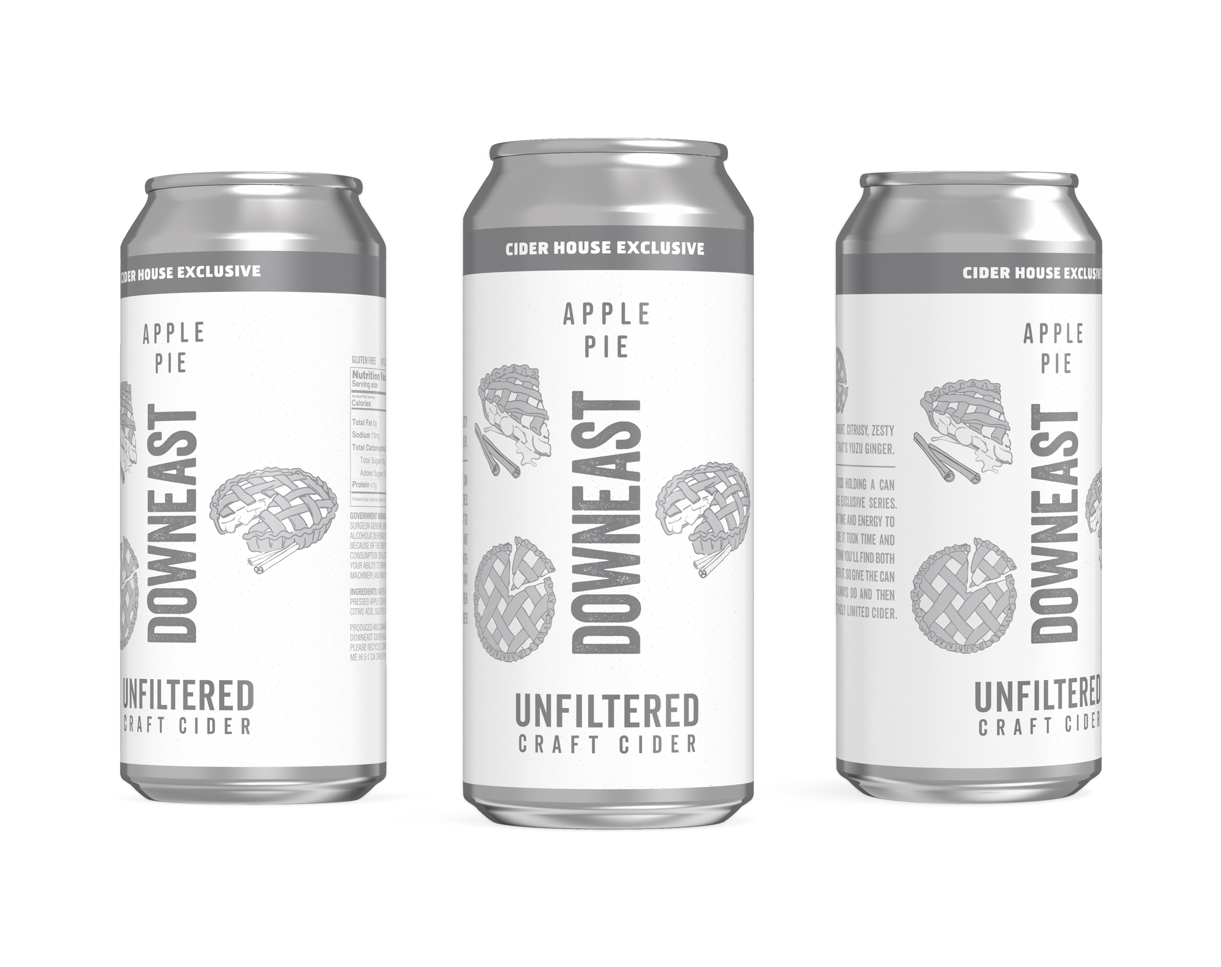
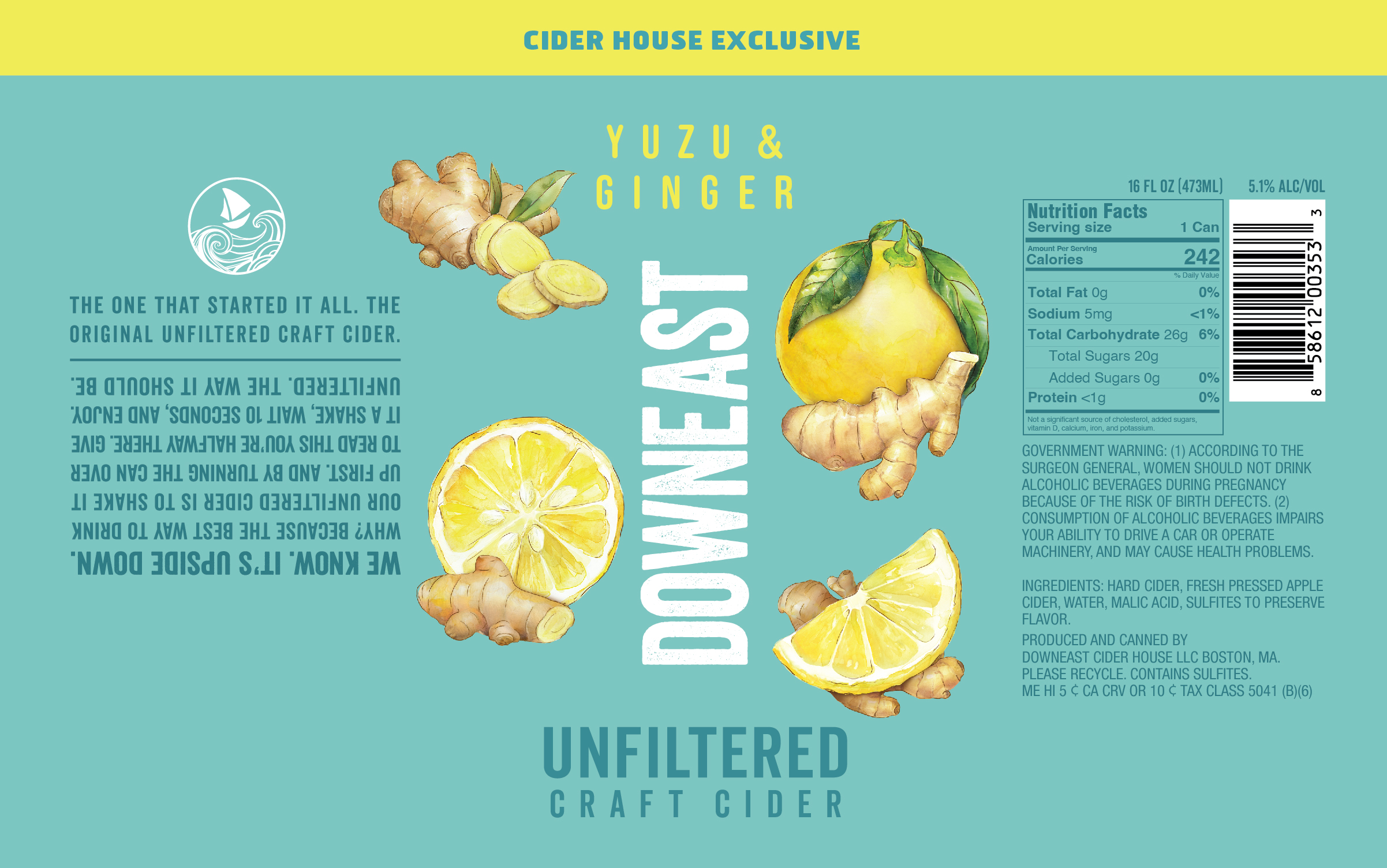
We partnered with the Downeast team from concept to final artwork, applying our process to build a flexible design system that ties the series together. Each can features hand-drawn, watercolor-style illustrations of key ingredients, giving the lineup a crafted, small-batch feel. The first of four flavors was Yuzu & Ginger, a 2025 Spring release - see below for the process that we applied to the creation of this flavor.
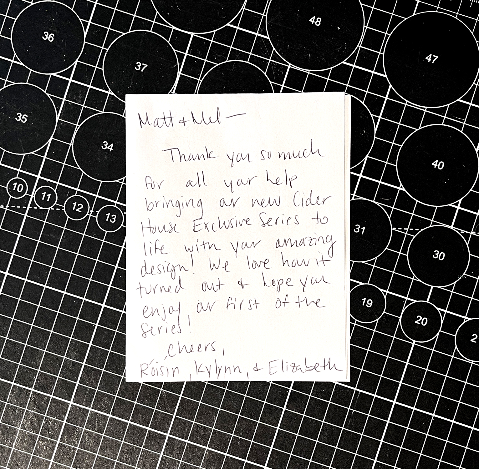
It was a true collaboration—clear vision, creative trust, and a lot of fun along the way. And the flavors? Genuinely delicious, each perfect for the season. We’ve been thrilled to create artwork that pairs so well with what’s inside the can.
Visit Downeast’s website or the TAP House to try the current seasonal variety ︎︎︎


Step 1: Aligning on the System
We kicked things off by working with the Downeast team to define the design hierarchy for the new series. Our goal was to build a system that could flex across future flavors while staying cohesive. We shared a variety of layouts using greyscale ‘sketches’ of the artwork, giving the team space to react and help shape the direction from the ground up. Other flavors were included in this study, to explore how different flavor names and ingredients might work within the proposed systems.

With feedback from the team, we landed on the design hierarchy below.
Fixed elements are the logo. copy elements, and placement of color.
Flex elements are the ingredient visuals, specifically the number of elements - we agreed that this could shift between 3 and 4, depending on the flavor.
Fixed elements are the logo. copy elements, and placement of color.
Flex elements are the ingredient visuals, specifically the number of elements - we agreed that this could shift between 3 and 4, depending on the flavor.
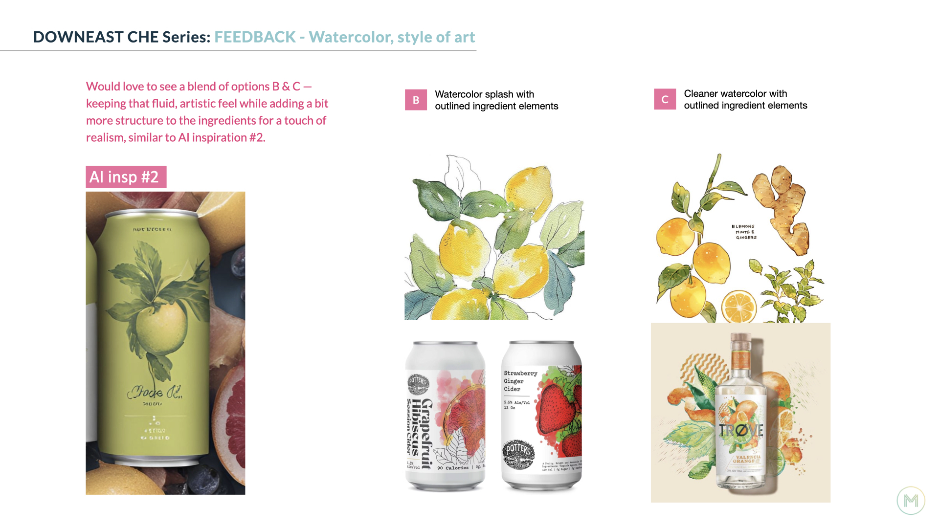
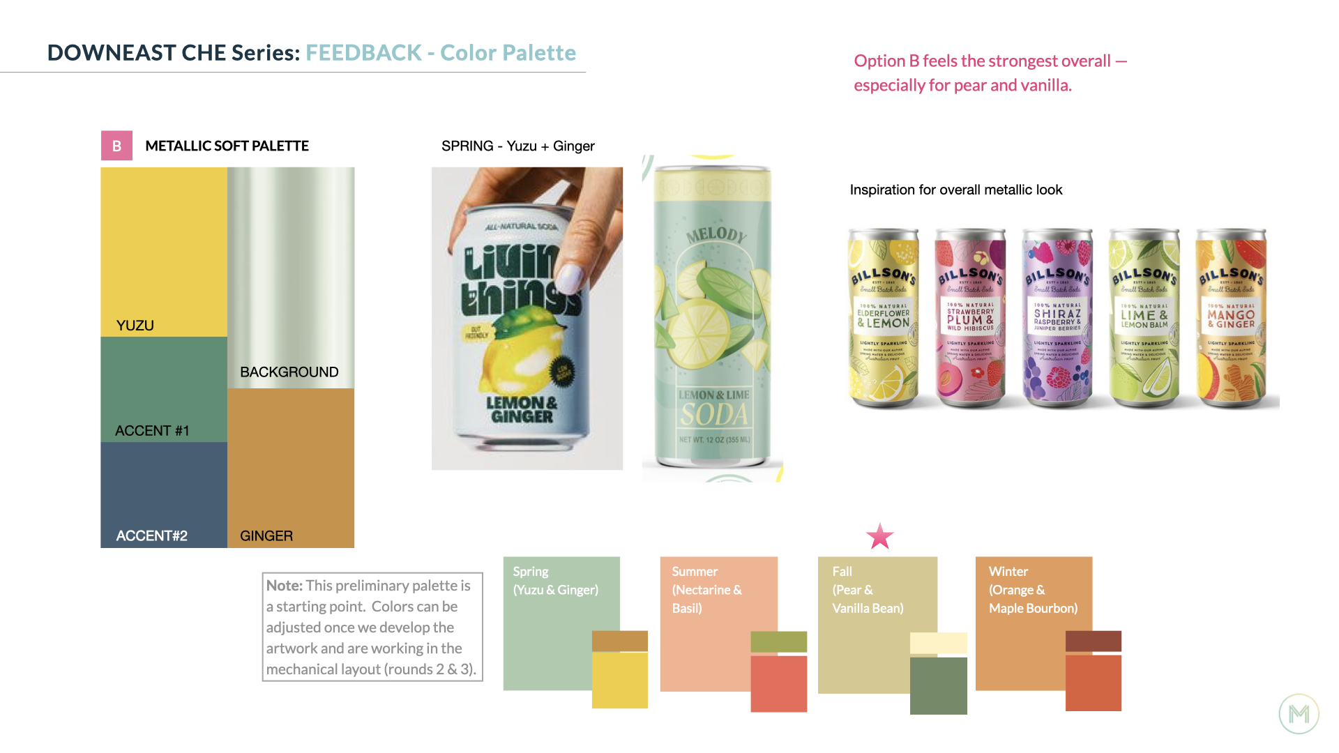
In addition to aligning on a design hierarchy, we’re sharing inspiration for potential color combinations, and relevant art styles early on to make sure we’re heading in a direction that feels right for everyone.
Step 2: Creating the art
With the design system in place, we moved into developing the ingredient art and exploring how color could bring each flavor to life in layout. This is one of the most enjoyable parts of the process for us. It's hands-on, creative, and full of discovery.
Mel paints each ingredient element by hand using watercolor. We then bring those scans into Photoshop to refine, clean up, and prep for layout. It’s an iterative process within the studio that thrives on collaboration and keeps the final ingredient art feeling fresh, crafted, and full of character.


Color exploration in layout.


Step 3: Finalizing the Artwork
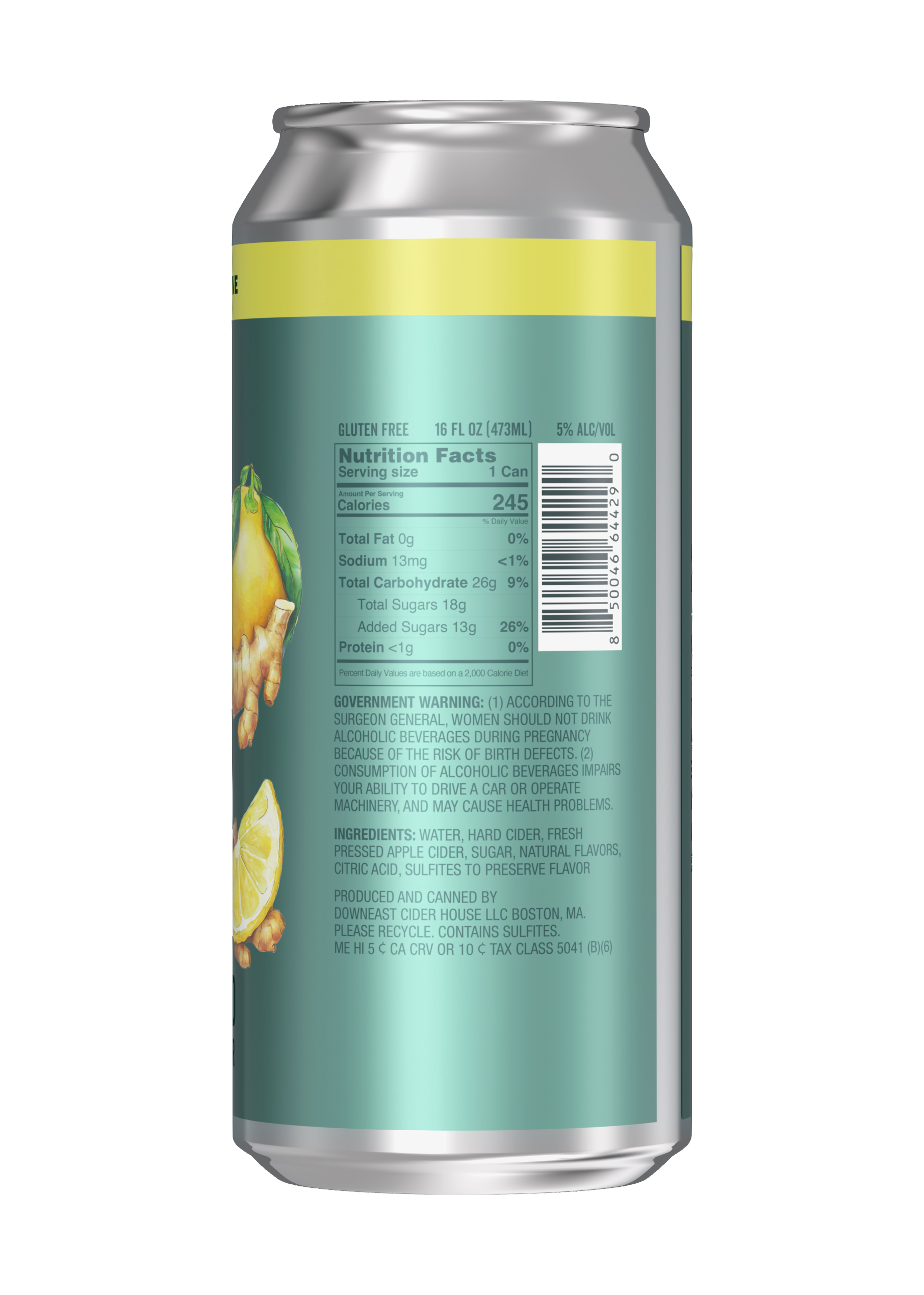
With initial concepts explored and feedback in hand, we start honing in on the final artwork and color. This phase is all about refinement, tightening the details, fine-tuning the palette, and making sure everything feels cohesive and shelf-ready. We make updates to key elements like marketing copy and NLEA info so everything is accurate. Recommendations on ways to optimize the finish for the metallic substrate are made, and 3D can renderings are provided.


︎Image below by Downeast
![]()